
This story is taken from “Before & After” Magazine.

You pay attention to colors in your photographs. You may even use a color management system to ensure that the colors you see on screen are the same as the ones that print. Yet do you pay enough attention to the colors that surround the image? The colors you use in your design can lessen the impact or change the meaning of a photo.
It all goes back to the color wheels we used as kids to learn about color. Colors can coordinate, complement, or clash to different effect. Start by selecting tones from your image itself then experiment with the color wheel for endless options.

This article was available on CreativePro.com for a limited time only. However, you can still read the article by buying Issue 31 from the Before & After site. Since we’re big fans of the magazine, we recommend you subscribe for a full 32 articles (that’s four print issues for $42 or 32 downloadable PDFs for $24).
This article was last modified on January 3, 2023
This article was first published on May 2, 2003
Commenting is easier and faster when you're logged in!

Recommended for you
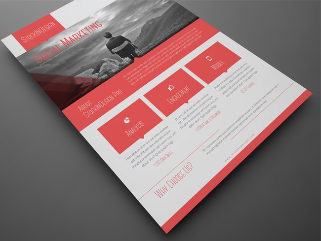
Corporate Flyer Templates
This is an awesome set of corporate flyer templates from StockInDesign, in InDes...
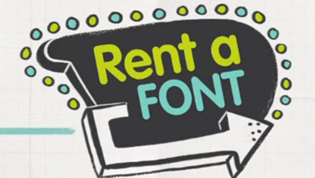
SkyFonts, the Rent-a-Font service
Ownership or access? Increasingly, that seems to be one of the fundamental quest...

FontAgent Pro Server From Insider Released
Designers have known since a long time ago That the #1 font manager’s Font...