


dot-font was a collection of short articles written by editor and typographer John D. Barry (the former editor and publisher of the typographic journal U&lc) for CreativePro. If you’d like to read more from this series, click here.
Eventually, John gathered a selection of these articles into two books, dot-font: Talking About Design and dot-font: Talking About Fonts, which are available free to download here. You can find more from John at his website, https://johndberry.com.
Remember when writing a document and typesetting it were two entirely different things, separate processes performed by different people at different times? No?
Well, back in ancient days—the late 20th century—there was a pragmatic separation between creating what we now call “content” and formatting it visually for presentation to its audience. The first part—creation of the words—would be done on a typewriter, or on a piece of paper by hand, and later on a word-processor; the second part would be done on a large, complex, expensive proprietary typesetting system, at first in hot metal and later in film or early digital type. The skills involved in design and production were not necessarily those needed for writing and editing.
To be sure, sometimes there was close collaboration; there had to be, to make things come out right. In advertising agencies, especially, there would often be an intense back-and-forth between copywriter and designer. But neither the designer nor the writer was the typesetter; ultimately, the ad copy had to be sent out to a type house to be set in type, which would then be pasted up by hand.
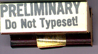
When paper was king, you had to rubber-stamp the printed copy to show whether it was approved and ready to go into production.
Type Without Direction
Today, when everything is written, designed, and typeset on a Mac or a PC, there are very few type houses left, and the professional typesetter is often dishonored and forgotten. Most typesetting is done in-house, where it’s left to the designers or their assistants. But most graphic designers never get more than rudimentary training in typography; they never learn the painstaking craft of making words on a page read effortlessly and well.
Once, it was common in large companies and ad agencies to have a “type director,” someone who knew the ins and outs of type and how to get it to look right. The type director wasn’t the typesetter; he (more rarely, she) would be in charge of setting standards of typography, and making sure that the type was spec’d right and that what came back from the type house was acceptable. The type director oversaw the typographic identity of everything that went out of the agency or the company.
The position of “type director” largely disappeared when desktop publishing took over, but ironically it’s a skill more needed today than ever. All these companies that produce their own type could use someone whose job it is to pay attention to type standards. A glance at a page of almost any popular magazine these days makes this obvious.
Between Editing and Design
With the words flowing back and forth between “content” and “design,” there’s a blurring today between design considerations and editorial decisions. Copyeditors and proofreaders often find themselves making judgment calls on things that are rightly part of the typographic design, such as how many lines in a row may end with a hyphen.
When I worked at Microsoft Press in its early days, we had two proofreading departments: editorial proofreaders and production proofreaders. The editorial proofreaders were responsible for checking to see that the words were right; the production proofreaders were responsible for checking to see that the words were typeset right.
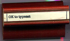
When “OK to typeset” was stamped on the copy, it was ready to leave the editorial department.
When, as part of a reorganization in the mid-1980s, one of the proofreading departments was dropped as redundant, things began to fall through the cracks. One chapter of a book suffered an unusual typesetting error: The small-caps command had been turned on at the beginning of the chapter, but inadvertently never turned off, and the whole chapter went through production typeset in small caps. Only when the galleys were sent to the editor did anyone notice. (Unfortunately, galleys were sent out at the same time to the author, who was understandably disconcerted.)
Somewhat later, at a busy type house in Seattle, I observed how the production proofreader could become the arbiter of typographic style. This shop was so busy that it had round-the-clock shifts. A lot of the business was advertising, which saw frequent changes and revisions, often being sent back later in the day by the client. Turnaround was so fast that in these cases an ad might be worked on at different times by different typesetters working on different shifts; the proofreader, working the day shift, would try to keep the typographic details consistent, even to the point of marking changes to the kerning. This infuriated some of the nighttime typesetters, who might come back to find their careful kerning changed; but it was the result of dedication and attention to detail on everyone’s part. These conflicts were inevitable when a complex job was being done, on an impossible schedule, by a conflagration of perfectionists. (If you have a better collective noun for perfectionists, please let me know.)
Flexible Precision
In practical terms, today, what’s needed is more care and attention to detail but less rigidity. Rules (such as that old bugaboo about hyphen stacks) are just guidelines, reflections of patterns; they should be used as such, rather than applied blindly. There’s no virtue in following rules; the rules exist solely to help us create a good result. Whoever is setting our type needs to have a good knowledge of those patterns and why they exist; it should not be up to the editor or the proofreader to plug the gap and make decisions about how the words should be typeset. Perhaps more training in typography for both editors and graphic designers would help—to increase each one’s understanding of what the other does.
I’d be interested in hearing from readers of this column how typesetting gets done in your organizations, and who sets the standards and makes the detailed decisions. I suspect there’s still a good deal of typographic expertise out there, even if it often goes unrecognized.
This article was last modified on March 9, 2022
This article was first published on November 18, 2002
Commenting is easier and faster when you're logged in!

Recommended for you

dot-font: Boundary Disorders
dot-font was a collection of short articles written by editor and typographer Jo...

dot-font: From Russia with Type
dot-font was a collection of short articles written by editor and typographer Jo...

dot-font: Typeface With Flourishes
dot-font was a collection of short articles written by editor and typographer Jo...