
Great Sites: Bright Site, Little Company

It’s a small site for a small company, but with all the elegance of an agency-designed site — the kind that only big companies can afford. From the site it appears that Griffin Technology manufactures and sells fewer than a dozen products, but each product is carefully targeted for its market niche and meticulously designed. Ditto, the site.
Griffin makes Mac add-on products and its success is closely linked to Apple’s and to the slick industrial design that has propelled Apple’s fortunes. Not surprisingly, Griffin’s site has an Apple computer-like appearance — a cleanly divided display of products on a white background, with just the hint of aqua glowing under Griffin’s PowerMate (see figure 1). (Aqua is the color of Apple’s OS X interface.)
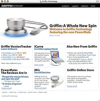
Figure 1: It’s no accident that Griffin’s home page looks reminiscent of the clean, graphically oriented appearance of Apple’s Web site.
Balancing Graphics, Text, and Bandwidth
While the layout of the home page provides an uncluttered display for Griffin’s products, it is the site’s navigational scheme, and the elements of this scheme, that provide the structural underpinnings for the site? The product matrix of the home page, with each item serving as a link to the product hierarchy, doubles as the prime non-hierarchical navigation. For a strictly hierarchical approach, there’s a discrete, black navigation strip across the top of every page with links to the first-level divisional pages: Products, Support, Software, and Store.
Graphically, there is a nice balance of text and graphics on the home page that provides an obvious hierarchy of information. Three images (products with drop shadows on white backgrounds) highlight the best-selling items, with the spotlight turned on the PowerMate, Griffin’s breakthrough knurled Knob (more about this difficult-to-describe device, later). Other items receive a simple black headline, a one-line explanation, and an aqua link. Highlighted subheads are also aqua, but the PowerMate’s subhead and the “NEW” highlights are a standout orange shade that just happens to blend with the photograph on the display of the open PowerBook in the iCurve product image.
Stepping down into the hierarchy introduces a second navigational element; a simple column of links (see figure 2). The current page in the secondary hierarchy is indicated with a plus sign and any pages under this level are added to the list in gray with a dash to distinguish them as lower in the navigational hierarchy. So, for instance, the products divisional page lists nine secondary links. Clicking the PowerMate link brings up the product item page with tertiary links for more PowerMate information added to the list (see figure 3).
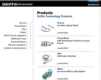
Figure 2: The product hierarchy lets you navigate by image or by text. Either way, you get both simplicity and elegance.
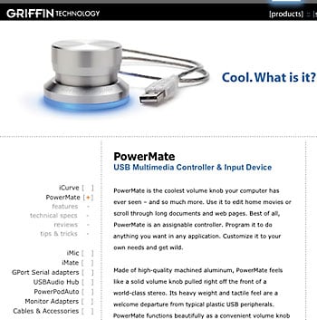
Figure 3: Stepping down into the site hierarchy expands the navigational list so that you both know where you are and can direct your next step further down. It’s maximum information with minimum clutter.
At all levels, the site remains elegantly uncluttered. The second-level pages are divided into neat columns and the text is nicely broken up into paragraphs and bullet points of sans serif type. Links are always blue so that they stand out even within text blocks. There’s also a tone of irreverence to the site; it doesn’t take itself too seriously. The item description on the PowerMate product page demonstrates this nicely, “Cool. What is it?”
Since you asked, it’s actually a “USB Multimedia Controller & Input Device,” but who needs one of those? While it’s not easy to say what it is (there are more pages about the PowerMate than any other product on the site), it is easy to see that it’s a cool-looking product — you want to get your hands on one of these things. Conveying the tactile quality of this product is not easy on a Web site, but the combination of imagery, with aqua glow, and descriptive text set a tone of must-have gadget. The combination of product design and marketing has obviously been successful, because this single product has transformed the company.
New Product/Updated Image
Griffin Technologies has made intelligently-engineered, highly-functional add-ons for the Mac market for about 10 years, but it wasn’t until they introduced PowerMate that they attracted significant attention. According to Griffin’s VP of Marketing, Andrew Green, “The PowerMate is Griffin’s first ‘want-to-have’ product. We set a new level of sophistication and design integrity that is affordable and attainable.” Green wanted the site to reflect these qualities.
Now the company’s identity has become so closely tied to this item that the product is probably better known than the company. This creates an interesting branding problem. Griffin’s not-particularly-distinguished logotype is stamped onto every page as part of the hierarchical navigation strip. The Griffin name appears half-a-dozen times on the home page, but less frequently on interior pages. But there’s also a subtle PowerMate influence on every page.
In addition to the PowerMate logotype, the hierarchical navigation bar includes a nice Java-scripted halo effect over the selected link that mimics the aqua glow of the PowerMate. This glow is the PowerMate’s hallmark of “cool,” and Griffin uses it to add a luster of high-design to all its products.
But this is the only animation on the site. The site’s designer, Chris Blanz of cabedge.com, explains, “We were looking for simplicity, cleanliness, and ease of use. At this stage in the transition from the old site to the new, we wanted to keep technical hurdles to a minimum. Flash might add to the ‘cool factor’, but wasn’t absolutely necessary.” Blanz and Green are considering animated product features for future expansions, but only within the elegant sophistication of the current structure.
The store is also a model of cleanly laid out efficiency (see figure 4). In addition to the layout, one of the things that makes it so easy to see, select, and purchase items from the store division of the site is the careful non-hierarchical linking between store pages and product pages. Click for a description in the store and it links to the product description page. Click the “Buy Me” link on any product page, and you’re right back in the store where you left off.
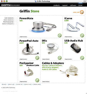
Figure 4: What a concept, an online store where you can really see the products and then order with a single click. Good photography, clean layout, and a thoughtful user-interface make the difference.
It’s heartening to see a small company like Griffin with a cutting edge product and a Web site to match. And they’re not anywhere near Silicon Valley, nor is cabedge.com near Silicon Alley. This was a client-designer match made in Nashville, Tennessee, and much of the success of their collaboration is based on the close relationship of the principles involved. Their willingness to put personal ego aside to create this little jewel of a site is evident. Let’s hope for more to come.
Read more by Clay Andres.
This article was last modified on January 8, 2023
This article was first published on October 23, 2002
Commenting is easier and faster when you're logged in!

Recommended for you

Conditional Text Sunshine (making a cool design with an unexpected tool)
You can't really make page designs using the Conditional Text panel, can you? Ke...

InDesign Template: Newsletter
Comes with three different master page designs, and frames for images and text,...

Creative Fuel: Tips for Stimulating Creativity
Tips and suggestions on how to prime the mental pump and keep your creativity fo...