
Great Sites: Netscape Breaks Away from the Pack
Is it possible to design a portal page that’s actually attractive, that’s both useful and easy on the eyes? I’d never seen one, at least until the graphic design firm of Helfand | Drenttel transformed Netscape’s home page. Let’s retrace the evolution of Netscape from a collection of links to a well-designed home page.
Eschew Yahoo
About 18 months ago when William Drenttel was asked to redesign Netscape’s home page, it was a Yahoo me-too, with a list of channels and hundreds of links. It’s an all-too familiar sight and an ungainly scenario. Is there an information architect in the world who would actually recommend piling up so many links on a single page? It’s not an efficient way to present categories of information. Yet ever since Yahoo established this model many years ago (in Internet time), it’s the one adopted by nearly all portals and the one with which all Web users are familiar.
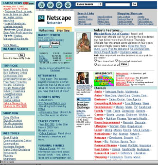
The first thing Drenttel did was break down the so-called channels into content zones. The resulting page begins to impose some order upon all of the links but, as Figure 1 shows, it wasn’t exactly an elegant presentation.
The difficulty in bringing a logical flow to the sea of information in Netscape’s Web presence is magnified by the fact that the site is more than a portal. AOL/Time Warner‘s buyout of Netscape means that Netscape’s home page functions as the entrance to the huge databases of information held by the newly combined corporation. In Drenttel’s words, Netscape.com is an “information hub.”
Channels-Be-Gone
About six months ago, Drenttel’s work started in earnest on the re-reinvention of Netscape’s home page. “From a design standpoint, we knew we couldn’t go anyplace new without a new structure that would rein in the content,” said Drenttel. He started by layering the information, but he then found that by flattening out the layers he could eliminate channels entirely and create an information hierarchy based on page location.
Take a look at Netscape’s current color landscape stripped of all content (Figure 2). Columns of list-like information have taken on a spacious, horizontal orientation that feels roomy and relaxed.
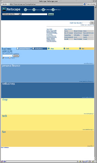
Yet despite this change in orientation, we can see that this is clearly Netscape’s page thanks to consistent branding. Across the top of the page are not only the company logo — itself more visible with less clutter — but also the button task-bar from the old site. The Search function is now more prominent and features a Netscape-branded search. Key, too, is the use of blue throughout the page. Netscape’c corporate identity uses the same light blue of the buttons. In fact, shades of this blue are found in every area of this page.
Color-Coded Content
Color bars of blue and yellow divide the content into logical areas. The central unlabeled white area is used for news headlines and images from CNN (a part of Time Warner} and also includes a grid of departmental links left over from the old channels.
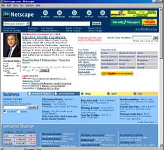
Now look at just the top portion of this page (Figure 3)– the white area above the so-called page fold on smaller monitors:
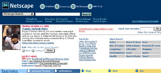
This is a nicely framed composition with branding and search elements in a dark bar on top and hierarchical navigation in a bar across the bottom. The content in between is spaciously displayed, yet there are enough links to choose from to please Netscape’s very broad audience.
Not only is the graphic design clean and appealing, but there’s a hidden element at work here that allows the full page to contain as many links as any Yahoo-like portal without the clutter and lack of focus.
Jump Down, Dig Deep
Finally, take a look at the remainder of Netscape’s home page (Figure 4) — the portion below the page fold.
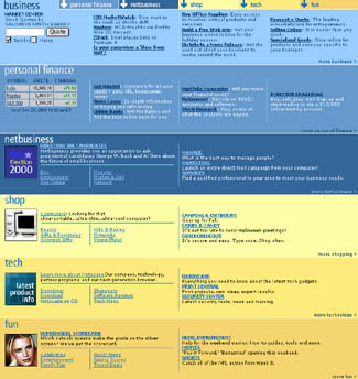
There are six hierarchical site divisions, each with a clearly delineated color bar of intra-divisional links. But notice what’s at the top of this stack of bars: the navigation bar from the bottom of Figure 3. I’ve contrived to show this single navigational element in both screen shots, because graphically and functionally it serves both halves of the page.
This navigation bar connects information in the top to links in the bottom, and by providing an express route to the hidden portions of the page beneath, it allows you to bypass scroll bars. It also enforces the Netscape-blue branding color and introduces the yellow used for half the divisions.
These labeled units are jump-down links, an original HTML construct that seems to have fallen into disfavor. The down-pointing arrows of the jump-down links make it clear that clicking on these color bars will lead somewhere, and the labels — business, personal finance, netbusiness, shop, tech, and fun — make it pretty clear what you can expect. Using two hues to differentiate business (blue) from pleasure (yellow) not only adds to the clarity of the page, but also maintains some continuity with Netscape’s previous home page design, which used two color-coded tabs to represent netbusiness and free time.
Seventh Heaven
The jump-down method may be old-fashioned, but it allows this top page, which is the only page Drenttel has redesigned for Netscape so far, to bind the contents of seven pages together as one. Think about it: The top of the page, with its two navigation bars sandwiching the information and departmental links of the middle white bar, is essentially one page. If the bottom navigation bar used standard link references instead of jump-down links, each of the six color bars would itself be a separate divisional page.
More and more it’s become clear to me that hierarchies can be collapsed to include multiple levels on a single page. The Frame construct provided the first inklings of what might be possible in this area, while more recently, changing page content with rollovers has become a very powerful tool for condensing much into little.
It’s interesting that Drenttel used one of the most basic HTML constructs (jump-down links) and married it to a new way of thinking about the division of content on the page. The result is simplicity where before clutter ruled. By breaking away from the Yahoo look and feel, Netscape not only stands out from competing portals, but it has enhanced usability by elevating the importance of design and using it to present a clear view of Netscape’s (and AOL-Time Warner’s) new world order.
Read more by Clay Andres.
This article was last modified on January 8, 2023
This article was first published on November 27, 2000
Commenting is easier and faster when you're logged in!

Recommended for you

On the Move to InDesign: Formatting Text
If you’re familiar with Adobe Illustrator, InDesign’s Tools palette...

Eliminating the White Box Effect
One of the most common complaints of designers or print service providers when p...

CreativePro Week Conference Speaker Spotlight: David Blatner, the Mountaineer
Welcome to our Speaker Spotlight series, designed to highlight some of our Creat...