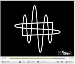
Logo Inspiration

In the May 2011 issue of The Atlantic, Michael Bierut talks about the process of designing a logo for the New World Symphony. And he doesn’t just talk: He shares early sketches from his notebook and the notebooks of Frank Gehry (who designed the symphony’s new hall) and conductor Michael Tilson Thomas.
The full article (“Project: First Drafts”) is worth a look, but if you only have a few minutes, at least watch Michael Bierut’s video and see how he was inspired by sounds waves and the movement of a conductor’s baton to create a logo that feels like music.
Click the screenshot below to open the video in a separate window:

This article was last modified on December 14, 2022
This article was first published on April 20, 2011
Commenting is easier and faster when you're logged in!
Recommended for you

Scanning Around With Gene: Give Me Back My Book!
While I’ve always had a pretty big library of books, I’ve never take...

Layout Basics: Using Boxes and Sidebars Effectively
When trying to think of an interesting design element that you can use to enhanc...

Copy all your linked images
Keith takes a "deep dive" into the "Copy Links To" command and reveals some deta...


