

dot-font was a collection of short articles written by editor and typographer John D. Barry (the former editor and publisher of the typographic journal U&lc) for CreativePro. If you’d like to read more from this series, click here.
Eventually, John gathered a selection of these articles into two books, dot-font: Talking About Design and dot-font: Talking About Fonts, which are available free to download here. You can find more from John at his website, https://johndberry.com.
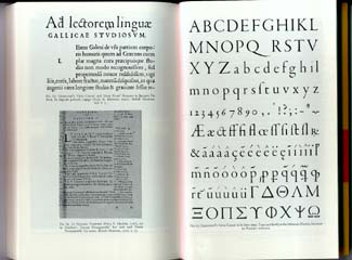
After my previous dot-font column—a look at the type specimen book recently produced by the Hoefler Type Foundry—I got a note from Jonathan Hoefler giving some fascinating background details on how he went about producing the book. Rather than risk losing the nuances of his writing by paraphrasing, I’ll pass along some of what he recounted.
Ghostwriting Samples
“I thought you’d be tickled to learn,” wrote Hoefler, “how the Knockout pages were created. After finishing the Knockout A spread, and deciding that I’d like to avoid repeating this grid in any of the subsequent six sections, I thought it worth trying to automate the system a little. (The Knockout A spread took more than six weeks!) I spent the better part of this spring sharpening my skills in Python, the scripting language that RoboFog uses, and then writing a program called ‘Ghostwriter.’ The idea behind the program was that you could feed it a font, a set of words, and a size (either as a phrase to be replaced, or a point size and a measure to match), and it would write the copy for you.
“Ghostwriter went a long way to automating the process—I could set a headline like ‘TEXT HERE XXXXX’ and see better replacements instantly—but I was quickly reminded that there’s a lot more to type specimen design than that. Making sure that words had flat sides wherever possible was part of it, so I built a feature to screen for V’s and T’s and the like on either end of a phrase. I also tried to avoid having two consecutive words begin or end with the same letter, and naturally I wanted the font’s best characters to appear wherever possible, so there was quite a bit of editing involved. In the end, one of the greatest challenges involved finding word lists to feed the program. I did a lot of searches in my vintage 1991 WordStar dictionary, which formed the basis of the 10,000-word list (you’ll notice recurring themes from music, architecture, mythology, and law, as well as names of composers, painters, novelists, and Nobel Prize winners). There were only a certain number of names and phrases capable of reaching a certain length (thus ‘Oscar Fingal O’Flahertie Wills Wilde,’ etc), so I somewhat diabolically shredded a variety of texts to yield the longer phrases. You’ll see sentences in there from The Federalist Papers, Around The World in Eighty Days, and The Invisible Man, among others.
“Of course, the real challenge was ignoring the ‘best fit’ words and phrases suggested by the program, a lot of which had rather colorful interpretations, especially read out of context and en masse.”
Mortal Letters
Hoefler also made an observation on the survival rate of type specimens: “If we share the same love of type specimen books, I suppose we also share the same morbid acknowledgement that they are generally so much ephemera, and that even the most carefully crafted ones are barely regarded for more than a moment. (Years ago, this was brought into very sharp focus when I met a retired printer at a book show, who mentioned that he’d once had all the ATF books but was in the regular habit of throwing them away once the new editions arrived!)” Those big volumes from ATF (the American Type Founders, which dominated the market for type for hand-setting a hundred years ago) now command collectors’ prices, even for copies with ink stains and pages cut out.
Another Fontside Attraction
I don’t mean to turn this column into an ongoing review of type specimen books (although that might actually serve a useful purpose!), but in the mail the other day I received another that deserves mention. It’s from LucasFonts, in Berlin, and it’s a catalog of the many font families created by Dutch type designer Luc(as) de Groot.
The catalog is called Newspaper, identified for some reason as “v 1.0 beta 2.” (Why a type specimen needs a beta version is an open question.) It comes in the form of a booklet in landscape format, just under 6 inches tall and a little more than 8 inches wide, printed on uncoated stock and saddle-stitched. Despite its small format, it gives ample space to each typeface; de Groot not only designs very attractive typefaces, he also knows how to show them off.
Sans Serif You Can Read
I confess I’ve long been a fan of Luc(as) de Groot’s type designs—for their shapeliness, their clarity, their superb fit, and their exhaustive character sets. The Thesis superfamily (which he originally developed for FontShop International’s FontFont line) could fill a book all by itself. It includes a serif family, a sans serif family, and a half-serifed family called TheMix. I consider the sans serif version, called TheSans, one of the very best sans serif text faces; it’s elegant and exceptionally readable. He has expanded the family with a seemingly endless set of variations on a theme, including an “office” version of TheSans, a monospaced version (TheSansMono), and condensed versions of each.
The original Thesis serif family, TheSerif, has slab serifs and evenly weighted strokes. “How can one set a text collection in a slab serif font!” cries one of the sample texts in the specimen book. “Misuse of FF TheSerif, a typeface with a low contrast and strong serifs, led to TheAntiqua family.” The book—or booklet—shows de Groot’s experiments toward producing a traditional serif text face. One called TheAntiquaE is the most successful, perhaps because it goes furthest from the original conception.
Through a Mirror, Darkly
Newspaper also shows some lesser-known faces by Luc(as) de Groot, including faces developed for newspapers and magazines in Germany and Brazil. (One done for “Der Spiegel” is fascinating because it’s clearly meant to suggest an old American grotesque like Franklin Gothic, yet it’s got humanist curves and details that make it look contemporary and European.)
There are lots of text blocks scattered through the book, to show off the various text faces. But to judge them all fairly for their readability, you’d have to speak several languages: I count samples in Dutch, English, Portuguese, Italian, Finnish, Spanish, Swedish, and German, with a sprinkling of French. And at least two of the faces say they’re “also available in Eastern European encodings.”
Dot That Font
Here’s an interesting footnote to the title of this column. Although I didn’t know it, Peter Fraterdeus, of the dezineCafe and the Design Digerati resource list, had applied a while back for a trademark on “.font” as a top-level internet name. Luckily for my innocently chosen title—but unluckily for Peter—the U.S. trademark office denied it as too generic. When he told me about this, Peter generously wished the column luck, asking only for a footnote, “since that’s what history seems to be offering.”
This article was last modified on April 7, 2022
This article was first published on July 20, 2000
Commenting is easier and faster when you're logged in!

Recommended for you
dot-font: Where Type Came From
dot-font was a collection of short articles written by editor and typographer Jo...

dot-font: Serifs from the Portuguese
dot-font was a collection of short articles written by editor and typographer Jo...
dot-font: Type now
dot-font was a collection of short articles written by editor and typographer Jo...