
TypeTalk is a regular blog on typography. Post your questions and comments by clicking on the Comments icon above.
Q. Can you explain some of the terminology for the parts of a character that would be most useful to know?
A. The operative word in your query is “useful,” as most explanations of the anatomy of a typeface (or parts of a character, as I like to call them) list many more terms than you need to know for everyday usage.
Here are the most commonly used (and most useful) terms when talking about type and the differences between one typeface design and another:
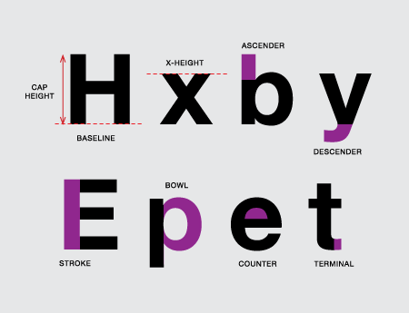
Baseline: The invisible line on which the flat part of characters sit.
Cap height: The height of capital letters from the baseline to the top of caps, most accurately measured on a character with a flat top and bottom (E, H, I, etc.).
x-height: The height of lowercase letters usually based on the lowercase x, not including ascenders and descenders.
Ascender: The part of a lowercase character (b, d, f, h, k, l, t) that extends above the height of the lowercase x.
Descender: The part of a character (g, j, p, q, y, and sometimes J) that descends below the baseline.
Stroke: A straight or curved line.
Bowl: A curved stroke that creates an enclosed space within a character (which is then called a counter).
Counter: The partially or fully enclosed space within a character.
Terminal: The end of a stroke not terminated with a serif.

Love type? Want to know more? Ilene Strizver conducts her acclaimed Gourmet Typography workshops internationally. For more information on attending one or bringing it to your company, organization, or school, go to her site, call The Type Studio at 203-227-5929, or email Ilene at info@thetypestudio.com. Sign up for her e-newsletter at www.thetypestudio.com.
This article was last modified on January 12, 2021
This article was first published on August 11, 2010
Commenting is easier and faster when you're logged in!

Recommended for you
TypeTalk: Top Ten Type Resources Online
TypeTalk is a regular blog on typography. Post your questions and comments by cl...
TypeTalk: Try Before You Buy
TypeTalk is a regular blog on typography. Post your questions and comments by cl...
TypeTalk: Give These Fonts a Hand
Should you choose a handwriting font or real handwriting for your next project?