5 Great Script Fonts From Adobe Fonts
Need a great script font for use in your next InDesign project? Look no further!
Most designers have heard of Adobe Fonts, which provides thousands of fonts to subscribers of Adobe Creative Cloud. But you might not be familiar with the details of all of their offerings. Adobe Fonts brings fonts from dozens of foundry partners into one library for quick browsing, easy use on the web or in applications, and endless typographic inspiration. The result is a wide range of inspiring fonts available for all the tools you use to get your work done each day.
This article begins a series of posts to help you quickly identify some of the best Adobe fonts to use in InDesign. I selected the following script fonts for the originality and overall cohesiveness of the design, as well as details such as integrity of the connections, consistency of strokes, character width, spacing and kerning, and overall impact. So without further ado, here are five Adobe script fonts worthy of your consideration.

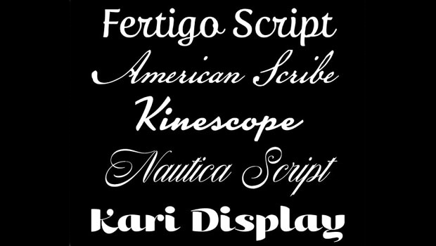
Fertigo Script is a warm, sturdy, connecting script with a lyrical, calligraphic touch. Nearly all the lowercase characters are connecting in this upright design. Its tall x-height and open letterforms make the font both legible and inviting. Fertigo Script is an addition to the Fertigo family, designed by Dutch designer Jos Buivenga of the exljbris Font Foundry.
American Scribe is a typeface designed by Brian Willson that is based on the Declaration of Independence. Although it was Thomas Jefferson who authored the Declaration, it was actually written in the handwriting of Timothy Matlack, a patriot who fought in the Revolution. He also penned copies of a number of documents for General George Washington. Matlack’s script was compact but legible, perfect for the first and most famous of American documents, and worthy of reviving for today’s digital applications.
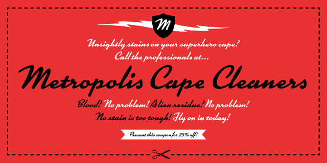
Kinescope is a dashing, 1940s-style, casual brush script by Mark Simonson. It was inspired by hand-lettered titles in the Fleischer brothers’ Superman cartoon series: “Although I used that as a starting point, there was much room for interpretation, and many characters had to be invented,” explains Simonson. Kinescope’s OpenType glyph substitution features mimic hand lettering, automatically choosing the best character shape based on its position in a word. Kinescope is perfect for packaging design and advertising, especially when you desire an informal, somewhat retro look.
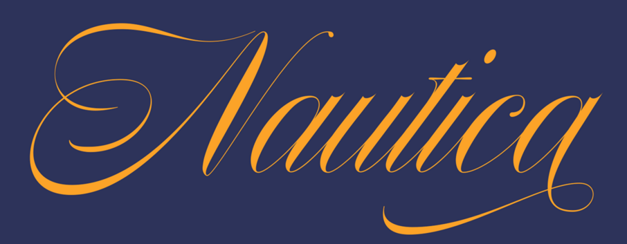
Nautica is a new design from Giuseppe Salerno and Paco González of Resistenza. This original design based on Copperplate is a high contrast, narrow script with highly decorative caps and a very assertive personality. Its ligatures and swashes are inspired by brush pen strokes. Nautica is available in three weights and one set of icons and knots, making it a very useful script when you desire a variety of weights.
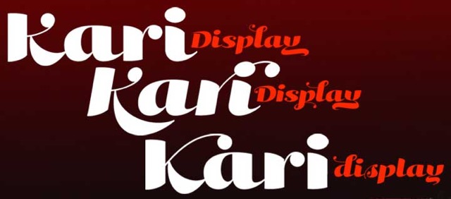
Kari Display is a bold, high-contrast, upright script designed by Neil Summerour as a companion to its namesake, Kari. Kari Display is an orderly yet beautiful script, with movement, curviness, and elegance. Summerour says of the font, “I did not want to take it too far, limiting the use of the typeface, but rather opted for a delicate balance of thick and thin against the added movement of the glyphs.” Just about every character has at least one or more alternates, giving the designer lots of options to customize its appearance.
This article was last modified on September 27, 2022
This article was first published on September 26, 2022
Commenting is easier and faster when you're logged in!
Recommended for you
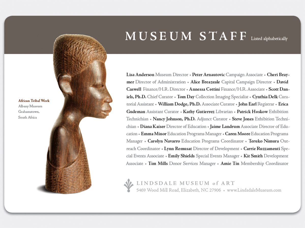
Before&After Design Tip: Two Ways to Typeset a List
Design a list that bestows visible stature to the names on it

Fontober: Free Sans Serif Fonts
Each Friday this month, we’ll feature a new set of free fonts for your use...

TypeTalk: The Typographic Expressions of Stefan Sagmeister
Stefan Sagmeister is an award-winning designer known for his bold, innovative wo...


