
20 Obscure Features
David Blatner shares his favorite 20 obscure features that every InDesign users should know about.


This article appears in Issue 118 of InDesign Magazine.
For the past 15 years, Anne-Marie Concepción and I have explored the nooks and crannies of Adobe InDesign in a segment called “Obscure Feature of the Week” in our InDesignSecrets podcast. It began almost as a joke, assigning so much importance to seemingly unimportant features, so we added a fake echo effect, drawing out the name to “…the week-eek-eek-eek!” But we quickly realized, along with the podcast audience, that the obscure features are not just fun to learn about, but they help us use the tool more effectively. As we like to say, “the more you know, the better it gets.” At the time of this writing, we’ve discussed over 260 “obscure features” in our podcast. Some are obvious, such as the rarely-used Erase tool or the Lab color mode. Some are hidden inside dialog boxes, such as Simulate Paper Color or Download PPD Fonts. A few don’t even exist anymore, such as Share My Screen (an ill-fated attempt at helping users collaborate more easily), cut with hardly anyone noticing. But there are some obscure features that are actually quite helpful, and it’s unfortunate that more users don’t know about them. It’s this last group that I’ll focus on in this article. How many of these do you know?!
Appearance of Black
Most InDesign users blithely accept the default look of on-screen black—after all, black is black, right? No! Black ink on a printing press is decidedly not a solid black. Rather, it’s closer to charcoal gray. So if you are preparing a document for press, you can make your on-screen representation of black more accurate by opening the Preferences dialog box, clicking Appearance of Black in the list along the left, and choosing “Display All Blacks Accurately” from the On Screen pop-up menu (Figure 1).
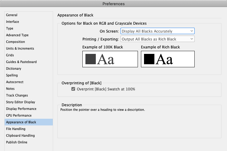
Figure 1. Setting On Screen to “Display All Blacks Accurately” allows you to see the difference between 100% black and rich black (black with color mixed in).
Go Forward/Go Back
Jumping from one page in your document to another is much like navigating from one web page to another. And in a web browser you can jump to the previous page you were looking at by clicking the Go Back button, right? In InDesign, you can do the same by choosing Layout > Go Back (or press Command/Ctrl+Page Up). For example, if you’re on page 3 and then you jump to page 9, then you can get back to page 3 with that Go Back command. Then you can choose Layout > Go Forward (or press Command/Ctrl+Page Down) to jump back to page 9.
View Threshold
Dragging guides onto your page is a terrific way to ensure that objects are lined up properly. But if you add a lot of guides, it’ll clog up your view when you’re looking at the whole page or whole spread. Instead, you can select the guide with the Selection tool, choose Layout > Ruler Guides, and change the View Threshold setting. Normally, it’s set to 5%, which means the guide is visible at any zoom value above five percent. If you set it to 50%, then it will only be visible at that value and higher—so it will likely disappear helpfully when you’re zoomed back to view the whole page or spread.
Flush Space
You probably know that InDesign has a bunch of fixed-width spaces, such as an em space or a hair space. But you may not be aware of the Flush Space, which can stretch as big as it needs to help you fill a column. For example, in Figure 2 you can see three short phrases.
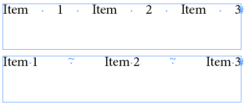
Figure 2. When you set a paragraph to Justify All Lines, all regular spaces get stretched (top). If you replace some spaces with Flush Spaces, only they get stretched.
The Barbell
The Story Editor (Edit > Edit in Story Editor) is one of the most useful features in InDesign for working with text, but the default settings are pretty bad. So you should open the Preferences dialog box, click Story Editor Display in the list on the left, and change the font and size of the text. While you’re there, set the Cursor Options to Barbell (Figure 3). This will make your text cursor stand out much more clearly while you edit text inside Story Editor. (I wish we could get a Barbell cursor on the normal document page!)
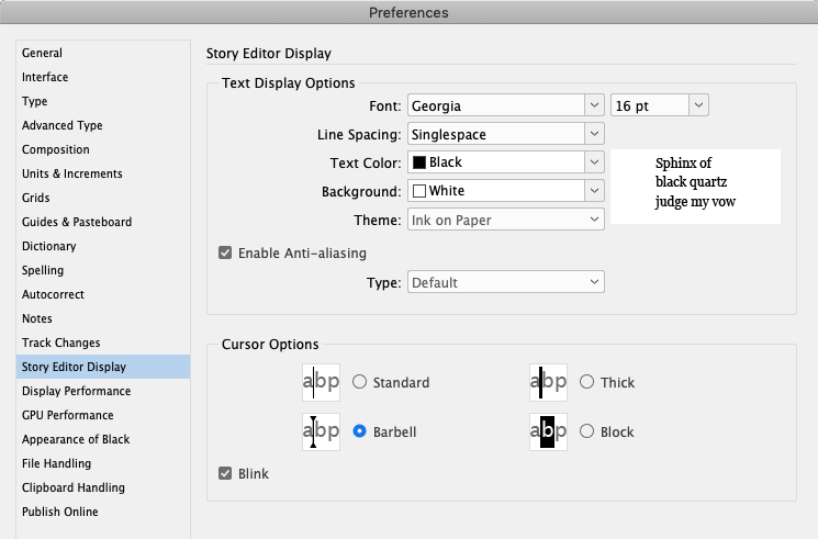
Figure 3. The Barbell cursor in Story Editor is accurate but easy to see on screen.
Balance Ragged Lines
When a heading is a little too long to fit on a single line, it looks weird (Figure 4).

Figure 4. The original headline (top); after turning on Balance Ragged Lines (middle); after using the BalanceRaggedLines script to set the shape to Pyramid (bottom).
Reset Workspace
If you’re not using InDesign’s workspace feature, you’re not being efficient with the program. Here’s how it works: open, close, and position all the panels you want on you screen—get everything set up just the way you like it—and then choose Window > Workspace > New Workspace. Give your workspace a name. Now you can change everything with the comfort of knowing you can always get back to your happy place… the trick? Choose Reset Workspace from that same menu. (Note that this menu also appears on the right side of the Application Bar.) Once you get the hang of resetting your workspace, it saves so much time!
Gravity
Once you have used the Type on a Path tool to place text along a path, you can tweak its appearance in a number of ways. For example, you can choose Type > Type on a Path > Options and then change how the text aligns to the shape. One option inside this dialog box is to choose Gravity from the Effects pop-up menu. Normally this has either very little effect, or it makes the text look crazy-warped! But once you understand how Gravity works, it turns out to be the secret to making some cool effects. The key is that gravity skews each letter individually so that it “points” away from the center of the path. When you adjust the center point, the type updates (Figure 5). See this post at InDesignSecrets for using Gravity to make awesome cast shadow effects for type. 

Figure 5. Gravity forces text on a path to skew toward the center point of the object (top); when the center point changes, the text changes, too (bottom).
Font Version
Most people don’t think of a font as a software program, but that’s actually what it is! And just like other apps, fonts have versions. Different versions of the same font are usually similar, but they may have different features. For example, sometimes a font developer will add characters to a font, or update its OpenType abilities, and then release it with a new version number. Understanding that fonts have versions was key to unraveling the mystery of the weird InDesign bullet character, which you can read about here. If you have installed a font, you can see its version number in InDesign by choosing Type > Find Font, selecting the font in the list (assuming you’ve used it in your current document), and then clicking the More Info button.
Crop to Media
You want to place a PDF or Illustrator file into InDesign, so you just choose File > Place, select the graphic, and then click OK… right? Well, that’s what most InDesign users do, but they’re missing out on some goodies! If, instead, you turn on the Show Import Options checkbox in the Place dialog box, InDesign offers you several important additional features. For example, you can choose which page or artboard you want to import, which layers should be visible, whether the background should be transparent, and—here’s the obscure one—where to set the outside edge, called the cropping boundary. If you choose Media from the Crop To pop-up menu, then InDesign sets the outside edge to the same as the page or artboard instead of snugging it up against the artwork itself (Figure 6). 

Figure 6. You can see the subtle dotted line change when you change the Crop To menu. Bounding Box captures only the art on the page; Media displays the entire page.
Snap-To Icon
There are several obscure features in InDesign that could be called a “Snap-To icon.” Here are two: When you select a tool that makes a frame (such as the Type tool or the Frame tool), pay attention to the cursor, which changes subtly. Most of the time, the cursor contains a tiny black arrowhead. However, that black arrowhead sometimes turns white (Figure 7).

Figure 7. This one is really subtle! The tiny arrow inside the cursor becomes white when the cursor is aligned with another object (in this case, the text frame above it).
Show Paragraph Break Marks
I mentioned the awesome Story Editor earlier, and discussed one way to change its appearance for the better. Here’s another one: After opening the Story Editor window, choose View > Story Editor > Show Paragraph Break Marks. This adds a special »» notation, indenting the beginning of each paragraph. The result is that it’s much easier to see the paragraph breaks (which don’t usually appear indented). I’m not sure why this is even an option; it should probably be turned on and left on.
Folder 0
Very few InDesign users realize that the Links panel isn’t just a list of linked images; it’s like a whole DAM (digital asset manager) that can tell you all about the assets you’ve placed in your document. Check this out by choosing Panel Options from the Links panel menu and turning on some of the checkboxes in this dialog box (Figure 8). 

Figure 8. Setting the Links Panel Options to show the folder structure (top) allows you to see at a glance where a file lives on disk (bottom).
Show Single Plates in Black
You may know about the amazing Separations Preview panel (Window > Output), which lets you view individual inks, such as just the cyan plate. This is a huge help when preparing a document for print. For example, you can see if an object is knocking out the colors beneath it properly. You can also view individual spot colors, which turns out to be a helpful trick for finding where they are used in your document. But when you view each process color plate, it’s often hard to see, because the yellow ink displays in yellow, and so on. Fortunately, you can turn on Show Single Plates in Black from the panel menu. Or disable this feature for a more colorful view of your separations.
Last Line Right Indent
Everyone knows about Left and Right Indent for a paragraph. And I hope you know about First Line Left Indent, which is a terrific way to provide an indent on just the first line of a paragraph. (Or, if you use a positive Left Indent and a negative value for the First Line Left Indent, you create a “hanging” indent into the margin.) But few InDesign users take advantage of the Last Line Right Indent. Try applying a positive value for the Right Indent (such as 3cm), and then a negative value for the Last Line Right Indent (such as –3cm)… you’ll find the last line can extend past the right margin. This is awesome for things like table of contents or menus with prices (Figure 9).
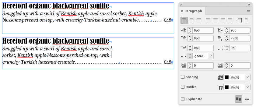
Figure 9. A paragraph with no indent (top); the same paragraph with a positive Right Indent and a negative Last Line Right Indent (bottom).
Select All Pages Matching Size of Current Page
InDesign lets you change individual page sizes inside your document, which turns out to be helpful in a wide range of applications. Let’s say you have a 15-page document, and three of the pages are A4 size. If you want to print just those three pages, and they’re not in order, it may be hard to figure out what to type in the Print dialog box. Fortunately, there’s an obscure feature for that! Just type the first page of that size in the Range field, and then click the “Select All Pages Matching Size of Current Page” button (Figure 10).
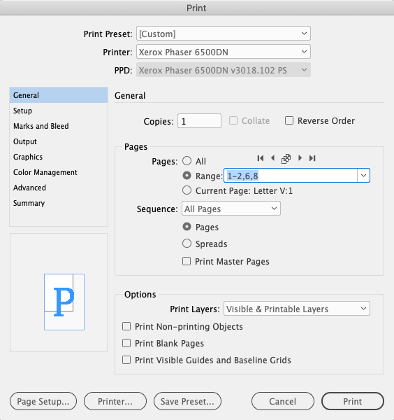
Figure 10. Pressing the Select All Pages Matching Size of Current Page button auto-fills the Range for you.
Reverse Path
Compound paths are paths or frames that contain more than one path, such as a donut shape (torus) where there is an inside and an outside circle. You can make a compound path by placing one path (or frame) over another, selecting both, and choosing Object > Paths > Make Compound Path (or pressing Command/Ctrl+8). Normally when you do this, the inside of the new compound path is transparent (so you can see through it… again, like a donut). But sometimes, the inside path is solid. For example, if you put a giant letter “A” inside a frame, and then select the frame with the Selection tool and choose Type > Create Outlines, then you get a compound path. Then try this: Choose Object > Paths > Release Compound Path, and then, while the objects are still selected, choose Make Compound Path. Strangely, the interior of the “A” (what is called the counter) isn’t a hole—it’s solid. It’s just one of those things that happens with compound paths sometimes. The solution is obscure but easy: Select either the inner or the outer path with the Direct Selection (white arrow) tool, and choose Object > Paths > Reverse Path. Voilà, the hole is a hole.
Select Next Object
You’ve probably noticed that the more objects you have on your page, the harder it is to select just the right one you need. And that’s especially true if a bunch of those objects are grouped together! Well, here’s an obscure feature that can come to the rescue: the Select Next Object button in the Control panel. This button looks like a little Martian or octopus, with a small arrow pointing to the right (Figure 11).

Figure 11. Clicking the Previous Object and Next Object buttons is a great way to select hard-to-select objects or groups on your page.
Load Selected Glyph
Let’s say you see that someone typed a special dingbat character into a story, and you want to see if that character also appears elsewhere. But you have no idea how to type that character, much less get it into the Find/Change dialog box. That’s where this obscure feature comes in: just select the character with the Type tool, and then right-click on it and choose Load Selected Glyph In Find from the context menu (Figure 12).
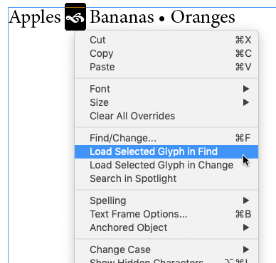
Figure 12. Right-click (or Control-click on a Mac with a one-button mouse) to get the context menu, allowing you to load glyphs to the Find/Change dialog box quickly.

Sort All Colors by Color Value
Have you ever made so many color swatches that it’s nearly impossible to find just the one you need in your Swatches panel? You’re not alone! The good news is that you can easily sort colors in the Swatches panel. First of all, you can just drag the swatches up and down in the list to reorder them. (Be sure nothing is selected on your page when you do this, or you may change that object’s color.) But even easier, you can click in the Swatches panel menu and choose Sort > All Colors by Color Value. InDesign is great at figuring out the hue and saturation of each color. (Jeez, I wish I could do this to my closet full of shirts!)
Exploring InDesign
There’s a pleasure in having used a tool so often that it feels like an old friend, whether it be a solid hammer or a piece of software. The more you use it, the more fond you grow of its powers, and even of its foibles. Then one day you learn something new about your friend—a depth you hadn’t expected, a surprising backstory, or a little-known superpower—and this new awareness leaves you fascinated and wanting to learn even more. I hope that you feel this way about InDesign, and that this exploration of some of this tool’s lesser-known features leaves you excited to delve in even further. InDesign is such a rich and varied app that I’m not sure we’ll ever run out of “obscure features” to cover in our podcast!
Commenting is easier and faster when you're logged in!

Recommended for you

Working With Custom Glyph Sets
Tired of searching through the huge glyph sets of OpenType fonts for just a few...

The Heart Glyph’s Digital Touch
Just in time for Valentine's Day, a look at the history of the heart symbol and...
How to Make Nonprinting PDF Objects
Need to have something visible on screen in an interactive PDF but not printable...