
10 Incredible InDesign Features Hiding in Plain View
Take a fresh look at some powerful tools you may have missed

This article appears in Issue 150 of InDesign Magazine.
Some powerful InDesign features are truly hidden, difficult to find inside tabbed dialog boxes or nested menus. But many of InDesign’s best features are “hidden in plain view”: They’re easy to find, but most users still don’t even see them. Often, this blindness stems from not knowing what the feature does (if something’s not meaningful to you, you probably just ignore it). Even if someone knows what a feature does, they may simply glance over it out of habit. The habit of not using one feature is as powerful as the habit of using another.
So, we’re here to try to break some habits, explain some features, and point out the obvious: Ten incredible InDesign features are hiding in plain view. It’s time to find out what they do and why you should use them!
Object Layer Options
When you use File > Place to import a layered Photoshop or Illustrator file into InDesign, the image looks the same as it did when you last saved it. But, amazingly, you can tell InDesign to change the “look” of the graphic by turning on or off individual layers. For example, if you place a PSD file that has three visible layers, you can tell InDesign to hide two of them (Figure 1).
The trick for showing or hiding layers in placed graphics is Object > Object Layer Options (or right-click on the graphic and choose Object Layer Options from the context menu). This works on PSD images, AI graphics, PDF documents, and even native INDD files that you’ve placed. (Most people don’t realize you can place one InDesign document into another!)?
Note that this feature does not change the original file on disk; it changes only this one instance of it on your page. In fact, you could place that same three-layer PSD file three times, and then use Object Layer Options to show just the first layer in one, the second layer in the next, and the third layer in the last.
One potentially confusing aspect of this feature is if you select one of these placed images and choose Edit Original, the artwork opens in its native app but the image may look different. Remember, editing layer visibility in InDesign does not affect the original image; it will appear as you last saved it, whichever layers were visible at the time. For images with many layers, you can remind yourself which one you want to edit by checking with the Object Layer Options dialog box back in InDesign.
Bonus Tip 1: To make the Layers panel show which placed images have layer overrides, go to the panel menu and choose Panel Options. Then in the Show Column options, turn on Layer Overrides.
Bonus Tip 2: Check out this post at CreativePro for a script that allows you to change the layer visibility in all instances of a placed file at once.
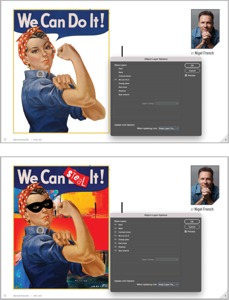
FIGURE 1. The Object Layer Options dialog box lets you change the visibility of each layer in a placed graphic. Tip: Turn on the Preview checkbox to see what you’re doing!
Preflight Panel
If there were a competition for “Most Underappreciated InDesign Feature,” the Preflight panel would win our votes. But we’re on a mission to change that! We’re here to tell you that you must start using the Preflight panel—it’s that helpful. You see evidence of InDesign’s Preflight feature literally every time you use InDesign: It shows up as a green or red dot in the lower-left corner of your document window (Figure 2).
By default, the Preflight panel flags only a few common errors, such as overset text frames. That’s helpful, but to get the most out of this feature, choose Define Profiles from the panel menu. Then create a new profile (click the + button) and choose features along the right (Figure 3). For example, we usually enable:
- [Registration] AppliedOverprinting Applied to White or [Paper] Color?
- Minimum Image Resolution
- Minimum Stroke Weight
- Glyph Missing
- Color Spaces Not Allowed
- Non-proportional Type Scaling
- Non-proportional Scaling of Placed Object
However, there are a couple dozen other options in the lists for you to choose. Important: After you make your custom profile, you then must choose it from the menu at the top of the Preflight panel. To set that profile as your default to use from now on, choose Preflight Options from the panel menu and set it as your Working Profile.

FIGURE 2. InDesign’s Preflight feature appears as a green or red dot along the bottom of your document window. Tip: Double-click the text to the right of the dot to open the Preflight panel.
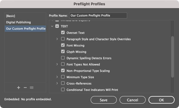
FIGURE 3. Choose your Preflight Profile options carefully. Tip: Option/Alt-click one of the twirly arrows in the list, to open all the subsections/arrows for that section.
Publish Online
You’ve almost certainly heard of Publish Online: the feature that gives you the ability to take any InDesign document and “one-click” publish it to the web. It really is that easy in most cases, and yet… too few InDesign users ever try! Raise your hand if you haven’t yet used Publish Online. Okay, now put your hand down, and go try it!
To publish your InDesign document to the web, choose File > Publish Online (or choose it from the Share menu in the Application Bar, next to the Workspace menu). The Publish Online dialog box is very simple (Figure 4); besides a title, description, and which pages you want to export, the most important option is whether you want to publish a new web document or update one you’ve already published to the web.
After you click the Publish button, InDesign converts your document, uploads it (the bigger the file, the longer this takes), and then provides you with a URL to view it. The file is stored on Adobe’s Creative Cloud servers, so you can post that URL on social media or email it to someone, and they’ll be able to see your file. (No, there’s currently no way to put it on your own web server. If you need to do that, you’ll need a tool such as in5 from Ajar Productions.)
Bonus Tip: Publish Online is a great way to share your portfolio, especially if it contains video, audio, or animations, because the format supports all that rich media. Enable the Allow PDF Downloads option in the Publish Online dialog box so potential clients or employers can download a (non-interactive) PDF version to review off-line.
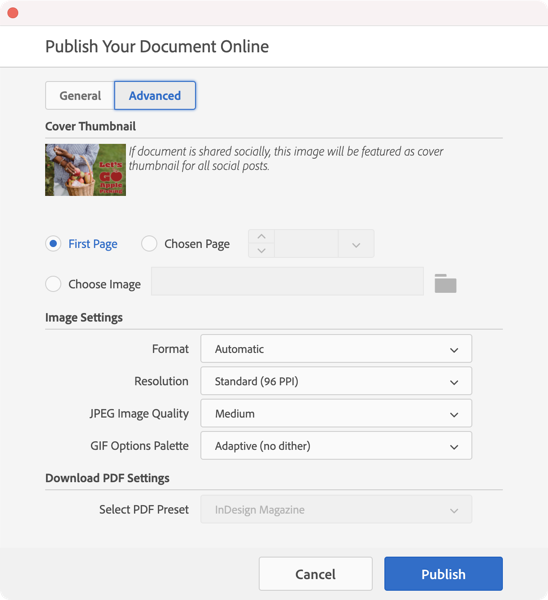
FIGURE 4. Publish Online is an amazingly simple way to make your document available to anyone on the web. Tip: Make your images load faster over the web by clicking Advanced and changing JPEG Image Quality to Medium. Or, increase the resolution a bit to make them look better.
Share for Review

FIGURE 5.You can initiate a review at any time from the Share menu. Tip: If you change the InDesign document, don’t save a new version; just click the Update Link button to push those changes back to the web so people can see them.
After we started using Publish Online, one of our first thoughts was, “Wow, it’s so easy to put these documents on the web… wouldn’t it be cool if clients or stakeholders could mark them up for corrections and comments in their web browser?” Fortunately, Adobe must have had the same thought because they built Share for Review. The interface is different, but it’s just about as easy to use. First you choose File > Share for Review (or choose Share for Review from the Share menu in the Application Bar) (Figure 5). Next, you click the blue Create button, and after a few moments (the bigger the document, the longer you’ll wait), InDesign provides you with a link to invite people directly (you’ll need their Adobe ID email address.)
Alternatively, you can set the Access Settings to Public and then just copy the URL from the bottom of the window. Anyone who has that URL will be able to provide you feedback by logging in as a Guest at the prompt.
You can see and respond to comments and annotations in the Review panel (Window > Comments > Review; Figure 6). While we still prefer the Acrobat PDF comment and review process for longer, detailed work, the simplicity and speed of Share for Review is hard to beat! Give it a try. See Issue #135 for a deep dive on Share for Review.

FIGURE 6. All stakeholder comments appear in the Review panel. Tip: You can hide a comment by clicking the … button and choosing Resolve or Delete.
Page Tool
It’s amazing that Adobe placed the Page tool so prominently—third down in the Tools panel, just below the two selection tools—and yet, almost no one uses it! It’s an incredible feature that lets you change the size of each page in your InDesign document independently. Not all documents need this, of course, but it’s important to know it’s possible.
There are, however, a few important tricks you need to know when using this tool. First, when you select the Page tool, the default setting for the Liquid Page Rule will be “Controlled by Master” (you can find this in the Control panel or the Interactive > Liquid Layout panel). This means that when you change a page size, it also updates the master page size (and therefore all other pages based on that master page). Yikes! Typically you’re trying to change the size of just one or two pages, not the whole thing. So, in most cases, you want to be sure to set the Liquid Layout Rule to Off or some other setting instead.
The second “gotcha” is that if you use the Page tool to drag the corner or side handles of a page, it appears to resize the page… but when you release the drag, the page reverts back to its original size. The trick is that you need to hold down the Option/Alt key when you drag. That tells InDesign that you’re serious and you really do want to change the page size.
Rotate Spread
Rotate Spread lets you change the view of the current spread of pages by 90 or 180 degrees. We emphasize the word view because this does not actually rotate your page—just how it appears on screen. (Weird Fact: Even the Page tool cannot rotate a page’s contents, just the page itself.) When you print or export a PDF, the page is unrotated.
To rotate the view of a spread, make sure it’s active in the Pages panel (it usually is if you’re looking at it in the document window), and then choose View > Rotate Spread. You can choose to rotate 90 degrees clockwise or counter-clockwise or flip the spread a full 180 degrees upside down. (There are other ways to get to this feature, too, including right-clicking a page in the Pages panel and then choosing Page Attributes.)
Of course, you may not need Rotate Spread every day, but it comes in handy when you’re working on packaging, or calendars, or other designs that require “sideways” text or graphics. It’s better than cocking your head to one side, or flipping over the monitor on your desk!
Generate QR Code
Have you noticed that QR codes are back in style? Recently we’ve heard InDesign users say, “If only we had a way to make one of those QR codes…” even though—wait for it—InDesign has offered a built-in QR code generator since 2013! What? Believe it or not, most people don’t seem to notice it, but it’s sitting halfway down the Object menu: Generate QR Code (Figure 7). InDesign lets you make several kinds of QR codes, including hyperlinks and even text messages.
Once you make a QR code, you can change it by selecting it on the page and choosing Edit > Edit QR Code.
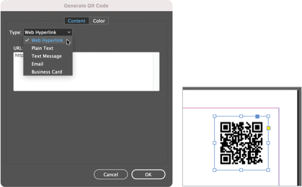
FIGURE 7. InDesign lets you choose what kind of QR code you want, including a web hyperlink. Tip: You can even use Data Merge to generate many codes quickly; see this tip by Colin Flashman at CreativePro.
Style Override Highlighter
Even people who are proficient in using paragraph styles find themselves dealing with situations where someone has manually applied local formatting to text. For example, perhaps someone selected a word and changed its size or tracking; or perhaps someone adjusted the right margin of a paragraph. Well, at first glance it can be very hard to see small formatting changes like this. Fortunately, InDesign has a feature that makes it super easy to see: the Style Override Highlighter.
To enable the highlighter, click the [a+] button at the top of the Paragraph or Character Style panel (Figure 8). Note that character formatting (font, leading, size, and so on) will be indicated with a bright blue highlight on the text. However, local overrides of paragraph formatting (margins and so on) are represented by a vertical blue bar to the left of the paragraph.

FIGURE 8. The Style Override Highlighter makes it easy to see local/manual formatting in your documents. Tip: You can apply your own keyboard shortcut to this in the Panel Menus section of Edit > Keyboard Shortcuts.
Color Theme Tool
Perhaps you’ve placed an image on your page and you want to “draw out” colors from the picture to use in text or other InDesign objects. Enter the Color Theme tool (third from last tool in the Tools panel). When you click an image with the Color Theme tool, InDesign displays a small floating panel with the five most common colors from the graphic (Figure 9). Alternatively, you can drag the tool like a selection marquee over two or more images, and it will average the colors it sees in all of them.
Once you have some colors in the Color Theme tool panel, you can add them to your Swatches panel or to your current CC Library by clicking the buttons on the right side of the panel.
Bonus Tip: If you want just one of the colors, select it in the little floating panel and then Option/Alt-click one of the buttons on the right.
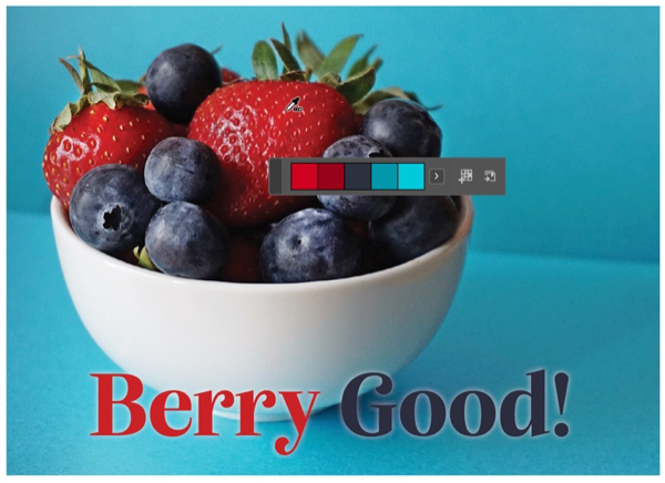
FIGURE 9. When you click an image with the Color Theme tool, it shows you the five “average” colors. Tip: Click the little arrow to the right of the swatches to adjust the tone of the colors it picks.
Separations Preview
If you’re like most InDesign users today, you’re often making documents for print, but you don’t have first-hand experience with preprint and printing presses and stuff like that. However, you probably do know that when it comes time to print, your full-color pages will typically be broken down into four basic colors (or plates): cyan, yellow, magenta, and black. It can be very helpful to see what those plates are going to look like, by choosing Window > Output > Separations Preview (Figure 10). You may then need to enable the feature by choosing Separations from the View menu in the panel.
Once the panel is open, you can hide or show individual plates by clicking the little eyeball icon in the left column. We often use this to ensure black text or other black objects aren’t showing up on the color plates. For example, if you turn off the Black plate and text is still visible, then you may have a problem. Perhaps the text was accidentally set to Registration or an RGB color (these colors are temporarily converted to CMYK for previewing), or a four-color “rich” black.
Similarly, the panel will alert you to spot colors in the document. If you did not intend to use spot colors, it’s critical to know about their presence before you send your file to your print service provider.
Also, by the way, if you move your cursor over any part of your page when the Separations panel is enabled, the panel will act like a densitometer (aka colorimeter), showing you the percentage of each color at that position. That is amazing!?
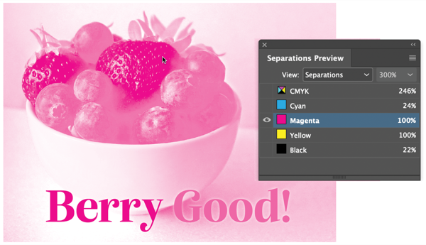
FIGURE 10. Separations Preview lets you really see how your document will appear in print, one plate at a time. Tip: If you’re looking at a single plate (such as magenta) and you want to see it in its own color, deselect Show Single Plates in Black from the panel menu.
Always Be Learning
It’s all too easy to fall into the rut of using the same few functions of InDesign for all your work. Do yourself a favor and learn something new: Try each of these oft-overlooked but awesomely helpful tips in your current and next couple of projects. When you get a feel for these in your day-to-day work, we guarantee you’ll welcome one or more to your favorite toolset.
Commenting is easier and faster when you're logged in!

Recommended for you

Non-Rectangular Text Wrap Around Drop Caps
Someone recently asked me about making non-rectangular wraps around drop caps...

Illustrator Downloadable: Cozy Plaid Pattern Set and Palette
Use this Illustrator downloadable to evoke cozy warm feelings in your vector art...

InDesign How-to Video: Reset Tracking and Kerning
In this week’s InDesignSecrets video, Mike Rankin explains how to reset any cust...