
Working With Spot Colors
Claudia McCue's guide to everything you need to know about designing and printing with spot color inks.

This article appears in Issue 112 of InDesign Magazine.
When you’re creating work for commercial print, color is a major tool in your arsenal. You can depict a wide range of colors by combining cyan, magenta, yellow, and black—the “process” printing inks. But there’s a limit to the hues than can be printed like that. For example, bright orange, vibrant purples, fluorescents, metallics—even rich navy blues—fall outside the capabilities of CMYK. That’s where spot colors come in: they are dedicated solid color inks for rendering those elusive hues.
Not All Spot Colors Are Pantone
While “Pantone” and “spot” are widely used interchangeably (like people say “Kleenex” regardless of tissue brand), they’re not truly synonymous. There are multiple color reference systems. For example:
- The HKS system, in common use in Europe, consists of 88 base hues and 39 shades of each color, for over 3,000 colors. The “HKS” comes from the collaboration of three companies: Hostmann-Steinberg, Druckfarben; Kast + Ehinger Druckfarben; and H. Schmincke & Co.
- Toyo Ink originated in Japan, but was introduced in the U.S. in 1976. The Toyo Color Finder System consists of 1,050 inks, arranged by hue, based on the Munsell color model.
In addition, Pantone provides digital and printed color reference libraries for CMYK recipes—so, not all Pantone colors are spot, either. Because Pantone is the top spot color reference system in the U.S., though, this article is going to focus on its color system.
Some Quick Pantone Basics
You’ve probably seen the lovely Pantone fan books, which are used as references by designers and printers in the U.S. and beyond. A Pantone number designation identifies a hue so that it can be faithfully rendered at any commercial printer. Pantone 185, for example, will look like Pantone 185 regardless of the printing company (so long as it’s
printed as a spot color and not converted to process). Most people don’t realize that Pantone doesn’t make or sell hundreds of different inks—just the recipes and printed references. Specialists at ink companies and printers follow a strict recipe provided by Pantone to mix base component colors in specific amounts to create the desired solid color ink.
About Those Fan Books…
Pantone sells a number of different swatchbooks, or “fan books” or “fan decks,” including:
- The Pantone Formula Guide (Figure 1), which is used as a recipe book by ink technicians to mix base colors into the 1,867 Pantone spot colors. It’s also a great reference for designers wanting to pick that perfect spot color for a job.

Figure 1. Pantone PMS Formula guides
- The Pantone Color Bridge book (Figure 2), which contains spot colors as well as examples of (and recipes for) the closest CMYK equivalents. If you’re going to buy just one fan book, this is the one to get. And guard it with your life: the coated version retails for $175. Buy both coated and uncoated versions as a set for $300. Tip: Don’t leave them out in the sun.
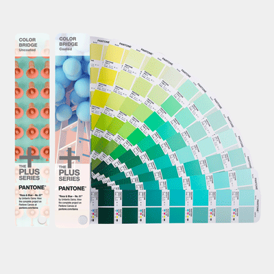
Figure 2. Pantone Color Bridge guides
What’s With “Coated” and “Uncoated”?
To paraphrase Gertrude Stein, “Pantone 021C is Pantone 021U is Pantone 021C.” The same can of bright orange ink is used, whether it’s being printed on coated or uncoated stock. So why are you given the options of C (coated) and U (uncoated) when you create a Pantone swatch in an Adobe application? The appearance of ink on paper varies depending on the paper stock—color will be brighter on coated stock because the ink isn’t absorbed substantially into the paper. On uncoated stock (newsprint, for example), the color will be duller and often darker. Think of drawing on a nice shiny piece of paper with a red permanent marker; compare that to writing on a paper towel. That’s an extreme example, but you get the idea. So the coated (C) and uncoated (U) options in new swatch choices are intended to represent not different inks, but the different appearances of the same ink on different stock. The intention is to give you a better idea, on your monitor, of how the spot colors will print (as if you could actually believe your monitor). Note that coated and uncoated versions of a Pantone color will produce different mixes of CMYK or RGB if you convert them to process colors. Ultimately, many spot colors simply can’t be represented properly on screen, but if you know the destiny of your design, you can choose your swatches accordingly and hope for some remote semblance of realism onscreen.
Spot Colors Requiring Special Treatment
Because printing inks are a soup of chemicals, including pigments, carriers, and fillers, not all inks behave the same. The nature of pigments dictates how inks behave during the printing process—and after. For example:
- Dark Blues: In the past, dark blue inks required the use of a base ink called Reflex Blue. Unfortunately, because of the nature of its constituent chemicals, Reflex Blue was notoriously slow to dry. In recent years, however, “fake” Reflex Blue inks, formulated from different pigment components, have come into use, providing more practical drying times.
- Fugitive colors: Fluorescent and pastel inks (anything with high percentage of opaque white) have a tendency to fade under long exposure to sunlight or heat. While a clear UV (ultraviolet) coating will protect these colors to some degree, it can sometimes kill the vibrant nature of fluorescent inks. Also, these colors may need two applications of ink (a “double hit”) to achieve full vibrancy, and that necessitates an additional unit on press and a slight increase in the cost of the print job.
- Metallic Inks and White: Like fluorescents, metallic inks may require double hits to reach full shiny wonderfulness, especially on dark stock. Metallics can also be subject to scuffing if roughly handled, and may require a clear protective coating.
Printing on Colored Stock
Most printing inks are more or less transparent, and you can imagine what that means when printing on, say, black stock. If you’re printing a bright orange, such as Pantone 021 Orange, it would almost disappear. The solution? Lay down opaque white first, and then print the orange on top of it. This adds to the cost and preparation of the job, but ensures the desired result. Even printing on light-colored stock can affect the final appearance. Think of printing the aforementioned 021 Orange on light blue stock—the result might be a bit unappetizing (orange + blue = yuck). Depending on the colors of ink and stock, the answer might be an underlay of white ink, a double hit of the spot color—or both. Inks with somewhat higher levels of opacity—such as metallics and pastels—fare better, but may still require double hits or an underlay of white to ensure predictable color.
Spec’ing Spot, Printing Process
The most common question about spot colors goes something like this: “I love that pretty lime green Pantone 374 C in the Pantone book, but we’ll have to print the job in CMYK—what should I do?” The concise answer is, “It depends—ask your printer.” If your job is going to be printed in process colors on an offset press, and you suspect there will be a noticeable discrepancy between the spot color and its rendering in CMYK, leave your colors spec’d as spot, and ask the printer to provide a paper contract proof so you can have realistic expectations. This way, you’ll see how their RIP (raster image processor) and color management setup will convert to CMYK. If your job is a short run (say, 5,000 copies or less), it will be run on a digital press, which (generally speaking) can only print in CMYK. Fortunately, the colorants used in digital press inks have a wider color range than that of offset inks, so there’s a good chance that your spot color can be more closely approximated if you leave it defined as a spot color. The RIPs that feed digital presses have internal lookup tables that handle the conversion from spot colors to CMYK inks, with recipes optimized to that press’s colorants and conditions. However, if your printer tells you that you must submit a purely CMYK file for offset print, use the Ink Manager in InDesign (Figure 3) to non-destructively convert spots to process. (The Ink Manager appears in several places, such as in the Swatches panel menu.) Then, when you export to PDF for job submission, there will be no spot colors in the outgoing file; the conversion happens on the fly. If you later send your job to a more enlightened printer who runs your job on a digital press (or trusts his or her RIP to do a better conversion than InDesign’s Ink Manager), you can return to your spot definitions by unchecking that option in the Ink Manager dialog box.
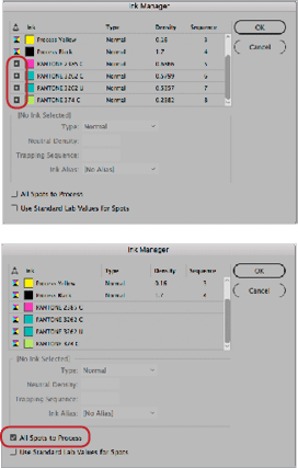
Figure 3. InDesign’s Ink Manager allows you to nondestructively convert spot colors to process (great if you change your mind later). To convert a specific spot color to process, click the button to the left of the ink thumbnail (top). Or, you can convert all spots to process by selecting that option near the bottom of the dialog box (bottom).
Pantone Color Bridge: What Do All Those Numbers Mean?
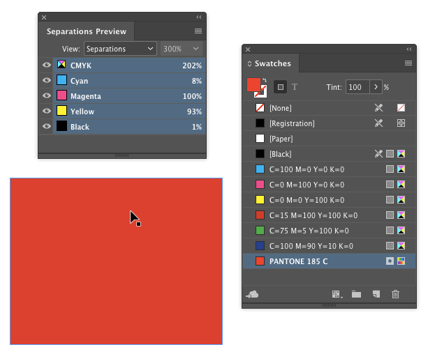
As I mentioned earlier, Pantone’s Color Bridge swatchbooks provide a recipe for converting spot colors to process (sort of) equivalents. But let’s talk about a bit of a quandary with the Color Bridge. Pantone thoughtfully provides CMYK values under the process patches, but if you’re nosy, you’ll discover that those CMYK recipes don’t match the spot-to-CMYK conversions performed by InDesign or Illustrator. That is, if you choose Pantone 285C and then ask InDesign to convert it to CMYK, you’ll get a different set of process colors than if you look in the Pantone Color Bridge fan book. On the other hand, if you pick the Color Bridge swatch directly in an Adobe program, you get the same set of values that are printed in the Color Bridge fan book (Figure 4).
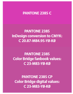
Figure 4. Of course, you can’t perfectly replicate the vibrancy of Pantone 2385 in lowly CMYK, but note how close the Pantone Color Bridge recipes are to InDesign’s values, with almost indistinguishable visual results.
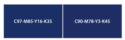
Figure 5. These frames use different CMYK recipes for the dark blue, but they’re almost indistinguishable (if they look radically different in this PDF, try creating both swatches in InDesign and comparing them on your own screen in InDesign). The point is that the same color can be achieved with more than one combination of cyan, magenta, and black.
Pantone Appearance In Adobe Applications
Are you experiencing inconsistent Pantone color appearances between Adobe applications? Try following these basic tips. 1. Synchronize your color settings across all apps, using the synchronize option in Bridge. Choose Edit > Color Settings, choose a setting, and click Apply (Figure 6). My preferred setting is North America Prepress 2. If you have a custom setup from your IT department or commercial printer, follow those guidelines.

Figure 6. Easily synchronize the color settings in all of your Adobe apps by using the synchronize feature in Bridge.

Figure 7. Top: In Illustrator, choose Spot Colors from the Swatches panel menu, and select Use Lab Values Specified By The Book Manufacturer. Bottom: In InDesign, launch Ink Manager (Swatches panel menu > Ink Manager), and select Use Standard Lab Values for Spots.
Figure 8. Left to right: Illustrator CC2018, InDesign CC2018, Acrobat DC. Color settings have been synchronized through Adobe Bridge. I’m using North America Prepress 2 (I have no idea what happened to North America Prepress 1…).
Matching Old Jobs With Spot-to-CMYK Conversions
When Adobe released Creative Suite 6 (CS6), Pantone color definitions in Adobe programs changed radically. Previously, spot colors from Pantone had two internal definitions: Lab and CMYK. Onscreen, and during any conversion to CMYK, the built-in CMYK values were used. Those values were based on general offset process ink characteristics and press capabilities at the time. So why the change in CS6? By then, ink formulations had become more refined, and the increasing computerization of press controls resulted in higher color fidelity in print. Starting with CS6, the internal Lab color definitions are used to display Pantone colors, and as a reference when performing the conversion from spot to process.
The 2018 Color Of The Year: Ultra Violet
 Did you know that the Pantone Color Institute annually designates a Color of the Year? For 2018, that’s Ultra Violet. In the words of the color prophets, “A dramatically provocative and thoughtful purple shade, Pantone 18-3838 Ultra Violet communicates originality, ingenuity, and visionary thinking that points us toward the future.” I envision them in a secret underground bunker, gathering around a monitor in their Druid-like black hooded robes, and throwing 100-sided dice to come up with the recipe. I suppose it’s an indictment of my design sensibilities that they see “visionary thinking,” and I see, well, purple.
Sounds great—until you have to create a new project and convert spots to process under the new rules, while matching a previously printed piece that used the old rules. Your converted colors may not match the original job, which used the older conversion values. What can you do?
- Open the original file in the current version of InDesign or Illustrator, right-click the swatch in the panel, switch the color mode to CMYK, and make note of the values. Even though you’re in the current version, these values are still used in the old file.
- If you no longer have the ancestral file, find a computer with pre-CS6 software on it (good luck with that), create a file, add the swatch, choose the CMYK color mode, and jot down the conversion numbers. Build the colors in the new job as CMYK, using those numbers.
- If you don’t have access to the old file or an ancient computer, you’ll have to embark on a science project. Start with the conversion numbers generated by your current version of the software, and then experiment with different values until you’ve matched the previous job. To reach the ideal, you’ll probably need more than one round of proofing before you hit the magic numbers. For efficiency, create several “guesstimate” patches on one page and proof them together, and then compare to the previously printed piece.
- If you don’t even have access to a copy of the previously printed piece, you’re stuck with the client’s (hazy) memory of how the color looked in the past (“It was more goldy-pinky-blue than that…”). In this case, it’s a good time to suddenly go on vacation.
Remapping Spot Colors
What if you have multiple spot colors that should match at output and be converted to CMYK? For example, what if you’ve used both 7642 C and 7642 U accidentally and they should really just be the same? The good news is that InDesign has a built-in feature that can help! Don’t select All Spots to Process. If you do, the disparity between the appearance of the two spot colors will not be resolved. Instead, map the renegade colors to the “good” ink using the Ink Alias popup menu in the Ink Manager dialog box. Then, if you want the spot color to convert to process colors upon output, don’t select All Spots to Process! Just click on the “spot” icon to the left of the “good” ink to convert that one color to process (Figure 9).
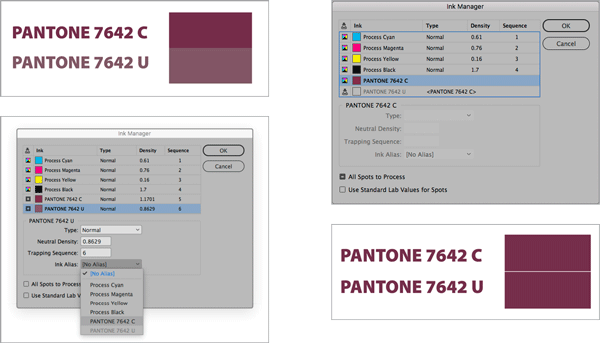
Figure 9. First, map the “renegade” ink to the “good” ink, using the Ink Alias feature in Ink Manager (left). Then, convert the “good” ink to process; any inks aliased to that ink will follow—and will be a visual match (right).
To Sum Up…Spot Or Not?
When should you choose spot over process, or vice versa?
Choose spot when:
- You have to render a challenging color on an offset press (e.g., bright orange, navy blue, or neon green). The extra printing plate will add to job costs but guarantees a faithful rendering of the important color.
- Your job is going to be printed on a digital press, and you’d like to come as close to a particular spot color as possible. If you prematurely convert to CMYK, you’ve already sacrificed some color gamut that might be within the range of digital colorants. So leave your colors spec’d as spot, and let the RIP work its magic. It may not be a perfect match of the true spot color, but it may be closer than you could achieve with a manual CMYK mix.
- You don’t know how your job will be printed, and you want to let the commercial printer make the informed choice between spot and process.
Convert to process when:
- Your printer insists on CMYK content because he or she wants the color nailed down before it hits the RIP. In my opinion, this is sort of an antiquarian approach, and the printer is missing out on some flexibility, but that’s their choice.
- You’re submitting an ad to a publication that specifies process-only content.
Finally, if you’re concerned (and confused) about choosing spot or process, or whether you should convert, talk to your printer! They’re the ultimate authority on interpreting your color vision.
Commenting is easier and faster when you're logged in!

Recommended for you
Tip of the Week: Using the Ink Manager
How to use the Ink Manager in InDesign to prevent unwanted spot colors from show...

RGB vs. CMYK
It’s time to close the case on this ancient debate that stretches back to the be...

InQuestion: Matching Photoshop Colors, Combining Documents, Using Smart Guides
Learn how to troubleshoot and solve common problems in InDesign