
Work That Text: The Power Behind Typographic Collages

Direct Impact
The principal reason for the presence of copy in a piece of design work is to convey specific information to the viewer, whereas a text-free work that uses only images depends on the viewer to draw the correct conclusions. Text can have a positive aesthetic impact on a piece. And what’s more, by collaging text you can easily get a message across while transforming it into a piece of art as well.
A Simple Collage
The design shown in Figure 1 could be several things. Perhaps it’s an advertisement for a security system company. Maybe it’s the lead-in for a magazine article about home safety or good parenting. Whatever its purpose, the contrasting text styles send two different types of messages to the same place in the brain. The strong, clear “statement keywords,” which are set in Avenir, evoke messages of safety and security. The punctuation at the ends of the words lends an extra-strong authority to this message. Also, by having the text softly repeat itself in the background, the point is being reinforced subtly.
The other text, in italicized Berkeley, is narrative. It tells a tiny story about the picture, and gives the girl in the picture a more personal connection to people viewing the work.
Finally, the large Comfort. at the bottom of the image summarizes the benefits of good home security into one simple concept. It anchors both text and image.

Figure 1
Accidental Tourism
Another interesting way to use text is to create a collage using two languages. On a menu for a Mexican restaurant, for example, pictures of sombreros, maracas or other overused icons might suggest a Mexican atmosphere. As an alternative, a landscape or cityscape shot could be used, with some Spanish wording creating the menu’s desired ethnicity.
An example of this is shown in Figure 2, a hypothetical lead-in page for a travel article. Those snapshots could depict a city in any European country, but the wording at the top and bottom of the page instantly localize the reader in Germany. In order to emphasize that localization, the German lettering is set in Helvetica, the same font used by the German airline, Lufthansa, on its aircraft. The colors also reflect those used by the airline and seen all over the world.

Figure 2
Letters Are Simply Symbols
Grab something with copy on it and look at the letterforms themselves. They are, in essence, little pictures. Although letters and type symbols usually impact us in specific ways, the curves and lines that make up letters can be used as graphic elements of an image. A simple example of this would be computer emoticons typed by users to express happiness, sadness, delight, etc. Examining the way letterforms look, both individually and when combined with other letterforms, can create complex designs that a viewer can relate to on both a viewing and a reading level.
Words Illustrate
The message in Figure 3 is crystal clear, yet not a single sentence is required to drive the point home. The lack of color and abundant text within this ad would provide an attention-grabbing contrast to the more traditional adver-tisements in print publications. The exaggerated organizational chart successfully lampoons the situation that many entry- and mid-level workers find themselves in. Is it pretty? No. Is it effective? Absolutely.
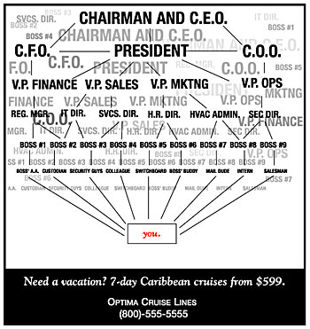
Figure 3
Never Underestimate the Power of Text
Of course, good design stems from the ability to select and balance elements of text and imagery together. Vivid imagery can definitely sear itself onto a viewer’s retina and implant a message, but there are times when a thousand words are worth more than the picture.
This article was last modified on February 16, 2023
This article was first published on April 5, 2002
Commenting is easier and faster when you're logged in!

Recommended for you
Sometimes a Logo Is Just a Logo
The recent hubbub surrounding Quark’s new logo has raised several question...

Learn About Photoshop CC While You Use It With the New Features Panel
We are all creatures of habit and develop our favorite ways of getting work done...
Now Shipping: Complete Digital Photography, 7th Edition
CreativePro author Ben Long has announced the publication of his latest book, Co...