

This article appears in Issue 132 of InDesign Magazine.
InDesign’s Type on a Path tool is one of many built-in devices for designing unique and eye-catching typography. But aside from setting an occasional bit of display type (or, say, chapters of Alice in Wonderland), where might this tool be useful? Type on a Path is as versatile as it is fun, and you can use it to create word games that can challenge thinking, provoke curiosity, and drive marketing. Here are some examples for inspiration, with tips on technique along the way.
Themed Word Search
For instance, Figure 1, is a word search worksheet for children, featuring gardening- related words hidden in the outline of a flower and a snail. Using the Pen tool, draw the outlines of a figure or scene. Then, use the Type on a Path tool to type the words you’ll include in your word search game. After setting the font, adjust the kerning (especially along curves and at corners of paths), and add miscellaneous letters between the words to fill out the design. Apply colors to different parts of the puzzle to help set the tone of the illustration, as well as make identifying words harder or easier.

Figure 1. Children’s word search game with a gardening theme
Question and Answer
From silly riddles and goofy jokes to factual trivia, upside-down text can help hide an answer until the viewer is ready to stop guessing. The flyer in Figure 2 demonstrates how upside-down text on a path can overlay a photo to create a playful yet unobtrusive Q&A.
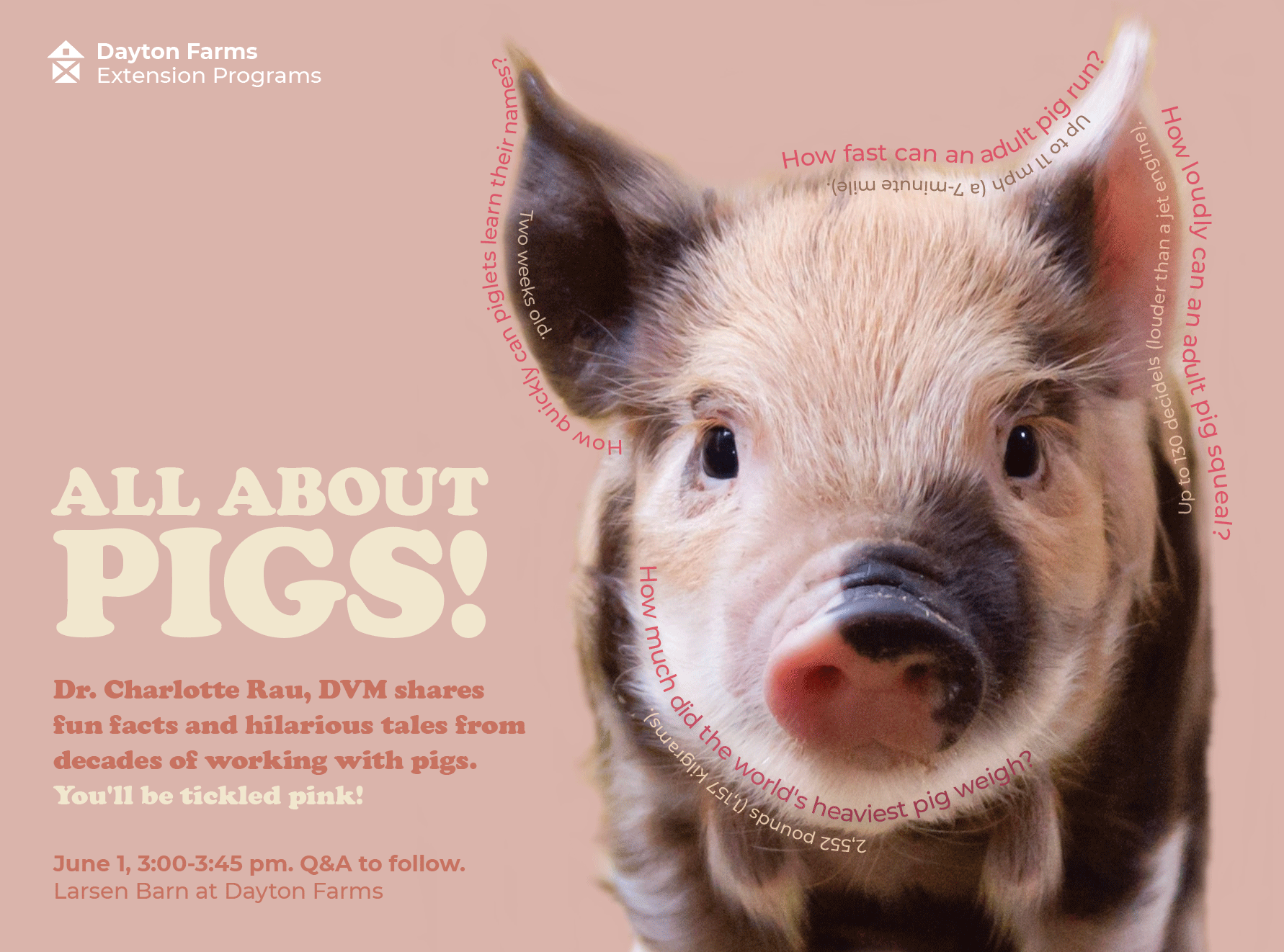
Figure 2. Flyer with trivia questions and answers shown upside-down
Use the Pen tool
to draw a curve that follows the outline of an object in the photo. Type the question on the path, using the Type on a Path tool. Make a copy of that path, and choose Paste in Place. Then, drag the vertical line in the middle of the path (officially known as the “center bracket”) to the opposite direction to flip the text to the opposite side. Type the answer, and position the path at the desired spacing from the question line.
Five Tips for Setting Type on a Path
Beware of automatic ligatures. Some typefaces automatically form ligatures for your letters. When set on a curving path, these connected letters can look awkwardly glued together. Separate them by kerning or by highlighting individual letters and selecting an alternative glyph.
Avoid kerning confusion. When you’re kerning a word that you’ve flipped upside down, it’s easy to get confused with the arrow keys—the Left Arrow key moves the text cursor to the right, and the Right Arrow key navigates it to the left. Instead of becoming a “text curser” yourself, temporarily rotate the path of text by entering a value in the rotation option of the top menu bar. When you’ve finished kerning, remove the rotation to get back to your upside-down text orientation with your perfect kerning intact.
Kern last. The Type on a Path Options dialog box (Type > Type on a Path > Options) offers additional features for flipping the text on the path, orienting the baseline, and applying various effects. If you plan to use any of the effects, kern after applying them. The letters will have shifted and will likely benefit from additional adjustments.
Simple paths improve legibility. Draw simple paths for typography that’s easier to read. Complex paths, especially angular ones, can create a jerky look with your lettering. Save these for designs where the typography is meant to be a challenge to read.
Be extra careful with script typefaces. Setting a script typeface on a curve often will break apart the joins between the letters, leaving you with unsightly, scraggly ends poking out of your design. Kern to create a smoothly joined appearance, or adjust the path.
Scrambled Words
Unscrambling words can be more challenging when the letters are placed on a path, especially when rotated. In this announcement for a literary event (figure 3), the mixed-up letters for three words are set on curving paths like steam rising from a teacup. Loosely set letters can be very challenging to unscramble (the brain struggles to string them together), as can be very tightly set letters (the brain tends to register the jumble as a word). Play with kerning to achieve your desired effect, while taking care to maintain even letterspacing overall. This example shows how the Type on a Path tool can help to create illustrations that reinforce a theme. Not only can a puzzle help to provoke curiosity, it can also motivate the targeted audience. In this case, unscrambling the words earns you a special cookie from the café.

Figure 3. Event announcement with scrambled text that illustrates steam
Missing Letters Puzzle
Filling in missing letters can be a challenging educational puzzle for beginning spellers and readers, but for everyone else, these puzzles can be too easy. Once you add a word scramble component, however, things get more fun. The concert mailer card in Figure 4 invites the viewer to think of the missing letters of popular song titles and then unscramble those letters for a discount code. Having all of the phrases in close proximity and running in the same direction makes this puzzle more approachable (and more likely to result in the discount codes being used).

Figure 4. Concert mailer card with missing letters on paths that illustrate rain
A layout with phrases spread across the page with the text running in different directions would be more challenging. The song titles appear on curved paths that mimic rain, and the dash marks substituted for the missing letters reinforce the rain-like look. Try other shapes or dingbats to match other topics, such as bowties along a string of letters to depict kite tails (perhaps for a kite festival), dots to suggest beads strung on a necklace of letters (perhaps for a jewelry sale), or cars in a traffic jam of letters (perhaps for a car show).
A Final Word…
Setting type in any way other than the usual horizontal direction can make reading more challenging, as the eye must follow a path it is unaccustomed to. This is an excellent opportunity for creating fun word games that can help to illustrate a topic. As you work with curved paths, always be aware of legibility with kerning, and always keep the use context in mind. Puzzles are more likely to be attempted (and are easier to solve) when presented in intimate viewing scenarios, such as a printed sheet that can be held and scribbled upon, rather than a huge poster hung in a crowded public area. Finally, be sure to check your work before sharing it—after all, if you can’t crack your own word puzzle, the game’s over!
Commenting is easier and faster when you're logged in!

Recommended for you

InDesign Magazine Issue 129: RGB vs. CMYK
We’re happy to announce that InDesign Magazine Issue #129 (January 2020) is now...
CreativePro Magazine Issue 2 Now Available
CreativePro Magazine Issue 2 has articles on Lightroom, Illustrator brushes, sty...
InDesigner: Carrie Bremner
This UK art director for Newsweek blends bold graphics with editorial accuracy