
Women Type Designers
How women emerged from the shadows of the past and left their mark in the world of type

This article appears in Issue 119 of InDesign Magazine.
Women have been a part of the world of printing and typography in one way or another for eons, but often in roles that have gone unnoticed and unacknowledged. Thankfully, this has changed over time, and especially the digital age, where the “democratization” of typeface design has included its becoming become faster, cheaper, and easier (although some might argue this point). This, in turn, has led to the art and craft of typeface design attracting more and more women.
In general, I dislike categorizing typeface designers (or any other category) by gender, but I am making an exception for this article, as I think it can educate, encourage, inspire, and empower not just women, but anyone who loves and uses type to get more involved. At the very least, I hope it will help you to appreciate the process of designing a typeface.
Historical Figures
Very few of the typeface designers of the past (think 19th and 20th centuries) were women. This probably had more to do with the unspoken rules of society at that time, which attempted to keep women in the home, and men doing the “real” work. But even so, there were exceptions to this rule, as there were a few women who were involved in type one way or another.
While they might not have been designing many original typefaces, women filled important roles of the design and production process. For instance, according to Allan Haley, former Director of Words & Letters at Monotype, “Monotype (in the UK) used women in its Letter Drawing Office. They weren’t necessarily designing their own original designs, but they were creating production drawings for fonts and adding new characters to existing families. It was thought that women had a better sense of detail than
men.”
The most notable of women associated with type design was Bertha Goudy (1869–1935) (Figure 1a), an American typographer, fine press printer, and co-proprietor with husband Frederic Goudy of the Village Press. Often referred to as “the first lady of printing,” Bertha was an important partner in the Village Press. She cut type, set type, and bound books. She also coauthored books with her husband. Fred Goudy’s designs include Copperplate Gothic, Deepdene, Remington Typewriter, Californian, and Bulmer, and it is very likely that she assisted him with some or all of these (Figure 1b).
Figure 1a

Figure 1b
Other women from the past who have been credited with typeface design include Hildegard Henning, who designed Belladonna in 1912, Elizabeth Colwell, who designed Colwell Handletter in 1916, Maria Ballé, Ballé Initials and Bauersche Gießerei, dates unknown, and Elizabeth Friedländer, who designed Elizabeth and Bauer in the 1930s.
Contemporary Figures
Once the design and production of type became digitized (and the software became affordable), virtually anyone who had an interest and the talent could jump onboard. This led to many more women getting involved in the typeface design process. Here are a few of the more notable of figures.
Carol Twombly
Carol Twombly is an American typeface designer who worked for Adobe from 1988 to 1999, designing some of the most important historic/revival and original typefaces. Her type design career might have been brief before she left to pursue other interests, but was extremely productive. In over eleven years with Adobe, Twombly designed a number of very popular text and display typefaces. Designs such as Trajan, Charlemagne, Lithos, and Adobe Caslon are inspired by classic letterforms of the past, from early Greek inscriptions, circa 400 B.C., to William Caslon’s typefaces of the 1700s. Designs like Viva and Nueva explore new territory while maintaining traditional roots (Figure 2).

Figure 2
In 1994, Twombly received the Charles Peignot award from the Association Typographique Internationale (ATypI) for outstanding contributions to type design. She was the first woman and only the second American to receive this prestigious honor.
Zuzana Licko
Zuzana Licko is a name that is very familiar to those who were working the world of type and design in the ’80s. Licko, born in Czechoslovakia and emigrated to the U.S. in 1968, graduated from the University of California at Berkeley in 1984. Together with her husband, Rudy VanderLans, Licko started the design company Emigre Graphics in 1984, which then became world renowned for its self-published magazine and type foundry which were greatly inspired by the new technical possibilities offered by the introduction of the Macintosh computer.
Licko and VanderLans became early adopters of the new technology, and used the computer to experiment and created some of the very first typeface designs and digital page layouts causing great consternation within the realm of graphic design. Eventually, exposure of the typefaces in Emigre magazine resulted in demand for the fonts, which lead to the creation of the Emigre Type foundry. Among the numerous typefaces she designed, the most well-known are Citizen, Fairplex, Filosofia, Matrix, Modula, Mrs. Eaves, Tarzana, Triplex and Variex. In 2011, five digital typefaces from the Emigre Type Library were acquired by MoMA New York for their design and architecture collection (Figure 3).
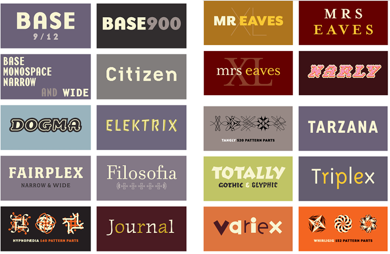
Figure 3
Laura Worthington
Laura Worthington is a typeface designer from Washington State. After training and working as a graphic designer since the mid ‘90s, she turned her lifelong fascination with lettering and typography into a business, publishing her first typeface in 2010. She has since published more than 80 typefaces, including Adorn, Beloved, Ed’s Market, Fairwater, Hummingbird, and Mandevilla, as well as having designed custom faces for Fortune 500 companies. Laura’s designs are based on her own handlettering and calligraphy, a practice she continues to hone daily.
Though her designs are often infused with the sense of a milieu or era, her type designs are not historical revivals, but updated interpretations with a modern sensibility. Laura was a pioneer in the practice of producing families of different display styles that work together to evoke a particular aesthetic —such as Charcuterie, which features ten distinctive faces inspired by artisanal French food packaging. Her typefaces are primarily for display, and often include a broad variety of ornaments, contextual alternates, and swash forms. She handles every aspect of a font’s creation, from concept and hand lettering to digitization (Figure 4).
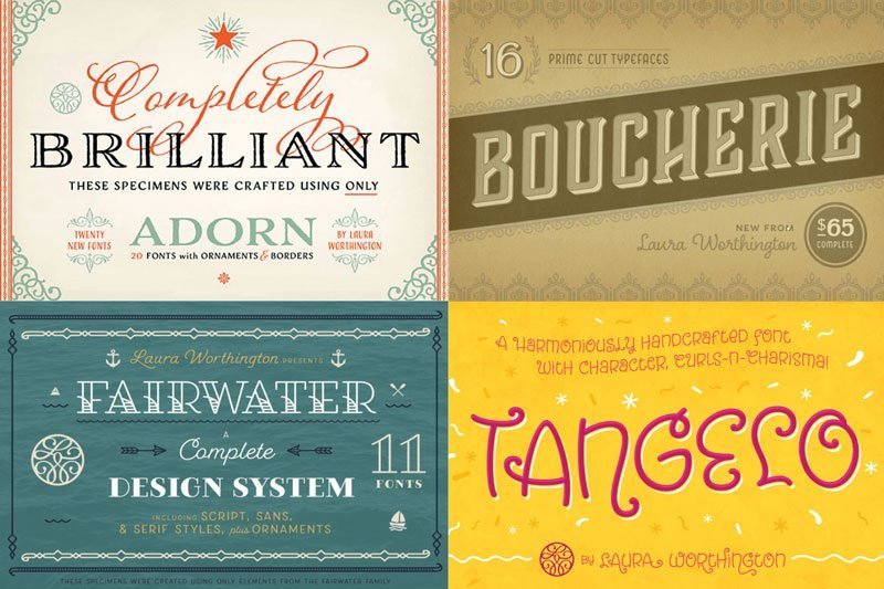
Figure 4
Veronika Burian
Veronika Burian is a type designer and the co-founder with José Scaglione of the independent type foundry TypeTogether, She studied Industrial Design in Munich and worked in that capacity in Vienna and Milan over a few years. Discovering her true passion for type, she graduated with distinction from the MA in Typeface Design in Reading, UK, after which her career took off. Her typeface Maiola received the TDC Certificate of Excellence in Type Design 2004, was selected in the Type Design competition from Creative Review 2005. Although Maiola and Crete are Veronika’s only solo efforts, she collaborated on many other designs, including Adelle and Adelle Sans, Abril, Tablet Gothic, and Maiola (Figure 5).
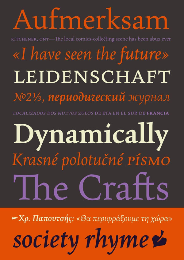
Figure 5
Kris Holmes
Kris Holmes is a contemporary American type designer, educator, and President of Bigelow & Holmes alongside Charles Bigelow. Her studies included time with with noted calligraphers Lloyd Reynolds and Robert Paladino, as well as type designers Ed Benguiat and Hermann Zapf. In 1976 she founded the Bigelow & Holmes company with Charles Bigelow. The pair co-designed the Lucida font family targeted at low-resolution, and the pi font Wingdings. Kris Holmes herself (Figure 6a) has had a hand in the design of over 90 typefaces, including the “city” fonts (Chicago, Geneva, Monaco, New York) for Apple, Leviathan, Shannon (with Janice Prescott), Baskerville (Revival, 1982), Caslon (Revival, 1982), ITC Isadora, Sierra, Lucida with Charles Bigelow, Galileo, Apple New York, Apple Monaco, Apple Chancery and Kolibri (Figure 6b).
Figure 6a
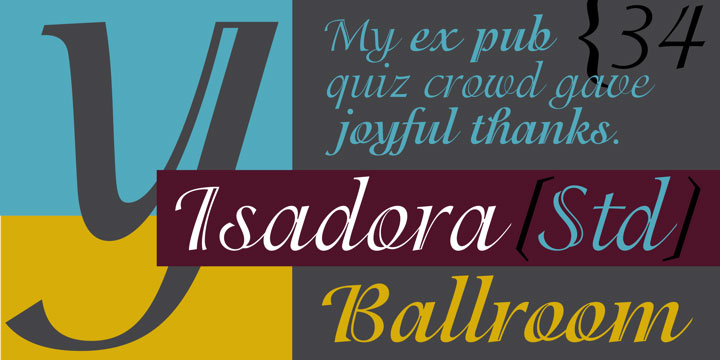
Figure 6b
Holmes clearly is a highly trained professional who made her mark on typography before the digital age, after which she kept abreast of new technology, and continued to design relevant and highly popular typefaces. Her work is included in the permanent collection of the Klingspor Museum, Germany and the Cary Graphic Arts Collection, Rochester Institute of Technology. Holmes received the 2012 RIT Frederic W. Goudy Award for excellence in typography.
Freda Sack
Freda Sack has a passion for letterforms and enjoys ‘making things happen’ typographically. She studied typography at Maidstone College of Art, School of Printing, and then went on to do type design at Letraset Type Studio, and later at URW, Hamburg where she was involved in first groundbreaking font software applications. Her commercial fonts include those she designed solo (Ingatius, Orlando, Vermont, Paddington and Proteus) as well as others she co-designed (Victorian, Jenson Old Style, University, Gillies Gothic, and Stratford), most being designed in the 70s and 80s.
In 1990 she and David Quay set up The Foundry to design and produce their own typefaces. From 2001–2013 she managed The Foundry library, and continued with custom font design. Sacks currently lives and works in central London as a design consultant, and education advisor. She lectures and gives workshops to students and professionals internationally, as well as developing more fonts for The Foundry (Figure 7).
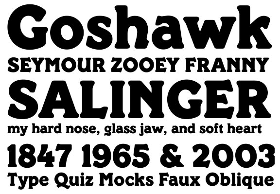
Figure 7
Fiona Ross
Fiona Ross is the queen of non-Latin type design. Her interest in non-Latin type design and typography arose from her post-graduate studies in Sanskrit and Indian Palaeography. Ross has a background in languages and from 1978 to 1989 worked for Linotype Limited (UK) where she was responsible for the design of Linotype’s non-Latin fonts. Since 1989 she has worked as a consultant, type designer, art director, and lecturer, and in 2003 joined the Department of Typography & Graphic Communication at the University of Reading.
Her recent work as type designer has been in collaboration with Tim Holloway and John Hudson (as Associate Designer of Tiro Typeworks), notably on Adobe Arabic, Adobe Thai, Vodafone Hindi, and Adobe Devanagari, Nirmala UI Devanagari, Aldhabi, and Sarkar (Bengali script). More recently in 2015 with co-designer John Hudson, Sanskrit Text (for Windows 10), and Murty Gurmukhi, Murty Hindi, and Murty Telugu for Harvard University Press for the Murty Classical Library of India (Figure 8).

Figure 8
The Takeaway
Although the art and craft of typeface design was previously considered “a man’s job,” the digital age coupled with a new social awareness has allowed and empowered women to rise up and join this somewhat elite group, eventually becoming important contributors. The typography we see every day, as well as some of the type trends that have changed the face of design, would not exist if not for the increasing number of women who now contribute to and enrich this important, and very visible discipline.
Commenting is easier and faster when you're logged in!

Recommended for you


Linotype: The Film hits the small screen
Since its premiere in New York in February, Linotype: The Film has been tou...
10 Display Faces that Digital Forgot
Because of your enthusiastic response to my last column, I’ve moved up its seque...