When Character Styles Collide
One paragraph style can apply a whole bunch of character styles to the same range of text. But how do you know which one will prevail when there's a conflict?

Someone asked me the other day if it was possible to have more than one character style applied to a range of text in InDesign. The goal was to get the font from one character style and the color from another character style. I said the answer depends on how you apply those styles. You can’t manually apply more than one character style to a range of text. (Well, you can, but when you apply the second style any leftover formatting from the first one becomes local formatting. Same goes for object styles.) However, with some effort you can apply formatting from different character styles to the same range of text as part of a paragraph style.
In CS3 you can blend formatting from drop caps and nested styles with the paragraph style’s character formatting. In CS4, things really get interesting. I count four places in the Paragraph Styles dialog box where you can specify different character styles to be applied under certain conditions: nested styles, nested line styles, GREP styles, and drop caps. Actually, you can also spec a character style in Bullets and Numbering, but it won’t blend with the others.
To illustrate, here’s a piece of nonsense, courtesy of Lewis Carroll (with my editorial comment):

It’s all styled with a single paragraph style, with five layers of formatting that converge on the first character of each paragraph. Let’s poke around in the Paragraph Style Options dialog box to see how we got here.
The paragraph style specifies a font.

A nested line style makes the first line of each paragraph bold.

A nested style increases point size of the first two words of each paragraph to 16 pt.

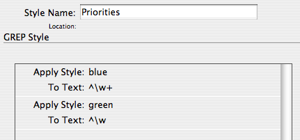
Now we have a pair of GREP styles.

The top style makes the first word of each paragraph purple. The bottom style underlines the first word character of each paragraph.
So that first word character receives formatting from five sources within the paragraph style. To your two-car garage, three-bean salad, and four-star general, you can add a five-formatted glyph.
One thing I glossed over so far was a conflict that had to be resolved. The paragraph style specifies cyan text color, and that cyan is being overridden by the purple GREP style. OK, so a character style overrides paragraph formatting. That’s pretty much the raison d’être of a character style. I conveniently made all the character styles apply separate attributes. But what happens when overlapping character styles specify conflicting attributes? What if one style says make the text green and another style says make the text red? What happens when we pit a nested style versus a nested line style? Who wins the battle between a GREP style and a drop cap style? Or even the heartbreaking scenario of GREP v. GREP?
Here’s the deal in a nutshell:
Nested line styles are overridden by nested styles.
Nested styles are overridden by drop cap styles.
Drop cap styles are overridden by GREP styles.
When it’s GREP style against GREP style, the lower the style in the dialog box, the higher the priority.
FYI: I wrote this post blissfully unaware that Tim Cole had already written a tidy summary of style priorites on his InDesign Backchannel blog a couple months back. It’s definitely worth checking out for as long as Adobe leaves it up. The comments add some valuable ideas as well. OK, back to the show.
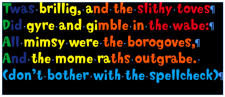
Here’s another illustration with our same nonsense.

Everything is styled with one paragraph style. In addition to its own character formatting, the paragraph style applies five character styles. The character styles all only apply color to the text, so there are plenty of conflicts to resolve.
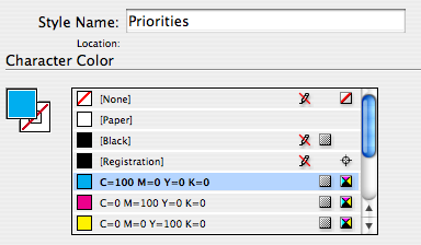
The cyan is basic paragraph formatting.

It gets overridden by a nested line style, red.

The nested line style gets overridden by a nested style, orange.

The nested style gets overridden by a drop cap style, yellow.

The drop cap style gets overridden by a GREP style, blue. And the blue GREP style gets overridden by the green GREP style, because green is lower on the list (i.e. the green is applied after the blue). Whew!

Of course, a manually applied character style overrides any automatically applied styles, and manually applied formatting trumps everything else.
Just goes to show there’s more than one way to skin a glyph. By understanding style priorities you can design layers of automatic formatting, and save time and trouble by not manually applying character styles to ranges of text, or whole paragraphs.
This article was last modified on December 19, 2021
This article was first published on December 10, 2008
Commenting is easier and faster when you're logged in!
Recommended for you

The Inconsistent Indent Contest Answer and Winner
Solve this InDesign mystery for a chance at winning a great prize.

InDesign Magazine Issue 76: Publish Anywhere with InDesign to HTML5
We’re happy to announce that InDesign Magazine Issue 76 (August, 2015) is now av...

Selecting Horizontal and Vertical Spaces with GREP
by Erica Gamet If you use GREP in InDesign, you either know the name P...


