
What Your Printer Wishes You Knew
Your design is great! Your client loves it! But will it print as expected?


This article appears in Issue 37 of CreativePro Magazine.
Much like making cookies, designing your file to print successfully requires that you follow a sensible recipe and use the correct ingredients. But suppose you accidentally grabbed the salt when you reached for the sugar—or decided to experiment with using mustard instead of vanilla extract.
What would happen if you handed over that batter to someone to finish making your cookies? The most professional baker in the world would still give you a cookie that nobody would want to eat.
Because we’re print production folks, not designers, we look at your files differently, and we see things that designers don’t. You might see the perfect brilliant red; we might see a color that a four-color press can’t reproduce. We’ve seen how the very software you use to translate your creative vision into reality can thwart your efforts.
Because we want you to succeed in print, this article shows you how to avoid these and other expensive and crushing surprises. By the time we’re done you’ll understand how to ensure that your print projects will be delicious—unlike those mustard cookies.
Learn Some Fundamentals
Regardless of the nature of your print project, some basic rules apply, including how you size your piece, how you use your software to create it, and what formats you use—both for your source files to create your design and for the final files to submit to your printer.
Build your document to the final trim size
Whether you’re creating a business card, a brochure, a catalog, or a greeting card, build your file to the correct finished size (the trim size). Don’t put a lonely business card in the middle of a letter-sized page; start with a page of the right dimensions (Figure 1).
For example, to create a U.S. business card in InDesign, start with a page that’s 3.5 in. wide by 2 in. high. In Illustrator, create an artboard with those same dimensions. Take this approach with Affinity Designer or Affinity Publisher, also.
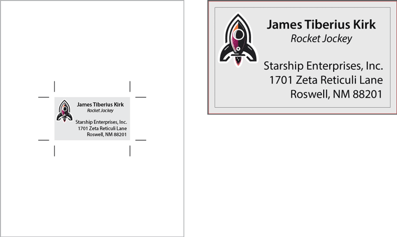
FIgure 1. Don’t put artwork in an oversized page or artboard (left). Instead, build to the correct trim size, (right) using correct bleed settings.
In any of these applications, be sure to include your bleed if your artwork or background color goes all the way to the edge of the finished size. This provides a margin of error when your piece is trimmed. This does not mean that you should build your artwork oversize: instead, use the dedicated bleed feature in your chosen program.
How wide should bleed be? U.S. bleed is usually .125 in. Outside of the U.S., it’s usually 3 mm. For large pieces such as posters or billboards, you may need to allow an even more generous bleed.
But these are typical measurements. For your particular project, ask your printer. (You’re going to see that phrase a lot in this article.)
Use the right tools
You know the old saying: If all you have is a hammer, everything looks like a nail. There’s a corollary, too: Don’t use a screwdriver to drive in a nail.
What does that have to do with design?
If you’re creating content that includes text, don’t use Photoshop unless the text requires some fancy effect. Instead, use an application with native support for vector text, such as Illustrator, InDesign, Affinity Publisher, or Affinity Designer.
Tip: If you do use Photoshop to create an image with text or vector art, export to Photoshop PDF to maintain these elements. Note that vector Smart Objects in Photoshop are rasterized in the export.
If you’re creating a single-page ad, InDesign, Illustrator, Publisher, or Designer will be appropriate. But multi-page projects, such as a brochure, catalog, or magazine, should be created in a dedicated page layout program, such as InDesign, Publisher, or QuarkXPress (yes, it’s still around). Don’t create a 32-page catalog in an Illustrator file with 32 artboards!
And if someone asks you to design a print project in Word, just say no thank you. Then run far away.
Set up folds correctly
If you are creating a project that involves folding, such as a three-panel brochure, you have to design around the folds.
You will need to set up your document to accommodate the folding process. You won’t just set up three panels of equal size; one panel has to be narrower in order to fold inward (Figure 2).
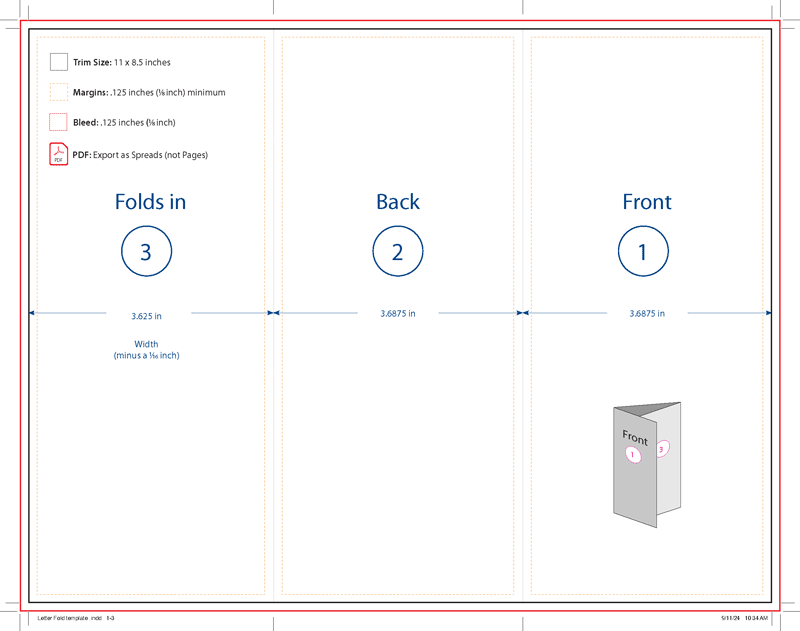
FIgure 2. Here’s a US Letter-sized brochure template exported as a PDF. Often times your printer can provide this along with the native file for you to use, if you choose.
Once you’ve established the fold locations, design accordingly:
- Make sure panel artwork stops precisely at the fold or adheres to a healthy margin.
- Don’t put text too close to a fold or the trim.
- Consider how the reader will read the brochure as they unfold it.
Tip: Ask if your printer has a standard template you can use.
Build Your Covers Correctly
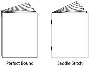
Catalogs and magazines are typically either saddle stitched or perfect bound (see the “Binding Types” sidebar). If your project is perfect bound, you will need to include a spine for the cover. The spine width is based on the thickness of the stock and number of pages and should be obtained from your printer.
If you’re using InDesign, covers with a spine should be supplied as a spread (back cover plus spine plus front cover), either as three facing pages (with the spine as a third page, using the Page tool to override the document width) or as one large page to accommodate both covers and the spine.
You should build the body of your book as single pages arranged in spreads. If you are submitting your project as a PDF, your printer will need single pages, not spreads, for the interior.
Color
If color is crucial on a project, you must have the printer provide a contract proof matched to their press. It’s the only way to get the real story, and it will be worth every penny.
Why?
You may have seen the acronym WYSIWYG (what you see is what you get, pronounced wizzywig). Here’s the truth about your monitor: WYSINNWYG (what you see is not necessarily what you get).
Your monitor may be well-calibrated, but it will never be a perfect match for a printing press. The monitor beams light at you; the printing press uses inks on paper illuminated by reflected light. They’re two different realities.
There are things you can do to narrow the gap. First, calibrate your monitor and avoid environmental influences, such as glaring reflections or bright colors from nearby room colors. Neutral gray might be boring, but it won’t unduly influence what you see on your monitor.
Then, compare your monitor representation to an actual printed version (or proof) of a design you’ve created. Does your design on your monitor look bluish or reddish compared to the printed piece? Consider investing in a colorimeter such as the Spyder X Pro from Datacolor to calibrate your monitor.
RGB or CMYK?
As with so many things, ask your printer if you should leave your images in RGB mode. You might be shortchanging yourself and your clients if you convert them to CMYK.
That’s because your RGB monitor can display an enormous range of brilliant colors, but you can’t print in light. When you convert an RGB image to CMYK, expect some loss of vibrancy—heartbreaking, isn’t it? The basic process colors used on offset presses for color printing work start with good old CMYK and maybe some spot colors as well (see the “Spot Colors” sidebar).
Digital printing processes can extend the limited gamut of CMYK inks; some use models that combine colors like violet, orange, light cyan, and light magenta. Even the CMYK colorants on many digital devices have a wider gamut than offset inks, and they may be able to print a wider range of color than an offset press can.
Consequently, converting your images to CMYK might prematurely deprive you of the possibility to render them more vibrantly.
For more on this, see these two InDesign Magazine articles: “The New Rules for Printing” in Issue #82 and “RGB vs. CMYK” in Issue #129.
Graphics
Whether you’re using raster images or vector art, you should follow some basic rules to ensure that your project—with the photos and illustrations that you include—prints exactly as you expect it to.
Image resolution
The time-honored recipe for image resolution is 300 pixels per inch (ppi) at final size.
Those last three words are everything.
As you enlarge your image, its resolution decreases. What if you have to double the size of a 300-PPI image in your page layout? The effective resolution is now 150 ppi, and it has become pixelated. Bummer!
It’s better to scale your images in Photoshop, which can manufacture pixels and interpolate, but that attempt will never be as good as a file that began life as a full-resolution image with at least enough data to reproduce at the correct size. Recent versions of Photoshop have included other options for upsampling such as Super Zoom, which you can read about in Nigel French’s article on neural filters in Issue #31. Third-party tools such as Upscayl and the highly regarded Topaz Gigapixel are also available.
As a general rule, try to avoid scaling an image beyond 125% in a page layout, unless it’s something like a blurry, pale background shot with no detail. If your image is 250 ppi or up, you’re probably OK.
But what if you have to scale down in a page layout? No worries; yes, innocent little pixels will be discarded, but in most cases you won’t notice any degradation of image quality.
Silhouettes (a.k.a. cut-outs or dropouts)
If you want to drop out the background of an image for placement in your page layout or illustration document, you need to isolate the subject using either a layer mask or a vector mask in Photoshop.
Using a layer mask allows you to soften the edge of the subject (which is especially nice for hair or fur), whereas using a path results in a hard edge (nice, perhaps, for an image with, say, a car or table).
Tip: You can create a vector mask from a path you make with any of the pen tools or shape tools in Photoshop, or one pasted in from Illustrator. If you’re using one of the shape tools, just make sure it’s set to Path mode in the Options bar before you start drawing.
To ensure that you maintain the dropout effect, save your image as a native PSD; avoid JPEG, because your transparent background becomes opaque white instead.
Image formats
Because the goal is to retain as much detail as possible in image content, you should stick with native Photoshop or TIFF files for images.
JPEG files are so much smaller than other formats because the file format’s algorithm analyzes the colors in your image and discards some of them. The Quality slider controls how much data is thrown away.
Note that resaving a JPEG performs another act of lossy compression and may result in loss of detail. Alternatively, you can save it as a PSD or TIFF (with LZW or ZIP compression, which are both lossless).
Note that JPEGs or PNGs of satisfactory resolution are not an issue in modern prepress systems.
Raster vs. vector
When you work with pixels in Photoshop or Photo, you’re creating raster artwork, with your image’s resolution imposing scaling limits. That’s why you should not create logos, maps, or diagrams in Photoshop. Instead, use Illustrator or Designer to create vector artwork, which remains sharp no matter how much you enlarge it (Figure 3).
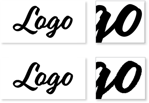
FIgure 3. The vector logo maintains sharp detail when enlarged (above), whereas the raster logo (below) is rendered as crunchy pixels.
As for saving your vector artwork, Illustrator’s native AI format is fine, as is Adobe PDF. Unless you have a reason to do otherwise, select the Illustrator default PDF preset, which preserves the ability to edit the file in Illustrator.
Importing graphics into other applications
Unless your final project consists entirely of an image or an illustration, you’ll likely be using a page layout program for final assembly. Whether you’re using InDesign, QuarkXPress, or Publisher, you will want to make sure that your imported graphics render as you wish.
Use the Import or Place command to bring files into your page layout—don’t copy and paste. Why? Pasting images into your layout provides no link to the original artwork, which is important if you want to edit or reuse that content. In some cases (such as selecting, then copying, an image from Photoshop), you’ll sacrifice resolution.
Here’s an interesting exception: If you copy and paste certain kinds of content from Illustrator into InDesign or Publisher, you may be able to edit the contents in the layout program. However, because you’ve lost the link, you won’t see your changes reflected in the original Illustrator file, nor will you be able to update your layout after making a change in the software from which your image originated.
Fonts
If you have text in your project, you must deal with fonts. You could choose from three species of fonts—PostScript (Type 1), TrueType, and OpenType—prior to Illustrator 27.3 and InDesign 18.2.
Affinity Publisher and Designer still support PostScript fonts as of this writing.
In newer versions of InDesign, if you open an older file that uses a PostScript font, InDesign will consider it missing (Figure 4) even if it’s loaded into your system.

FIgure 4. Open an older InDesign file that uses a PostScript font, and you’ll see this warning.
What are your options? You can search for an OpenType version of the font or look for a font that’s similar, using a resource like WhatTheFont.com. You can also scroll through the fonts available on Creative Cloud. Another option (if your font license allows it) is to convert from PostScript to OpenType with a tool such as TransType by FontLab.
What if you have a favorite PostScript font family or create frequent materials that rely on a required corporate font that’s available only as a Type 1 font?
If you’re still using a version of Illustrator or InDesign that supports Type 1 fonts, just don’t upgrade, or keep the older version of your program along with the newer version of software; they’ll cohabit safely on your computer.
When you use the Package feature in Illustrator or InDesign, it gathers all fonts you’ve used (except for Adobe Fonts synced via Creative Cloud). Affinity and Quark products offer an equivalent feature.
Please use this approach to ensure that all the components of your project—fonts and graphics—are included when you submit your job.
Tip: In the olden days, printers asked designers to convert text to outlines to avoid having to purchase the fonts used in a document. Those days are gone! In the vast majority of cases, there’s no reason to outline your text and some very good reasons not to do so. Packaging your file or submitting a press-ready PDF with fonts embedded ensures that all the correct fonts are included. If you absolutely must convert text to outlines, don’t do it in InDesign! That destroys your ability to edit the text. Instead, use Adobe Acrobat, as discussed in this post.
Submitting Your Job
Depending on your commercial printer’s workflow, they might want you to upload PDFs via a web portal or they might prefer native files. Be sure to familiarize yourself with the printer’s specifications early on in the project.
PDF Export settings
Before exporting a PDF, check with your printer to see if they have a custom PDF Export setting they want you to use. Most printers will either email you their particular settings file when you book your job, or they will make it available to customers on their website.
Once you have exported a PDF, make sure you review it using the Print Production tools in Adobe Acrobat Pro. Use the built-in Preflight tools (Figures 5 and 6) to check image resolution and font embedding. Check the Output Preview panel to view the separations for each ink used in your PDF. You can also temporarily hide one or more plates to confirm that your file is generating the separations you need. This lets you verify that black type contains only black ink, for example.
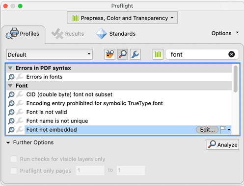
FIgure 5. Checking image resolution
using the Acrobat Pro Preflight panel
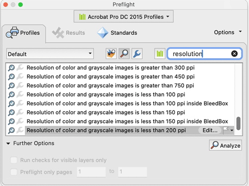
Figure 6. Checking if fonts are embedded
using the Acrobat Pro Preflight panel
Finally, visually check bleed and margins. In general, you want to make sure nothing is closer than 1/8 in. (0.125 in.) from your trim—unless it bleeds, then it should extend 1/8 inch beyond your trim. If your printer gives you different numbers, use those numbers, not ours.
Digital versus offset
If your project consists of fewer than 5,000 copies, your printer might run it on a digital press. Think of digital printing as industrial-strength color laser printing with far more options and far higher quality standards.
One of the advantages of digital printing is that individual pieces in a run can be personalized with names, addresses, or even different graphics and text. Such customization requires special setup, including database and content management. Of course, you should discuss such a project with your printer far in advance of the press date.
Keep in mind that not all digital presses can print true Pantone spot colors, so any need for special inks, such as metallic or fluorescent colors, should be discussed early in the game. However, inks for digital presses have a wider color gamut than conventional process color offset inks, and they can often approximate spot colors without their added expense.
Projects with longer press runs, such as books, magazines, or catalogs, will be printed on offset presses (you know, those loud, metallic behemoths you see in movies about newspapers). Offset presses use multiple imaging units to print individual inks, so they’re capable of printing spot colors and varnishes to enhance your job.
Talk with your printer early in the process; your choice of colors, paper, and quantity can be impacted by the choice of press that the printer deems suitable. Conversely, if your project’s needs are exacting, your specifications will influence which printers you consider.
Varnishes and coatings
How many times have you noticed attractive, shiny areas accenting details or felt the velvety surface on a printed piece? These effects are accomplished with varnishes, special finishes applied either on the press or as a post-print process.
Localized spot varnishes, such as those shiny areas, require artwork (much like a silhouette) to indicate where to apply the effect. Your printer will specify the correct way to build spot varnishes into your files.
Overall varnishes cover the entirety of a piece. Often called flood varnishes, they can often be easily applied without special artwork as part of the finishing process.
Again, ask your printer if they need you to provide any artwork for varnish areas.
Finishing and die-cutting
After the ink hits paper, some sort of finishing will take place. For a magazine or catalog, pages are stacked, joined at the spine, and trimmed to final (trim) size with a guillotine; that’s pretty straightforward. Items such as trifold brochures are folded in a separate folding machine, either at the end of the press path or in a distinct process, and then trimmed to final size.
But any project with irregularly shaped edges, such as a pocket presentation folder, must be die-cut. To accomplish this, a cutting die is created using a heavy-duty steel blade bent into the outline of your irregular shape, then mounted on a carrier.
As each printed sheet passes under the die, pressure cuts the necessary shape like a cookie cutter, and the excess paper is pulled away and discarded. Along the way, this process can compress lines on the paper to make folding easier.
If you’re creating a standard-size pocket folder, your printer probably has a standard die and can provide you with a die-line file for your design to ensure your artwork falls correctly along fold and cut lines. Use what your printer can provide!
However, if you’re creating something unique, you will need to provide the printer with die-line artwork very early in the process so they can commission the creation of the cutting die. Manufacturing the die and configuring the finishing process will, of course, add to the cost of the job.
Getting Your Project to Press
Once the printer accepts your file, multiple operations are set in motion. Your main contact will be customer service representative, or CSR, assigned to be your point person through the process.
Behind the scenes, an estimator will look at your project, determine the amount of paper, ink, and work time to be involved in production, and create an estimate of overall cost.
Next, a scheduler will look at existing work in the plant, and, using the estimator’s input, will determine which press and finishing equipment should be used and when your job fits into the existing schedule overall.
Your job will then head to the prepress department, which will perform a preflight on your files to ensure that they’re prepared correctly for the printer’s specific equipment and workflow.
Specifically, prepress technicians will scrutinize your file to determine that it’s built to the correct size, it has the required bleed, and it includes any necessary support files, such as images, graphics, and fonts, if you are submitting an INDD, AI, AFPUB, or other native file. If you submit a PDF, they will put it through a similar examination.
At this point, the printer should provide you with a proof. If your project will run on a digital press, your proof will come off the actual machinery and will represent exactly the product that you should expect. If your project will run on an offset press, you might receive proofs from the same files that will be used to create the printing plates, run on devices that can simulate ink on paper.
Warning: For book projects, digital bluelines are low-resolution inkjet proofs made from the final files that will print full signatures—4, 8, 16, or 32 pages at a time, back to back—folded and trimmed like the final product will be. Work with your CSR to be aware of pitfalls. Rules that might be almost invisibly thin when printed at 2,400 pixels per inch will show up far more thickly on digital bluelines. When in doubt, ask for a full-resolution photographic contract proof of representative pages to see your design elements before ink hits paper.
Corrections and changes
But what if something is wrong with your file? What if a graphic is corrupt or you haven’t provided sufficient bleed? What if you wish to make changes (text corrections, new graphics, alteration of layout)?
The printer will attempt to fix the issue, but if that’s not possible, you might be asked to make the correction and submit new files.
Either way, if you will need to submit updated files, you will likely (and not unreasonably) incur extra charges for the delay. If your alterations are substantial, the estimator and scheduler will have to reassess both cost and schedule. Your files will need to go through preflight again, and if any materials such as plates must be remade, you will absorb these new, unexpected costs.
The moral of the story: Proofread, check, and double-check your work before you submit your job. And, as a bonus, don’t just meet the deadlines—turn in your homework early!
If everything passes muster and you’ve given the thumbs up, the job is then electronically processed to send to a digital press or, if it’s going offset, to the platemaking department to image plates that will be mounted on the press when it’s time to print.
When the Presses Are Rolling
You may wish to attend the press check as your job begins its run on the press, for a number of reasons. For one, it’s a great opportunity to learn what goes into the actual printing of your job. And it’s also a chance for you to catch any problems with the job; ideally, there won’t be any, if you’ve followed the printer’s specifications, built your file carefully, and performed detailed proofreading. But this step represents your very last chance to avert catastrophe, albeit at significant expense.
Regardless of the size of your job, plan to arrive early. But just know that schedules can change—an issue with a job running just before yours or a mechanical problem can throw a wrench in the works. So be flexible, and come prepared—snacks, reading material, and comfortable shoes are not a bad idea!
It might be loud in the pressroom, so conversation may be tricky—consider bringing earplugs or other protective devices.
Also, be aware that you are in an industrial setting with heavy machinery. Avoid loose clothing, stay within clearly marked aisles, and heed warnings. Watch for forklifts and other equipment in motion. Respect the space in which you are a guest.
Don’t hesitate to ask questions of those around you; the CSR may attend with you and can answer lots of your inquiries or introduce you to someone who can do so if they can’t.
What can you expect on a press check? For each press run—a printing process that results in a finished piece of your project, like a magazine cover or a signature of a book—the press operators will get the press working to the point of producing a result that meets their standards. You will likely be taken to a neutral light booth to look at this press sheet against contract proofs.
We’ve found that CSRs, prepress technicians, and press operators welcome intelligent questions from customers who want to be educated. Just don’t be a pest!
Takeaways
So much happens once your printer gets your file, and if you take away anything from this article, let it be these words: Communicate with your printer as soon as you can, as often as you need to. If in doubt, ask.
Printing is difficult, painstaking, specialized work. Printers don’t want to go through this entire complicated process and create something that will disappoint you. By working hard throughout the process, you can avoid technological curve balls and human error that creeps in.
Develop your own project checklists. If you work with others to create projects that go to press, make sure everyone who has a stake in the printed piece knows the deadlines and knows the consequences. It’s all in the name of saving time, money, and resources—and avoiding catastrophe.
We hope this article has made you think and that we’ve given you some tips for making your next print job run smoothly!
Commenting is easier and faster when you're logged in!

Recommended for you
Scanning Around With Gene: All the Mens’ Presidents
When I was a kid there was no “Presidents’ Day.” We celebrated two presidential...

New App Converts InDesign Files to Office Files
It’s a rare designer who likes to create in Microsoft Word or PowerPoint...
Neenah Paper to Buy Fox River Paper Company
Neenah Paper, Inc. announced today it has signed a definitive agreement to purch...