
Visualizing Data
Try these simple (and scientific) data visualization principles to engage your audience.


This article appears in Issue 6 of CreativePro Magazine.
In any given day, over 2.5 quintillion of data—that’s 2,500,000,000,000,000,000 bytes or 2.5 million terabytes!—are produced, collected, and analyzed to feed the growing beast of resources and services that depend on it. Big data fuels businesses, drives life-changing decisions, and personalizes the ways in which we experience the world around us. In the right hands it can help conquer global crises, build communities, and deliver world-changing insights. In the wrong hands, it can help divide nations, shatter ideologies, and manipulate facts. Put simply, big data (good or bad) is the most valuable economic and social commodity on the planet. Data can be hugely valuable, but without context that full value is squandered. On its own, big data is just numbers on a spreadsheet to the average person. It must be refined and processed to deliver the most value. Through data visualization (data viz), we derive and disseminate meaning. In the age of big data, designers who can interpret and present data correctly are in high demand. Data visualization is much more than adding a few bar graphs and pie charts to your content, however. Visualizing data is part art, part science. It takes a trained design eye combined with an analytical mindset at minimum. If you’re a great designer but not that analytical, don’t worry! You’re about to gain the understanding you need to approach data viz correctly and methodically.
Look to the Past
For centuries, the graphic representation of data has been our go-to method for understanding how numbers correlate. Maps, which have been around for at least 8,000 years, are considered the first form of data visualization through the combination of scale, distance, latitude, and longitude. The first line and bar graphs were developed as early as 1786 when William Playfair released The Commercial and Political
Atlas. Playfair wanted to determine, among other things, which locations drove the most imports and exports for Scotland. To present his findings in a way an average person could understand, he created a bar graph (Figure 1) to represent the information visually. Playfair would go on to invent the pie chart (Figure 2), area graphs, and much more—all in his pursuit of understanding and fact finding.
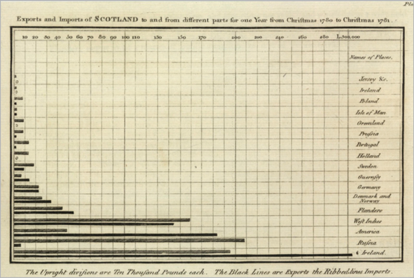
Figure 1. In 1786, William Playfair, credited with creating many forms of data viz, published the very first bar graph…
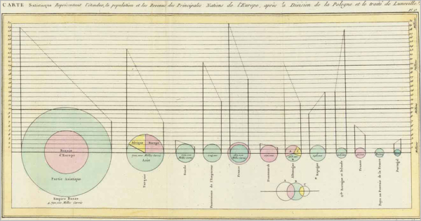
Figure 2. … and pie chart.

Figure 3. Data visualizations were used to bridge an educational divide, helping unite communities by disproving many claims that drove class warfare.

Figure 4. Using 1860 census data, this map was made by the US Coast Survey in 1861 to show the immense prevalence of slavery in Southern counties. It provided President Abraham Lincoln a better understanding of where he could cull favor from counties not reliant on slavery.
Great Data Viz Takes Advantage of Brain Science
Why haven’t basic charts and graphs evolved beyond their 18th-century origins? The answer rests in brain science and drives my earlier bold claim: Humans have a universal vernacular for data visualization. We may read and speak in different languages, live in different parts of the world, and lead entirely different lives, but most people share a united understanding of basic charts and graphs. These constructs take advantage of how our brains are hardwired for visual communication. The human brain registers visual information 60,000 times faster than any other form of communication that exists today. When it comes to charts and graphs, this is especially true. Our brains process information in two ways: subconsciously (pre-attentive processing) and consciously (attentive processing). Pre-attentive processing works like a filter. This unique system in our brain takes in all the information around us, culls immediate insights, and forms conclusions before the brain moves into attentive processing. Taking on average 1/10th of a second, our brains will combine such visual cues as colors, iconography, and scale to form immediate conclusions. Those conclusions can both inform and bias our conscious mind before we’ve even realized it. In the world of data viz, a chart or graph can either result in immediate clarity or just as quickly lead to massive confusion. For example, the three charts in Figure 5 show the same data. Which one do you think takes the most advantage of pre-attentive processing?
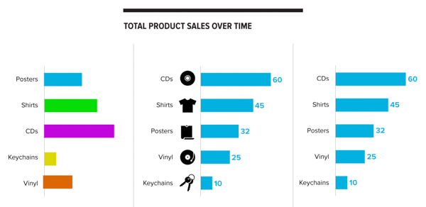
Figure 5. While these three charts show the same data, the methods they use impact our pre-attentive processing differently.
The brain processes shapes differently
When it comes to the pre-attentive process, different shapes yield highly different results. For example, bar graphs are used to compare unique values along a scale because the brain can pre-attentively process the area of rectangular shapes, making it easier to delineate values when viewing bars side by side. Show that same data using circles (Figure 6), and the pre-attentive process stalls. The brain cannot pre-attentively process the area of a circle, making it far harder to compare unique values without first attentively processing the written labels of the visualization itself.
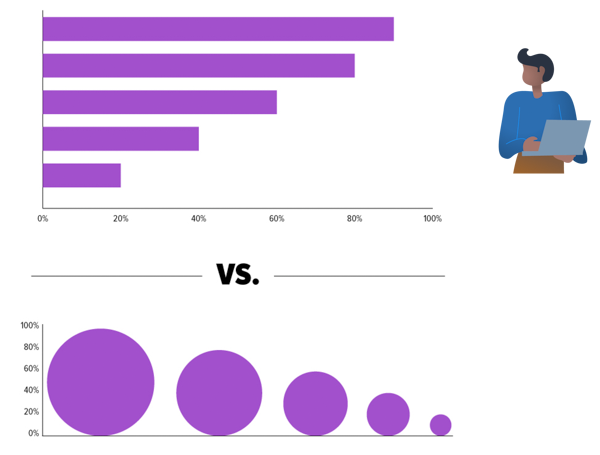
Figure 6. The human brain cannot decipher the area of circular objects, but it can very easily identify area when viewing rectangular objects.
Color in data viz can further leverage brain science
Another great way to take advantage of pre-attentive processing is to use color. See for yourself: Although Figure 7’s black-and-white line graph is technically accurate, the use of color in the version on the right helps you quickly identify key categories in the data that might otherwise require a lengthy explanation.

Figure 7. Using color can immediately help imbue the data with meaning and context.
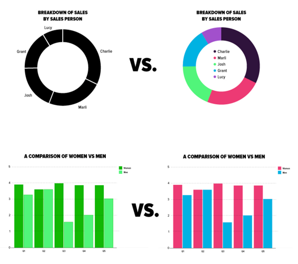
Figure 8. The intentional application of color can further improve understanding during the pre-attentive process.
Labels and scales connect the pre-attentive and attentive mind
Labels and scales are key ingredients to a successful data visualization and have a part to play in both the pre-attentive and attentive processing of information. While the pre-attentive brain does not comprehend text—reading occurs consciously versus subconsciously—it does process the size, weight, and amount of text in any visualization as follows:
- Size: The pre-attentive brain will apply value to larger text and ignore smaller text. Because of this, your largest text in a data visualization should be reserved for the headline of your chart or graph and any important numbers.
- Weight: Just as the size of text implies importance, bold text stands out even more to the subconscious mind. Use bold text in a data visualization only for the main headline, when it is incredibly necessary to bring attention to an important outlier in the data, or to highlight a key takeaway.
- Amount: During the pre-attentive process, our brains are deciding how simple or complex the information in front of us might be. If text is minimal, we enter the attentive process feeling more at ease and open to the information at hand. Large blocks of text, however, trigger stress and anxiety. Before we even enter the attentive process, our brains conclude that the information at hand could be too complex to grasp.
To avoid overwhelming your audience before they have even had a moment of conscious consideration, use the least amount of text as possible to get your points across, and let the data itself tell the story. To cue the pre-attentive mind and improve understanding, look for ways to take advantage of scale and labels. For example, consider ordering your data along a bar chart from smallest to largest to make it easier for a viewer to compare values without requiring a deeper explanation. If you are showing data over time, consider adding a trend line to show seasonal shifts rather than calling out those shifts in accompanying text. Consider using the headline of your chart to deliver the most important takeaways rather than creating a list of those takeaways. Often, the more complex a graph is, the more important labeling is to ease understanding. For example, earlier we discussed how the human brain cannot pre-attentively process the area of a circle so it’s best to avoid things like bubble graphs when possible. But what if your data set requires this approach? Look at the two slides in Figures 9 and 10. While Figure 9 relies too heavily on text, Figure 10 takes advantage of labels and text hierarchy to reduce clutter and improve understanding. (And of course, the latter’s use of color and iconography helps show the data story rather than tell it, too.)
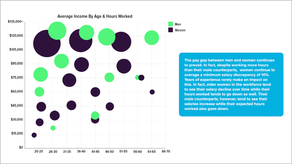
Figure 9. This example, sized like a traditional presentation slide, relies heavily on a detailed paragraph to explain key takeaways. Instead, you could use labels to accomplish this same goal.
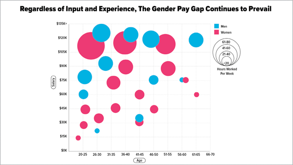
Figure 10. Compare this slide to Figure 9. Changing the title, adding labels to the axis, altering the colors to leverage a societal trope, and including a scale in the key all improve understanding without requiring a lengthy paragraph to explain key takeaways.
If you skirt the science, you risk losing the trust of your audience
There’s simply no getting around the pre-attentive process. It’s as natural as breathing, which means it can work for you or against you, depending on how you communicate your data. All too often, designers nowadays are encouraged to push beyond traditional charts and graphs to create something unique and eye popping. When you sacrifice accuracy and simplicity to deliver eye candy, though, you may end up sacrificing your audience’s trust in the process. Consider Figure 11, which aims to depict the changing demographics in America. On first view of this visualization—broadcast on NBC Nightly News and described by Fast Company as “The Worst Infographic of 2014 (So Far)”—you might assume that Maine is the most diverse state in the US. It takes a thorough attentive process to realize that this visualization is entirely inaccurate. In fact, it’s two data visualizations (a map and an area graph) superimposed. Combining two unique visualizations produced an entirely different meaning than what was intended. Instead of simply taking the area graph at face value, as it would with a traditional depiction, the pre-attentive brain looks for meaning in the map, leading to a variety of incorrect conclusions.
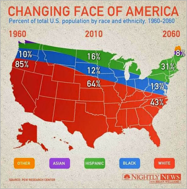
Figure 11. Created for NBC Nightly News, this chart incorrectly visualizes the data at hand by merging two different types of data viz: a map and an area graph.
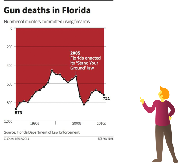
Figure 12. Do you look at this visualization and see gun deaths declining after 2005? Because of the flipped y-axis, most people do.
So, Where’s the “How To” of It All?
Relax, you’ve found it, but you simply can’t deliver successful data viz without first thoroughly understanding the history and brain science behind it. Now that you do, I encourage you to leverage that science and remember these basics to help your data visualizations resonate with your audience:
- Traditional charts and graphs are part of a steadfast and universal vernacular. Don’t feel pressured to reinvent the wheel.
- In most cases, line graphs, bar graphs, and pie charts are all you need to depict the data at hand and connect with the average audience.
- Complex charts and graphs, including bubble charts, histograms, Sankey diagrams, and spider graphs, should be reserved for targeted, analytical audiences.
- Carefully choose how you order your data to help tell your story.
- Use labels and text hierarchy to target the attention of your audience.
- Simplify your information by using colors, scale, and iconography.
Today’s audiences value accuracy over superficial imprecision, simplicity over complexity, and expediency over needless delay. By designing your data visualizations to leverage the pre-attentive process, you can deliver that to them.
Commenting is easier and faster when you're logged in!

Recommended for you

Creating Custom Default Swatches
When you open InDesign you are greeted with a few default swatches, styles, and...
Tip of the Week: Easy Fake Duotones
How to create duotone effects applied to images with a simple blend mode techniq...
Changing Colors During a Data Merge
From time to time, I’m asked the following question: Is it possible to change th...