

Starting with the 2026 version, Illustrator offers features that make it easier to work with gradients, including better presets and options for creating smoother gradients. Here’s a quick introduction to using the Gradient panel in Illustrator.
Using Gradient Presets
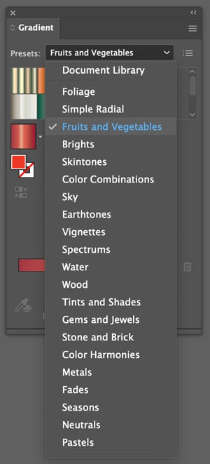
Using presets is a convenient way to get started applying gradients in your artwork. To access the presets, open the Gradient panel from the Window menu. Then, select one of the libraries of presets at the top of the panel.
Select your art and click one of the presets to apply it.
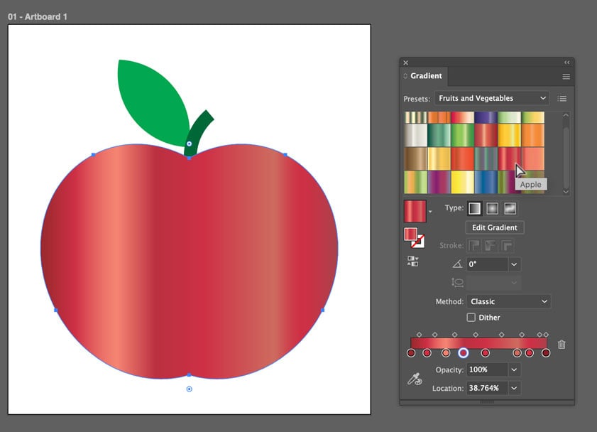
Then, you can adjust the appearance using the Gradient Slider in the panel, or the Gradient tool. The tool has the added advantage of putting the slider on top of the artwork, which is a more intuitive way to work.
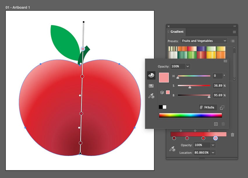
- Drag the the white slider to reposition the gradient.
- Drag either black endpoint to adjust the length of the gradient
- Drag the color stops or midpoints to adjust the transitions of color.
- Option/Alt-drag a color stop to duplicate it.
- Drag a color stop off the slider to remove it.
- Double-click a color stop to change its color. You can also click once on a color stop and use the Color Picker to sample a color from your artwork.
- Start dragging anywhere away from the slider to change the position, length, and angle of the gradient all at once.
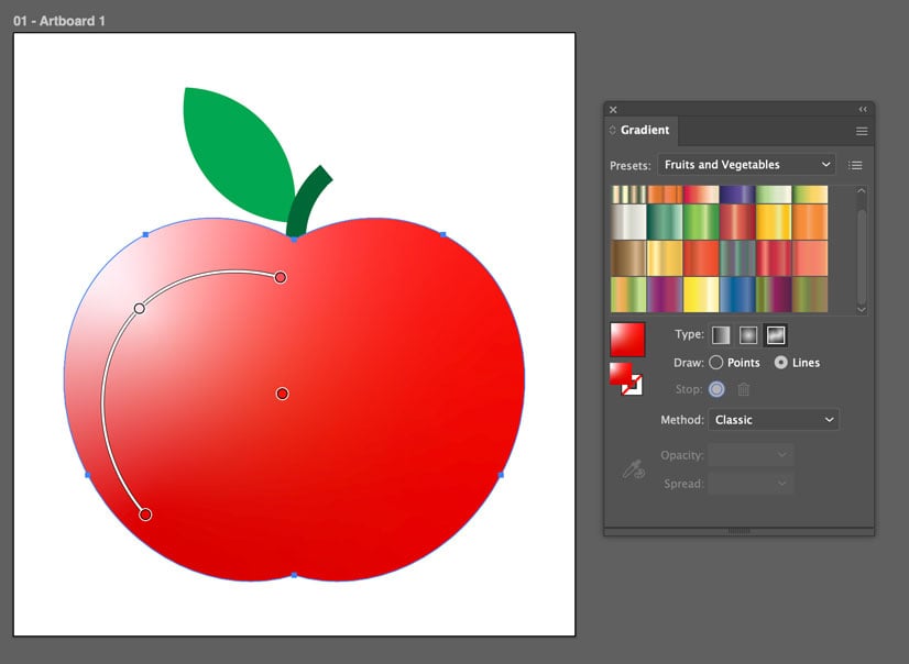
Freeform Gradients
Freeform gradients give you the ability to build transitions of color in any direction, freeing you from the traditional linear and radial styles. You can build transitions using lines (straight or curved), points, or a combination of both.
To create a Freeform gradient, start by choosing that option from the Type area in the Gradient panel. Then select Points or Lines. Click on your artwork to add points and lines. Drag to reposition them and adjust the color transitions.
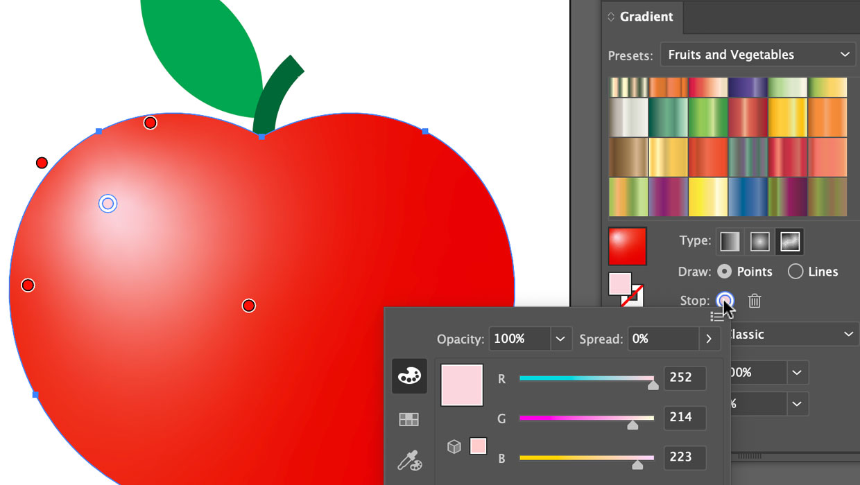
Double-click the Stop button in the panel to adjust the color of a stop. Click the trash can to delete a selected stop.

Options for Making Better-Looking Gradients: Perceptual Method and Dither
Illustrator offers two settings in the Gradient panel for improving the appearance of gradients in output: the Perceptual interpolation method and Dithering.

The Method menu offers two choices for how colors are interpolated in gradients, Perceptual or Classic. Perceptual is intended to produce gradients that appear as smoother transitions to human vision (as opposed to being mathematically consistent transitions between colors).
Dithering adds tiny specks of noise to break up noticeable bands of colors in gradients.
Whether these settings actually make a difference and improve the appearance of your gradients will depend on the physical size of the gradients, the colors used, and your output conditions. The differences may be very subtle. The one thing that’s certain is that both the Perceptual method and dithering will output gradients as raster (pixel-based) objects instead of vectors. And the resolution of those raster objects will depend on the Document Raster Effects Settings value that you can set in the Effects menu. Be sure to check that any time you’re using either the Perceptual method or Dither.
Gradients that use the Classic method and no Dither will be output as Smooth Shade vector objects where the transitions are determined by the RIP if the file is output to print.
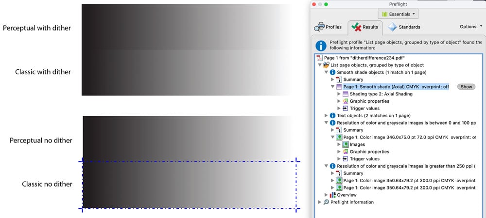
Note: Gradients added to CC Libraries don’t support Dither.
Commenting is easier and faster when you're logged in!

Recommended for you

Three Ways to Make a Heart in Illustrator
Learn how to create a heart shape in Illustrator three different ways, using str...

Quick And Easy Flower Design Creation In Illustrator
This beginner-friendly tutorial teaches how to create gorgeous floral designs in...
Illustrator Downloadable: Retro Rainbow Pattern Set
Add cheerful colors and shapes to your designs with these Illustrator patterns