
Using Adobe Spark Post
Web and mobile app allows you to create gorgeous graphics for social media with ease


This article appears in Issue 104 of InDesign Magazine.
Adobe Spark Post—part of Adobe’s Spark suite of apps—is a free-for-iOS-or-web app that lets you easily create graphics for the web, social media, and other uses. I know what you’re thinking: InDesign and Photoshop already do that. Yes they do, though not on mobile platforms, and not without lots of creative input (a.k.a. “work”) from you.
While Post may have been originally geared towards the non-designer, crafty DIYer, or small business owner, its ongoing upgrades are making it increasingly more attractive to creative pros. It is a template-driven app that makes editing and repurposing content easy and carefree. For instance, you might create a blog header graphic—then want to send that same graphic out as a tweet, and then as a banner on your email newsletter (Figure 1).

Figure 1: Spark Post excels at helping you create simple but effective graphics for multiple uses.
Creating all those by hand would be tedious, but Post can resize and rework all the elements to fit the new output.
As someone who is constantly working on other people’s projects, you might know that end-of-day feeling where your brain is just out of ideas. But what if, at that running-on-empty mark, you still need to create a catchy graphic for a Pinterest board to alert your followers of the cool calligraphy class you offer on weekends? Enter the ease and—dare I say it?—fun of creating in Post. Much of the planning and design has been done for you. All you need to do is add in the content.
In a nutshell, that’s the what and why of Post… let’s take a look at the how.
Where’s the App for That?
Spark Post
lives as an app for iOS and a web interface at spark.adobe.com. The web portal serves up all three Spark components (Post, Page, and Video) while each has its own app on iOS (a promised Android version is on the horizon). Opening the web interface lets you see all your Spark projects together in one place. Click the big green plus button to start a new project. The iOS app puts you immediately into creation mode.
All About That Base
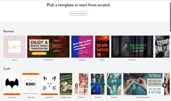
Creating a Post graphic always starts with a template, which I realize is sometimes considered a dirty word in the design world. But these templates are very well-designed, and filtered into useful categories such as Lifestyle, Seasonal, Business, and Travel (Figure 2).
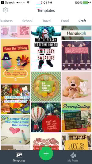
Figure 2: Templates on the iOS version of Adobe Spark Post (above), and the web version (below).
You can also start completely from scratch (by clicking or tapping the big green plus), but that route sidesteps one of the best reasons to use Post, namely, that much of the design work has been done for you.
Tap Templates, and choose one of the categories (on the web version, click Featured to see the categories), find a sample layout that catches your eye, and then tap or click on it. I generally start with the one with the proper orientation, knowing that I can also change it after the fact if I need to. On iOS, tap Remix to get into editing mode (Figure 3).

Figure 3: Tap Remix (above left) to enter editing mode (above right)
NOTE: I create almost exclusively in the iOS app, so the rest of the steps will describe the iPhone steps, but I’ll be sure to point out any significant differences in the web version along the way.
Change It Up
If the size isn’t what you wanted, now is a great time to change it. Tap the Resize option at the bottom—or under Layout on the web—and scroll through the options, choosing from social post sizes, social profile layouts, and standard sizes like square, letter, and 16:9 proportions (Figure 4).

Figure 4: Changing output size is as easy as picking a preset.
Picking a new layout moves all the elements to fit beautifully in the new size.
Before exiting, you can also tap the Layouts tab to edit the layout by creating a grid or banner layout. Set a border around the images and cells here as well, by choosing Spacing, and then use the slider to adjust the width. Click Done when you’ve finished fine-tuning the layout.
Now the real fun begins: customizing images and text. Images can come from a multitude of sources, depending on which platform you’re using. On iOS, tapping an image in the layout and then the photo icon at the top will bring up the import location options to replace the image. Choose from your camera roll, your device’s camera, Lightroom Mobile, Creative Cloud, or select from the Free Photos, Pattern, and Color libraries. The Search Free Photos option allows you to do a keyword search and pick from the public domain images it finds.
Interestingly, on the web version you can click the Info icon and see where the image is being hosted and look at the license, but I have found no way to do the same in the iOS version. On the web, you can upload an image from your computer or even add one from Dropbox or Google Photos. Along the bottom, you’ll see multiple filters that can be applied to the image. Those photo filters also incorporate the color palette from the template.
After exiting the image mode, you might find that the image doesn’t fit into the design as you intended. You can make basic adjustments to the size and position. Tap once on an image, and then use Pinch To Zoom to adjust size, use two fingers to rotate the image, or drag within the frame using one finger. You can also manipulate the image frame by dragging any of the side handles. Note that manipulating handles affects other objects in the layout, so use with care.
Adjust and Shuffle
At some point in the creation process, you’ll select Palette from the design options and see a slew of palettes from which to choose. These palettes feature two circular icons: a slider adjustment and a shuffle button. Tapping the adjustment slider brings up a host of color options, including a new eyedropper option to sample color from your image, color sliders, and a place to enter custom hex values. The shuffle icon rotates through and reapplies the colors from that given palette (Figure 5).

Figure 5: Customize color options
Not My Type
When you’re ready to replace the template text with your custom message, tap on the text you want to change; a whole slew of options appears along the bottom. Resist the temptation to start exploring—add your actual text first. Doing so will make the next few steps easier, since you don’t have as much control over text in Post as you’re used to having in InDesign. Double-tap on the text, and replace it with new text. While you can apply forced line breaks, the results might not turn out as expected. I usually just type in everything and let it flow how it will, at least to start. Tap Done when you’ve entered all your text.
Ignore the first option (Style) for now, because we’re going to use its magic after we’ve gone over the individual elements we can adjust. I usually start with color and scroll over to the Suggested sets of colors—for a non-branded piece—tapping the adjustment slider to customize. If you don’t see what you want, keep scrolling and adjusting until you find that magic combo.
Next, jump over to Shape to bring up the library of shapes and elements that enclose the text. The solid shape icons are hiding goodies like cut-out text that reveals the underlying image. You’ll have to tap the shuffle icon to cycle through these options. Finding a shape that works with your text is key, as is choosing a good font. I tend to jump back and forth between the Shape and the Font tabs. Click on Font to choose from categories such as Classic, Clean, and Natural. I do have to say there are some really nice fonts included, but my #1 wish list item is Typekit integration. After seeing it introduced in Comp CC quite a while ago, I know it’s possible, and I want it. Everywhere. C’mon, Adobe, make it happen!
Tap on the Align, Opacity, and Spacing tabs to set even more options. Out of the four Align options, the last one is the most fun—if not always necessary. That option justifies the text by adjusting the size of each line of text to fit. Sometimes this option highlights words unnecessarily, but that can often be fixed by forcing line breaks. Tap on the Spacing icons to rotate through the few options for padding and line spacing, and then choose Opacity to adjust the visibility of any shape element. In the most recent update to the iOS version, Post added the ability to manipulate each word in a text box individually. After selecting a text box, press and hold on a single word and make adjustments from there (Figure 6).

Figure 6: Applying a different color to a single word
The implementation of selecting and formatting is less than ideal, but the feature is new and I expect it will be perfected over time.
The last option—Order—is a new and welcome addition, which lets you change the stacking order of objects. Grab and drag any of the green text-box handles to resize the frame, keeping in mind that any shapes you’ve assigned will grow along with the text frame as you change it. Tap and drag the button below the frame to rotate the text frame and drag the frame into position, using the alignment guides. Tap Done to accept all the text changes you’ve just made.
Spin! That! Wheel!
I promised we’d come back to that first option—Style—and now it’s time. Selecting a text frame, and then tapping on this option brings up a solitary control, one I have dubbed “The Spinning Wheel of Incredibility”—which is way better than whatever its official name is (Figure 7).
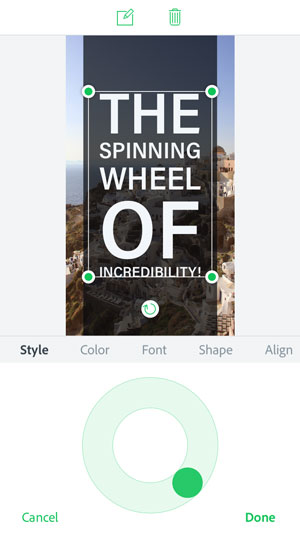
Figure 7: The Spinning Wheel of Incredibility lets you cycle through layout options.
Giving this little orb a spin cycles your text through shapes, fonts, alignment, and color (within the palette you’ve chosen). If you’ve been designing all day and really want an app to do the work for you, then give that wheel a spin. Or thirty. Let go and tap Done when you’ve found the perfect design; make more tweaks as needed.
Sharing is Caring
You can add extra elements by tapping the Add button to insert more text or images, and you can delete elements as needed using the trashcan that appears when you’ve selected an object. When you’ve perfected your design, you’re ready to share it with the world. To do this, tap the Share option at the top of the screen; a list of options appears. Share directly to social platforms Twitter, Facebook, and Instagram, or compose an iMessage or email (Figure 8).

Figure 8: Sharing options in the iOS version of Spark Post
This is also where you save your image to photos—the option that I use most of the time.
One thing to know: Even if you have a premium subscription, the app really wants you to share your creation with the world. If you’d rather not, be sure to tap the slider at the bottom to turn off the “Get Noticed” feature.
You probably wouldn’t use this to create high-end graphics going to print, but the resolution is high enough that you could get away with it in many circumstances. Using the “letter” layout, you can manipulate the resolution to a respectable 233 dpi without loss of quality. Note to self, however: Create your branding PNGs on the larger size, since there is no way to gauge the resolution when placing the logos in a Spark Post layout.
Lastly, you may want to make many iterations of this same design. Generally, after I save a copy of the current design to my camera roll, I exit back to My Posts. Select the item you just created, and then choose Duplicate. Now you can easily resize the layout to fit your needs, save to camera roll, and remix as needed (Figure 9).
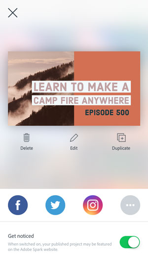
Figure 9: Reusing existing designs is easy.
The Good (Premium) Stuff
Everything I’ve covered so far are features that exist to anyone who wants to use all the Spark apps with no obligation other than an Adobe ID. But Adobe recently launched Spark Premium, which includes branding features, allowing us business-type folks the opportunity to infuse our designs with our company look. This includes integrating logos, our company’s colors, and custom fonts. I’m placing a big ol’ virtual asterisk after that last item, because like Comet Kahoutek, this feature isn’t nearly as spectacular as anticipated. The Premium features are available to every Creative Cloud subscriber, or they can be purchased separately for $9.99 paid monthly or $99 when paid annually.
Branding
You set up branding via the web interface at spark.adobe.com. Make sure you’re logged into your Adobe account (you may have to log out and back in if you just purchased the premium or recently upgraded your CC subscription or apps). Click Add Brand, and follow the prompts for adding your logo, colors, and fonts (Figure 10).
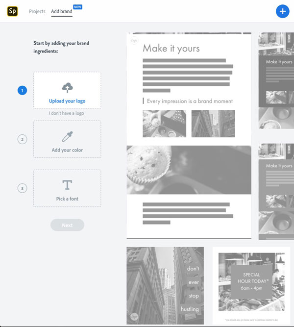
Figure 10: Setting up branding, part of the Premium Spark features
In terms of file formats, I recommend using a transparent PNG logo, since it will play nicely with all other elements in your designs. Choose your main color; it will build complementary colors to integrate into your branding palette. Add extra colors as needed so you have access to those within the Spark apps.
Custom fonts
Now for those fonts. You have the option of only 22 typefaces, some with several styles to choose from. None of these fonts are the ones I use in my logo and my branding. I’ve used Typekit fonts to maintain that consistency, but sadly, as of this writing they are unavailable in Spark. I’m going to reserve too much judgment for now and cross my fingers that Typekit integration appears in a not-too-distant update. So, for now, just choose a font that works with your branding, and Spark will even suggest another font to pair with.
Font limitations aside, having the option of plopping my logo into a design I create in Spark Post (as well as the other Spark apps) is amazing, and something I’ve long wanted for this little app. Now when I start the creation process, I have the option of selecting Brand templates that already incorporate my color palette, and I can easily bring my logo into any design using the Add button (Figure 11).
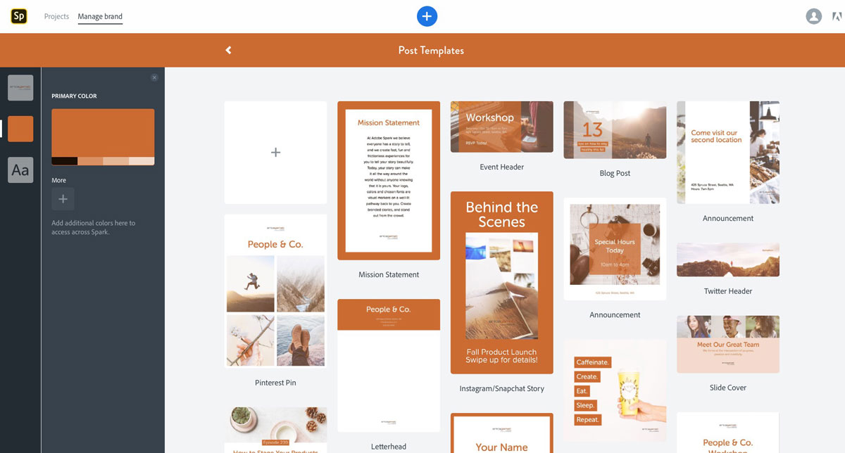
Figure 11: Branding options are pre-built into templates.
In addition, my colors and fonts are available throughout the creation process (Figure 12).

Figure 12: Branding colors appear automatically when accessing color palettes.
I’m able to customize blog post graphics to match a client’s graphic look, and I know that my own creations will already feature my company colors without my having to integrate them from scratch for every design.
The Takeaway
While not perfect, Spark Post is a diamond in the rough and a welcome addition to my design toolkit. I appreciate its great pre-built features like templates, access to stock photos, and the design wheel for quickly scrolling through layouts. In terms of feature requests, I’m hoping to see Typekit integration happen sooner rather than later. And if Adobe could add a few more things like multiple undos, layers, and a system for organizing and naming projects, then Spark Post would truly shine. But even as it is right now, Spark Post delivers a fun and simple way to create gorgeous graphics. And if you find yourself needing a more robust app, well, that’s what InDesign is for!
Commenting is easier and faster when you're logged in!

Recommended for you

InDesign Nightmares
Terrifying tales of the evil that lurks in some InDesign files, and how to survi...

InFocus: Resources for Book Design and Production
Cool stuff for InDesign users to help with book design and production, including...

100 Free InDesign Scripts
Free for the taking: a heaping helping of features that make InDesign better, fa...