


This article appears in Issue 135 of InDesign Magazine.
InDesign is a well-designed, high-performance page layout beast. In the hands of an experienced user, it can chew through paragraphs and pages so fast you can hardly keep up. The power and depth of the InDesign feature set is astounding, enabling it to adapt to an incredibly wide array of layout challenges. But with great power comes great responsibility, as many of these features have some not-so-obvious “gotchas.”
Sometimes these pitfalls exist because of the sheer power of the feature—you just need to learn how to use it properly. Sometimes the feature is half-baked—developers incorporated it into InDesign but then never properly polished it. And sometimes a feature just doesn’t work the way you would expect for completely inexplicable reasons.
Here is your guide to avoiding problems while taking full advantage of these powerful features. First up: Be careful of your language settings!
Watch Your Language
You can change the language of any selected text or any character style in the Character panel or the Character Styles dialog box. InDesign can then spell check and hyphenate the indicated text in the language you have chosen. This is really helpful for working with multiple-language documents. In addition, many people find it helpful to set the language for hyperlinks to [No Language] so that the the spell checker ignores them (Figure 1).
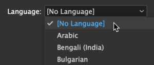
Figure 1. Choosing the correct language or even choosing [No Language] can be useful in many situations, but you need to ensure that all your text has the correct language applied.
But you can run into trouble if [No Language] or the wrong language is applied to text accidentally. This will cause spell checking and hyphenation to stop
working, leaving you scratching your head and wondering what’s going on. I’ve seen InDesign inexplicably assign the wrong language to text imported from Microsoft Word, so keep an eye out for this when importing text.
Use Find/Change with Care
InDesign’s Find/Change feature is incredibly useful for finding and replacing not only actual text, but also text formatting. But you have to be careful in the Find/Change dialog box, particularly if you’re in a hurry.
InDesign remembers the last query that you used in the current work session. Imagine that you’ve searched for the word cat and replaced it with dog, but only when the word cat is bold. Much later, you’re working on a completely different document, and you need to find the word yesterday and replace it with today. You fill in the Find/Change fields as shown in Figure 2 and click Change All. InDesign makes no replacements, but you can see an instance of the text right in front of you. Why can’t InDesign find the text? Look again, closely, at the full dialog box: The Find Format field still specifies + Bold from your previous search. Such persistent settings are easy to overlook, especially if the dialog box is collapsed to show fewer options. However, InDesign warns you, if you know where to look: The i icon next to “Find what” is a reminder that formatting is specified in either the Find Format or Change Format section in the “basement” of the dialog box.
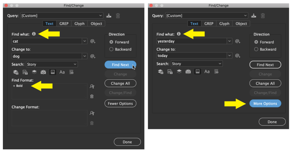
Figure 2. In the dialog box at left, Bold formatting is specified in the Find Format field, as indicated by the icon next to “Find what.” Later, another find/change is performed, but the “basement” of the dialog box has been hidden, so it’s easy to overlook that formatting is still applied—watch for the icon next to “Find what.”
While focusing on your search terms, you can also easily overlook the search scope setting (All Documents, Document, Story, To End Of Story, or Selection), as well as the modifier buttons directly below that. Be sure to verify all these options before doing your find/change. It’s too easy for the scope to be more restrictive than you intended (so you find less than you mean to) or less restrictive (so that you change far more than you want).
Place CC Library Assets Carefully
I think by now most of us understand how placed images in InDesign are normally linked back to the original image file. If the original image file is updated, the image is updated in InDesign. The same workflow is available for assets stored in a CC Library. Placing these cloud-based assets in your image is as easy as a drag and drop—but that simple method may trip you up.
The most reliable way to place an image or object from a CC Library into an InDesign layout is to right-click the asset and choose Place Copy or Place Linked. The Place Copy option places a copy of the asset into the layout, but be aware that the copy isn’t linked to the original cloud asset. The InDesign Links panel displays the asset as an embedded graphic, meaning when the original asset changes in the cloud, it won’t change in your InDesign layout. If you choose Place Linked, the image appears with a cloud icon next to it in InDesign’s links panel, indicating that it is linked to the cloud-based original (Figure 3). If the asset in the CC Library is later edited, it will change in the InDesign layout, just like any other linked asset.

Figure 3. Right-click an asset in the CC Libraries panel to choose whether to place the asset as a linked asset (Place Linked) or an embedded asset (Place Copy). A linked asset will display with a cloud icon in the Links panel.
Outline Only when Needed
The ability to select some text and then choose Type > Create Outlines is a powerful feature, useful for when you need to fill a headline with an image, or to modify the shape of a character. But, despite what some print vendors still insist on claiming, I can’t think of any situation where you should convert all the text in a layout file to outlines in InDesign.
If a print vendor requires this, a much better workflow is to use Adobe Acrobat to convert the text to outlines. In Acrobat Pro DC, select the Print Production tool, and then choose Preflight. Click the wrench icon, and then type outlines into the search field. Select “Convert fonts to outlines,” and then click the Fix button (Figure 4). Save the PDF with a new name, and you’re done (and your InDesign file is still intact).
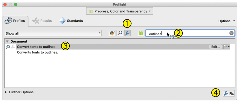
Figure 4. Follow these steps to convert text to outlines in Acrobat Pro DC.
Don’t Paste Graphics into InDesign
The ability to copy and paste graphics and images from Illustrator, Photoshop, web browsers, and many other sources into InDesign can be really convenient and useful in some workflows. But in most situations, you’ll be better off taking the extra time to save the graphic in a file format that InDesign can import, such as PSD, AI, PDF, JPEG, or TIFF, and then choosing File > Place or dragging the file onto your page from the macOS Finder or Windows Explorer. Why?
Pasted graphics are “consumed” by the InDesign file and make it much larger. Pasting in a 1 MB graphic makes the InDesign file 1 MB larger. In my experience, larger InDesign files tend to be more error-prone.
Also, if your file is going to be edited by someone else—for example, localized by a vendor for use in other countries—the lack of graphic links makes it more difficult for them to replace the graphics with new versions.
InDesign’s Info panel (Window > Info) is a great place to view the effective resolution of a selected image—unless that image has been pasted into InDesign. In general, pasted images are much harder to work with, so you should avoid them. (One exception: There are occasionally good reasons to copy and paste simple vector shapes from Illustrator into InDesign, such as when you want to use them as frames or further edit them on your InDesign page.)
Avoid the Registration Swatch
InDesign’s [Registration] color swatch works perfectly for its only purpose: creating marks that will go on every plate of a color separation. However, this is only very rarely needed by InDesign users. If you accidentally use the Registration swatch instead of black and then send your job out for offset or digital printing, you’ll be disappointed (and your printer may be mad). Whatever you’ve assigned the swatch to will appear as 100% cyan, 100% magenta, 100% yellow, and 100% black, which is undesirable in almost all situations. Unfortunately, there’s no way to remove or hide this swatch, and it’s easy to accidentally select because it is right next to the [Black] swatch in the Swatches panel. So be careful! Tip: Use InDesign’s Preflight feature to alert you if the [Registration] swatch is used anywhere in your document (Figure 5).
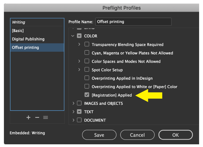
Figure 5. Create and apply a custom Preflight Profile to make InDesign automatically alert you if the [Registration] swatch is applied.
Leave the [Basic Paragraph] Style Alone
In InDesign, the Paragraph Styles feature is robust and full-featured, and you should certainly use paragraph styles whenever you can. But the [Basic Paragraph] style is problematic. In short, when it comes to professional-level work, never use the [Basic Paragraph] style, never modify it, and never base any of your paragraph styles on it.
The problem is that, unless you’ve changed your defaults, InDesign applies the [Basic Paragraph style] when you type new text in a new document. The result is that this style is applied to lots of text in lots of documents, without you being aware that it is happening. This leads to unexpected behavior when you copy and paste text with the [Basic Paragraph] style applied from one document into another. If the definition for the [Basic Paragraph] style was changed in the document you are pasting into, the formatting for all your pasted text will unexpectedly change. This can be even more puzzling and unexpected if the source text has a paragraph style applied that is based on the [Basic Paragraph] style (using the Based On option), but the [Basic Paragraph] style differs between the documents (Figure 6).
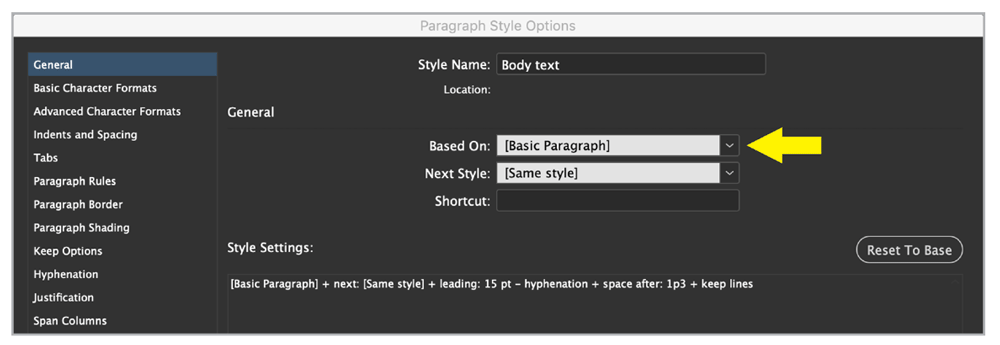
Figure 6. This has tripped me up many times over the years. “Just say no” to the [Basic Paragraph] style!
Convert Variables and Captions to Wrap
InDesign’s text variables feature (Type > Text Variables) is useful for inserting automatically updating dates, running headers, or variable text. This works very well with one severe limitation: Variable text cannot wrap. If you’re using variable text for running headers, for example, if the text exceeds the width of your text frame, the text just crunches together—not really what you want (Figure 7). The only solution is to design around this constraint if you want to use this feature.

Figure 7. Even though there is plenty of room in the text frame for this running header to wrap to a second and third line, because it was created with the Text Variables feature it will not wrap.
The same situation occurs with automatic captions (Object > Captions). Caption text created with this feature will not wrap to a second line. One possible workaround for both of these situations is to choose Type > Text Variables > Convert Variable to Text or Object > Captions > Convert to Static Caption to convert the “live” variable or caption to static text. But this kind of defeats the purpose of setting up the “live” automation in the first place.
Remember to Update
The Table of Contents feature (Layout > Table of Contents), the Index feature (Window > Type & Tables > Index), and the Cross-Reference feature (Window > Type & Tables > Cross-References) all greatly aid the process of creating TOCs, indexes, and cross-references in long documents. Once created, all of these need to be kept up-to-date manually as your document changes. It’s easy, but you must remember to do it. There is no visual prompt anywhere that a table of contents or index is out of date, so you could easily to forget to do this. To update an automatic table of contents, select its text frame and choose Layout > Update Table of Contents. To update an automatic index, choose Generate Index from the Index panel menu.
Thankfully, the Cross-References panel features a visual cue in the form of a yellow warning icon when a cross-reference is out of date. To update, just click the Update Cross-References icon at the bottom of the panel.
Color Management Puzzlers
Color management in InDesign can work quite well (if you know what you’re doing), ensuring you get the same color (or close to it) on screen, proof, and final print. You need to be aware of a couple of caveats, however, if you routinely place CMYK images in InDesign. First, beware that usually InDesign will ignore any CMYK profiles embedded in CMYK images, which is usually what you want. But a handful of triggers can cause InDesign to honor a profile embedded in a particular CMYK image, potentially causing inaccurate color. The bottom line: Don’t embed color profiles in CMYK images in Photoshop unless you know what you’re doing. But you should embed color profiles in RGB images.
A second oddity is that the choices you make in the Color Settings dialog box (Edit > Color Settings) have no effect on the active document. Nor do the settings you see there reflect the settings that are in effect for the active document. The settings affect only new documents you create in the future. This behavior is unlike almost any other feature in InDesign. For a deep dive into the mysteries of color managing CMYK images, see David Blatner’s article.
GREP Style Gotcha
Using GREP inside a paragraph style is a tremendously powerful feature of InDesign. With a GREP style you can apply a character style automatically to text whenever certain criteria are met. For example, you could specify that whenever a price with a dollar sign appears in your text the character style named Red Text should be applied. This works great once you learn how to set it up. However, there are a couple of gotchas with this feature.
When applying a character style to text via a GREP style, you’d expect to be able to select the text and see the name of the character style highlighted in the Character Styles panel. But alas, the Character Styles panel shows that [None] is applied, and you may be confused initially. Look closely, however, and you’ll see that the name of the applied character style does appear: It’s in the bottom-right corner of the panel with a ¶ symbol before it, indicating that the character style is being applied by a GREP paragraph style (Figure 8). Unfortunately, the Character Styles section of the Properties panel offers no clue at all that the Red Text style is applied.
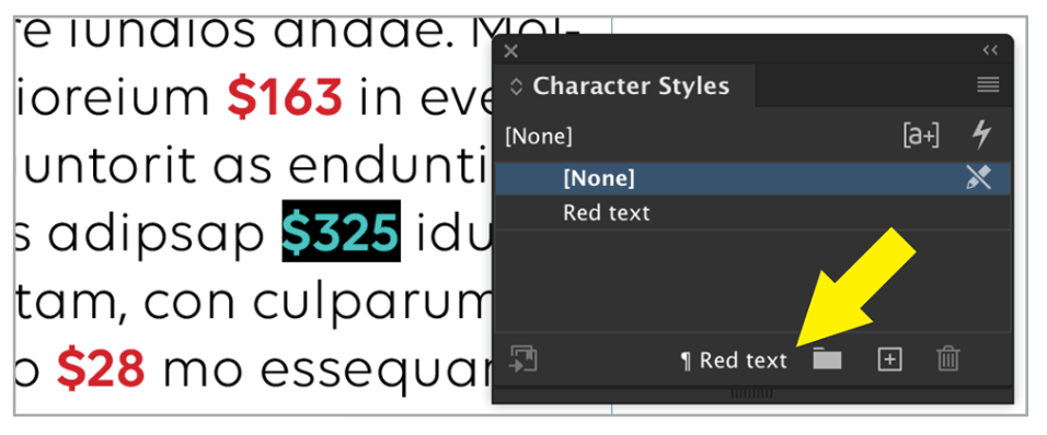
Figure 8. Pay attention to the bottom of the Character Styles panel, as this is where character styles that are applied to text via a GREP paragraph style will appear.
One other thing: If you need to export text that contains GREP styles to Rich Text Format, the character formatting will be lost in the RTF file. One workaround is to use Find/Change to search for the character style applied by the GREP style and replace it with the same style. The result is like applying the character style manually throughout the document.
Use Style Groups Carefully
The ability to organize your paragraph and character styles into folders (called style groups) is really handy for complex documents with a lot of styles. But this feature comes with a cost that you should be aware of. One potential problem is that InDesign allows you to have multiple styles with the same name, as long as the styles are in different style groups. I discourage this, because it can lead to confusion as you copy text between documents with different style groups. Furthermore, beware that some custom scripts don’t take style groups into account, so the script may not function properly if it needs a paragraph style that is in a group.
Another problem with style groups is that they aren’t fully supported in Rich Text Format output, so they’re not “roundtrip-able.” The groups aren’t preserved if you export text to RTF that uses paragraph styles in style groups, and then place that RTF file back into your document or in a new InDesign document (Figure 9).

Figure 9. If you export text that uses styles in style groups to Rich Text Format and then import the text into another InDesign document, you’ll get the results shown above right.
Publish Online Shortcomings
Publish Online is a simple, quick, foolproof way to publish print content on a website and is a good alternative to posting PDFs online. Many designers offer Publish Online output as a way to add value to client print projects. However, you need to consider a couple things in this scenario. First, although you can embed the Publish Online document as an iFrame on any website, you cannot add password protection or a paywall to the content. Second, the content is forever tied to the Creative Cloud account of the person who “publishes” the content from InDesign. So if a freelancer publishes a client’s document using Publish Online and later the freelancer quits, the client can’t get access to that work. Or, if the freelancer stops their Creative Cloud subscription, the document will no longer be viewable on the web.
File Info Is Visible in PDFs
In some workflows people enter information in the File > File Info dialog box to aid in tracking the progress of a document. For example, you could enter the name of the last user who edited the file in the Author field or enter notes in the description field. When you save the file, InDesign saves this information. When you export the InDesign file as a PDF, remember that this information gets passed through too! It is visible in the PDF if you choose File > Properties in Acrobat and select the Description tab (Figure 10). Of course, this can be useful… but it could also be embarrassing if you include information here that you’d rather others not see.
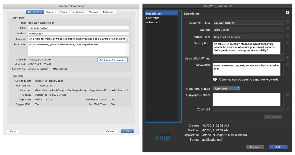
Figure 10. The Document Properties box in Acrobat displays any metadata you added to the InDesign file. Clicking the Additional Metadata button shows even more metadata in the box at right.
Use Tints, Not Transparency
The ability to make any object semi-transparent allows you to create all kinds of beautiful and interesting layouts in InDesign. But this powerful feature is often misused for one simple task: to lighten the color that is applied to a fill or stroke. Let’s say you have a frame filled with a red swatch that you want to make a lighter red. Instead of going to the Effects panel and changing the Opacity of the fill, just change the Tint value of the color in the Swatches panel (Figure 11). Following this best practice creates a file that will output more reliably and be easier for others to edit.
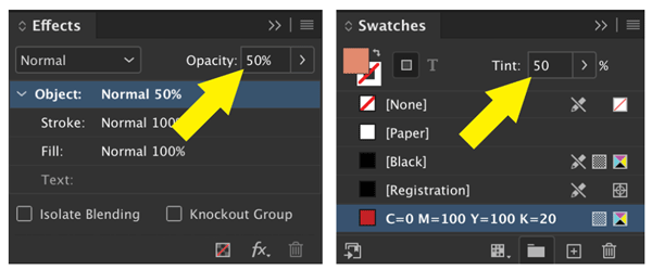
Figure 11. Don’t change the Opacity of an object just to achieve a lighter color. Instead, change the Tint value of the color in the Swatches panel.
Work Carefully With PDF Comments
The File > Import PDF Comments feature lets you import comments from a PDF, right into your InDesign layout. I’ve found this feature to be a game-changer when I need to incorporate lots of comments and changes from a client into a complex layout. You need to watch out for a couple of things, however, to make this work smoothly. First, this feature doesn’t contain a mechanism for enforcing any kind of workflow, so you need to be vigilant about version control. In other words, for this feature to work well, you must create a PDF file from InDesign, and then distribute that PDF for feedback while in the meantime not making any changes to the InDesign file! If you make changes to the InDesign file, and then try to import PDF Comments later, very strange things can happen.
Second, if you need to make a lot of text changes in a long document containing text flowing from page to page, you probably want to start making your changes from the end to the beginning, so that as the text reflows the comments don’t move out of position. Also, remember to remove the comments from the PDF Comments panel when you are done so as not to confuse anyone during the next round of changes.
Use Auto-Composition Features Wisely
In recent years, InDesign has gained more and more advanced composition features such as Auto-size text frames, Span & Split Columns, Balance Columns, and Smart Text Reflow. These are great features, but, depending on the length of your document and complexity of your layout, choose wisely which of these you use. In some layout situations these features can really slow things down, affecting screen redraw speed, accuracy, or responsiveness when making text edits. In some situations, you may occasionally need to use the Recompose All Stories command (Command+Option+/ or Ctrl+Alt+/) to force the screen to redraw properly.
Shared Destination Snafu
When you create a hyperlink to a URL, you may have noticed the Shared Hyperlink Destination option (Figure 12). Unless you have a specific use for creating a shared destination, avoid selecting this option.
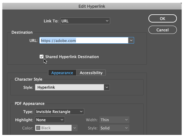
Figure 12. Unless you have a specific reason, don’t select the Shared Hyperlink Destination option.
A shared destination acts sort of like a linked image in InDesign. It memorizes not only the URL that you enter, but also the file name and location that contains the hyperlink. So if you copy and paste text from the original document into another document, InDesign references the original document in the hyperlink and changes the Link To setting from URL to Shared Destination (Figure 13).
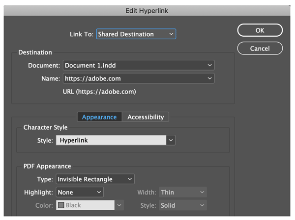
Figure 13. When you copy and paste text that contains a hyperlink with the Shared Hyperlink Destination option to a second document, the hyperlink references the original document—leading to unexpected behavior.
Why does this matter? If you close the original document and try to test the link in the second InDesign document (by clicking the green dot in the Hyperlinks panel), the first document will open before the link is displayed in your browser. If you delete, rename, or move the first document, the link no longer will work. This situation is just bad all around, though easily avoided—just say “no” to shared destinations!
Avoiding the Traps
As you can see, there is a lot of “great power” in InDesign, but you need to use this power responsibly. Keep these items in mind throughout your day to ensure that InDesign works smoothly, quickly, and as intended.
Commenting is easier and faster when you're logged in!

Recommended for you

InDesign Magazine Issue 126: Charts and Graphs
We’re happy to announce that InDesign Magazine Issue #126 (October 2019) is...

InDesign Magazine Issue 75: The Ultimate Guide to Kerning
We’re happy to announce that InDesign Magazine Issue 75 (July, 2015) is now avai...

InDesigner: Raphaël Freeman
Addison Lalier shows how one designer has mastered the complex layouts and types...