Use Split Window when Applying Colors to Text
How to fix the problem of seeing selected text in inverted colors in InDesign.

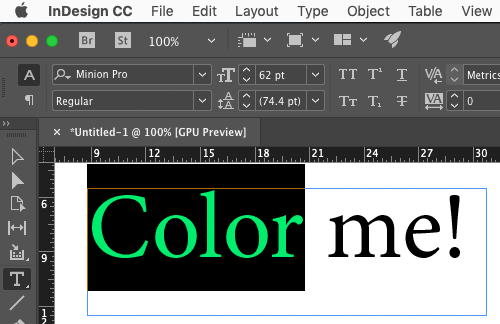
Applying colors to text can be really annoying in InDesign because when you select the text, it appears highlighted—and therefore all the colors are inverted. For example, here’s some text that is selected and colored magenta:

Um, that is definitely not magenta! It looks green, right? Again, that’s because the color is inverted. Of course, you can see the real color by just deselecting the text. But that is so annoying to have to deselect everytime you want to see what the color really looks like, especially when you’re testing out a bunch of different colors to see what looks good.
So I want to let you in on a little trick that takes the frustration out. Before you go applying colors, click the little “Split Window” button in the lower-right corner of the window.
![]()
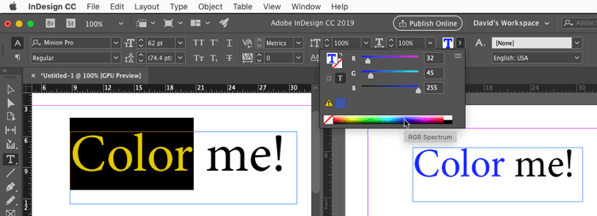
Now you have two views on the same page! Each view can have its own zoom percentage… in fact, you can even show different parts of the page, or different parts of the document in each half of the window! But here’s the important part: you can see what the color really looks like!

So now, in the window on the left (where the text is selected), you can choose any color you want, with the Color panel or the Swatches panel or whatever… and you can immediately see what it looks like.

Then when you’re done, just click that button again and the split goes away.
This article was last modified on July 25, 2019
This article was first published on December 23, 2018
Commenting is easier and faster when you're logged in!
Recommended for you

Tip of the Week: A Shortcut for Accessing Grid Preferences
The fastest way to open the Grid preferences dialog box in InDesign, so you can...

The Mystery of the Phantom Fill and Stroke Contest Answer and Winner
Solve this InDesign mystery for a chance at winning a great prize.

InDesign to Print & Screen: A Best-of-All-Worlds Workflow
When the output could be PDF, EPUB, or print—or all three—there’s no need to com...


