
Unforgettable Folds
Think beyond a basic Tri-Fold and elevate your print marketing game with creative brochure ideas that won’t break the bank.

This article appears in Issue 2 of CreativePro Magazine.
Tri-Folds are the foundation of brochure folding. They’re the most practical and common folded brochure format there is—a simple document composed of three panels with two folds that is easy to mock up, as well as fast and efficient to fold by machine. Tri-Folds are affordable and often a great choice for print marketing. Even people who don’t design for print understand what a Tri-Fold is, which makes it easy to communicate design and folding intent with your clients, but… Sometimes you just want to elevate your design game a bit. Although there’s nothing wrong with choosing a Tri-Fold for your project, it can get old using the same three-panel rectangular canvas over and over again. So, let’s explore ideas for how to add some of variation to your brochure repertoire.
First, Can a Tri-Fold Be More Interesting?
Before you abruptly abandon a classic, sometimes it’s a good idea to rule out the Tri-Fold before you rule in anything else. After all, if you have three panels worth of content, you may find that a Tri-Fold is your best choice—but there are many things you can do to make a standard Tri-Fold a lot more interesting. Here are a few ideas.
Shorten or shape the cover
A short cover makes for a very interesting reveal of the edge of the fold-in panel. You can do interesting things with typography, crossovers, and creative crops of imagery. The beauty of a short cover is that it doesn’t involve a die cut. It’s just changing the document size and adjusting the placement of the folds. If you’d like to see some examples, I recently shared four inspiring short-trimmed Tri-Fold designs on Episode 567 of my weekly video show, Super-Cool Fold of the Week. If you have a little bit
of room in the budget for extras, adding a die cut to the cover can be a really nice upgrade on a Tri-Fold. I love a curved edge on a cover panel (Figure 1). Or, try a square or circular window cut out of the cover to add a sense of dimension and intrigue for what’s on the inside. Add a second, smaller window on the fold-in panel for a layered, telescoping effect.
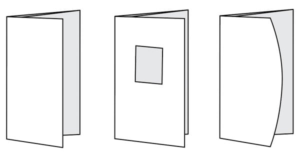
Figure 1. Shortening the cover panel or adding a shaped die cut can add interest to a basic Tri-Fold.
Add a short panel
Another simple idea for making a Tri-Fold more interesting is to add a short, narrow panel to the fold-in panel that can carry a testimonial or pull-quote, a tear-off coupon, or a special offer (Figure 2). Again, this does not require a die. You’re really just adding the width of the narrow panel to the document, and then placing a fold. From a design perspective, the short panel almost works like a little handle to open to the interior spread of the brochure, which I also like. This element does not add complexity to the job, but it adds a lot of interest to the format.

Figure 2. Adding a narrow panel to the fold-in panel can draw the eye without driving up cost.
Add an interaction device
Next, I want you to consider adding interaction to your Tri-Fold, including little perforated peek-a-boo windows to lift and reveal an image or a message (Figure 3).
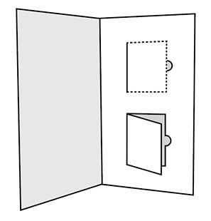
Figure 3. An interaction device like peek-a-boo perforated windows can reveal images and messaging.
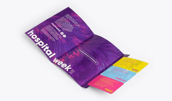
Figure 4. Tear-and-save coupons can be a great way to drive sales and add interaction to a Tri-Fold brochure. (Design: Jacob Chavez, Graphic Designer; Photo courtesy of smartpress.com)
Play with perimeter shape
If you’d really like to have some fun with the Tri-Fold, try playing with the perimeter shape. The Octagonal Tri-Fold in Figure 5 was designed as an invitation for a 25th Anniversary Gala. All three panels were octagonal in shape and designed to connect along one segment of the shape. This piece was printed on shimmery specialty paper with gold metallic inks and tucked into a carrier piece, then into an envelope. If an octagon is too far out for you, even simple rounded or angled corners can be refreshing to work with. It’s also fun to play with perimeter shape on Accordion folds.
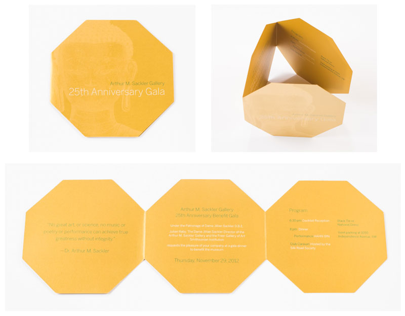
Figure 5. Playing with perimeter shape: an octagonal-shaped Tri-Fold designed as an insert for a 25th Anniversary Gala invitation (Photos: Chris Paulis Photography)
Three Creative Brochure Formats for Smaller Budgets
My favorite formats are the ones that offer a lot of bang for the buck, and these three are at the top of my list. Another qualifier for this list is that none these formats require die cutting. If you want to try any of these on for size, you can download a free reference template, place it into InDesign, and design your own.
Wrapped Stepped Accordion
One of the most exciting lower budget format solutions that doesn’t involve a die is a Wrapped Stepped Accordion (Figure 6). This design features stepped, zig-zag accordion panels and a protective wrap cover that seals the edge so that you can mail it with or without an envelope. You can do great things with the stepped panels, organizing information or creatively cropping imagery.
Broadside Reveal Brochure
The Broadside Reveal Brochure is a unique format that actually finishes into a Tri-Fold but holds a surprise (Figure 7). The magic is in the unexpected slice of imagery that is revealed when it’s folded and the broadside panels that open up and down into a larger poster spread.
6-Panel Mega Brochure
The 6-Panel Mega Brochure is an oversize format that offers a lot of real estate for graphics and a compact format for mail. Think of an oversize three-panel Tri-Fold that is folded in half one more time on the long dimension. The net result is six panels and an almost newspaper-like size and proportion. These are great for real estate, retail products, and art exhibits (Figure 8).
Three Creative Brochure Formats for Bigger Budgets
When your budget has some extra room for… well… extras, here’s what generally drives the budget up in the format category:
- Hand folding, which can be driven by low quantity or complexity of the fold
- Added processes, like die cutting, gluing, taping, tipping on of elements
- Oversize proportion, which could mean length, height, or both
- Specialty coatings, paper, and print effects (this is unrelated to formats specifically, but it counts)
Now, where it gets interesting is that having any one of the above does not necessarily mean you’ll bust your budget, so always check with your printer before you rule out an idea. (Remember the exercise in modifying a Tri-Fold?) So, for example, a larger, folded brochure that is folded entirely by machine (efficient production) is not going to lead to a huge jump in budget. Paper will be your biggest cost in that case. Start to layer these options together, however, and it adds up. An oversize brochure (plus higher paper cost) with a custom die cut that also must be glued (plus two extra processes) and hand folded (plus human effort instead of machine) is in a different pricing category entirely. But there’s nothing wrong with spending extra money in exchange for impact on a targeted, high-value customer. That’s where your marketing strategy comes in: So as long as your decisions are calculated and you know what’s involved cost-wise, you’re golden. A quick discussion with your print service provider can go a long way. After all, nobody wants the embarrassment of accidentally selling a client an idea they can’t afford. So, if you’ve got a bit of padding in the budget, here are three of my favorite formats. If you like any of these, you can download a free reference template, place it into InDesign, and design your own.
Folded Cross Catalog Wrap
A wonderful, oversize format, the Folded Cross Catalog Wrap works well on its own or with a nested catalog or marketing brochure on the inside (Figure 9). Among many things, I’ve seen this used as an impressive acceptance packet for universities, as a promotional brochure for high-end vehicles, and as a fun holiday-gift-themed wrap for a toy catalog.
Large T-Cross Mailer
The Large T-Cross Mailer is unexpected in shape, has great presence, and offers a really nice roll down or out, depending upon the orientation you choose for the layout (Figure 10). These make a big impression in the mail.
9-Panel Reveal
There is something very exciting about the 9-Panel Reveal format. It really is a journey to open, and you can treat every panel as its own unique step in the journey. The panels can build on a message, or you can have the panels work together to form an image, much like Figure 11’s example from Jennifer Williams.
Making the Most Out of What You Have
The nice thing about print formats is that you always have options—no matter what budget you’re working within. We talked about shortening and adding panels, adding interaction, and changing shape and proportion, as well as the layering of production processes and the effect it has on pricing. That’s a lot of ideas to breathe new life into your projects and give you the confidence to think beyond the basic Tri-Fold at your next opportunity. Give one—or more—a try!
Commenting is easier and faster when you're logged in!

Recommended for you
InDesign Magazine Issue 148: Designing for Social Media
Issue 148 has articles on designing for social media, dielines for creative fold...

Creative Folding for Every Budget
Whether you’re a high roller or watching every penny, you can find an eye-catchi...

Working with Dielines for Creative Folded Brochures
Learn the right way to prepare eye-catching brochures that your printer and your...