

Small caps are capital letterforms that usually approximate the height of the lowercase, but can be taller in certain fonts. They are a very useful feature for both text and display type. When used with small text, they are frequently applied as a lead-in to lengthy copy in magazines, book chapters, brochures, and other written materials. Small caps can also be used alongside full caps (this combination is referred to as cap and small cap), for title pages, book and magazine headers and footers, film and video titling, logos, letterheads, and many other applications.
In spite of their usefulness, small caps are a frequently overlooked, as well as misused, feature of typesetting. While many designers are aware of small caps and apply them to their work, they often don’t know the difference between true-drawn small caps and the fake, computer-generated variety that are considered a type crime by those in the know. What’s more, programs like InDesign can be misleading, offering fake small caps without warning.
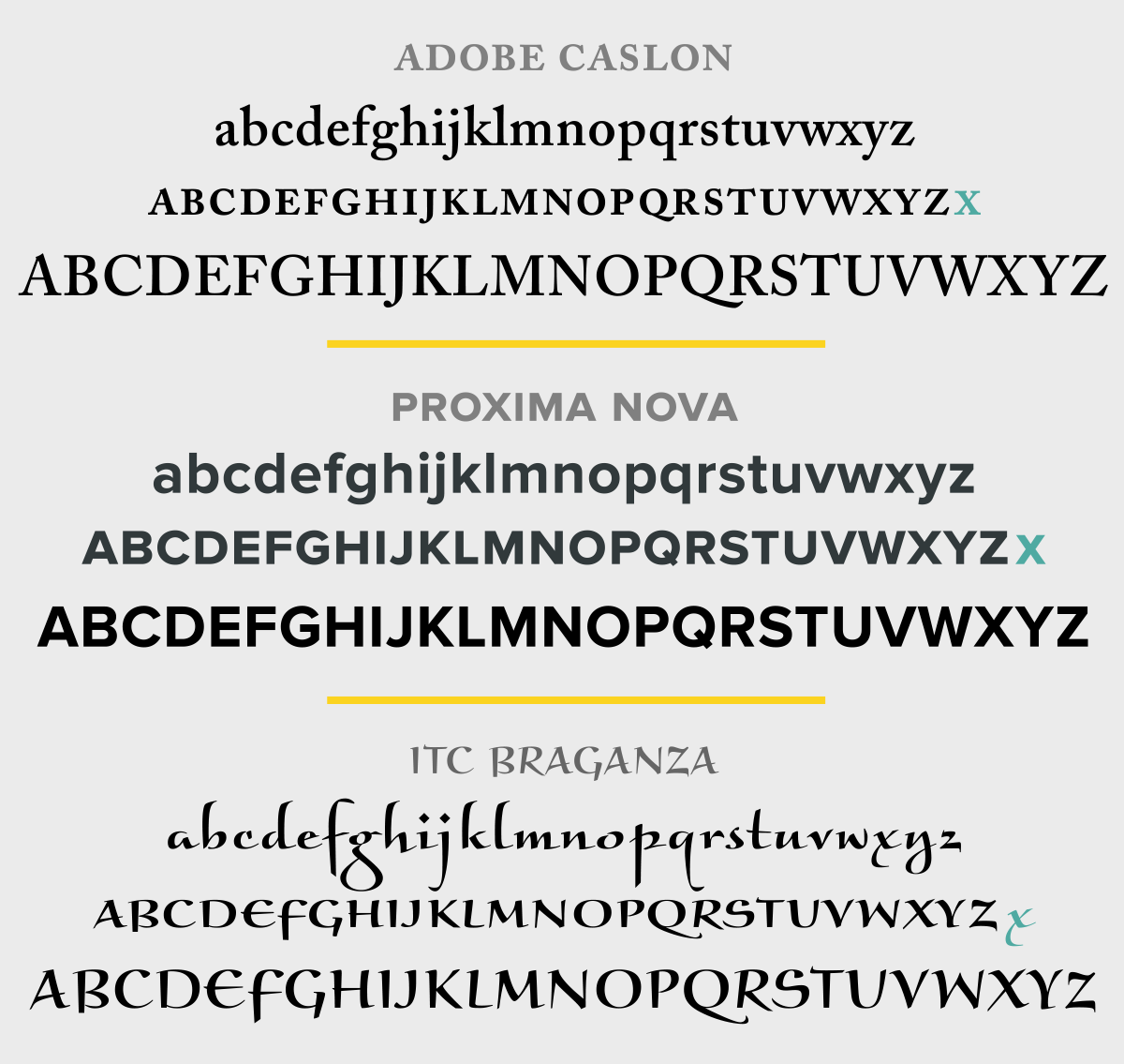
These three fonts contain true-drawn small caps. You can see their relation in height to the lowercase as indicated by the turquoise lowercase x at the end of the small cap line.

Small caps can be used as a companion to full caps, as seen in the title and byline in this example, as well as for a lead-in to text, shown below them.

Sometimes the use of all small caps (below) is a better solution for an all-cap setting than full-sized caps (above), as their heavier, more open appearance can make them a more readable choice for small text. (Note that this example is set large to see the differences between them.)
True-Drawn vs. Fakers
So what’s the difference between the true small caps and the fakers? True-drawn small caps are designed by the typeface designer or foundry to match the weight, width, and spacing of the rest of the character set. They blend in beautifully without creating discord, or disturbing the overall color and texture of the type. On the other hand, computer-generated small caps are just reduced capital letterforms. They look too light compared with the rest of the typeface, and frequently too tight, too narrow, and not in proportion as well.
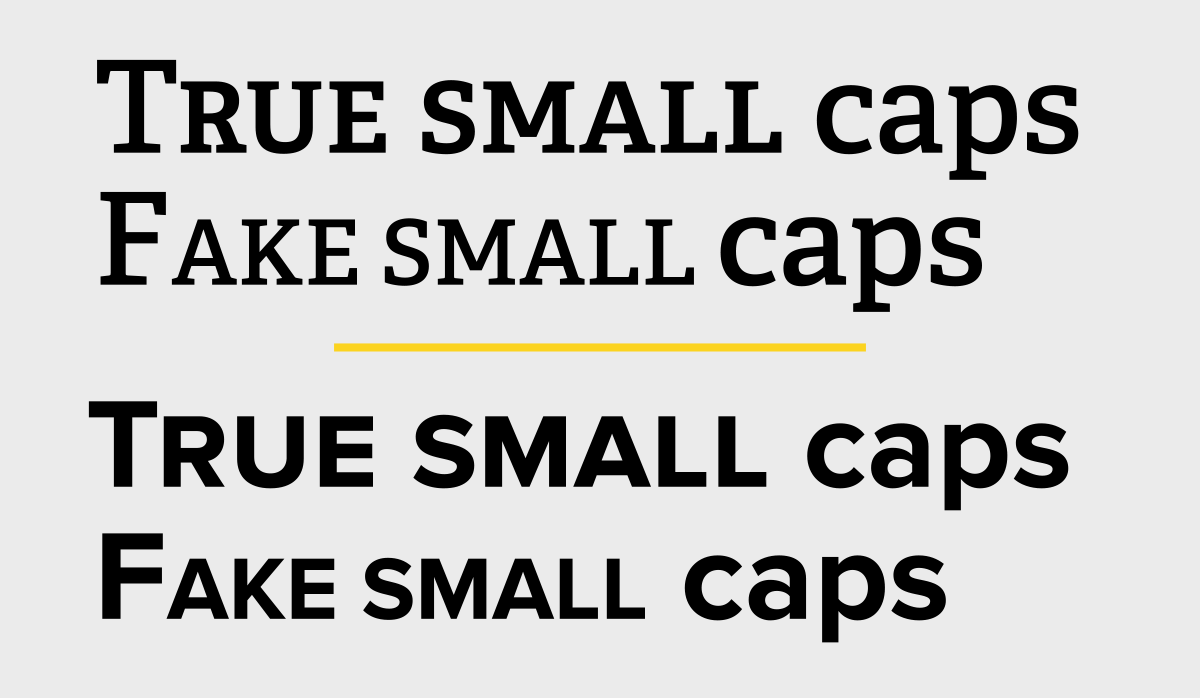
The difference between the true-drawn and the fake small caps is easy to see in these two examples: the fake, computer-generated ones are too light, and frequently too narrow and tightly spaced, while the true small caps blend in beautifully.
The only fonts you’ll find with true small caps built into their character complement are OpenType fonts. This is because OpenType can accommodate a very large number of glyphs. In contrast, the older Type 1 and TrueType font formats have a very limited character complement, and therefore do not have room to include many special characters. In some cases, separate fonts were created for these older formats to include small caps and other desirable glyphs, but most did not have them at all.
This does not mean that all OpenType fonts contain small caps. So you should check for them before purchasing a font and know how to find them in the fonts you already own. There are a couple of ways to do this. One way, in InDesign, Photoshop, or Illustrator, is to look in the Glyphs panel, where they often appear under the subset Small Capitals From Capitals. Another way is to look for them through the OpenType panel, described below for InDesign.
Locating & Applying Small Caps
There are a couple of ways to find real small caps in Adobe Creative Cloud software.
In InDesign, Photoshop, or Illustrator, look in the Glyphs panel where small caps often appear under the subset Small Capitals From Capitals.
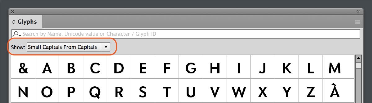
One way to see if there are true-drawn small caps in an OpenType font is via the Glyphs panel subset Small Capitals From Capitals.
In InDesign, you can also select a font, open the Character panel, and choose OpenType. Look to see if All Small Caps is unbracketed, which means they are available in that particular font. If they are bracketed, then true small caps are not available in that font.

Both the Small Caps and the OpenType All Small Caps options are located in the Character Panel menu. Note that both do slightly different things, as noted in the article below.
Applying True Small Caps
Once you know that true small caps are included in a font, there are two ways to apply them. If you just want the lowercase characters converted to small caps and the full caps (if any) to remain as is, then select the text, and choose Small Caps from the Character panel menu.
If you want both caps and lowercase to be converted to small caps, then go to the panel menu and choose OpenType > All Small Caps.
Beware of Fake Small Caps
Don’t use the Small Cap option in a font that doesn’t have true-drawn small caps. If you do, you’ll get fake, computer-generated small caps that are just reduced capital letterforms. They will look too light, too tight, and often too narrow. This is considered a type crime, and it’s easily avoidable nowadays since so many OpenType fonts have true-draw small caps. Just know ahead of time if you need small caps for a project, and only select fonts that have them.
Another way to head off this problem is to change InDesign’s preferences so it doesn’t make fake small caps. In Advanced Type preferences, change the Small Cap value to 100%. Then if you apply small caps in a font that doesn’t have them, the result will look like all caps.

This article was last modified on August 19, 2022
This article was first published on August 19, 2022
Commenting is easier and faster when you're logged in!

Recommended for you

Centering Lines of Type? Don't Trust Page-Layout Software
It’s easy to have too much faith that our page-layout programs will do the right...

TypeTalk: Standard and Discretionary Ligatures
Q. What exactly is a ligature, and what is the difference between a standard and...
TypeTalk: The Quick Brown Fox
TypeTalk is a regular blog on typography. Post your questions and comments by cl...