
Q. Why is stretching or squeezing type in headlines considered a type crime? I occasionally get this request from art directors, clients, and marketing. I know it’s considered wrong, but I don’t know how to reply to them.
A. Distorting type in any way, whether it be stretching, squeezing (AKA squishing), or slanting, is a type crime of the highest degree. It distorts the proportions in a way that destroys the integrity of the letter shapes. It can also reduce legibility by creating a fun-house effect.
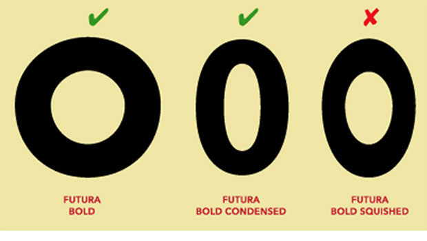
You can see the effects of artificially condensing a typeface in the Futura example below. It has its own condensed version that maintains pleasing curves and the minimal stroke contrast of the regular version. The computer-scaled version to the far right fails miserably in comparison, with its ugly egg-shaped contours and exaggerated stroke contrast.

Check out the difference between Futura Oblique and the computer-generated slanted version below. The fake slanted version on the right has a more distorted shape, as well as uneven and exaggerated stroke contrast.

Finally, observe the unpleasant result of stretching Univers. The true-drawn extended version, second from the left, looks far better than the two examples of computer stretching on the right.

A way to avoid these requests for artificial distortions is to pick a typeface or type family that contains legitimate, true-drawn width variants. When created by a skillful type designer, a width variant maintains the weight contrast between thick and thins; the relationships of the horizontals and verticals; the axis of the character stress of italics (when applicable); the thickness and integrity of the serifs, if any; the overall width of character; and the spacing.
Don’t give in to these requests to “set to fit” or fill in white space! Instead, work with the chosen typefaces and other elements to make a successful composition and overall design.
This article was last modified on February 21, 2025
This article was first published on July 29, 2010
Commenting is easier and faster when you're logged in!

Recommended for you

The Measure of Type
Agates. Ciceros. Nuts. Even people who use type every day may not know these wei...

Typography Tips From the Pros
David Blatner asked eight type titans to disclose their dos and don’ts.

TypeTalk: The Typographic Expressions of Stefan Sagmeister
Stefan Sagmeister is an award-winning designer known for his bold, innovative wo...