
Q. Can you explain the “three-letter approach” to kerning?
A. When I first began learning about typography, the concepts of kerning and proper letterfit were mysterious and challenging. Then Ed Benguiat taught me a way to better see spatial relationships between letters when kerning a headline or any display type.
As I discussed in my “Kerning Principles” column, the goal of kerning is to create even color, texture, and balance between all characters. All character pairs should theoretically have the same negative space between them. But analyzing the spacing of many characters and/or several words at once can be overwhelming without a strategy. That’s where the three-letter technique serves you well.
The technique goes like this: When looking at a headline, start from the beginning and isolate three letters at a time, either by blocking them off with your hand, two pieces of blank paper, or, as you become adept at it, just mentally.
If you’re looking at a computer screen, enlarge the type as much as necessary to get a more accurate representation of the actual outline of the characters as well as the space between them. Just make sure you can still see the entire word. Look at the volume of negative space between each pair of letters and determine if they’re relatively even.

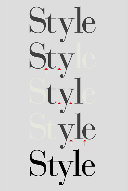
Figure 1. This word, commonly seen in headlines and ads, is a tough one to space properly. By isolating three characters at a time, it becomes easier to see the unbalanced negative spaces, which can then be adjusted for more even overall spacing, as see in the bottom example.
If the negative spaces are noticeably different, you might need to open or close one or both letter pairs a bit. But before you make any changes, use the three-letter technique for the entire word or several words to get a feel for the rhythm, flow, and balance of the headline. The optimum overall spacing depends on the typeface (serif, sans, and overall design characteristics) and on the intended size of the actual type.
Once you get a sense of the overall rhythm of the spacing, begin to open or close some of the worst spacing with your software’s kerning feature. Then step back, take a look, and go through the process again, adjusting as much as necessary to create even typographic color. Print out the type often during this process for a more accurate representation.
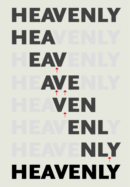
Figure 2. All cap settings, especially those with diagonal letterforms such as A, V and Y, are often poorly spaced. The three-letter technique makes it easier to find the offending combinations, which can then be opened or closed for a better overall result.
Note that certain character pairs, such as Ty and rk, always have a lot of negative space between them. Don’t over-tighten them, and don’t use them as a guide for the rest of the character combinations.
To see more illustrations of kerning principles, read my “Kerning in Action” column. Once you become adept at this technique, kerning a headline will undoubtedly become faster and easier, and you will be able to kern without fear.
Confused about kerning’s definition? Read my account of the word’s evolution.
This article was last modified on July 1, 2022
This article was first published on September 15, 2011
Commenting is easier and faster when you're logged in!

Recommended for you
Case Study: Designing a New Logo
Developing a new logo for an established brand is always a tricky thing. You wan...

TypeTalk: Say No to Word's AutoFormatting
TypeTalk is a regular blog on typography. Post your questions and comments by cl...
Adobe's New Open Source Font: Source Code Pro
This past summer, Adobe released their first open source type family, Source San...