

There are many script typefaces to choose from, and those that are the OpenType font format may have dozens (or even hundreds) of alternate characters. Script typefaces can be expressive, eye-catching, and fun to use, but if you are not careful, it’s easy to misuse them, leading to unattractive, unreadable type. Here are a few dos and don’ts to get you started:
Dos for Working with Script Typefaces
- Do pay attention to point size. When selecting a script typeface, consider the range of sizes at which you’ll be setting it. Make sure it looks and reads well, and will print successfully, at all of those sizes. What looks attractive, inviting and readable at 24 or 36 point might look crowded and hard-to-read at 10 or 12 point.
- Do adjust letterspacing as necessary when setting scripts on a curve. When you set a connecting script on a curve, the spacing between some character combinations can be altered in a way that disturbs the smooth connection. To remedy this, use tracking and/or kerning as necessary to reconnect those characters. If the connections are irreparably disturbed by the curve, you might need to rethink your layout or change to a different font.
- Setting a connecting script on a curve will disturb the connections between certain letters. It might be fixable with the use of tracking and kerning, but in some cases (such as this example set in Shelley Allegro Script), it is probably best to change the font or your layout.

- Do combine with care. Scripts have a lot of personality and usually take center stage, typographically speaking. When combining them with other typefaces, avoid other scripts that will compete and clash. The simpler and more neutral the companion font, the better.
Don’ts for Working with Script Typefaces
- Don’t set all caps. Most script typefaces have decorative capital letters that are designed to work well with the lowercase, not with other caps. For this reason, most scripts should not be set in all caps, as this can render them unreadable.
- This all cap swash setting (upper) is almost impossible to read. It looks much more attractive and, most importantly, readable, when set with an initial swash cap and the rest, all lowercase (lower). Set in Cancellaresca Script.

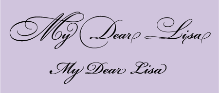
- Don’t use too many swashes and alternate characters. Some OpenType script fonts have lots of alternate characters, many of which are very elaborate and decorative. For the best effect, use these characters conservatively so they don’t overwhelm your design.
- Don’t use too many decorative swash and alternate characters at a time (upper), or your work runs the risk of becoming too busy and hard-to-read. Use them judiciously for the best effect (lower). Set in Bickham Script Pro.
- Don’t track out connecting scripts. Many scripts are connecting, that is, many of the characters have joining strokes which are designed and spaced to connect perfectly with adjoining characters. When you open the tracking of this kind of script, it can alter the carefully designed letter spacing, and sometimes disconnect characters intended to connect.
- Don’t open the tracking of a connecting script (upper) or it will disconnect the carefully joined characters (lower). Set in Greyhound Script.

This article was last modified on April 14, 2022
This article was first published on March 10, 2011
Commenting is easier and faster when you're logged in!

Recommended for you

New Typeface Design Program Is Unique In the United States
Press Release David Greenstein, Ph.D, director of continuing education and publi...
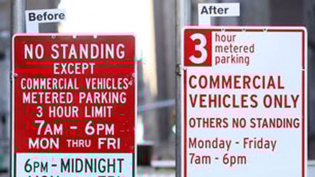
New York street signs get a much needed redesign
Drivers in Manhattan will soon see just how much impact good type design can hav...

What Makes A Good Typeface?
Here are some guidelines to help you tell a good typeface from a poorly designed...