

Q. I’m working on a brochure and need to display the content in a conservative, yet inviting way. What guidelines would you suggest to make long blocks of text more inviting?
A. We’ve all come across type-heavy pieces that are dull, monotonous, or uninviting. Where do they wind up? All too frequently, right in the garbage or shredder. There is an abundance of text-heavy material being produced, and it can be challenging to keep it visually engaging, and the content digestible to its intended audience. Here are ten factors to consider, along with recommendations to help attract and hold your reader’s interest—and keep your work out of the trash!
Typeface
Select a clean, legible typeface that is appropriate for your message and audience, as well as easy to read at the size(s) it will be used at. The type style should not overpower the message with too much personality. Make sure to use the most readable weight, such as book or regular; very light or too heavy type styles are harder to read for lengthy copy, and best saved for smaller settings (Figure 1).

Figure 1: The upper two examples are set in typefaces (Noteworthy and Alphatier) whose personalities are too assertive for lengthy copy, and inappropriate for this rather serious content. The example below them is set in Adobe Garamond, a more suitable typeface for lengthy copy of this nature. Excerpt from Outlines of Greek and Roman Medicine, by James Sands Elliott.
Line Length
Set the text at a comfortable, moderate width/line length for maximum readability. Avoid extremely narrow columns that can become tiresome to read for lengthy copy, as well as very wide columns that can result in overshooting or undershooting the next line when going from the end of one long line to the beginning of the next; both can visually tire and frustrate the reader.
Line Spacing
Apply generous line spacing so type doesn’t appear too dense and crowded, and thus uninviting and more challenging to read. Three or four points of leading is a good starting point for most typefaces, although what looks and works best depends on the individual typestyle and size (Figure 2).

Figure 2: Tight line spacing reduces the readability of an otherwise legible typeface, such as Caecilia. More generous line spacing makes text easier to read, which helps keep the reader engaged.
Subheads
Use subheads whenever possible to clue the reader into the overall content of the piece. Not everyone has the time or the inclination to read an entire brochure or booklet, so breaking up the content in a way that allows readers to scan for the most important elements (to them) will help hold their attention (Figure 3).

Figure 3: The addition of subheadings within lengthy text breaks up the copy into more digestible bits, and allows the reader to scan for topics of particular interest, as illustrated in the ‘before and after’ above. Excerpt from Type Classifications, by Allan Haley.
Margins
Create roomy margins and ample white space, both of which help draw the reader in. A crowded layout with tight margins and a busy design will be harder to read and absorb, repelling some readers. For example, which attracts you more—a few lines of type elegantly placed in the middle of an ad or an article, or a crowded layout where you don’t know where to look first?
Bullets
Consider bulleted lists when appropriate to the content, as they can help organize lengthy text and listings into digestible bits. They can also provide an opportunity to incorporate simple graphics in place of more traditional round bullets, as well as a bit of color to keep the text visually interesting.
Pull Quotes
Select and insert pull quotes consisting of tasty tidbits of information extracted from the article, throughout the piece. They will help invite and entice the reader into and through the article.
Graphics
Include images, charts, and graphics that will serve to break up the text. Use them to illustrate a point, simplify complicated information, or just make the piece more interesting and engaging. Keeping a page visually appealing is a sure way to hold your readers’ attention (Figure 4).
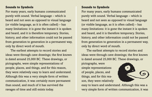
Figure 4: The insertion of a graphic element, whether a photo, illustration, chart, or dingbat, creates visual interest and provides some relief to a text-heavy page or piece. Excerpt from Type Rules! The designer’s guide to professional typography, 3rd ed., by Ilene Strizver.
Contrast
Create strong contrast between headline, subheads, body text, and other textual elements. If they all blend together with the same color, texture, and “grayness”, the reader will not easily be able to recognize the individual elements and gauge the intended hierarchy.
Hyphenation
Limit hyphenation to no more than two hyphens in a row, each containing three or more letters before and after the hyphen. Too many breaks and interrupted words (especially in lengthy text) make the reader work harder and reduce readability.
This article was last modified on April 7, 2022
This article was first published on July 2, 2021
Commenting is easier and faster when you're logged in!

Recommended for you
TypeTalk: (Re)Introducing Tobias Frere-Jones and his latest typeface, Mallory
He’s back! Two years after launching his new foundry Frere-Jones Type, Tobias Fr...

Linotype's New Serif, Script, and Stencil Fonts
Malabar For the next 30 days, all customers who purchase any font licenses at Li...
TypeTalk: Creative Indents
TypeTalk is a regular blog on typography. Post your questions and comments by cl...