
Treasures From the Vaults
We dug deep into the depths of InDesignSecrets to reveal some great "lost" tips.

This article appears in Issue 111 of InDesign Magazine.
You’ve probably heard about those amazing people who can remember everything they wore on every day of their lives, or can recall every line of every episode of Seinfeld from memory. We aren’t like that. We occasionally forget things (sometimes more than occasionally). We bet you do, too, and you probably appreciate a gentle reminder from time to time.
So perhaps it’s not surprising that we constantly find old articles that we ourselves wrote or edited… and yet have completely forgotten about over the years. That’s what happened recently as we delved into the thousands of posts on InDesignSecrets.com. We kept exclaiming, “wow, what a great tip! I forgot about that one.”
That’s when we realized that it was time to pull some of these out the dark recesses of the vaults and bring them back into the light, publishing them in this issue of InDesign Magazine. We’re sharing a wide variety of the fun and the funky, the useful and the unusual tips and techniques that InDesignSecrets has been publishing gratis for over a decade.
The amazing thing is that even tips from years ago are still very relevant to InDesign users today. Our goal is to help make you more productive and have more fun while you work. We think these “secrets” will do the trick!
Find Where That Color Is Used
by Anne-Marie Concepción
How can you find out where a color is being used in your layout? If only there was a Find Color feature that worked like the Find Font command and dialog box in the Type menu.
You can use Find/Change to search for any text colored with a particular swatch (use the Find Format area, revealed by clicking the More Options button in the
Find/Change dialog box), but that doesn’t help you find any instances of that swatch used in a stroke, a fill, or in imported artwork.
Here’s a workaround: Use the Separations Preview panel. Open the panel from the Window > Output flyout menu, and change the View to Separations from the panel’s drop-down menu. (Why the View drop-down defaults to “Off” is beyond me … sigh … topic for another post.)
The panel shows a list of all the process colors and any spot colors used in the document, equivalent to the plates that would be output if you printed the layout to color separations (Figure 1).
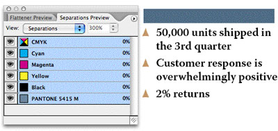
Figure 1
Turn off the visibility (click the eyeball icon to hide it) next to all the color plates in this list except the one you’re looking for. For example, if you want to see where a spot color is used, turn off the visibility of the four process colors: Cyan, Magenta, Yellow, and Black; or just turn off the visibility of the very first entry in the panel, the composite CMYK plate, which hides/shows all the process colors at once.
When only one separation is visible, InDesign indicates the use of that color on a page with “black ink,” similar to a film separation (Figure 2).
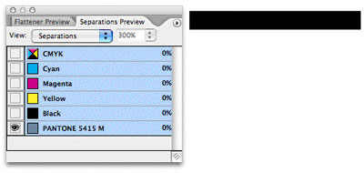
Figure 2
That makes it easy to spot on the page; and if you have a lot of pages in your document, you could just Zoom Out to view a couple or three spreads at a time and then scroll through it, keeping an eye out for any black splotches.
Select a splotch with the Selection tool, choose Off from the Separations Preview panel’s View menu, and you’ll see the item in full color, still selected. (A great way to track down small instances of spot colors used in placed PDFs or intricate Illustrator drawings, for example.)
Finding non-spot colors
What if the color you’re looking for is a CMYK or RGB swatch? The Separations panel won’t show you these. Custom CMYK swatches are broken out into their individual plates, just as they would be if you printed seps. RGB colors are converted to process equivalents. Separations Preview assumes that’s what you’re going to have InDesign do in the end, otherwise why would you be looking at the panel? So the panel shows you how they’ll be converted.
Here’s how to work around this over-helpfulness: In the Swatches panel, double-click the custom CMYK or RGB swatch and change the Color Type from Process to Spot. Here, I’m trying to find where my golden brown CMYK color, C19 M35 Y0 K0, is being used in the document. So first I double-click its entry in the Swatches panel and change its Color Type to Spot (Figure 3).
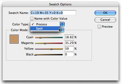
Figure 3
That forces Seps Preview to list it as a distinct plate. Turning off all other colors except for this one spot CMYK plate (separation) makes it easy to find where it’s being used in my document. Anything that shows up in black, such as the bullets shown in Figure 4, are filled and/or stroked with this color.
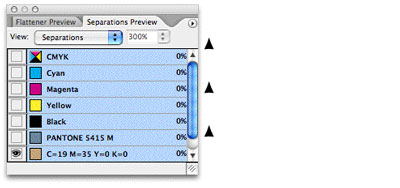
Figure 4
Of course, after you’ve found where the color’s used (and had your way with it), you’ll want to change its type back to Process or RGB again. Double-click its entry in Swatches, change the Color Type back to Process, and then click OK. Don’t worry, this move doesn’t affect the color mix of the swatch in any way.
To recap: The advantage of using the Separations Preview method to track down colors is that it shows all instances of the color, including objects created with InDesign tools, live text, imported images, and even spot-colored objects that were in a PDF you placed into a layout as artwork.
When InDesign Ignores Your Leading Values
by David Blatner
We’ve received two emails this week regarding leading—or, more specifically, InDesign apparently ignoring or changing the leading values of paragraphs.
For example, G. wrote:
…The problem arises when we copy and then paste a text frame into a new document—some of the text blocks (not all) change their leading. But this is the thing: when highlighted, the text blocks display exactly the same leading as the original… same font, size, leading—but on the page they look like the space between the lines has been doubled… what’s going on!?
As Insp. Poirot would say, “Ah, we must use the little gray cells, I think.” (I always like to think of David Suchet at times like these.) The clue to this mystery is that the leading value (what’s listed in the Control panel) doesn’t match the reality on the page. This can happen for at least two reasons. (I can actually only think of two right now, but I’m hedging my bets by saying “at least.”)
- Vertical Justification. The first instance in which InDesign can ignore leading is when the Align pop-up menu in the Vertical Justification section of the Text Frame Options dialog box (Command/Ctrl+B) is set to Justify. Vertical justification typically overrides your leading values. You can return to normal leading values by increasing the Paragraph Spacing Limit in the same area, which lets InDesign add space between paragraphs instead of between each line.
- Align to Grid. InDesign also throws your leading values out the window when the paragraphs have Align to Baseline Grid turned on (in the Control panel or the Paragraph panel). Align to Baseline Grid is a powerful force of nature, but as we have said in the past, it is not to be used lightly or by the faint of heart. This is the Number One source of “what the heck is InDesign doing to me now!?” comments by users worldwide, I’m convinced. When align to baseline grid is on, your leading is off. Period. Bye-bye leading values. It’s “snap to the grid or talk to the hand” time. The grid can, of course, be managed in the Grids pane of the Preferences dialog box, or the Baseline Options tab of the Text Frame Options dialog box.
Now here’s the problem: Sometimes align to grid is turned on for a paragraph style (say, for instance, the Basic Paragraph Style, if someone has been so foolish as to edit that style definition) in one document, but not in another. In that case, when someone copies text from document A to document B, the leading goes haywire!
Why won’t my text move up?
Here’s a bonus corollary to the leading value issue. A prominent and bright industry presenter asked me recently why some text would simply not move any further up on the page. He sent me the file, and it was true: You could drag the text frame all the way to the top of the page, but the first line of text—a headline—would not move any higher than about 2 inches from the top of the page. My little gray cells were baffled. But then it came to me: Yes! Align to baseline grid. The fiend. The menace. Yes, it was true; when I turned That Feature off, the text could move anywhere.
Why was it stopping so low on the page? Because the Start field of the Baseline Grid was set to 14p! The Start field determines where the first baseline grid appears. And if something is locked to one of those infernal baseline grids, then it ain’t moving higher!
Turning Off Hanging Punctuation for Quotes in the Middle of a Paragraph
by David Blatner
Many of you know I’ve been working on a book called Spectrums. The designer is Scott Citron, whom many of you know, and he has done a terrific job laying out this complex book. However, the production editor recently noted that while she doesn’t mind quotation marks hanging out in the left margin at the beginning of a paragraph, she doesn’t like it when the quote marks are in the middle of the paragraph.
As you may know, InDesign handles “hanging punctuation” via a feature called Optical Margin Alignment (Figure 5), which lives in the Story panel (Type > Story). OMA affects every character along the column edge, not just punctuation—that’s why capital Ts and Ws and letters with rounded edges hang out a little bit. But the effect is way more obvious with punctuation, and most of all with quotes (Figure 6).
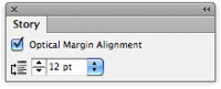
Figure 5
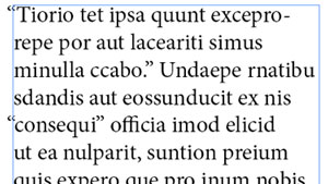
Figure 6
Unfortunately, you can only turn OMA on or off; you can’t say “just apply it to some characters and on some lines.” But the production editor’s request got me thinking, and… well, here’s one way to do it.
First, do a GREP find/change for: ~{ (that’s a space, tilde, curly brace, and replace it with: ~[~{ (that’s space, tilde, square brace, tilde, curly brace).
That adds a single quote to the left of every double quote, but only if there’s a space before it. That is, it doesn’t do anything for quotes at the beginning of a paragraph (Figure 7).
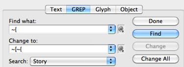
Figure 7
After you click Change All, you’ll get an extra character inserted (Figure 8). Note that technically you don’t have to use a single quote—you could use any character before the double-quote—but the single quote is convenient here.
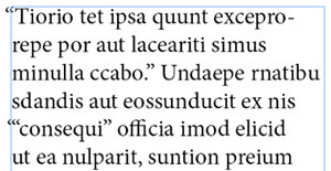
Figure 8
Step two is to add a GREP style to this paragraph style. You need to create a character style that turns the text Paper and applies –100 tracking (Figure 9). The exact tracking value is actually dependent on the font and the effect. –150 might actually be slightly better.
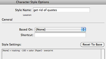
Figure 9
After you have a character style, you can apply it as a GREP style inside the paragraph style definition (Figure 10).
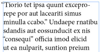
Figure 10
That GREP code is '(?=") which means “any single quote that is immediately followed by a double quote.” It will make the single quote white and “disappear” it (with kerning) when it’s in the middle of a paragraph. But at the beginning of the paragraph, the optical margin alignment applies to the single quote (hanging it) and leaves the double-quote slightly indented (Figure 11).
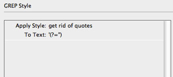
Figure 11
Of course, there are a couple of things to consider when taking advantage of this. First, if you’re going to export the text as EPUB or HTML or even RTF/Word, you’ll want to remove that extra single quote first, or else it will appear in the exported file. (You could even use the Conditional Text panel and the Find/Change panel to apply a condition to those single quotes, then turn off that condition before exporting.)
Also, it’s still not perfect, because the negative tracking pulls the quote out into the margin a tiny bit. But you need the negative tracking so that the single quote doesn’t take up space for quotes in the middle of the line.
Nevertheless, we think this may solve the problem for this book, and perhaps for you, too, next time you run into this kind of issue.
Easier Import of Complex Excel Spreadsheets
by Keith Gilbert
Imagine you have a large Excel spreadsheet, and you need to import sections of the spreadsheet into InDesign as separate tables. Rather than saving multiple copies of the spreadsheet, each containing the specific fragment you need, or laboriously copy and pasting into InDesign, there’s a better way.
When you choose File > Place and click the Show Import Options button, the dialog box shown in Figure 12 appears. Normally, you’d have to use a cell range such as B6:F18 to designate which of the cells in the larger spreadsheet you want to import. But finding and remembering those coordinates can drive you batty.
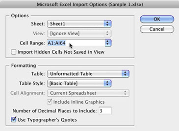
Figure 12
A better way is to use a “named range.” In Excel, just select the cells that you want to place into InDesign, and then choose Insert > Name > Define (Mac) or right-click and choose Name a Range (Windows). Then type a name for the range, and click OK. You can have as many different named ranges as you want in a single spreadsheet.
Then, in InDesign, choose File > Place, and click Show Import Options. In the Cell Range drop-down list, you will see each of your named ranges, ready to place in your layout (Figure 13).
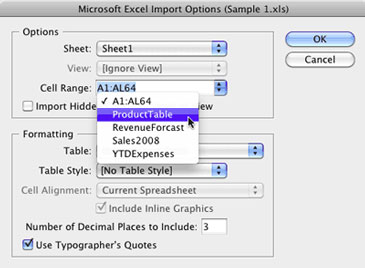
Figure 13
Using the Shift+Arrow Keys to Extend a Text Selection in Both Directions
by Ashley Mitchell
Everyone knows that you can hold down the Shift key and then use the arrow keys to extend a text selection. Well, this is all pretty straightforward when you want to extend the selection in just one direction, but what if you want to extend it in both directions?
In this case, you need to know one tiny little detail: When you hold down the Shift key, and for as long as you hold it down, InDesign will only shrink or grow the selection from the first side you started changing. The trick to getting the selection to shrink or grow in both directions is to temporarily lift up on the Shift key before switching the side of the selection that you want to change.
Let’s say that you have a word surrounded by quotation marks and you want to select the entire thing. You can double-click on the word and this will get you most of the way there, but you are still left having to select those pesky quotation marks (Figure 14).

Figure 14. Double-clicking selects the word, but what if you also wanted to select those quotation marks?
OK, no big deal, you say to yourself, you know how to get past this. So you hold down the Shift key and use your Right Arrow key to extend the text selection to include the right quotation mark (Figure 15). Sweet! You’re almost there!

Figure 15. Almost there! You are so close to selecting all the text you can almost taste it!
Keeping the Shift key held down, you then press the Left Arrow key to extend the selection in the other direction and select the left quotation mark. But do you get what you want? No! You have just unselected that right quotation mark and you’re right back where you started! (Figure 16)

Figure 16. What the…?! After using the Left Arrow key you are right back where you started. You clench your puny fists and raise them to the sky: Khaaaaaaaaaan!
OK, champ, calm down! Calm down! I believe in you. You can do this. Remember: Every time you press the Shift key you get to tell InDesign again which side of the selection you want to add to or subtract from.
Let’s start over from the beginning. Double-click the word to select it. Next, hold down the Shift key and press the Right Arrow key to select the right quotation mark. Good job! You’re doing it!
Now, before you hit that Left Arrow key, lift up on the Shift key for a second. Now press the Shift key again and use your Left Arrow key. And you did it! All of the text is now selected! You rock! (Figure 17)

Figure 17. Shift+Right Arrow key extends the selection to the right. Temporarily lift up on the Shift key. Shift+Left Arrow key now lets you extend the selection to the left.
So remember, the trick to extending a text selection in both directions is to temporarily lift up on the Shift key before switching the side of the selection that you want to change.
Shift+Left Arrow. Shift+Right Arrow. Mr. Miyagi would be proud of you.
Of course, I am not the first to come across this little bit o’ goodness. You can find an earlier post on this topic by the Blatman himself.
Why Is My Punctuation Floating High?
by David Blatner
Diane wrote:
I have imported a Word doc into InDesign and experienced some glyph weirdness. When I chose Adobe Garamond Pro, all of my commas, periods and other punctuation turned into smaller and higher-placed versions of themselves. But when I choose Garamond Premier Pro it doesn’t happen.
Floating punctuation is a classic problem having to do with the Fractions OpenType feature: When the Fractions feature is enabled, some OpenType fonts exhibit this behavior, and some don’t.
So check your paragraph style, your character style, or any local formatting that might be applied to the font. As we’ve said before, we do not recommend leaving the Fraction feature on for all your text—just apply it to the text that really is a fraction. You can turn this on/off from the OpenType submenu, in the Character panel menu, or the Control panel menu (Figure 18).
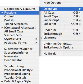
Figure 18
Also, check our Guide to OpenType Fractions for more information.
Auto-Reflowing Images in a Grid
by David Blatner
Here’s a cool trick that I learned from Karin Söderlund at an InDesign conference a few years ago in Stockholm: Anchor graphics into a text frame to allow them to reflow. In other words, don’t just make a big grid of images on a page; make each graphic an anchored object. The benefits are quite amazing.
For example, here’s some images on a page, with captions (Figure 19).
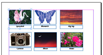
Figure 19
In this case, each graphic is grouped with a caption text frame and simply placed on the page. That makes it very hard to re-order them. I mean, can you imagine having to add a new image between the first and second frame, while keeping the others in order? Gah!
Figure 20 shows the same layout, but where each group is anchored into a text frame (each group has been assigned an object style to make placement and text wrap more consistent).
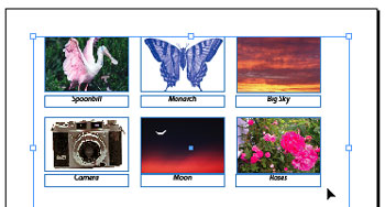
Figure 20
Suddenly, it becomes far easier to rearrange the items, because each object (each group, that is) acts like a single character in a story. Figure 21 shows what it looks like in the Story Editor.

Figure 21
To move one of the graphics, just select it with the Type tool and drag it to a new location in Story Editor (or copy and paste, or whatever). If you delete one, the rest all reflow into position. Or, you can add a new image by just inserting a new anchored object group into the proper place. In Figure 22, I added a picture of a zebra as the second image. Note how all the other images reflow to make room.
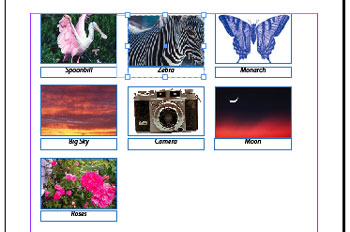
Figure 22
What’s even more astonishing about this technique is that it also lets you apply text wrap to these images. For example, Figure 23 shows what happens when I put a starburst violator over the upper-right corner of the page. Because we’re treating the images (or, in this case, the groups) as text, they reflow around the starburst easily and painlessly.
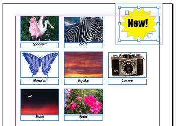
Figure 23
I wouldn’t use this technique for all my images, of course, but when I need a grid of images (or text blocks, or any other object) that may need to reflow, Karin’s technique is awesome.
Auto Style the Last (or First) Paragraph of an InDesign Story
by David Blatner
Some newsletters and magazines put the author’s byline at the end of the story, on its own line, in its own style. Wouldn’t it be spiffy if you could just have InDesign apply that formatting for you automatically? You can, with the help of a slightly non-intuitive GREP style.
The key to making this work is to consider how the last line of the story is different from all the other paragraphs. Remember, if you can identify a pattern, you can target it with a GREP expression. In this case, the last line of the story should never end with a return character! The story must end at the conclusion of the paragraph. In that case, the pattern we can search for is “any paragraph that does not end with a return.” Here’s the GREP style as I wrote it:
>^.+?$(?!r)
Figure 24 shows it in context, in the paragraph style.
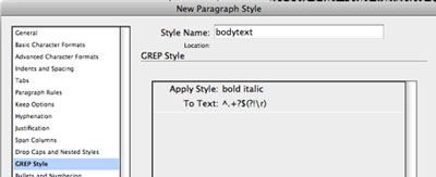
Figure 24
Figure 25 shows the result.
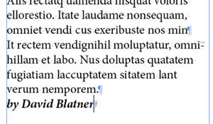
Figure 25
Note that I would have been at a loss as to how to write this if it weren’t for Kris Coppieters at Rorohiko pointing out that “no return at the end” idea. Thanks, Kris!
However, literally as I type this, I’m thinking… duh, there’s a far easier way! This code literally means “the last paragraph” of the story:
^.+?Z
I had forgotten about the “Z” code, meaning “the end of the story.” You could select the first paragraph of the story with A.+?$ (the dot-plus-question means “all the text”; the A, Z, ^ and $ are all for marking location: beginning of story, end of story, beginning of paragraph, and end of paragraph).
Now, someone is going to accuse me of cheating here because I’m applying a character style to the entire paragraph. I plead guilty! I would ordinarily avoid applying a character style to an entire paragraph, but there’s no other way of automating this, besides using a third-party plugin or a custom script. If cheating gets the job done efficiently and doesn’t cause too many other problems, then I’m all for it.
Also, someone else is going to argue that this will cause problems if there is other local formatting already applied to that text, such as a different style. Nope, try it yourself. Local formatting is always added after the GREP style, so it will not be overridden.
What is That Weird “A” Bullet Character in the Dialog Box?
by David Blatner
Krissy wrote:
Does anyone know what that bullet symbol with the A is called? And why anyone would use it as a bullet?
About half of the world’s InDesign users know what you’re talking about, and half have no idea because they see the bullet correctly! For those in the latter camp, Figure 26 shows what Krissy is talking about.
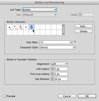
Figure 26
See that bullet character highlighted in the Bullets and Numbering dialog box? That’s what I see, too. But a lot of InDesign users don’t see that… instead, they see what’s shown in Figure 27.
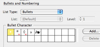
Figure 27
Oh! That character in the fifth spot makes a lot more sense, doesn’t it?! Kind of a lovely flourish bullet. Too bad it doesn’t work for the rest of us.
Technically the weird “A” character is Unicode 1F88, a.k.a. the Greek capital letter alpha with Psiili and Prosgegrammeni.
This mismatched character problem has been showing up for several years, and I finally figured out what the problem is, with the help of the amazing Thomas Phinney.
The problem comes down to font versions. Most people don’t think about fonts having versions, but they do! Whenever a font foundry creates a new version of a font, they give it a new version number, but almost no one ever pays attention to that. You can usually see it by choosing File > Get Info (Mac) or File > Properties (Windows). Even easier, you can choose the font in the Type > Find Font dialog box and click the More Info button (Figure 28).

Figure 28
If you look closely, on the 5th line, you’ll see that this version of Minion Pro is 2.112. But when I do a search on my computer, I find a bunch of different Minion Pro Regular fonts. If I install 1.021 from 2003, I get this kind of bullet shown in Figure 29.

Figure 29
Isn’t that crazy?! It’s a totally different Unicode character. Then, when I install a different copy of 1.021, from 2005, I get what you see in Figure 30.
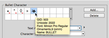
Figure 30
There we go! That’s what I wanted. But this is yet another, different Unicode character.
So what’s going on? Well, look at the GID number in that tool tip above… yes, the GID is the same. The GID is the “glyph ID number.” So, my best guess is that many years ago some Adobe engineer decided he or she wanted that floral bullet. Unfortunately, that character doesn’t have its own special Unicode value (it shares the same value as many other “bullet” characters) so the engineer decided to base the bullet character on the GID value—kind of like saying “just choose the 503rd character in Minion Pro.”
That was all well and good until a new version of Minion Pro came out, where the characters (glyphs) were encoded slightly differently. Ooops.
Solutions
There are a number of solutions for this problem, including finding an older version of the font and putting it in your document’s “Document fonts” folder. But my recommendation is simpler: Select the character in the dialog box and click that little ol’ Delete button to get rid of it.
Then click Add, and select yourself a new bullet character from a different font. If you want that floral bullet, you can find a very similar one in Zapf Dingbats (Figure 31).
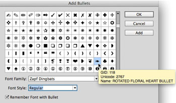
Figure 31
Mystery solved.
How to Type “The Last Page Number in a Book”
by David Blatner
You already know that InDesign has a “the last page number” text variable, right? To get that, you choose Type > Text Variables > Insert Variable > Last Page Number. And because it’s a variable, it automatically updates if the last page number of that document changes. Cool!
But what if you want “the last page number in a book”—that is, not the last page number in this document, but in the last file in a book panel? InDesign doesn’t have a variable for that.
(By the way, one reason why it doesn’t is that the same document can be in more than one book. I usually don’t recommend doing that, but if you did do that, the text variable would get mighty confused as to which book you were talking about.)
Okay, so there’s no variable, but sometimes we really need to grab that number. For example, if your headers are supposed to read “Page 1 of 28” or something like that. Here’s the secret: Use cross-references.
In order for a cross-reference to work, you need to point it to some text or a text anchor. I usually just throw a piece of text in a frame on the last page, like this (Figure 32).
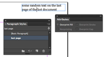
Figure 32
And you need to apply a paragraph style to that text. It doesn’t really matter what you use, but I make a style just for that one paragraph. Also, make sure that the text is in a frame that is set to Nonprinting in the Attributes panel (so it won’t print). I did that in Figure 32, but you can’t see it in the panel because I have the text cursor inside the frame. (If I had clicked on the frame with the Selection tool, you’d see Nonprinting selected in the Attributes panel.)
Now, back in your other document, you can use that page number by creating a cross-reference in the Cross-References panel. First you place your cursor where you want the page number to be displayed (I’ve put it inside a text frame in the header on my master page) (Figure 33)…

Figure 33
…and then when you click the New Cross Reference button, you can choose your “last page” paragraph (Figure 34).

Figure 34
To select that paragraph, I chose the last document of the book in the Document pop-up menu of the Destination section, and then I chose the paragraph style, and then I clicked on the paragraph I wanted to point to. Finally, note that I’m choosing Page Number from the Format pop-up menu. That means I will get only the page number in my cross-reference.
When I click OK, InDesign inserts the page number into the text frame (Figure 35).
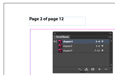
Figure 35
Of course, then if I later change the number of pages in any of my documents, the cross-reference will update automatically. See Figure 36, where I have added two pages to chapter 1.
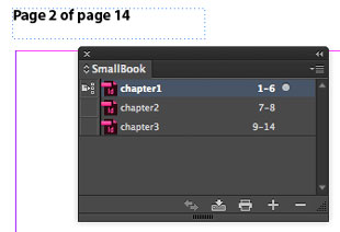
Figure 36
Important note: When you add the page numbers, the cross-reference page number doesn’t update on your page immediately! You sometimes need to give it a few seconds and you need to change the screen view. That is, it won’t update on screen until you change from one page to the next, or zoom in and out, or do something else that forces the screen to redraw.
Editing the cross-reference
If you look closely, you’ll see that the “Page Number” cross-reference we used above shows up as “page 14”—that is, it actually shows the word “page,” and we don’t want that. Fortunately, it’s easy to get rid of by editing the x-ref you made.
First, double-click the x-ref inside the Cross References panel to open the Edit Cross-Reference dialog box. Then click the little pencil icon next to the Format pop-up menu. This lets you change how the cross-reference shows up on your page.
In the Cross-Reference Formats dialog box, choose Page Number in the list on the left, and then click the + (plus) button at the bottom, which duplicates it. Now change the name, and remove the word “page” in the Definition. It should look like Figure 37.
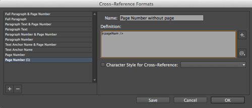
Figure 37
After you click OK, make sure your new format is selected inside the Format pop-up menu of the cross-references dialog box… then click OK. Now your page number should appear without the word “page” in it, like Figure 38.
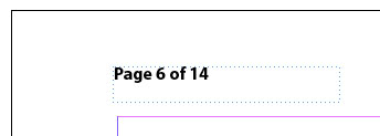
Figure 38
Whew! The good news is that you only have to do this once. From then on, you can copy and paste this text frame to the master pages of your other book documents. And once you make that cross-reference format, InDesign remembers it for other documents, too.
The Keys to the Vaults
Want to see more of the treasures from the InDesignSecrets vaults? The keys to unlock what you seek can be found in every article. They’re the categories and tags that we apply to every post. The categories are general classifications and appear at the top of each post, just above the title.
Tags are more specific and appear at the end of each post. You’ll also find a list of related articles at the end of each post. Click on any category or tag to see a list of articles with that category or tag applied.

You can also search the site from the menu bar or from Google, using the syntax: site:indesignsecrets.com followed by your search term.

Commenting is easier and faster when you're logged in!

Recommended for you

InDesign Magazine Issue 135: Use With Caution
We’re happy to announce that InDesign Magazine Issue #135 (July 2020) is now ava...
InDesign Magazine Issue 130: Accessible PDF
We’re happy to announce that InDesign Magazine Issue #130 (February 2020) i...

Quirky Ads Tout Improved Bikeshare Program
May is National Bike Month, and things are ramping up where I live, so I’m...