
Top 10 Type Tips
Nigel French shares his most important hints and techniques for working with type.

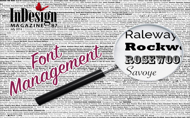
This article appears in Issue 87 of InDesign Magazine.
In most layouts, typography is the base, the rock, the foundation on which all else is built. Here are ten type tips—really more suggestions for best practice—that will help elevate your typography and by extension, your whole designs. These tips are rooted in print typography, but most are equally applicable to screen. Some are preventative, some cosmetic; some will cause a huge difference, others facilitate subtle improvements. There’s no hierarchy—they are all equally important, and I’ve just listed them as I thought of them.
1. Know the difference between Metrics and Optical Kerning
InDesign’s automatic kerning ensures that the space between characters appears optically even. For most of your text, automatic kerning is all the kerning you’ll need, but there are two types: Metrics and Optical. What’s the difference, and which is best?
Metrics uses the kern pairs that are part of the font’s design (Figure 1). The quality of Metrics kerning therefore depends on the quantity—and quality—of these kern pairs. Some fonts have thousands; others have none. The price of the font is usually an indication, but not always.

Metrics kerning uses the font’s kerning pair to ensure that the strokes of script types connect.
Optical kerning adjusts the spacing between the characters based upon the character shapes. Because this will usually involve more adjustments between more pairs, the end result is typically tighter when compared to Metrics kerning, but because this varies from font to font, you have to compare the two kerning methods to know. There’s no right or wrong answer: the method you feel looks best is the one to use for that typeface. That said,
there are times when one method is preferable to the other.
The letters of a script typeface need to connect in a comfortable way that emulates handwriting. If the font is a good one, the type designer will have taken special care to make sure this happens. For this reason, metrics wins out over Optical kerning with script faces.
Monospaced fonts have no kerning metrics. Each character occupies the same set width, and the letter shapes have been designed to take this into account. Using Metrics kerning with monospaced typefaces honors the original intent of having a monospaced font: if you apply Optical kerning, the font ceases to be monospaced (Figure 2).

Figure 2: Metrics kerning honors the intent of monospaced fonts and lining numerals.
For the same reason, if you’re using lining numbers, where the figures are designed to have the same set width (so they can be aligned in tables), then metrics kerning is the way to go (Figure 3).

Figure 3: When you need numbers to align in tables, use metrics kerning
For those rare occasions when you mix two or more typefaces in the same word or phrase, no kern metrics will exist. In such cases choose Optical kerning (Figure 4).

Figure 4: When combining fonts in the same word or phrase, Optical kerning delivers the better result.
If you’re using a proportionally spaced font with no kern metrics, then use Optical kerning to improve the readability of the type.
2. When to use (and when to not use) Optical Margin Alignment
The easiest thing you can do to improve the quality of your type, especially if you’re using justified alignment, is turn on optical margin alignment (OMA). Select the text with either the Type tool or Selection tool, choose Type > Story and check the box (Figure 5).

Figure 5: Using Optical Margin Alignment
With justified text, any punctuation and hyphens at the end of the line are pushed beyond the right edge of the text frame, avoiding the optical holes that these small characters would otherwise create at the end of the line and strengthening the flush right edge. The size should theoretically correspond to the size of your type, but you can adjust this to your taste.
OMA is an object-level format, so to automate its application, include it in an object style that you apply to your text frames. While you’ll get the most benefit from OMA when working with justified type, it will also strengthen the flush left edge of left aligned type.
Because there are times when you don’t want certain types of paragraph optically aligned, there is the option in the Control panel menu and in Indents and Spacing to turn off OMA. This is useful when you’re working with bulleted lists.
3. Choosing the right amount of leading
There is no magic formula for choosing the right amount of leading, just a few common sense guidelines to consider. Firstly, avoid auto leading—as indicated when the leading value is in brackets. While convenient, having your leading expressed as a percentage of your point size can cause problems, especially with display type. While the default amount of 120% works OK for body text, it is proportionally too much for anything above 14 point and fails miserably when you have display type in all caps because the absence of descenders makes the lines look even further apart. Also, because auto leading is technically 120% of the largest character on the line, there’s the potential for inconsistent line spacing when one character is—intentionally or otherwise—bigger than the rest. (The Apply Leading to Entire Paragraphs preferences makes this impossible, but personally I don’t use this because there are times when you need to adjust the leading of a paragraph line-by-line.)
Rather than use auto leading, take charge of the exact amount of space assigned to each line by choosing an absolute leading value. As a rule of thumb this should be between 1–3 points more than the size of body text. If working with a wide column, increase the leading to improve readability, likewise if your type reverses out of a solid color. Typefaces with a high x-height, like Helvetica, benefit from a bit more leading; those with a low x-height, like Jenson look better with less. As type gets bigger, so the relative size of the leading should decrease. But don’t take these guidelines as truth—use them as a starting point and then adjust to your taste (Figure 6).

Figure 6: Auto leading vs. Manual leading
4. How to get good looking justified text
We’ve all seen amateurish justified type with gaping holes between the words. While the danger of justified type is gappy text with an inconsistent type color or density, it only takes a few tweaks to ensure your justified type looks professional.
To start with, give the text a fighting chance. Justification works by varying the width of the word spaces, and potentially the letterspacing (Figure 7). InDesign can’t perform miracles—there should be sufficient words and characters on the line to allow this variation to be as subtle as possible. As to what is the right number of characters per line, I prefer to have a wide range and not be too prescriptive. An old rule of thumb is two alphabets, or 52 characters, but this may not be feasible in magazine publishing. Anything less than 40 characters per line can be trouble. You can use the Info panel to count the characters per line.

Figure 7: Word spaces are highlighted to show how the above settings result in a more even type color. The default Justification settings often leads to uneven spacing throughout a paragraph (top left). By adjusting the Word, Letter, and Glyph Scaling settings, you can achieve more even spacing (top right).
Second, you’ll get a more even type color if you allow hyphenation. While some people avoid hyphenating at all costs, hyphenation is an acceptable compromise if done well and much preferable to the alternative of gappy text. Because InDesign’s default hyphenation settings allow far too many hyphens, I change these to limit hyphenation to words with at least 7 characters and set the Hyphen Limit to 1 to prevent consecutive hyphens, which create a ladder on the right side of the text frame. I deselect the boxes that allow hyphenation across a column or the hyphenation of the last word of a paragraph. While I prefer not to hyphenate capitalized words, depending on their frequency in the text, this may not always be possible.
You should be prepared to intervene when InDesign doesn’t hyphenate the way you want. A discretionary hyphen (Cmd+Shift+-) will cause a word to break at the point of insertion, or, if inserted at the beginning of the word, will prevent a word from breaking. Note that hyphen breaks should be before a consonant.
InDesign’s default justification settings only use the adjustment of the word spaces, but allowing a modest amount of variation in the letter spacing and in the glyph scaling, shares the burden across three variables, with the overall result of a more even type color.
The Highlight H&J Violations Composition preference is useful for highlighting spacing problems, or more precisely where InDesign can’t do what you’re asking of it, either because your column measure is too narrow or your justification settings too strict. While a small amount of yellow highlighting is often unavoidable, if you find your page a sea of yellow when you turn this on, it’s time to make some changes.
5. Know your spacing characters
While there’s never a time to use multiple consecutive spacing characters, there are times when you want spacing characters of different widths. InDesign has a space width for every occasion from the widest, an em space which will correspond to the size of your type, down to a hair space. There are also special types of spaces like a non-breaking space that will keep two words from being separated across a line, a figure space used align numbers in tables, and a flush space and punctuation space which are useful in different ways when working with fully justified text.
6. Sweat the details
At the risk of repeating stuff that you already know, I’m going to say that fiddly small details really matter. To be taken seriously we need to make sure that we we’re using quote marks and apostrophes appropriately. It’s obvious stuff but barely a week goes by when I don’t see some expensive-looking brochure or poster that has a single opening quote where there should be an apostrophe. And while I admit to being more uptight than most about em dashes, en dashes, and the like, each mark is designed to communicate something specific; if we’re using the wrong punctuation, then we’re failing to communicate clearly. And communication is our business. So be sure you know your accents and diacritical marks, be consistent with the spacing around your em dashes, and know the difference between a lower case x and a multiplication sign. And…don’t forget to spell check and proofread!
7. An ounce of prevention—practicing good type hygiene
Prevention is the best cure when it comes to keeping your type consistently spaced and formatted. The simplest thing you can do to prevent spacing problems creeping into your document is to work with hidden characters shown (Type > Show Hidden Characters).
And then there is the inevitable clean up. No matter what state it’s sent to you in, it’s your responsibility as designer to clean your text by purging any extra carriage returns, multiple spaces, and other unnecessary formatting that will only cause problems later on. To make this quick and painless, there are several predefined queries that you can use, or for an even more automated blink-of-an-eye approach, use the FindChangebyList script that comes with InDesign (Figure 8).


Figure 8: Eliminating consecutive paragraph returns is just one of the text clean up chores you can speed up with predefined searches and/or the FindChangeByList script.
While either of these approaches is sufficient for most documents, if you have specific Find/Change routines that you need to apply consistently, you can customize the text file associated with the FindChangebyList script. See Cari Jansen’s article in issue 84 of InDesign Magazine for details of working with this script and other text clean-up techniques.
A useful tool for diagnosing spacing problems is the Story Editor, which gives you a different—and often illuminating perspective—on your text. You can see all your text, including overset text, and egregious formatting is easier to spot.
As well as deleting unnecessary formatting, Find/Change is also useful for automating the conversion of local formatting to character styling. It’s common for text files to contain local formatting in the form of italics and bold for emphasis. This necessary formatting may be lost when applying paragraph styles unless it has been applied via character styles, which are retained when overrides are removed from text, and which provide full control over how you choose to give emphasis within the text. Once the local formats have been converted to character styles—if for example, you want to change from bold to italic as your preferred method of giving emphasis within a paragraph—all you need do is edit the style definition.
8. Avoiding runts, widows, and orphans
When fixing composition problems it’s best to use a light touch—otherwise it’s all too easy to end up with a “solution” that looks worse than the problem it fixes. Firstly, don’t bother fixing widows (last lines of paragraphs stranded at the top of a page or column) or orphans (first lines of paragraph stranded at the bottom of a page or column) until text content is finalized. While the text is being edited, the text flow is subject to changes, which can make your widow and orphan control either unnecessary or undesirable. Also, if rewriting is an option, sometimes a subtle rewording of the text can have a big impact on how a paragraph is composed. Only resort to tracking to fix widows and orphans when there’s no other choice.
Before you worry about widows and orphans, start with the more global approach of fixing runts (short last lines of paragraphs) as this will affect the overall text flow. Adding a simple GREP Style to your body text keeps a specified number of characters at the end of a paragraph together through the application of a No Break character style. I like to set this at 9 characters—this will still allow single words of 10 or more characters at the end of paragraphs, but that’s OK as they will be longer than the first line indent of the paragraphs that follow (Figure 9).

Figure 9: A GREP style that prevents runts
Once the runts have been fixed, you can address widows and orphans by targeting longish paragraphs, especially those with relatively short last lines and applying negative tracking to reduce the length of the paragraph by one line. Use a light touch—the objective is to make sure your adjustments are imperceptible and that the letterspacing remains visually consistent. Set the Tracking/Kerning increment to the smallest amount possible: 1/1000 of an em, and avoid applying more than -10, as the difference will be noticeable to your reader.
9. Take advantage of OpenType features
Not much has changed regarding InDesign’s support for OpenType features, but InDesign CC now offers Contextual Controls that make it easier to access OpenType fractions and contextual alternates. Because many of the OpenType features are buried, they are frequently under-used, so make sure you’re taking full advantage of the capabilities of your font. Features like ligatures, real small caps, real superior and inferior characters can add flair to your work and help it stand out from the competition (Figure 10). Fonts vary in the extent to which they exploit the potential of the OpenType format, so when you’re auditioning typefaces for a job, the availability of such OpenType features as oldstyle numerals, alternate characters, and fractions should be considered.

Figure 10: OpenType features
10. Use a grid
Some designers love them, some hate them. Working with a grid takes practice. It imposes constraints, but constraints can also spark creativity. If you’re the kind of designer who experiences Options Paralysis without a clear brief, then grids may be for you.
There are two types of a grid: a baseline grid, which ensures the baselines of your type cross align, and a layout grid that divides your page into a specified number of rows and columns. Just how many rows and columns is up to you. The more grid fields, the more flexibility, but also the more complexity. The layout grid takes the guesswork out of where to put things, helps ensure that every element on your page relates to some other element, aids consistent and harmonious spacing between and around elements, and suggests ways in which you can effectively incorporate white space into your layout.
To use a baseline grid, first turn on the grid. Next, set your Grid Preferences. The increment should correspond to your body text leading. Thirdly, align paragraphs to your grid in the Indents and Spacing Options.
Here are a few things to keep in mind: For the grid to work, the total amount of spacing per paragraph (Leading + Space Before + Space After) must equal your grid increment or a multiple thereof. If you’re finding this too restrictive consider halving the grid increment—for example if your body text leading is 12, make the grid increment 6.
You are the boss of the grid, not the other way around. If certain paragraphs don’t fit on the grid, then don’t force them. Also, there is the option of aligning only the first line of the paragraph to the grid. This is useful for caption paragraphs where the full grid increment would result in loose leading. The first baseline of such paragraphs will cross align with adjacent columns, thereafter the leading will do its own thing. With a little bit of math you can ensure that every third or fourth line of the caption comes back into alignment with body text.
There is also the option of using a custom baseline grid. While this is handy when working with paragraphs of differing sizes, purists might argue that a well-conceived grid should be able to accommodate any size of paragraph. Also, don’t lose sight of the purpose of the grid: to keep the spacing consistent; if you’re finding yourself using multiple custom baseline grids, you might want to rethink your grid strategy.
Be thorough, but tread lightly
It’s true; there are so many rules for type! Following them will guard against bad typography, but it’s no guarantee of good typography. Follow the guidelines but stay flexible—sometimes you’ll need to break the rules, but you’ll be able to do that more convincingly if you’re aware of why and how you’re breaking them. Keep in mind that we all have different tastes and different workflows, some of these points you may disagree with—I’d be interested in hearing why—and some may not be relevant to the kind of work you’re doing. Take what you need, adapt as necessary, but whatever you do, use a light touch.
Commenting is easier and faster when you're logged in!

Recommended for you


2012 Holiday Gift Guide
Holiday gift giving time is here and the clock is ticking. If you have a creativ...
A Script for Easier Table Formatting in InDesign
Format an entire table with a single click, including the text within the table’...