
Tips and Tricks: Summer 2024
Pack these essentials to bring along on your summer adventures in design.


This article appears in Issue 32 of CreativePro Magazine.
Ah, summer: Vacation! Beaches! Road trips! New tips to help you be more productive in the apps you use every day!
Okay, I realize that sitting in front of a computer isn’t much of a summer vacation, but these tips should help the time between your real summer adventures fly by just a little quicker. And you probably won’t get sunburned while using them.
Creating an Offset Outline Type Effect in Illustrator
Creating a type effect with an offset outline (Figure 1) is easy. And, as you would hope, the text remains completely editable.
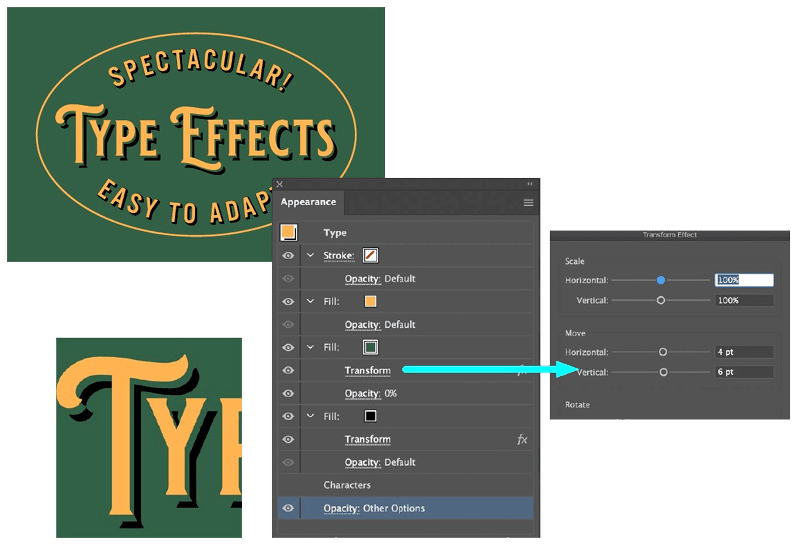
Figure 1. The Appearance panel showing the separate fills to achieve the effect
- Set the type, select it with the Selection tool, and using the Appearance panel, add three fills of different colors. Make the color of the second fill the same as the background.
- Select the second fill, and choose FX > Distort and Transform > Transform to apply a move.
- Select the third fill, and repeat the previous step, moving the fill slighter farther than the second fill.
- To ensure that the effect works against any color background:
- Select the second fill, and change its Opacity to 0.
- At the bottom of the Appearance panel, select the Opacity for the whole effect and select Knockout Group.
- Change the background color to view the effect.
—Nigel French
Placing InDesign Captions to Spec Automatically
A frustrating thing about setting captions under photos is getting them all to be a specific distance from the photo. Fortunately, you can create a frame with a
built-in space that you can use as a guide when you move the frame under the photo (Figure 2).
Figure 2. Caption text frames with text the same distance from the image
- Make a text frame that is the same width as the photo, type your text, and format it.
- Create a paragraph style for the caption text.
- Select the text frame, choose Object > Text Frame Options, and apply a top Inset Spacing of .125“. Now, when you position the frame perfectly under the photo, the distance will be consistent.
- For even more precision, you can use the Align panel to butt them exactly together. Open the Align panel (Window > Object & Layout > Align), and select both the photo and the caption frame. In the bottom of the three rows, Distribute Spacing, turn on Use Spacing, type 0“, and click Distribute Vertical Space, the first of the two buttons.
- Select the caption frame, create an object style, and name it Caption. If you turn on the Paragraph Style option and make sure the Caption paragraph style is selected, you’ll be able to format the geometry of your text frame and the type in your caption with one click of the object style.
—Laurie Ruhlin
Working Nondestructively with Photoshop’s Remove Tool
The perfectly named Remove tool is great at removing objects, which it does nondestructively.
- Create a new layer.
- Select the Remove tool in the toolbar.
- In the Options bar, turn on Sample All Layers.
- Paint on top of the objects you’d like to remove (Figure 3).
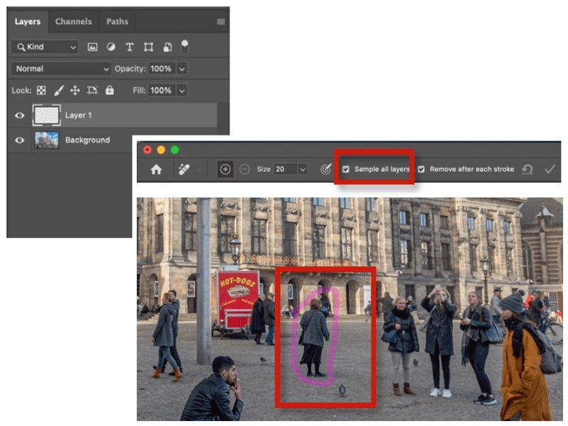
Figure 3. The Photoshop Remove tool lets you paint out what you don’t need.
Want quicker results? Paint a “lasso” with the Remove tool, and Photoshop will remove everything within this lasso.
—Rob de Winter
Working with Patterns in Illustrator
Illustrator has two features for working with patterns: Pattern Editing Mode and the Repeats feature.
Pattern Editing Mode
Select some artwork, and choose Object > Pattern > Make. This puts Illustrator in Pattern Editing Mode and creates a pattern fill swatch on the Swatches panel (Figure 4). Within this mode you can change the repeat style and control the dimensions of the tile. When you exit, Illustrator saves the changes to the fill swatch. You can apply fill swatches to objects to create a pattern field, or you can drag them to the artboard to extract a pattern tile.
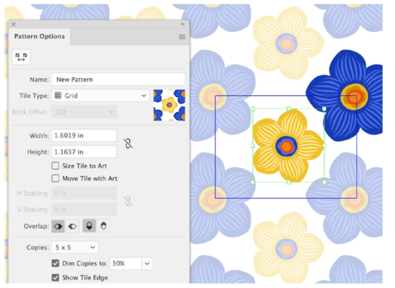
Figure 4. Pattern Editing Mode and swatch preview in Illustrator
Repeats feature
The newer Repeats feature works directly in the Illustrator window (no separate mode). Select your desired artwork, and choose Object > Repeat > Grid to turn the art into a repeating pattern field with handles, allowing you to resize it and change the spacing (Figure 5). Choose the repeat style and other options in the Properties panel. This feature does not create a pattern tile or pattern fill swatch, so it’s best for making quick fields of the pattern and comping up your ideas. The Repeats feature options are also available using Illustrator on the iPad.
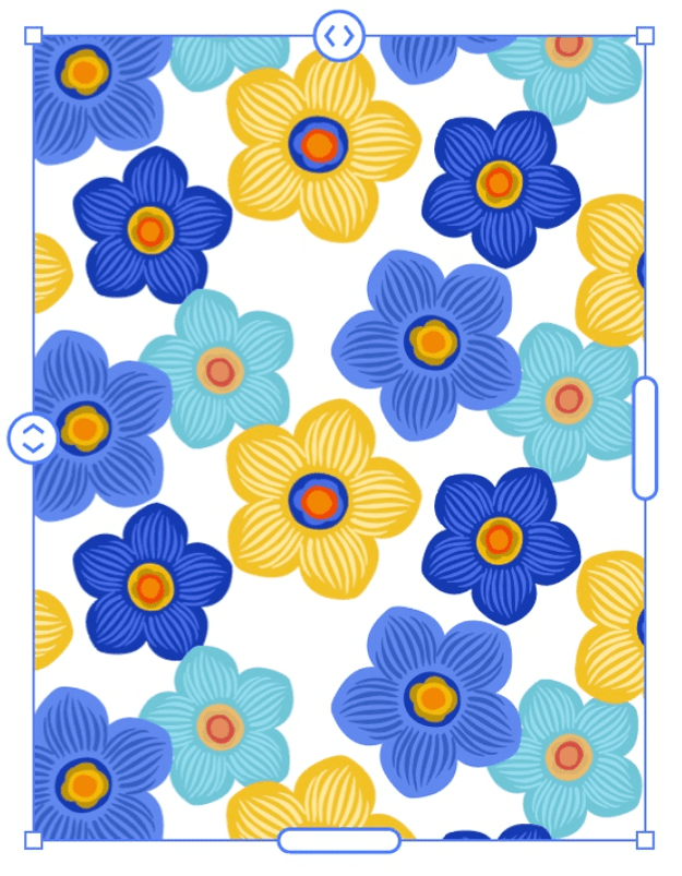
Figure 5. Repeating pattern field in Illustrator
—Laura Coyle and Theresa Jackson
The Art of Pairing Typefaces
Look for similarities as well as differences when pairing typefaces (Figure 6). The difference factor is obvious. Why else would you mix typefaces if you weren’t craving contrasts (such as more curves, more sparkle, or more peace and quiet)? In addition to their differences, however, font pairs should share common features, such as narrow or wide proportions, similar shapes in the lowercase a or g, or mutual cultural or historical heritage.

Figure 6. Some sample typeface pairs
Why are wine and cheese served together? Entrenched custom and cultural reinforcement helps. So does the contrast between fatty, slippery cheese and acidic wine. Cheese and wine offer commonalities as well as contrasts, however: Both are the funky, fermented products of controlled decay.
—Ellen Lupton
Unlinking Duplicate Smart Objects in Photoshop
By default, a duplicated, embedded Smart Object layer remains linked to the original embedded content. This is good for logos and graphics that should remain the same in all occurrences of the document.
However, you might want to make a copy but break the link. To do this, select the embedded Smart Object layer, then choose Layer > Smart Objects > New Smart Object via Copy. You can also find the option by right-clicking next to the layer name in the Layers panel.
—Theresa Jackson
Finding Ranges of Numbers Using GREP
The simple GREP expression \d finds any digit, and you can find multiple consecutive digits using \d{x}. But that will find only uninterrupted strings of digits. If you’re searching for a number like 123,456, that expression will find 123 and then find 456 (because the comma interrupts the expression). Instead, to find any number, including comma separators that may or may not be there, use [0-9,]+.
If you add . inside the brackets, you’ll also catch numbers formatted with periods (dots) in addition to commas and digits. Keep in mind, though, that the above expression would also find the numeric portion of $12.99.
To find specific ranges of numbers, use a character class ([ ]) that includes a range and a set of either/or (|) expressions. For example, to find numbers in the range:
1–42 use ([1-9]|[1-3][0-9]|4[0-2])
47–93 use (4[7-9]|[5-8][0-9]|9[0-3])
96–138 use (9[6-9]|1[0-2][0-9]|13[0-8])
146–180 use (14[6-9]|1[5-7][0-9]|180)
You can use these expressions to highlight numbers that fall within these ranges inside a paragraph style or in a Find/Change query.
—Erica Gamet
Editing Images Right Inside PowerPoint
I’m pretty good at Photoshop, but when I just need to quickly brighten or crop an image, I do it all within PowerPoint. It’s much quicker, of course, to edit images in PowerPoint, but it is also nondestructive, enabling you to continually tweak adjustments at any time.
Select a picture on your slide, and the Picture Format tab will appear. You can also select a picture, then choose Format Object from the Format menu.
Figure 7 shows an image before and after touchups in PowerPoint and the settings used (macOS version). You can also use the Recolor Preset to quickly turn an image grayscale.
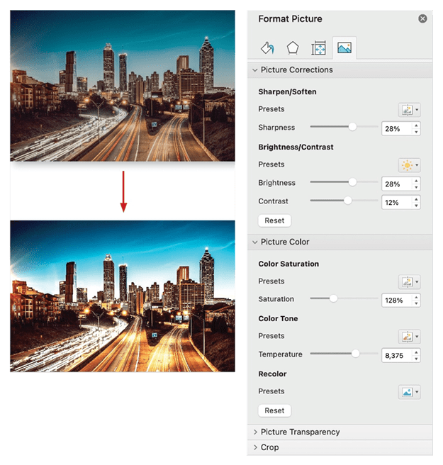
Figure 7. Image adjustment controls in PowerPoint
—Nolan Haims
Rating and Marking Images in Lightroom
Sorting out how and when to use flags, stars, and labels will help you sort your images.
Flags
After selecting the best image from a shoot (the best portrait from a series, for example), I typically assign a Pick flag. Likewise, I might flag any images that I want to delete with the Reject flag.
- Press P to add a Pick flag, X to apply a Reject flag, and U to unflag an image.
- When you apply the Reject flag to a photo (X), the rejected thumbnail dims in Grid view.
- When you add a Pick flag (P), Lightroom displays a highlight around the photo’s thumbnail.
Stars
When I need several levels of distinction between images, I assign star ratings. Press 1–5 on the numeric keypad to apply star ratings. Press the [ or ] key to decrease or increase star ratings, respectively.
Labels
When I need to remind myself that a file needs special attention, I use the numeric keys 6–9 on the numeric keypad to apply color labels (purple doesn’t have a shortcut). Pressing the same key again removes the label. Note: If you have a Mac keyboard without numeric keys, add Command+Fn to the number (e.g., press Command+Fn+8 to apply a green label). If you prefer to show a small, square color label in Grid view (instead of tinting the image thumbnail’s frame), turn off the option to Tint Grid Cells with Label Colors and turn on Include Color Label in the Expanded Cell Extras under View > View Options (Command/Ctrl+J).
Note: To maintain compatibility with color labels in Adobe Bridge you will need to use the same names in each application.
Auto-advance
Holding the Shift key or turning on the Caps Lock will auto-advance to the next image after applying a color label, flag, or rating.
Painter tool
You can use the Painter tool to assign Flags, Stars, and Color Labels.
- Command+Option+K/Ctrl+Alt+K selects the Painter tool. Choose an attribute, and click an image thumbnail in Grid view to apply that attribute. Drag across multiple thumbnails to quickly apply the attribute to multiple images.
- Option/Alt-click with the Painter tool to remove the attribute.
- Press Escape to dismiss the Painter tool.
—Julieanne Kost
Using Creative Cloud Libraries with Microsoft 365
I love the fact that Creative Cloud Libraries integrate very well with Microsoft 365 products. This makes it possible to build separate, curated libraries that you can share with other departments in your organization which don’t use Creative Cloud apps but still need to have access to the latest logos, product shoots, and other graphics.
Imagine you’re working for the local marketing department. You don’t have a Creative Cloud membership, but you do work together with the two designers in your organization responsible for creating and maintaining all of the branded assets. You’re responsible for building marketing collateral for email campaigns, updating the website, and posting on social media. This means you need access to the latest logos, icons, illustrations, colors, and images to successfully do your job. In that case, you could use the following workflow:
- With an active Microsoft 365 subscription, install the Creative Cloud add-in from the Microsoft Add-in Store. Alternatively, ask your IT department to deploy the add-ins organization-wide.
- Because you don’t have a Creative Cloud membership yourself, you can register for a free Adobe ID via Adobe.com which comes with 2 GB of storage—enough to receive the latest branding from your designers. If you are part of a Teams or Enterprise plan for Creative Cloud, you can ask your IT admin to assign you a Creative Cloud free membership. Once you have the add-in installed, click it to activate it.
- Ask the designer to build you one or several dedicated Creative Cloud Libraries, including everything you need.
- Ask the designer to share the libraries with you as read-only.
- When you receive the invitation to join the library, click the Add to Your Libraries button to add the shared library to your account and receive the latest versions of the graphics.
- Log in to your Creative Cloud account from the Microsoft 365 add-in to see and use all shared assets (Figure 8).
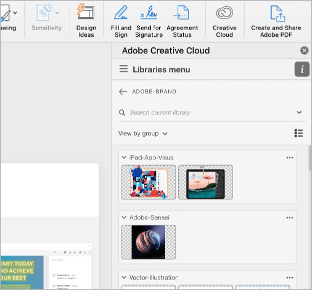
Figure 8. Creative Cloud access within Microsoft 365 apps
If changes are required, get in touch with your designer to make the updates. When the revisions are done, you’ll see the latest versions directly within your 365 solutions.
This workflow offers many solutions to common problems, such as:
- Anyone in the organization can have access to the latest assets.
- Any updates to assets will be immediately reflected in the shared libraries.
- You save a lot of time because you no longer need to search for an obtusely named file, like logo2-def-final-B.ai, on the server.
- You can use native PSD and AI files in Office.
- You can even apply InDesign paragraph styles in Word!
—Bart Van de Wiele
Commenting is easier and faster when you're logged in!

Recommended for you

How to Make an Object Style That Resizes Objects from the Center (or Any Other Reference Point) in InDesign
Learn the sneaky trick for choosing how an object resizes when you apply an obje...
25 Type Tricks for InDesign
Great tips to set stellar type and create beautiful typography in InDesign

InDesign Tip: Keyboard Shortcuts for Positioning Text
Use these keyboard shortcuts to quickly change kerning, tracking, leading and wo...