


This InDesign tip on using a fake word space for a nested style was sent to Tip of the Week email subscribers on March 2, 2017.

Sign up now and every week you’ll get a new tip, keyboard shortcut, and roundups of new articles, plus exclusive deals sent right to your Inbox!
Just scroll down to the bottom of this page, enter your email address, and click Go! We’ll take care of the rest. Now, on with the tip!
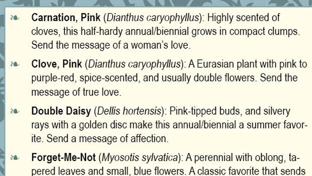
If you’re trying to add a nested style to a paragraph style, but you don’t have an obvious stopping point where the nested character style should stop being applied, like an em dash or colon, try a fake word space!
For example, you can replace a word space with a couple thin spaces (which, together, are about the same width), and choose “thin space” as the stopping point in the Nested Style setup.

Then in the document, the Bold character style gets applied to the text automatically, up to the first thin space it encounters, whenever the paragraph style is applied.

You can experiment with different space characters to see what’s the closest equivalent to a single space in the font you’re using in the text. It takes a little work to replace the spaces with your stop-character equivalents, but it only needs to be done once.
This article was last modified on July 25, 2019
This article was first published on March 7, 2017
Commenting is easier and faster when you're logged in!

Recommended for you

Holiday Text FX, part 3: Fun With Nested Styles
Learn how to use nested styles to make this cheery greeting in InDesign.

When Character Styles Collide
One paragraph style can apply a whole bunch of character styles to the same rang...
Rekindle Your Love of Typesetting with Nested Styles
Renée Dustman walks you through using nested styles for automating repetitive ty...