
The Web Wizard: Keeping Colors Consistent on Macs and PCs
Designing Web pages that look the same whether viewed on a Mac or a PC is no easy task: The Mac OS and Windows handle certain fundamental operations differently, and the differences have their implications. In the first part of this two-part column, I explored the differences in how fonts are displayed on the two platforms. This time, I’ll focus on cross-platform color challenges and how to get around them. Specifically, I’ll explain how different system palettes and overall gamma settings can affect the colors on your Web page.
Safety First
As a designer you probably run your graphics card in true-color mode — at either 24 bits or 32 bits of data per pixel — which gives you the ability to view the full RGB spectrum of 16.7 million colors. Virtually all computer systems sold today come equipped with graphics cards that support true-color modes, but there is a huge installed base of older computers that are only capable of displaying 8 bits of data per pixel, which delivers a palette of only 256 simultaneous colors. If you — or your client — want to play it safe and build a site that looks good on those older computers (and thus reach the maximum number of customers), you’ll have to learn to design within a limited palette and save your images in an 8-bit Web-compatible format, such as GIF.
Here’s the rub: The Windows and Mac OS’s don’t use the same system color palette. And browser programs, such as Internet Explorer and Netscape, contribute to the problem by reserving specific (and different) colors for their interface elements. If you create 8-bit images using a system-specific palette, a custom palette, or an adaptive palette, there is no guarantee that what you see on your screen will be what the viewers see on theirs. In fact it is very likely that at least some of the vibrant, solid colors you see on your computer screen will be unavailable on a given viewer’s system, causing the closest matching colors to be used in their place. If no good match can be found, color may be simulated with dithering, in which pixels of two or more colors are intermingled to produce an optical representation of a color that is not physically present. In short, the quality of your images will be compromised.
A simple if partial solution is readily available. You can limit your color choices to those in a Web-safe palette (see Figure 1) — also known as a CLUT (color lookup table) — which contains only the 216 colors that the Windows and Mac (and IE and Netscape) palettes have in common. If you restrict your color choices to these hues, the colors will be displayed properly — with no substitution and no dithering — on both Macs and PCs.

All professional-level graphics programs — such as Adobe Photoshop and Macromedia Fireworks — ship with a Web-safe palette that you can load into the Swatches palette. You can also download Web-safe palettes — some designed for specific applications — from many, many sites on the Web: Just search for “Web safe palette” or “Web safe CLUT.” (To download the palette in Figure 1, Ctrl-click (Mac) or right-click (Win) the image to save it to your desktop.) I’d also recommend Pantone’sInternet Color System Guide, offered as part of the company’s ColorWeb and ColorWeb Pro color utilities, because it makes it easy to match colors in different media by listing values for the Web-safe colors using the RGB, Hexadecimal, CMYK, and Hexachrome color systems.
Virtually the Same
Using a Web-safe palette is a terrific solution for hard-edged graphics containing solid areas of color, including logos, headlines, and diagrams. It won’t work at all if you are trying to reproduce your client’s custom logo color accurately, however. And it won’t work particularly well if the image contains photographic data or graduated and blended colors. If you try to save a photograph or softly shaded image as a GIF file using the standard Web-safe palette, you’ll find that your software will employ dithering extensively.
As I mentioned previously, dithering degrades overall image quality. More importantly, by introducing dithering you will actually increase the file size and increase the download times for the pictures on your site. That’s because dithering defeats the LZW compression scheme intrinsic to the GIF format. LZW requires large horizontal bands of the same color to achieve maximum efficiency. Dithering interrupts solid runs of color.
To avoid degrading your Web site’s performance, save photographic images and pictures containing shaded colors as 24-bit JPEGs. When viewed on an 8-bit system the JPEGs will be dithered. But the dithering will occur on the end viewer’s system using the default system palette, and so it will not adversely affect download times.
The Gamma Factor
As many designers already know, another phenomenon can wreak cross-platform havoc with your Web sites: Images look brighter or lighter on a Mac than they do on a PC. The fault lies, once again, with intrinsic differences between the Mac and PC operating systems.
Both the Mac OS and Windows have a system level setting called gamma. Gamma curves compensate for the fact that there is a non-linear relationship between the voltage used to stimulate the screen phosphors on a monitor and the perceived level of brightness. In plain English, gamma curves correct monitors so that there is a smooth, evenly stepped transition from light to dark values. Technically, gamma curves increase or decrease the contrast between mid-level gray tones in a picture. But experientially they control the overall brightness of an image.
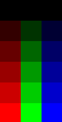
Take a look at Figure 2. This simple chart contains the six brightness steps for red, green, and blue that form the basis of a Web-safe palette. If gamma correction is working on your system, you should be able to distinguish between the six different rows. If you are viewing this on a PC, you may not be able to differentiate between the top row (which is black) and the second row.
By the way, please don’t confuse all this talk about system-level gamma settings with the gamma curve tools found in most image-editing software. Although both are built around the same concept, the gamma-curve functions in your image-editing program do not adjust your display; they change the actual data values in the picture. Conversely, adjusting the gamma setting for your display won’t actually change the brightness values in the images you generate; instead it will allow you to adjust your images using a display that approximates the brightness value of both a PC and a Mac.
In case you haven’t guessed by now, Macs and PCs employ different gamma curves. The result is that an image (or colors of any kind) that look fully saturated on a Mac will appear somewhat dark on a PC. And colors that appear bright on a PC may look too light on a Mac.
I can give you exact values for the gamma curves in use: Macs employ a setting of 1.8, uncorrected PCs display images with a gamma value of 2.5, and corrected PCs use a gamma of 2.2. But I can’t show you the absolute difference between those gamma settings, because you are viewing this Web page on screen and are already experiencing the effect of a particular gamma curve. I can show you the relative difference between those values by displaying two images with a differential gamma value of 0.7 (see Figures 3 and 4).


Someone glancing at these images casually may find them both acceptable. However, if you pay attention to the highlight and shadow areas, you’ll see some important differences between the two pictures. If you are viewing these images on a Mac, you may feel that the blend area between the two figures on the left is washed out in Figure 4, but fine in Figure 3. If you are viewing the images on a Windows system, you probably barely notice the person on the far right in Figure 3, though you can see him clearly in Figure 4.
Here’s a simple rule: If you want your images to work in a cross-platform environment, like the Web, you should set your system to a medium gamma value of 2.0 and design your images to look good at that level. If you have a good idea that most of your viewers are using Windows machines — a pretty safe bet for many sites — set your gamma value to 2.2, which is the recommendation of the World Wide Web Consortium (also known as the W3C). Mac users can easily change the system gamma setting in the Monitor and Sound Control Panel. On Windows, things are not so simple, because Microsoft does not supply a gamma setting as part of the monitor control panel. If you own just about any Adobe product you are in luck, because Adobe bundles a system-level utility — called Adobe Gamma — with products like Photoshop and Illustrator. Adobe Gamma allows you to calibrate your display and to specify a gamma setting value.
The best way to discover potential problems with your images is to preview them under different viewing conditions. While you could maintain both Macs and PCs in your studio for preview purposes, there’s an easier and less expensive approach: Both Adobe ImageReady (now a component of Photoshop 5.5) and Macromedia Fireworks can toggle your screen display between Mac and PC gamma.
Seeing Red
Armed with a Web-safe palette and the correct gamma setting, you can go forth and produce fairly representative color images that display pretty consistently on both Macs and PCs. But even using the techniques explained here, you can’t generate truly accurate colors.
Right about now, you may be shrugging your shoulders, secure in the belief that pleasing color is more important that accurate color. But if you or your client needs an e-commerce site, you’d be wrong. The hard fact is that inaccurate color reproduction ranks among the top reasons for catalog merchandise returns — and it doesn’t matter if the catalog is in print or online.
Differences between Macs and PCs aside, the simple truth is that monitors are like fingerprints, in that no two are exactly alike. There are a host of factors that influence the appearance of color on a computer display, including the make, model, and even the age of the monitor. Ambient light and the amount of heat the monitor generates also affect color.
Hope — in the form of an automated color management system — is on the horizon. Color management requires that the operating system know the color profiles of the device that created an image and that of the device displaying the image. It also requires that some engine translate between the two device profiles. Most of the strides in this area, including a standard specification for describing a device’s color space (called an ICC profile) have been made in print production where the majority of users are graphics pros.
Truly automated color management for the Web is still in its infancy. There really isn’t even consensus about whether color management functions should reside on the viewer’s system, where cross-platform incompatibilities might rear their ugly head again, or on the Web server.
For the time being, the overhead of maintaining a color-managed Web site (or in some cases two — one for PCs and one for Macs) makes color management an impractical technology for most Web developers. But keep an eye out for The Web Wizard here on creativepro.com. In an upcoming report, we’ll delve further into the state of the art in color management for the Web.
This article was last modified on January 8, 2023
This article was first published on August 1, 2000
Commenting is easier and faster when you're logged in!

Recommended for you

An Improved Sample Buttons and Forms Library Panel
Did you know that InDesign has a built-in library of buttons and forms elements?...
The Art of Business: Add Writing to Your Repertoire
Writing is a lot like the graphic arts: Anyone can do it, but few do it well. An...
Inspiration from the East: Japan
During my childhood, my dad traveled often for his work. Before he’d leave, he’d...