The Six Keys to Avoiding a PowerPoint Disaster
Learn the causes of bad presentation design and the solutions

What makes a presentation bad? What makes a presentation amazing?
Presentations are a synergy between content and aesthetics. This post is primarily about presentation aesthetics but I’ll also address some content-related issues. We’ll review six problems that can lead to bad presentations and the solutions to transform them into amazing ones.
- Inconsistency
- Bullets
- Too Much Text
- No Reason to Care
- Lack of Originality
- Cognitive Dissonance
Problem 1: Inconsistency
Solution: Templates
A template comprises layout, colors, fonts, brand standards, and graphic styles.
1. Create a PowerPoint template to define theme colors, layouts, and fonts.
2. Make a grid for consistency. I use the free add-in BrightSlide to add guides to my slides for margins, rows, columns, and units.
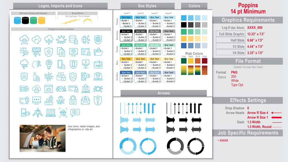
3. Assemble a slide style sheet for branding, logos, imports, icons, box styles, colors, arrows, fonts, file formats, effects, table styles, graphic sizing, line styles, types of images, etc. Add newly designed icons and images to this slide cheat sheet. An example is shown to the right.
4. Apply a consistent table design with Table Styles. On the Table Design tab, scroll to find the table style that fits your template. Apply the style to your selected table. Format the text with your fonts and styles.
5. Use the accessibility checker to ensure your styles meet readability guidelines.
Problem 2: Bullets
A person’s brain will take shortcuts regarding your content. The quality (and uniqueness) of the aesthetics is indicative of the quality (and value) of the content. If you design your slides with minimal effort, it reflects on your content. Avoid bullets because they are overused and tell the audience that you didn’t take additional time to better “design” your slides.
Solution: Chunk Information
- Spacing: Remove bullets and use bold typefaces and paragraph spacing to separate information.
- Auto Chunking: Select your text box of bulleted text. Go to the Home Tab and choose Convert to SmartArt. Under SmartArt Design, choose the basic box style. Ungroup the boxes so they are no longer SmartArt. Format the chunked text to your template guidelines.
- Alternatives: Use online search engines for design ideas. My favorite inspiration resource is The Better Deck Deck by Nolan Haims, a set of cards specifically created to inspire bullet alternatives.
Problem 3: Too Much Text
Solution: Visualize
Graphics can improve understanding, recollection, and adoption-when done correctly. Below are three ways to visually show content:
- Literal: When you are describing something, literally show your solution such as a screenshot of an updated Ul or the proposed plans for an office space.
- Metaphor, Simile, Analogy: When your content is complex or abstract, use a visual metaphor, similie, or analogy. Using symbolism related to your ideas can simplify a complex message and make it easier for audiences to understand. For example, you may use a tree growing from a sapling to indicate company growth with branches representing new departments.
- Quantitative: When you are explaining amount, value, or time use a quantitative graphic like pie, bar, Gantt, area, and line charts to help visualize numeric data.
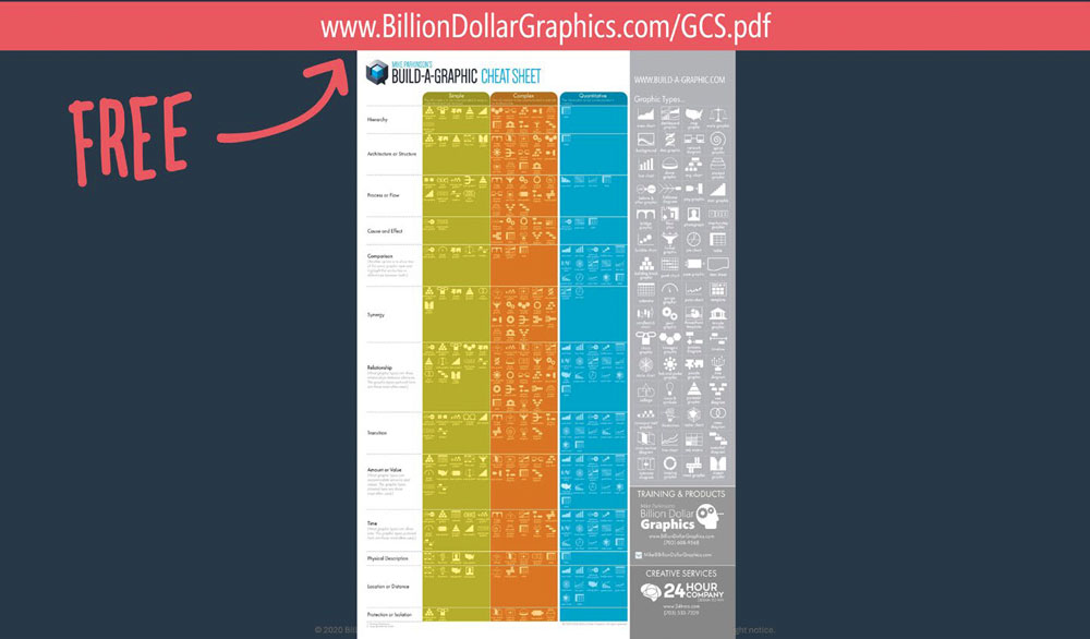
Download my free Build-a-Graphic Cheat Sheet. Explore different graphics types and how to use them to communicate simple, complex, and quantitative solutions. Alternatively, use the PowerPoint add-in Build-a-Graphic to search for graphic ideas for free.
Problem 4: No Reason to Care
Solution: Attach a Motivator to a Means (M&M)
This solution would involve reviewing the slide’s content closely to find the reason why the information is important to the audience. To discover the M&M, you may need to tweak the content or meet with the content creator if you can’t discern the importance and how the audience can benefit from what is shown.
The two examples below provide ideas for encouraging an audience to care about our content:
- Why should your audience care about an organization chart? The chart directs them to the manager of various departments and who can answer specific questions regarding security, proposals, or benefits.
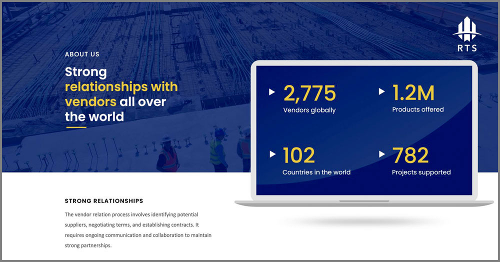
- Why should the audience care that your company has strong relationships around the globe? Those partnerships save our clients money by allowing us to negotiate better rates for them.

Problem 5: Lack of Originality
Solution: Be Different
Research new and interesting ways to layout or graphically present the information:
- Chunk text
- Use Maxi Type
- Consider metaphors, similes, and analogies
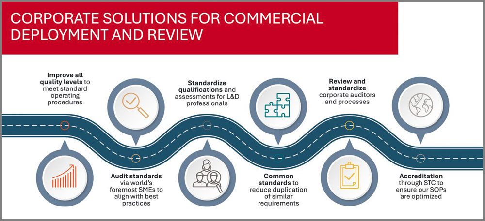
Find inspiration quickly online:
- Enter PowerPoint Templates to your favorite search engine.
- Enter keywords relevant to your content into iStock, Pexels, the Noun Project. Browse the various icons, photos, and graphics to get inspired by various ways to visually communicate your content.
- Input your content into Al tools like Midjourney or Hotpot and let these tools interpret your ideas. An Al perspective can be a good starting point for your own ideas.
- Suggestion: Use vector-based graphics on your slides when possible. It will be easier to export these graphics into other packages like Illustrator, InDesign, Google Slides, or Word.
Problem 6: Cognitive Dissonance

Solution: Be Congruent
- Look and Feel
- Imagery
- Messaging and Narrative
Slides should align with how you want to be perceived. For example, a company touts they are innovative. However, their presentation content uses archaic terms and dated graphics. If they can’t use the latest technology for their presentations and designs, how can the audience trust their solutions are innovative? Remember that the confused mind says “No!”
Consider what these graphic styles communicate:
- Skeuomorphic: 3D style, appeals to older generations since this style made an appearance in their early careers
- Simplified: Flat with no aesthetic embellishment, appeals to younger generations because they grew up with smart device images using this graphic type
- Material: Hybrid of the two styles, simple with minimal embellishment, appeals to both older and younger audiences
This article was last modified on December 18, 2024
This article was first published on December 5, 2024
Commenting is easier and faster when you're logged in!
Recommended for you
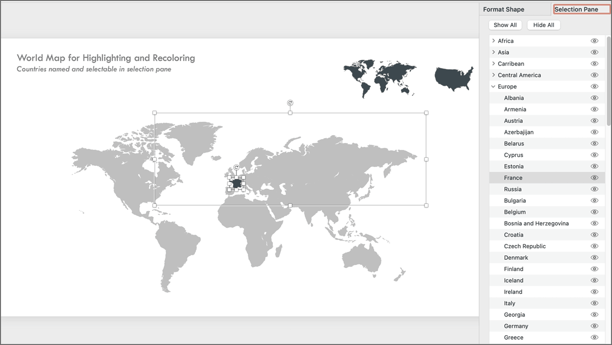
PowerPoint Maps Template
This PowerPoint template contains maps of the United States and world countries...
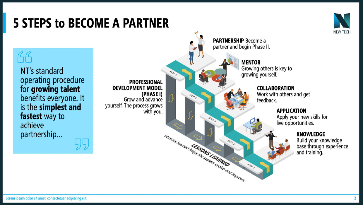
Advanced PowerPoint Infographics
Go beyond SmartArt and pretty pictures in your presentation designs

Storytelling in PowerPoint
Learn how to build a compelling story for a successful presentation.


