

The Process Is the Inspiration is not your average type foundry book. In fact, it goes way beyond the scope of any type book I have seen. This is because it is not really a type book per se, but a documentation of the passion, hard work, and inspiration of three guys – Andy Cruz, Rich Roat, and Ken Barber – who brought their hobbies to work, and grew them into an innovative company called House Industries.

Sketch and final from the book’s front matter.
It all began in 1993 as a way for Rich Roat and Andy Cruz to express their youthful passion for type. The addition of letterer and type designer Ken Barber to the team rounded out their skill set. They went from punk rock-inspired fonts such as Smackhouse and Housearrest to the very sophisticated and successful Neutraface and Chalet font families. But these days, House Industries does a lot more than produce fonts. They are a design studio whose creativity has expanded from “just fonts” to logos and other lettering jobs, signage, promotions, fabrics, ceramics, clothing, products, and a lot more. 
The Process Is the Inspiration is not a font catalog, but a peek behind the scenes of the creative powerhouse that is House Industries. This highly illustrated and beautifully printed book includes an explanation of their process, and the stories behind their expanding range of talents, services, and products. They lay their cards on the table, as they say, and invite us into how the magic happens.
The book is too rich to describe in depth, so I have selected some of my favorite stories and images to give you an idea of the breadth and scope of this fabulous, inspirational book.
Jimmy Kimmel Logo
Most people probably don’t know that Jimmy Kimmel, the late-night talk show host, is a type nerd who once aspired to be a graphic designer before settling on a career in radio and television. He was a fan of House Industries, and wanted them to design a new logo for his show. He invited them out to Hollywood to sit in on a rehearsal so they could get an idea of the process. It was at that point they just had to figure out what kind of logo would best tell Jimmy’s story.
Jimmy then sent them random photos of hotel and restaurant signage that he took from old movies. The guys from House then incorporated these and their own ideas into sketches, from which the final logo evolved. It was then fabricated into steel-and-neon versions for both indoor and outdoor stages. Kimmel said, “I’m not sure if we needed a new logo and thought of House, or if we needed a new logo because of House.” 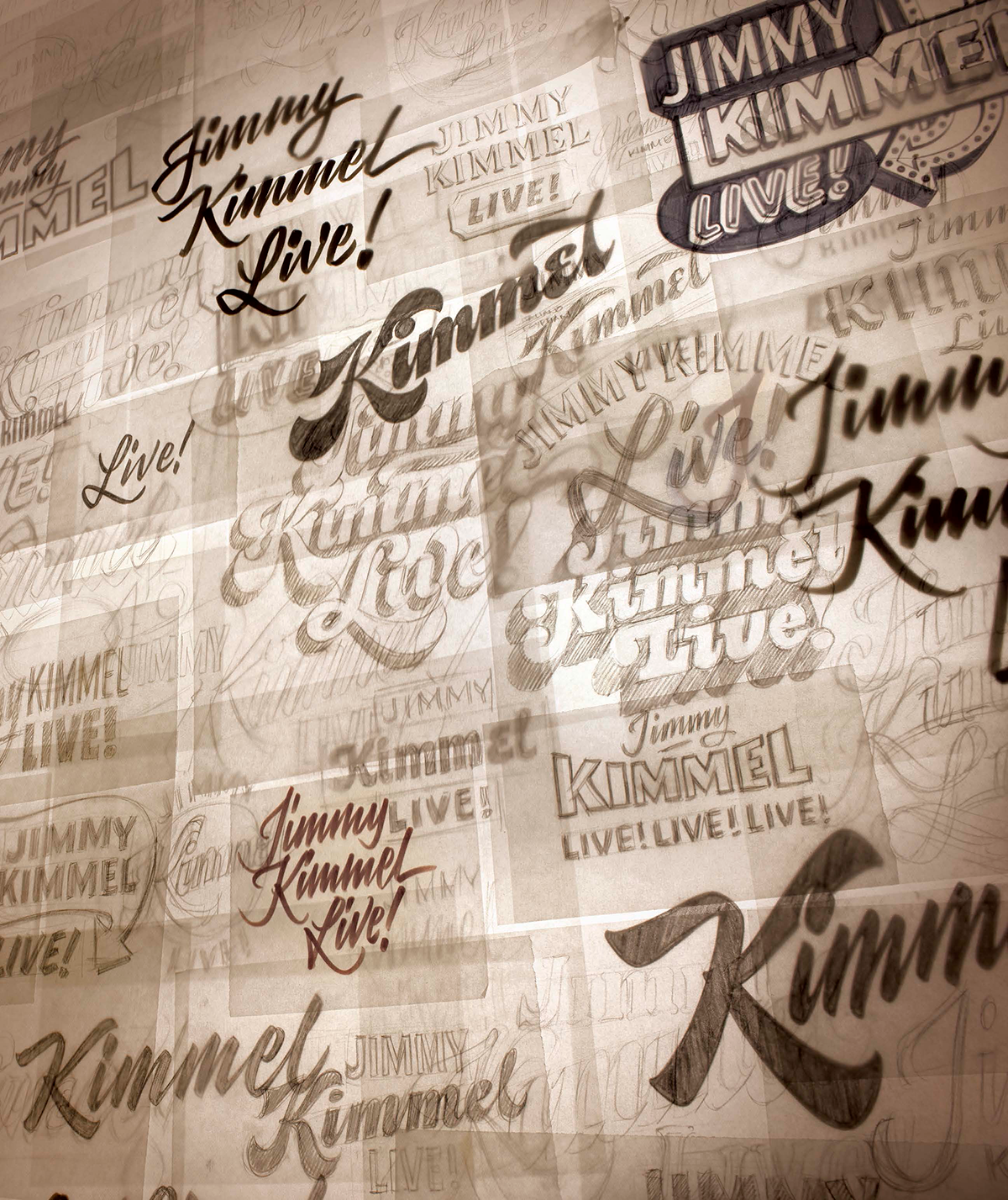

Suzannne Roberts Theatre signage
Taking on a project to design a logo for a city block-long theater in downtown Philadelphia is no easy feat. This describes the Suzanne Roberts Theatre, which House willingly took on as a client. Suzanne Roberts, a patron of the arts and an Emmy award-winning television host, initially wanted to base the signage on her signature, but this did not translate well to the materials used to create such a huge sign. The trick was to filter out the personal signature quirks that would be impossible to express in the intended scale and medium without sacrificing the character and charm of her original handwriting. This time-consuming process led to a dynamic yet personal sign that had structural as well as artistic integrity. 


Uncle Goose Alphabet Blocks
As the guys at House started to have families, their kids gave them the idea of making alphabet blocks. “As our kids started to play, walk, talk, and formulate their own opinions, our preoccupation with the décor of their bedrooms gave way to deeper concerns. If they were going to leave their toys all over the house, we figured we might as well try and make those toys look good.” This led to the creation of the Uncle Goose children’s blocks. They broke with tradition and created them in a range of big and tall sizes, with gorgeous fonts and decorative, geometric patterns. These blocks the led to other styles of blocks, many less for kids’ play than for adult toys.

The Uncle Goose alphabet blocks

The House team’s kids may have been the inspiration for the alphabet blocks, but it led to some adult fun such as this elaborate setup.
John Mayer and the Grand Rapids Studio
Screen-printed posters have always been near and dear to the hearts of the House trio, and a major inspiration for their love for type, design, and lettering. So when musician John Mayer asked House Industries to design four posters for his 2010 Battle Studios tour, they jumped at the chance. It gave them an opportunity to flex their type, design, and screen-printing muscles. With the help of screen-printer David Dodde and what was then to set up the Grand Rapids Studio, they pulled it off beautifully. The Studio went on to do much more than screen-printing – it became a source of the conceptualizing, printing and manufacturing of many other projects. 

These posters for John Mayer allowed the team to go back to their concert poster roots.
Hermès Logo
Before Hermès became known for their leather handbags, this luxurious French house was synonymous with high-quality saddlery. So when they asked House to design a window display for one of their retail flagship stores in Tokyo, it didn’t take long for them to come up with the perfect concept: pouring letters into the shape of a horse. The result of the conceptualization and execution of this idea is quite striking, as the contoured glyphs make the horse appear to leap into the air.
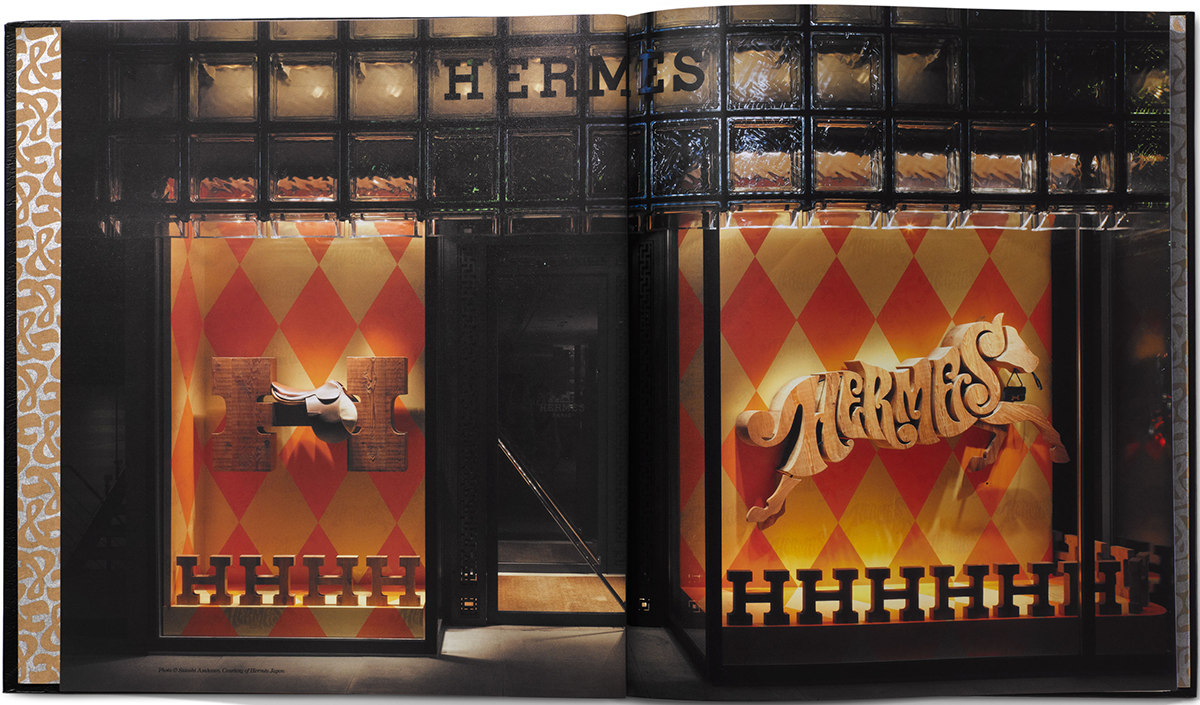
Photo © Satoshi Asakawa. Courtesy of Hermès Japon
Ed Benguiat and Photo-Lettering
Last but not least, this important project is near and dear to my own heart. I began my career first studying with and then working for the legendary type designer Ed Benguiat in his office in the basement of Photo-Lettering. So when I became aware that House Industries purchased some of Ed’s older fonts from the now-defunct type shop, and expanded the character set to include hundreds of alternate characters and ligatures with Ed’s blessing, I was ecstatic.
What began as the expansion and digitization of just five fonts grew to a much larger project. These original five were released on a CD with recorded interviews with Ed recounting some of his best stories. (And if you know anything about Ed, you know his animated telling of his stories is priceless!) The project then expanded tenfold when House purchased the remaining assets of Photo-Lettering, and went to work digitizing the fonts. They then built a specially programmed website that could deliver composed headlines directly to the user.
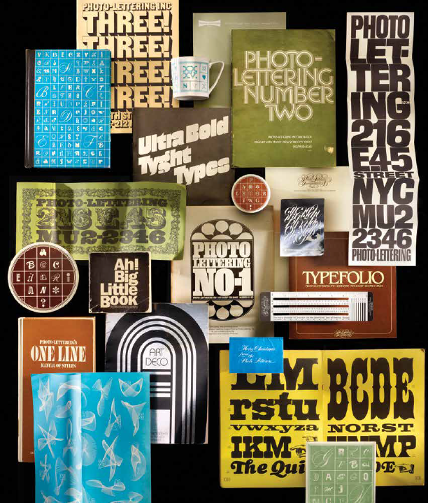
Some of Photo-Lettering’s marketing materials

One of the original sketches and films of Ed Benguiat’s fonts, along with the “Ed Head” included in the CD packaging

More font films

The conversion of the original Photo-Lettering font films to digital fonts was an arduous process.

The digitized Photo-Lettering alphabets were then used for a large Uniqlo project.
With its highly textured and embossed hardcover case, metallic ink and varnish, four different paper stocks, and hundreds of new photographs of sketches, reference materials, ?nished work, and archived artifacts, this comprehensive visual and anecdotal narrative is a must-have for any fan of design.
House Industries: The Process Is the Inspiration is available as of May 30, 2017.
* * * * *
All images reprinted from House Industries: The Process is the Inspiration Copyright © 2017 by House Industries. Photographs copyright © 2017 by Carlos Alejandro. Published by Watson-Guptill Publications, an imprint of Penguin Random House LLC.
This article was last modified on May 31, 2017
This article was first published on May 31, 2017
Commenting is easier and faster when you're logged in!

Recommended for you

A Type Geek’s Ultimate Calendar
I’m probably the odd man out when it comes to designers and type: I can...

Free WhatTheFont for the iPhone
WhatTheFont has long been available online for people who need to identify a cer...

Tip of the Week: A Shortcut to View All Available Font Styles
This InDesign tip how to view all available font styles was sent to Tip of the W...