
The Creative Type: Making Headline Graphics in InDesign
Placing an Image into Text
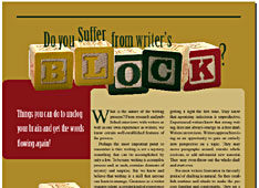
The next idea we have for a headline also involves converting text to paths. Once converted, text or graphics can be inserted into the newly created path, as shown in Figure 6.

Figure 6: Converting your text to outlines creates a path, in which text or graphics can be contained.
The hardest part about this type of effect is finding the right typeface and graphic. The typeface needs to be fairly wide in order to display enough of the graphic and the graphic needs to be large enough to fill the intended path.
To create a similar effect, enter some text, format it, and then apply the Create Outlines command, as you did in the previous example. With the converted text still selected, choose File > Place, choose a graphic file, and click Open to import it into the selection. If need be, you can adjust the position of the graphic with the Direct Selection tool. You can also adjust the graphic with the various Fitting commands available from the Object menu. They include: Fit Content To Frame, Fit Frame To Content, Center Content and Fit Content Proportionately. Aptly named, their purposes are self-explanatory.
On the Same Path
The final idea we have for a headline involves the Compound Path command. Upon applying the command to our headline, the selected items are combined into a single object. At the same time, the stroke and fill attributes of the paths that fall directly over the solid black elliptical object are reversed, as shown in Figure 7. This technique can create some very interesting effects and is especially useful for black and white layouts, where we often struggle for visually appealing graphics.

Figure 7: The Compound Path command enables you to merge paths together, creating a masked effect.
To create this effect, first type and format the text you want to run across the middle of the object. We left some space between the words black and white for the ampersand, which we’ll add later. Convert the text to paths using the Create Outlines command. Now, draw an elliptical object using the Ellipse tool and position it on top and in the center of the line of text. Make a copy of the object for later, place it off to the side, and deselect it.
Next, select the first ellipse and apply a black fill. Then Shift-click the Selection tool on the object and the text to select both and choose Object > Compound Paths > Make. That completes the first part of the process.
Now take the ellipse copy and type the text you want to run over the top of it using the Path Type tool. Next, place it directly behind the first ellipse. (You may need to choose Object > Arrange > Send To Back.) Finally, type the ampersand, format it, and color it with a light gray. Then position it between the words black and white.
In the Headlines
Feature stories are great because they give us the opportunity to do more to a page than just format text. We get to dig down into the content of the articles and come up with ways to relate them to our audience members visually, aiding their comprehension and enticing their interest for what lies in the story itself.
This article was last modified on December 11, 2025
This article was first published on June 7, 2002
Commenting is easier and faster when you're logged in!

Recommended for you
Xitron Announces New Help Column for RIP Users
Xitron, the prepress industry’s leading independent developer and integrat...

The Art of Business: Leading Like a Pro
What does it take to be a great leader today — not an effective manager or...
Scanning Around With Gene: Teaching Kids About Industry
Kids grow up these days taking a lot of things for granted. The electricity that...