

One of the more trying tasks when designing for the Web can be creating great-looking, legible type as a graphic element, particularly when that element must fit within the restrictive confines of a navigation menu or banner. Adobe Photoshop 5.5 brought us new additions in type control specific to interactive and Web applications. Learning how, when, and why to use these type controls will leave you better prepared to handle the challenges you’ll face when creating type for the Web.
Scarce Commodity
When it comes to the Web, pixels are very similar to the Force. “It surrounds us, it’s in your text, it’s within your graphics.” Regardless of how much you try, there is no way of getting around the fact that the pixel is the smallest building block of a display, be it a monitor, a TV, or the screen of a tiny handheld device. All present images in some form of pixels. The challenge we face as designers is the fact that the highest pixel resolution display is about 96 pixels per inch (ppi). (The commonly accepted average is 72 ppi.) Higher resolution displays are still a long way off.
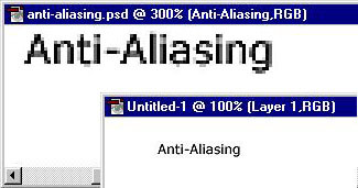
Recognizing that we have a very crude canvas to work with, we must also acknowledge that our medium is type — letterforms that not only demand high resolution to pronounce every serif with the greatest detail but that also require it for the utmost legibility. So herein lies the challenge. Creating successful graphical type on a low-resolution medium. How this is accomplished is mostly though trickery such as anti-aliasing.
Smear Tactic
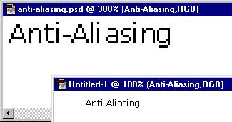
Anti-aliasing allows you to produce smooth-edged type by partially filling the opacity of the edge pixels. The effect causes the edges of the type to blend into the background. This is really nothing more than technological trickery, fooling your eyes into seeing a more-defined letterform, similar to mosaics or pointillism. One thing to keep in mind: Using anti-aliased edges increases the number of colors in your Web graphic, so this may not be the way to go if keeping file size small is imperative.
To apply anti-aliasing to your type, bring up the Type Tool dialog box in Photoshop 5.5, by selecting the Type Tool and then clicking where the text will go. Then use the pull-down menu for the anti-alias setting to choose from four values:
- None: Applies no anti-aliasing. This is great for really small type usage (below 9 points/pixels) or for simulating HTML text.
- Crisp: Makes type appear more sharp. Eight out of ten times I use this setting for the most commonly used point sizes (9 through 14 points/pixels).
- Strong: Makes type appear heavier. This almost causes a faux bolding effect. I rarely use this, but if the font your have chosen is inherently light, you may want to try this setting.
- Smooth: Makes type appear smoother. I suggest using this setting for larger text (14 points and above), such as text for big header graphics. This setting also works well with the more intricate serif font faces.
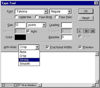
Note that you can select from the same settings with ImageReady 2.0 by using the anti-aliasing setting within the Type palette (or using the Type Tool dialog in version 1.0).

A Sharper Image
As helpful as these options can be, they won’t always give you just the results you’re after. It helps to have a couple of additional tricks at your disposal.
If you find your small type is getting lost in blurry pixels, try the following:
- Duplicate your type layer, to keep a copy in an editable format.
- Render your type layer by selecting Type>Render Layer from the Layer menu. I suggest using the Crisp setting.
- Select Sharpen>Sharpen Edges under the Filter menu.
You should end up with a nice happy medium between the Crisp and None setting.
It might also pay to take advantage of another opportunity for optimization — saving your graphics for Web viewing. The following trick, which essentially reduces anti-aliasing gradually, works best for type set against a solid background color:
- When your type is ready to go, select Save for Web under the File menu.
- In the Optimized view tab, select GIF as your file format.
- Begin to reduce the Colors. Start at 8 colors and work down from there.
- As you keep reducing the number of colors to be saved out, notice how the anti-aliasing is being affected as well as the Color Table palette. If there is a particular color that needs to stay in order to keep the letterform, lock it down by selecting the color and clicking the Lock icon.
- When you are happy with a certain Color setting, save out your type graphic.
- For even more powerful control, you can use the eyedrop to pick a particular anti-aliased color found along your type’s edge to select it in the Color Table. Then simply delete it by pushing the Trash icon.
Keep in mind that this approach can also be used when you want plenty of anti-aliasing but need to keep the file size small: By stepping down colors gradually, you can look for an acceptable middle ground between anti-aliasing quality and file size.
Character Adjustments
You can think of pixels merely as blocks that make up a grid. Photoshop must decide where to place the pixels that define a font’s letterform by mapping them to this pixel grid. Photoshop (and ImageReady) display type using fractional character widths — that is, the spacing between characters varies, with fractions of whole pixels between some characters. Most of the time, fractional character widths provide the best spacing for type appearance and readability. However, for type in small sizes (less than 20 pixels), fractional character widths can cause type to run together, sometimes making it rather difficult to read. This can also lead to blurred letterforms such as lowercase I’s and L’s: Even though they can be defined as simply three or four crisp vertical pixels, these letters may fall in between two pixels, causing undesired anti-aliasing. To help avoid these problems, turn off Fractional Character Widths, by deselecting the option in the Type Tool dialog box (or the Type palette in ImageReady 2.0). This will force the spacing between letters to whole-pixel increments.
Tight Quarters
When creating navigation menus and buttons, you may find yourself in the impossible position of having to create type that holds up in confined dimensions such as 25 by 10 pixels. When this happens, look to fonts that are made for this challenge. Such bitmapped (or pixel) fonts read exceptionally well in the smallest dimensions. Because these are meant to be used as aliased type, these incredible fonts add a subtle sense of coolness to your site. They also help keep file sizes small, by helping you avoid anti-aliasing. Kaliber10000 and Netbaby are wonderful examples of bitmapped fonts in action.
Any designer who has fallen in love with type and hasn’t dealt with the Web’s limitations is in for a rude awakening. Mass adoption of vector graphic formats such as Flash and SVG promise a better delivery mechanism for type. Still, until technology improves most of us will surrender to the lowest common denominator of Web and low-resolution displays. Knowing your way around anti-aliasing features and these few other tricks will help you get good results now without having to wait for a bevy of technological advances.
This article was last modified on January 3, 2023
This article was first published on August 21, 2000
Commenting is easier and faster when you're logged in!

Recommended for you

The Digital Art Studio: Recoloring a Scan with Illustrator
How to recolor Illustrator images with a new color palette—and do it quickly.

The Non-Designer’s Illustrator Book
Excerpted from The Non-Designer’s Illustrator Book by Robin Williams and J...
CreativePro Tip of the Week: Creating Guide Layouts in Photoshop
Ever need to create a set of regularly-spaced guides in a Photoshop document? Or...