

Should you put one word space between sentences or two? This question continues to be hotly debated between people in personal, professional, and educational settings, as well as in blogs, newspapers, online news resources, and even dinner parties! But for designers (or anyone setting typography as opposed to just “typing”), it should be a non-issue: double spaces between sentences does NOT have a place in professional typesetting. In fact, it is considered a serious type crime and a sure sign of an amateur. Here’s the scoop…
Double word spaces between sentences is a practice commonly believed to have evolved from the use of typewriters. Truth be known, this practice far preceded typewriters, as documented in Jim Felici’s excellent treatise on this subject. Double word spaces were frequently (albeit inconsistently) used in handset metal type settings, especially to help “force” justified type. Over time, this convention declined in commercial usage, and was replaced by single word spaces, which eventually became the accepted practice in professional typesetting – and one that has continued on to this day.

The use of double word spaces between sentences can be seen in this justified setting from 1844, excerpted from a reproduction of a Caslon Old Face specimen catalog.

This reproduction of an ad from 1885 shows both single (3rd line) and double word spaces (all that follow) being used, presumably in order to help balance the spacing in this justified setting.

This setting utilizing single word spaces is from a classic amongst type books, the big red Linotype Faces Specimen Book,1940. By then, single word spaces between sentences had become the accepted standard in commercial (metal) typesetting.
So how did this practice seep into contemporary usage? Along with the invention of typewriters in the 1860s came a simplified, “dumbed down” style of typing which included double word spaces between sentences – and for good reason. The typefaces used in typewriters (such as Courier) were monospaced; that is, designed so that all letters had a similar width – even the narrow letters such as the i and wide letters such as the m – so that they fit on typewriter hammers, which were all the same size. This made for very open-looking spacing, which (in all likelihood) prompted the adaptation of two word spaces between sentences to help create a more noticeable separation.
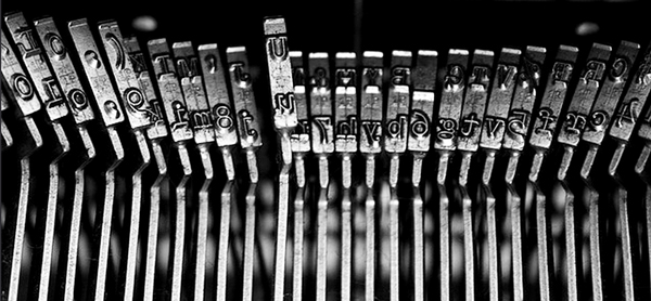
The hammers of a typewriter are all the same width.
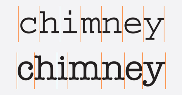
Each character in a monospaced font (upper) has the same total width, requiring some glyphs to have more expanded (i) or compressed (m) designs. A proportional typeface (lower) contains glyphs of varying widths, creating a more traditional, pleasing appearance.

A setting in Courier with double word spacing, as was the custom when using typewriters, which employed monospaced fonts.
The 1980s ushered in the transition from typewriters to word processors and personal computers. The typewriter’s monospaced fonts were then replaced with proportional fonts, which contain characters of varying widths. These visually-balanced fonts eliminated the need for double word spaces, a practice that when used with proportional fonts, results in visual “holes” that create uneven typographic color as well as reduced readability.
Unfortunately, this now-outmoded typewriter convention leaked into the world of professional typesetting and typography. Why? The most likely explanation is that this practice was – and in some cases still is – taught in typing classes, books, and software, most of which have not been updated. Subsequently, double spaces between sentences has become an almost impossible habit to break, especially by those who were taught to do this in their formative years, and still think it is correct.

This excerpt from Typing for Beginners, by Betty Owen, 1985, uses a single word space in the proportional type used to set the instructions, and double word spaces in the monospaced typing sample below it.

Mavis Beacon Teaches Typing, by Lawrence W. Erickson, 2004, also advocates double word spaces when typing, yet uses a single space convention in the body text which uses proportional type. I think they got it right! (BTW, Mavis Beacon is not a real person!)
This problem has become a frustrating one for designers who are supplied with digital copy from writers and contributors who don’t know that this is an outdated convention that is no longer used in professional typesetting. In some cases, company style guides have not been updated either. Subsequently, the problem of editing out this extra space falls into the hands of the designer, production artist, web programmer, and anyone responsible for inputting text. The solution? Correct it – whether you think it is your job or not – and if possible, provide all contributors with a set of updated guidelines.
* Let it be noted that this practice is very popular with students wanting to reach their required word or page count for assignments and papers. (And in fact, they commit many worse typographic “sins” than this!) So let’s hope that if they wind up being writers, they will amend their ways, and learn to type with today’s proper typographic conventions!
This article was last modified on May 6, 2015
This article was first published on May 6, 2015
Commenting is easier and faster when you're logged in!

Recommended for you
A Font "Dating" Game
They say that opposites attract, but then again, similar values and shared histo...

TypeTalk: Steve Lambert’s Typography for Social Change
Steve Lambert cannot be categorized. Although I was first attracted to his intri...
Redesigning Concert Tickets
Because they’re so familiar, the design of everyday things can become invisible....