

I fall into a hard-to-define category when it comes to my preferences for color. Studies say that, as a male, I naturally tend toward brighter and more saturated colors, but as someone who is contemplative and has a somewhat depressed outlook, I go for darker and more subtle tones. One thing I know for sure is that my favorite thing to adjust in Photoshop is saturation. I find it’s the most important consideration when determining the appeal of an image.
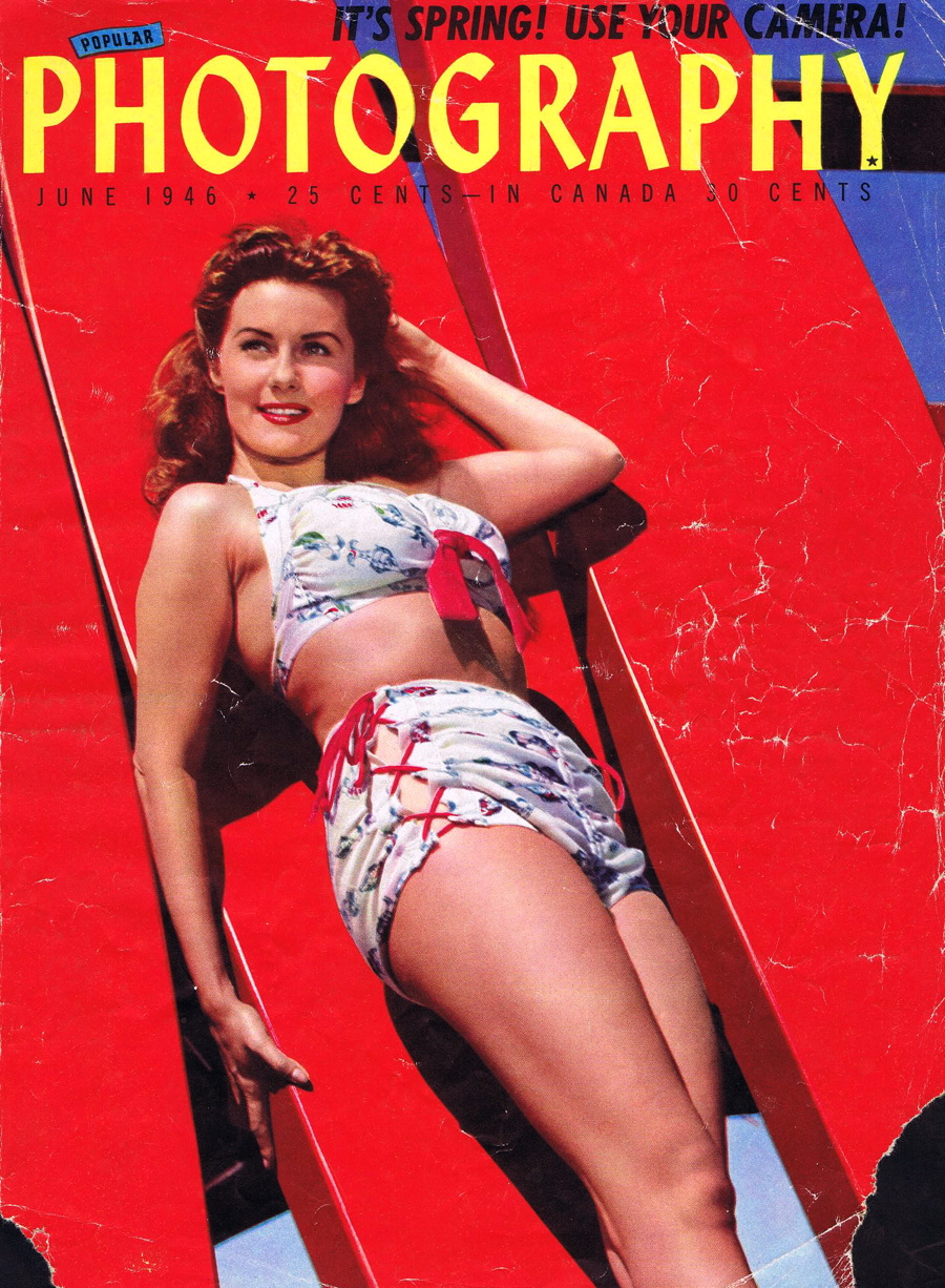
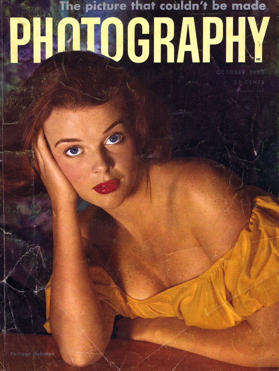
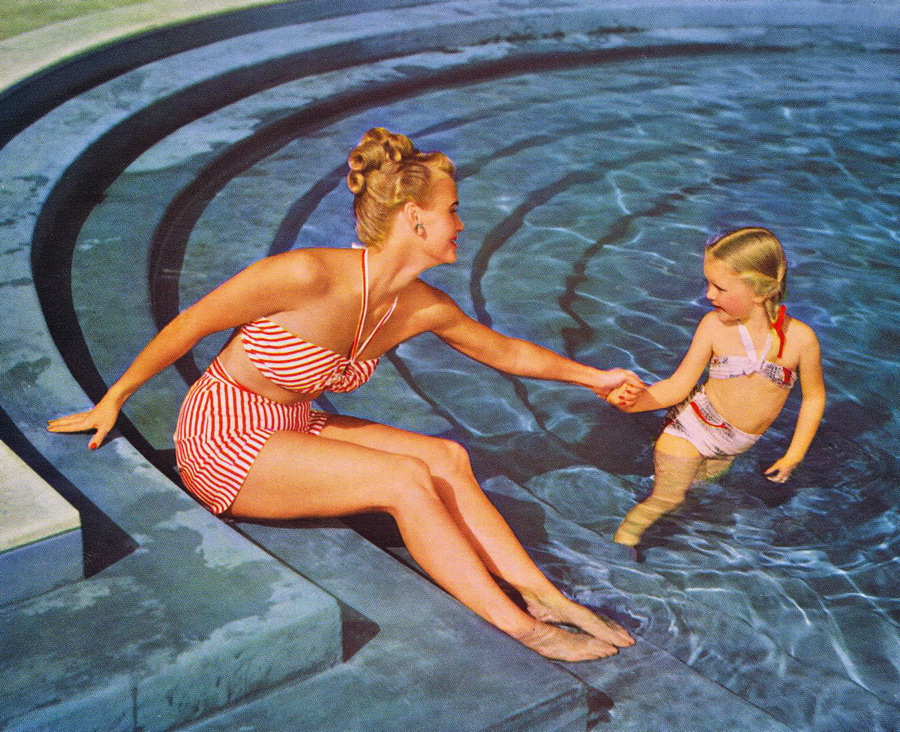
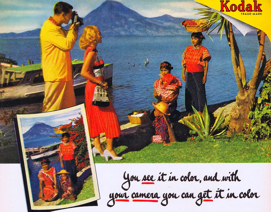
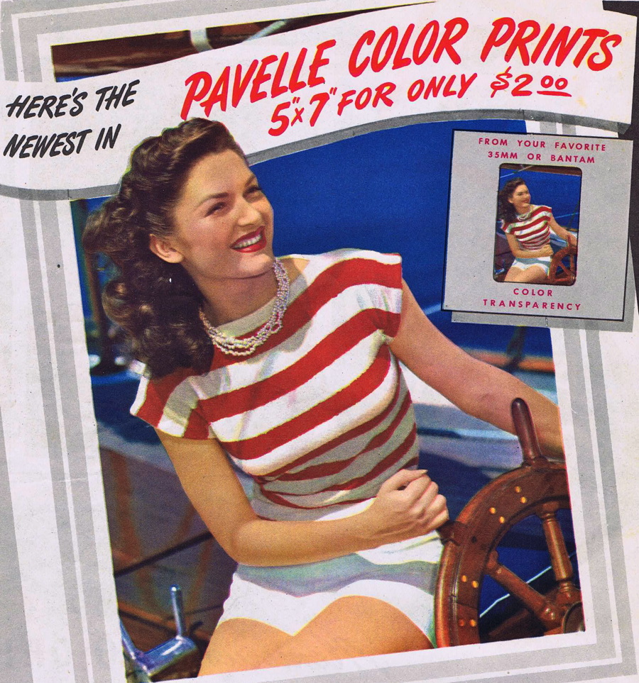
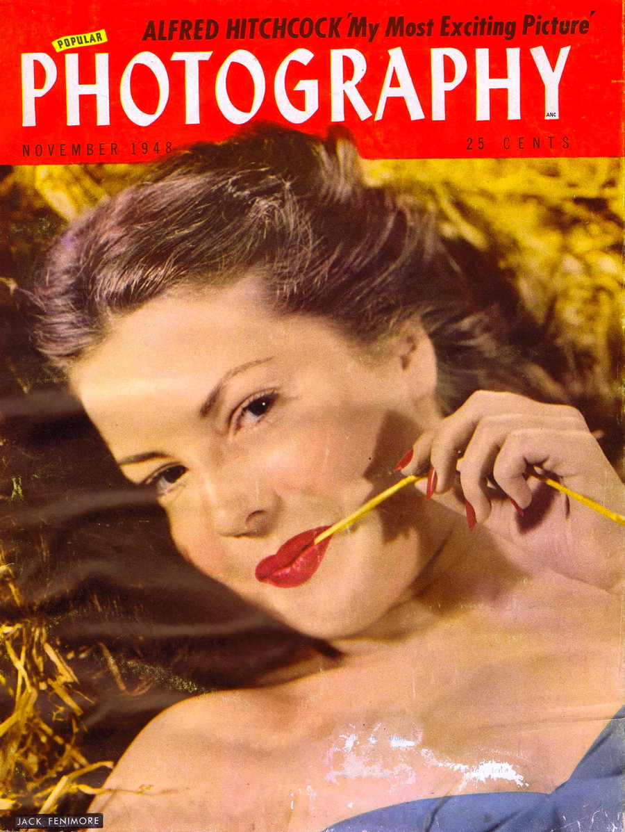
So it was fun for me to find a number of photography magazines from the late 1940s when over-saturated images were the standard. Color was a big sales tool back then and not only did the magazines use vivid colors on their covers, but the film companies presented images that were, well, colorful with a capital C. Click on any of the following images (either cover shots or from color film ads) to open larger versions.

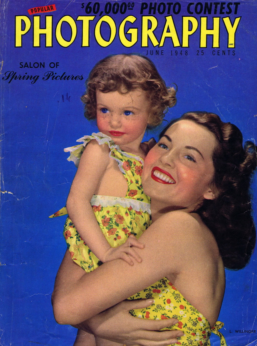
Photography as a hobby was, at least at the time of these images, more or less a male pastime, which explains the pictures of women that graced these magazine covers. And since men prefer more saturated colors than women, that may have also factored in to the reproduction techniques in use.
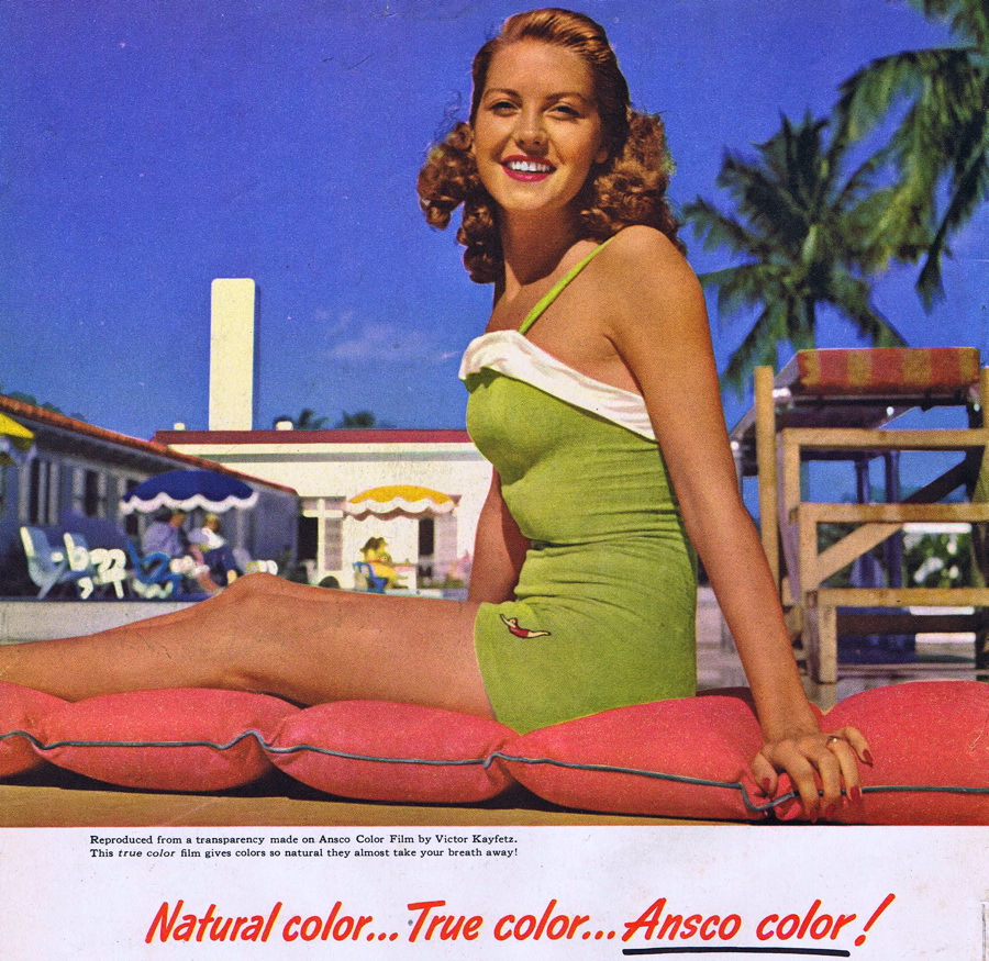
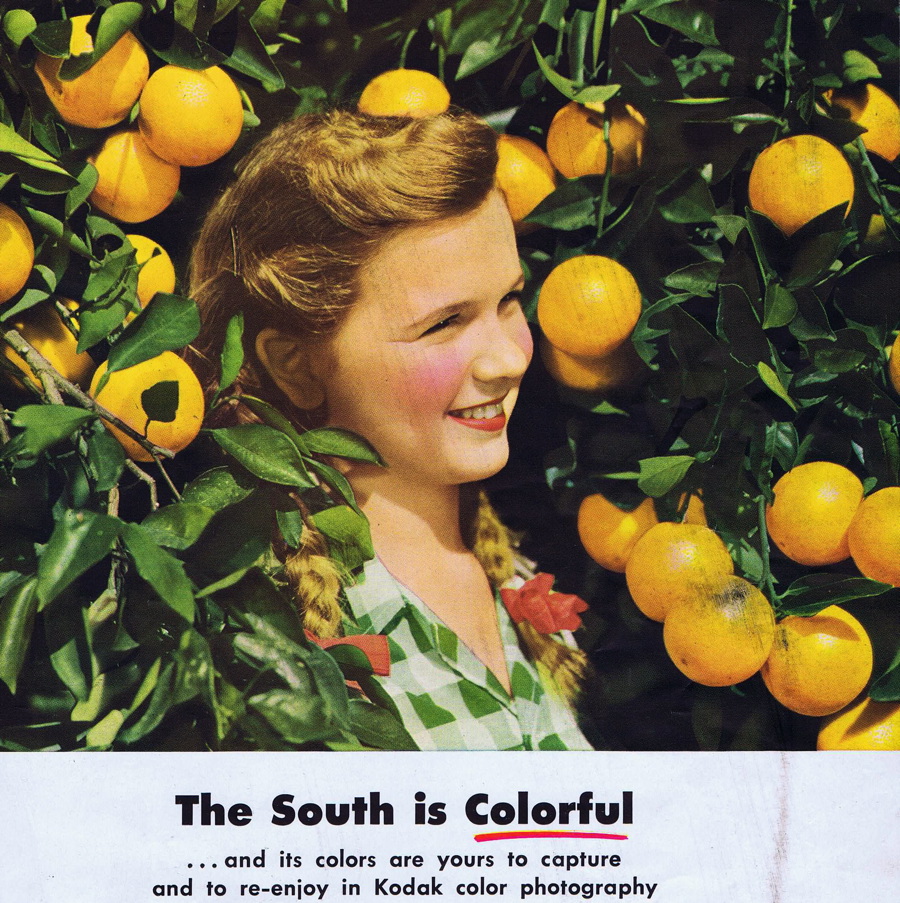
Color reproduction is a tricky business, and not all of the late 1940s over-saturation was by choice. The film emulsions tended toward high saturation, and printing techniques were crude by today’s standards. But I do believe there was a “if we’re going to print color we should make it vivid” attitude back then because color was still not all that common. Most of these magazines, for example, have only a few color pages in the folio; the majority of images are in black and white.

My basic color research uncovered a couple of interesting facts. In addition to men preferring brighter and more saturated colors than women, it seems that babies are even more disposed toward over-saturation. The older we get the less vivid our color choices become.

And people who are outwardly focused and active tend to like warmer and more saturated colors, while introspective and contemplative types prefer cooler, less-saturated ones. And downright depressed people tend toward the dark end of the spectrum.

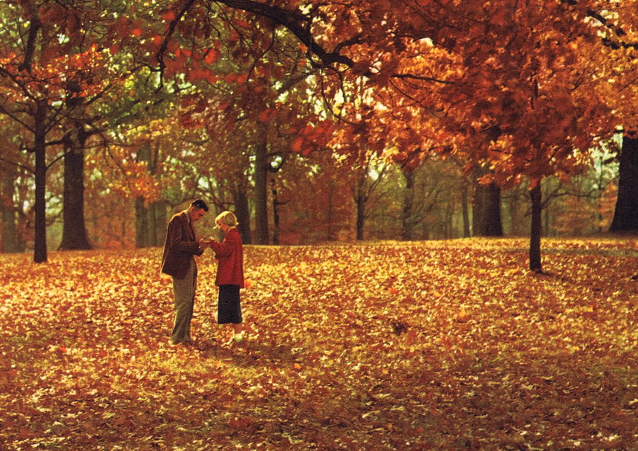
Perhaps it’s not surprising that we also often like colors that mimic things we like in life: blue skies, green trees, the orange and reds of fall. In fact, some scientists believe we choose our favorite colors almost exclusively based on biological/ecological references.
More tidbits from my research: Highly saturated colors tend to make things look larger in scale, while lower saturation diminishes scale. Americans like more saturated colors than the Japanese or Mexicans, at least according to one study I came across, and we tend toward the warm end of the spectrum. All three cultures have an aversion to browns and olives.

When presented with a variety of colors and asked to choose their favorite, men pick blue more than any other color and women pick red. And men will almost always pick orange as a top color while women prefer yellow.

People who score high on the anxiety scale prefer more subtle, less saturated colors, which are also more calming. I once read that Dunkin Donuts chose its orange and pink color scheme specifically because it was unappealing and made people not want to hang out at their shops taking up table space. And though that story is probably urban legend, it works for me.

In some ways, color preference is pretty simple: bright, perky, happy people like bright, perky, over-saturated colors, while quiet, depressed people go for pastels and darker tones.

We now live in a world where accurate color reproduction is possible, but most point-and-shoot cameras and inkjet printers still tend to crank up the saturation because it’s what people prefer.
What are your color preferences? Do they bear out the study findings? Click the Comments button and let me know!
Follow Gene on Twitter: https://twitter.com/SAWG
This article was last modified on May 17, 2023
This article was first published on November 5, 2010
Commenting is easier and faster when you're logged in!

Recommended for you

News Release: Adobe InDesign Goes All-in with iOS, Drops Support for Mac and Windows
SAN JOSE, CA — 12:01 AM 1 APR 2015 — FOR IMMEDIATE RELEASE [Editor...
Creating Inset Stroke Effects with Custom Stroke Styles
InDesign allows us to design our own stroke styles for dashes, stripes and dots....
Using Conditional Text for Web Addresses in Multi-Channel Publishing
Using the same layout for a print and digital version of a project? There are pl...