
InPerson: Roger Black
David Blatner caught up with world-renowned designer and font entrepreneur Roger Black to talk about the past, present, and future of type and layout.


This article appears in Issue 95 of InDesign Magazine.
Roger Black is the president of Roger Black Studio and the co-founder of the Font Bureau, which is now a partner of Type Network.
David: What have you been working on recently?
Roger Black: I just did a little tiny brochure about the typeface Eldorado. It’s 3 × 5 ½ inches. Isn’t that a nice size? It’s like a religious pamphlet! Maybe I should hand them out in the street or go door to door.
David: Exactly! I’d like to tell you about this font…
Roger: You look like you need a font. Have you had any fonts lately?
David: That would be very funny. The amazing thing is that 30 years ago, people would have looked at you strangely, but today everybody knows what a font is!
Roger: They all have a font menu, and they have their favorites. I remember we did a conference in 1990 and the slogan was, “By the year 2000, everyone will have a favorite typeface.”
David: And you were right. I remember, in the early ’90s, talking to somebody who, literally, it was the first time he ever really saw the difference between Times and Helvetica. He worked for a printing house and he never thought about the way the text looked. It was eye-opening and mind-blowing for him when he noticed. Now you, on the other hand, have been playing with fonts for, oh my gosh…
Roger: Yes, a long time. I think a lot of people think that we jumped from lead to digital, but there were many steps in between. I think that it’s good for people to learn where this stuff came from. In classical
design training for typography, you learn how to set type in metal—they still do that at The Hague and Reading, the big type design schools, and also at Cooper Union in New York. They have a big letterpress shop.
It’s important because for 500 years we used these little pieces of metal that had very specific physical restraints that you had to deal with as a designer. For example, you only had so much of it! If you were setting a book, you might use up all your headline type for chapter titles before you printed all the chapters. You could print only some of them, and then you’d have to wash the type and redistribute it, and reset it, and then you would print some more. That’s an almost inconceivable limit today.
David: Right, like saying “I’ve run out of zeros and ones…”
Roger: Yes! And it was time-consuming and therefore expensive to set type. You had to figure out how it was going to count up before you set it or you’d have to pay more money or spend more time.
David: What can new designers learn from that? How is that valuable for designers today?
Roger: In the design process, it’s important to visualize what you’re doing in advance. Any smart designer has some kind of model in mind, so that it’s playing out before they start doing anything. Some designers, at a lesser level, just iterate. They just try many, many things.
I think it’s terrifying when they walk in to the client with seven different ideas, and the client doesn’t know the right direction… It’s because the designer didn’t know either! But a good designer has thought it out already.
If you start by learning where things came from—if you have some idea of the past and the sequence of events that led up today—then you, as a designer, are in much better shape. It’s like [in] automobile design: when Porsche put the bulges back on the rear fenders, it was a “recall” that was very pleasing to people. But it actually went back to the old Volkswagen in a funny way, which had real bolt-on fenders.
People do revivals in architecture, and in other arts. Music is constantly playing over the same ground. You need to learn the history.
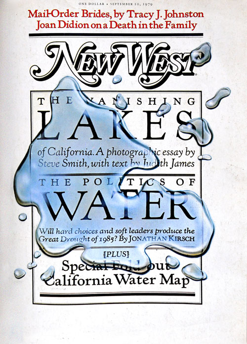
New West cover with metal Monotoype Kennerly and an homage to Ed Rucha.
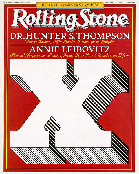
The 10th anniversary cover for Rolling Stone, introducing a redesign of Jim Parkinson’s logo. This year Rolling Stone will celebrate its 50th anniversary.
David: Yet at the same time, as a designer, you’re constantly moving forward, and I would think you’re looking to free yourself from the restraints, to kind of push outside the bounds. No?
Roger: I think, in terms of trying to look forward, it’s really just trying to figure out where the technology’s going, because the technology is just another kind of constraint.
You have to know what’s going on or, otherwise, you can’t play in the field. For example, I think a young designer today is probably, first of all, a coder. Design is becoming algorithmic. You’re not designing a page, you’re designing a kind of system of typography that adapts to different pages, different screen sizes. That kind of thinking is very, very important.
I was lucky as a graphic designer, because most of my life I didn’t design single pages. I designed a “format,” as we called it, for a magazine or a newspaper. That’s the same thing as designing a website, because the content’s always changing. What you’re trying to do is figure out all the possible containers, and what the flexibility is, so that it can adapt to whatever new content there is.
That helped when the web came out, because a lot of people really resisted that they were having to step away from the easel. Actually, web designers fell into the same trap. They’ve had a 640 × 480 easel and then suddenly it’s 16 × 9. The proportions changed, and they’re still changing!
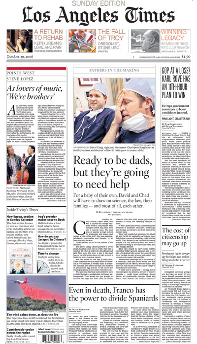
Design for the Sunday Edition of the Los Angeles Times
David: I think one of the things that’s amazing about you is that you’ve kept moving with the cutting edge of design. In the 1970s you were in the phototypesetting world. You were right there at that cusp. Then, in the ’80s you moved really easily into the digital design world.
Roger: I got onto the desktop very fast because it was easier and it was cheaper! Also, there was a wonderful fellow, Steve Luciani, who was with me at Newsweek. Then, he went to The New York Times.
At The Times he was involved with their very first website, which is pretty famous because it was 640 × 480, and it had little bitmap images of the type, like Bookman headlines. We wanted it to look like the print edition, and he was involved with that very early. At Newsweek, he made me get a PC in my office—I got there in 1983.
He was the techie in the photo department. We started getting Scitex equipment. In 1984 we bought three $1-million Scitex machines that were called Vistas. That didn’t include the scanner—the scanner was additional. What it was, basically—less than 10 years later—was a Mac 2. There was a big Barco color monitor, and then you had these Bitstream fonts. We could compose, and color correct, and strip up, and do special effects—just like we do with InDesign and Photoshop now.
Houston Chronicle redesign, with Christian Schwartz’s Houston for text and heads.
But then Steve said, “This is all very cool, but we also have a PC.” He was interested in a program called Ventura Publisher—it played on DOS, but inside an interface shell called GEM. It was actually pretty much like the Mac, with windows and a mouse.
David: Oh my, gosh.
Roger: It was pretty poor, but I remember, in 1987 we were doing stuff that I was showing to the big guys. I remember showing Hermann Zapf a newsletter that I had done in Palatino, and I thought he was going to kill me.
David: Wow.
Roger: He’s like, “Oh, my God. What is going on in the world? The world is destroying itself.” I guess I shouldn’t have showed it to him. “Sorry, Hermann! It’s just a proof!” [laughter] They didn’t like the crudeness, the low resolution, because I’m showing them a laser print.
David: Probably a 300 dpi LaserWriter II.
Roger: I thought it was fantastic, but Hermann didn’t. We moved from Ventura Publisher to Quark. Actually there was a three-month interlude of Ready, Set, Go!
David: Oh my gosh, I remember RSG.
Roger: But the end result was, I ended up switching to QuarkXPress when version 2.0 came out.
David: Probably about 1988.
Roger: Yeah, there were some good things about Quark. I remember some of the command keys that I learned in Quark back in the early ’90s, and I still try to use them in InDesign. [laughs]
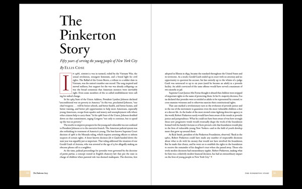
A spread from a book for the Pinkerton Foundation. The headlines are in Big Moore.
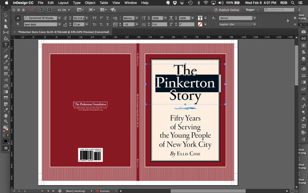
Cover of The Pinkerton Story, designed with James Reyman
David: Yes! You still go for Command+M?
Roger: Yeah.
David: OK, so when did you start using InDesign?
Roger: Well, I was never much of a PageMaker user. If you remember from that era, paste-up people worked a lot more freeform than old-fashioned printers. They would do these amazing collages—that’s where the whole punk look came from. I was not into that. I was trying to imitate old-fashioned printing.
When I did Rolling Stone in the ’70s, we were trying to follow the rules of metal composition. Actually, when I got there we were using Linotype, and then I changed to Monotype to set the type, and then phototype—the Mergenthaler VIP! All that time we were trying to paste up in a very straight way. What I liked about Ventura was that it had frames that you filled with content. Then when Quark came out, they used that same metaphor.
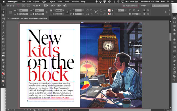
A prototype feature layout for Type, with pick-up art by Jeffrey Smith.
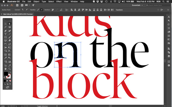
Roger notes: “I tweaked the title in Illustrator. The font’s designer, Richard Lipton, said, ‘What do you have against the letter “n”?!’”
That’s more the way I design. I work within the grid and then maybe tilt stuff or do stuff outside the grid, but have fun with the grid.
David: Then InDesign came out with the same frames that QuarkXPress had.
Roger: I think the typography was immediately better. The Adobe Paragraph Composer thing, that was amazing… they’re actually using a little algorithm to do typesetting, which is exactly what we needed, and it’s quite good. It’s amazingly good.
I think Adobe has always cared about typography in a way that most tech companies don’t. I’m very close with the Adobe type team, and have been all along. I was an adviser when they first started, when Sumner Stone was there in the late ’80s.
You know, the one thing I want to say to InDesign users is: do not set your character spacing, your kerning, to Optical! Use Metrics.
David: Really?!
Roger: If you’re using good fonts, which you should be, the spacing is all worked out for you. That includes what is called exception kerning. In metal there were no exceptions (except ligatures)—all the letters had space built in and that was it. Kerning is actually the notion of cutting into the metal so that you could overlap the letters, which was usually only done for larger sizes.
In the digital world, we can make those exceptions, called kerning pairs. When two letters need to have a different proximity, the designer puts that in there. David Berlow at the Font Bureau is like the aceking spacer of all time. He’s been doing this for forty years. He really knows how to do it.
If you take a look at something like Font Bureau Kis, or Titling Gothic, you cannot improve on the spacing. I cannot, and I am a fanatic! You can track it, and you need to track it sometimes according to sizes, because the spacing doesn’t adjust to size yet… It will, though! We’re working on that.
So if you set it on Optical kerning, you throw out all of that work.
David: What InDesign features do you really enjoy?
Roger: There are so many things. Today, I was using the Pages panel to reorder content in this tiny type book. I rarely use a big screen because I travel so much, but in a high-density screen, like a Retina screen on a laptop, you can see in the thumbnails a very good idea of what the book or story looks like.
You know, in the past we always had to print things out and put them on the wall. But in InDesign, or in Acrobat, we can see the whole thing quickly. That’s nice.
The other things that I really depend on are the paragraph styles, and character styles, and the color swatches. Of course [in recent versions] I’m confused that InDesign wants to save it to Creative Cloud every time I make something. I’m like, “Wait. Stop that! Leave me alone. I’ve got several clouds working for me already, so give me a break.” [laughs]
David: Right! Now, there are many designers out there who love design, but when it comes to doing any of the production stuff they say, “Oh, we have people for that,” and they just hand it off. But you’ve always been doing it yourself.
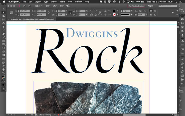
Layout for a keepsake about
the typeface Eldorado, a Font
Bureau custom project.
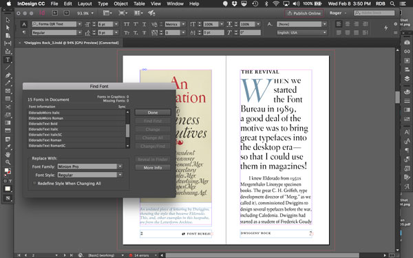
Managing fonts with “Find
Font.” Note the number of
Eldorado sizes used.
Roger: What you’re talking about is a kind of institutional habit that is a very 20th century thing. It relates to the studio—the atelier master, with the apprentices and their smocks… they always have smocks.
They would gather around the master and listen. Then he would hand them the sketch and they would scurry off. But, if you step back to an earlier era, you had the single printer doing their own design. Benjamin Franklin! You see, until the mid-20th century, printers were the designers for most publications. Life magazine didn’t have an art director until about 1975. Before that the printer did the layout.
The editors at the traditional magazines, like The New Yorker, would just talk to the printer and get it done. The printer was expected to be a designer in the old days! In the one-person shops they would design, and set type. They didn’t think of themselves as designers, they thought of themselves as printers. I identified with that.
My early training—right out of high school—was actually an apprentice job for a designer who showed me how to set type and print my own stuff. That made a big difference in terms of wanting control, like this whole thing about kerning.

“This text is ragged, but my default justification settings are for no letterspacing. Zero.”
David: Where do you think InDesign needs to develop next?
Roger: Adobe needs to be thinking, “How do we let the software fade away, and you just design and not think about it too much?” In psychological terms, it’s called the flow. A good designer starts working and time goes by and they really have a good time doing that. That’s what they get off on: the flow, the process. We’ve kind of had that for print, but we don’t really have the same tools for web design and other channels.
So I think Adobe needs to be thinking about algorithmic design. I think that if you can start linking your styles and layouts according to rules—you could say, “captions look like this in this situation, but if there’s not enough space here, or if the column narrows, or the picture insets or something like that, then it should change to look like this.” What we call responsive. That kind of algorithmic-based design is what everything is going to. Even in print, we need to be able to avail ourselves of that.
And I’d like to see almost everybody who’s working in design have these kinds of tools—even people working at a fairly modest level, what we used to call the “church newsletter” level. Today no one is doing just a church newsletter. They’re doing a website. They’re doing an email campaign. They’re trying to output to Twitter and whatever.
I think that we have to hook up the algorithms, but also the modules need to be more portable to go do different things. If you set a column of text, a river of text, you should be able to easily repurpose it for other platforms, and then recombine it according to new rules. I think that that kind of multiplatform design will be the next step.
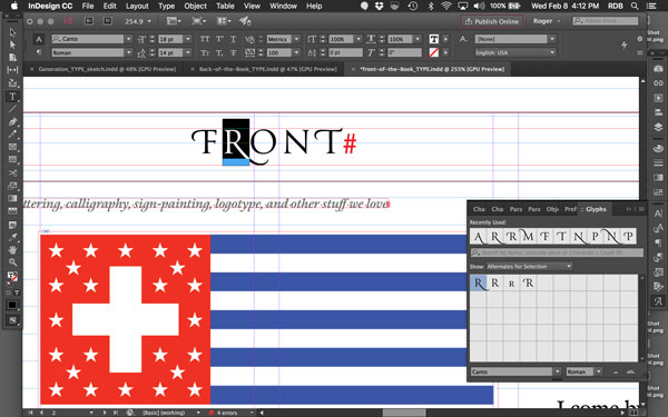
A quick prototype design for a front-of-the-book layout for Type magazine.
David: It seems like you have had these two very distinct careers: design, of course, but also making and selling fonts.
Roger: I don’t think they’re separate. I think of it as typography. From my point of view, the reason why Font Bureau started was that I needed fonts! In the late ’80s, I was advising Adobe, and there were very good fonts, but it was slow. Finally, I just said, “I’m going to do my own fonts.”
Actually, the very first Font Bureau fonts were two fonts for California magazine. First, Californian, which is an old Goudy face designed for the University of California. Then the other was an Egizio, a wonderful Nebiolo typeface. We couldn’t clear the name, so we called it Belizio.
David: So, your underlying philosophy is to get people thinking about typography and get fonts into people’s hands?
Roger: Yeah, well, it got into my hands! [laughs] It was almost inadvertent that we realized we could sell them. But I think most of my work is largely typographical. I’m not a typical art director that way because I’m more interested in the system of typography than I am in the art direction.
You know, I think there’s going to be a lot of font news this year. There are a lot of things happening. The biggest thing on the tech side is the TrueType or OpenType variations.
David: Which is like the multiple master thing all over again.
Roger: It’s a hipper version of that! It’s amazing. Now, the font itself can change—it can become bold… you can turn it more italic… you can grow serifs. For example, if you have companion faces—like Antenna and Antenna Serif—you could code that into one font.
“For the headings in the regular departments of Type, I picked swashes from the Glyphs panel.”
Then down the road we can say, after getting a little feedback from the server, “Ah, this reader really like serifs more, so we’ll give her serifs,” or, “She wants to have a script type,” or “She wants to have a very bold, simple Roman.” That’s one of the things that’s exciting to me about design: long term, the user can be the designer. Most designers don’t like that idea. But I want to get the reader to read this stuff, and enjoy it, and get something out of it. If they prefer more leading in the paragraph, let them have it.
That’s where the coding comes in, where you have to be able to figure out not just coding for design, but adapting the design to the customer. There are really wonderful things that are going to happen.

“Cover of yearbook for my 50th prep school reunion. Title was done in Illustrator. Background in Photoshop.”
OpenType Variable Fonts
Roger Black talked about the new variable fonts technology announced at the end of 2016. Here are several articles that go into more details:
Commenting is easier and faster when you're logged in!

Recommended for you

Creating an Interactive Portfolio
Sandee Cohen shows how to collect and display your best work in an interactive p...
New Book on the Totally Awesome VHS Video Cover Art of the 80s and 90s
As we all move ahead into the world of digital media, casting aside our old book...
InFocus: Resources for Book Design and Production
Cool stuff for InDesign users to help with book design and production, including...