Review: InDesign CC 2017.1

This article appears in Issue 97 of InDesign Magazine.
You know I love InDesign. And I usually love new versions of InDesign. And today Adobe gave us a new version of InDesign, called CC 2017.1. Yayyy… right?
Well, actually no. Not “yay.” More like…”sigh.”
Even though InDesign CC 2017.1 is the first significant upgrade since CC 2017 shipped last October, other than a handful of welcome bug fixes, it offers almost no new features. Instead, it only includes an updated “New Document” dialog box, some templates, and a UI makeover that affects the appearance of every button, tool, and panel.
Were you clamoring for a new UI? Were you sad because InDesign’s New Document dialog box was so old-looking? Neither was I. But we’ll all go along for the ride (at least those of us who are using CC) because it’s either that or we have to look at the annoying “1 update available” in the little CC app until CC 2018 comes out.
Let’s take a look at the new user interface changes, and see where a couple little features snuck in.
New New Document
Adobe rolled out a new “New Document” dialog box in Photoshop and despite a less than enthusiastic response from users (to put it mildly), they decided to put it in Illustrator, too. Now it’s in InDesign:

The main problem in Photoshop is that it’s slow to open — far slower than the older “legacy” New dialog box. I tried to like it in Photoshop, but I just couldn’t get past the fact that it takes far longer to open than the old dialog box. I’ve seen it take up to 6 seconds to open! That may not sound like much when you read it, but believe me, waiting 6 seconds every time you create a new document will start to get on your nerves.
The good news is that InDesign’s new New Document dialog box seems to be a little peppier, only taking an average of 3 seconds to open on my computer. But that is still ten times slower than the old dialog box, which opened, ready to use, almost instantaneously.
Plus, the new New Document dialog box is missing two features the older dialog box offered: the Intent popup menu and the Preview checkbox.
On the other hand, there is one new feature here, which I strongly applaud: You can set the measurements system for the document! In other words, if you want the document to be set to centimeters or picas or whatever, you can set that up here.
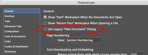
But if that’s not enough to convince you, note that you can disable this new dialog box design by turning on the “Use Legacy ‘New Document’ Dialog” checkbox in General Preferences.

Templates
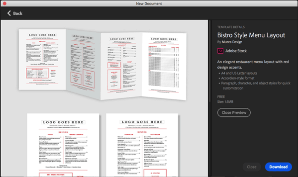
Perhaps the best new thing about CC 2017.1 is another feature hiding inside the new New Document dialog box: There are several new tabs, including Print, Web, and Mobile. Those tabs house lists of InDesign templates you can download and use.
The templates live on Adobe Stock. We’ll be talking more in future articles about how Adobe Stock is expanding to include templates of all sorts. But this is one way you can get access to them:

I’m not entirely sure where all these templates came from. Some are truly dreadful, both in design and construction. Others are pretty good! You’re just going to have to check them out to see for yourself.
Note that when you click the See Preview button you can see a close-up of the image, but you can’t really tell anything about it until you download it and open in InDesign.

By the way, I was tickled to see some templates by our friends Scott Citron and Sandee Cohen in the initial group! I hope we see more like this from them… and perhaps we’ll figure out how to get some InDesignSecrets templates up there soon.
Note that at first there doesn’t appear to be any way to delete templates once you have downloaded them. The solution: Open Window > CC Libraries, choose the Stock Templates library, choose it there, and click the Delete button in the panel.
New “Spectrum” UI
Aside from the updated New Document dialog box, the most obvious change in CC 2017.1 is what Adobe calls a “Redesigned Modern User Interface” and insists it “offers fewer distractions from workspace as well as modern design familiar with touch devices.” Internally, Adobe refers to this as the “Spectrum UI.”
Below is an animated GIF showing the old and new interfaces:

At first glance, it’s not a radical change. But my sense is that Adobe is determined to make everything look like an iPad app. It’s not terrible, but (in my humble opinion) it feels dumbed down.
For example, both the Selection tool (“black arrow”) and the Direct Selection tool (“white arrow”) have lost their tails. They now look like spaceships from a 1980s video game. The overall contrast is lower, so yes, it’s less distracting — but it also takes longer for the eye to find what it’s looking for.
And instead of a ramp that lets you customize the brightness of the background UI, InDesign now only gives you four options:

And, I really don’t mean to complain, but three of those four options result in truly unpleasant and bizarre gray combinations that I can’t imagine using.
Still Waiting
Look, I’m very pleased that Adobe continues to work on improving InDesign, even in little ways. And the inclusion of templates has the potential to help a lot of folks. But it has been years since we have seen an upgrade that was truly compelling. I’m deeply hoping that in the near future Adobe will deliver something great, with features that users are actually asking for. In the meantime, we’ll make the best of what we have, some bug fixes, a new UI, and a sluggish New Document dialog box that allows you to choose your desired measurement units.
Editor’s note: We welcome comments for this post but ask that you keep them relevant to the changes in CC 2017.1. Comments that are solely opinions about Adobe should be posted in the forums, not here.
This article was last modified on July 20, 2021
This article was first published on April 6, 2017
Commenting is easier and faster when you're logged in!
Recommended for you

Make Videos Anywhere, Anytime With Adobe Premiere Clip
Video editing and production is a part of my everyday life as a content creator...

InDesign New Features Guide Updated for CC 2015.1
James Wamser has updated his indispensable InDesign New Features Guide so it inc...

Stabilize Camera Footage with Warp Stabilizer in Premiere Pro
If you fail to stabilize your footage or are unable to using a Tripod or Shoulde...


