Removing Space Along the Left Edge of Text
Every character has a "left side-bearing" but few people notice... until it bites them!

Here’s another mystery of the deep explained: Why do some characters sit flush against the side of a text frame and others get inset a bit, even when the Text Inset values (inside Object > Text Frame Options) are set to zero?
For example, take a look at these five fonts in a row:

All five are exactly the same size, but some are inset, some are flush, and one sticks out the left side of the frame a bit. What’s the deal? It all has to do with the font’s left side bearing, also sometimes called underhang, overhang, or padding.
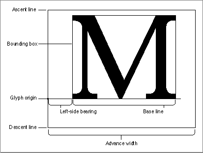
When a font is designed, each character is placed on a grid, with the lower-left corner (the origin) at zero,zero. The designer then has to decide how far from that origin the left edge of the character should sit. Here’s an example taken from the Apple web site (my apologies for appropriating it, but it’s for educational usage; and I was afraid that Apple might take that page down sooner or later):

Here’s another page that has some nice font “metrics” graphics I found.
Virtually all characters in all fonts have a little bit of a left side bearing. A few have negative or zero left side bearings and have a bit of a right-side bearing instead. If a font has no sidebearings, then each character would smash into the next in a line of text!
So different fonts have different side bearings for each character. Mystery solved, right?
Well, there are also a couple other factors that come into play. First, the Optical Margin Alignment feature (which you can find by choosing Type > Story) can change the space along the left side of a frame significantly. In some fonts, turning on OMA will cause characters to move in dramatically, adding lots of space where there was previously none. I love the OMA feature, but one must be careful of it, especially in numbered or bulletted paragraphs, where it can cause major alignment problems.
Also, Adobe added a very, very cool feature to its drop caps formatting: If you open the Drop Caps and Nested Styles dialog box (or choose that inside your paragraph styles dialog box), you’ll see a checkbox called called Align Left Edge:

When ALE (I’m in an intialism mood) is on, InDesign removes the left sidebearing of the drop cap entirely, so it becomes flush with the left edge of the frame. Cool!
I figured I could remove the left sidebearing from a one-line paragraph by setting the drop cap Lines to 1, and turning on Align Left Edge. But unfortunately it doesn’t work. I guess InDesign ignores ALE when Lines = 1. Oh well. Maybe in CS9.
In the meantime, there are, of course, tricks to fake InDesign into moving the left edge of a line of text — even moving it right out the left edge of the frame. The basic method is to place a space (or one of the whitespace characters) at the beginning of the line, then placing the cursor between the space and the first character of text, and then kerning backward… a lot!
You can also put the line of text into a table, make sure the cell insets are set to zero, right align the paragraph that the table is on, and make the table wider than the text frame. Did I say it was easy or fun? No. But you can do it!
[Note: See “script alert” in comments below to find a Dave Saunders script that removes the space for you automatically.]
This article was last modified on December 19, 2021
This article was first published on July 16, 2008
Commenting is easier and faster when you're logged in!
Recommended for you

TypeTalk: A Cornucopia of Font Facts
Optical Kerning and Scaling Surprises Q. From what I can tell, Adobe Illustrator...

Scanning Around With Gene: Lasting Love
This column usually focuses on printed pieces that were designed to be public: a...

P22 Type Foundry's Lanston Type Co. introduces LTC Holiday Ornaments
Based on the popular demand of the LTC Halloween and LTC Christmas Ornaments, a...


