
Preferences You Must Change in InDesign
Changing InDesign’s defaults is a must for the sake of efficiency and convenience.


This article appears in Issue 143 of InDesign Magazine.
When’s the last time you reviewed your InDesign preferences? Not just to tweak a specific setting, but to review all the settings that affect your documents? They’re called preferences for a reason: They give you options to fine-tune the way InDesign looks and acts. The fact that they exist at all is an acknowledgment from the folks at Adobe that no two InDesign users are exactly alike.
Let’s start with a simple example. You probably know that by default when you create a new document for print in InDesign, the unit of measurement you start out with is picas. If you’re not a fan of picas the first thing you probably do after creating a document is switch the unit of measurement to inches, millimeters, or whatever units you prefer. Now think about how many documents you create in a year’s time and multiply that by the time it takes to switch your unit of measurement each time, and you’ve wasted quite a bit of time! This is exactly where preferences come into play. They give us the ability to change InDesign’s behavior to make our lives easier. I’m here to tell you about the key preferences in InDesign that you must change to help you work more efficiently in your day-to-day work.
Understanding Preferences
Before I dive into the details, it’s important to understand a few basic concepts. You can essentially divide InDesign’s preferences into two categories, document-level and application-level. Document-level preferences are those that apply only to the current document you have open. Application-level preferences apply to the application as a whole and can affect existing documents as well as any new documents you create. Unfortunately there’s no indication in the Preferences dialog box as to which preferences are document-specific and which are application-wide. But not to worry—this post will help you differentiate between the two.
In addition to using the dialog box, you can also tweak preferences in InDesign by making changes to various properties in the application. For example, if you select a fill or stroke color, or if you choose a font, or create and select a paragraph style with no document open, you are setting the default properties for all new documents that you create moving forward. Conversely, if you change any of these properties with an existing document open, but no objects selected, you are setting the default properties for new objects created in that document going forward.
For the sake of this article, I’m counting those properties as “preferences” even though they don’t appear in the Preferences dialog box. Okay, now that we understand how preferences work, let’s get to the good stuff—the preferences that you must change in InDesign!
Units & Increments
As I mentioned earlier, when you create a print document in InDesign, by default the unit of measurement is set to picas. Personally, I do use this unit of measurement when working with type, but I find it less than helpful when dealing with things like page and frame geometry. To change the unit of measurement in InDesign, go to the Preferences dialog box—which you can open from the InDesign menu (macOS) or the Edit menu (Windows)—and choose Preferences > Units and Increments (Figure 1).

Figure 1. Changing the unit of measurement in the InDesign Preferences dialog box
If you find yourself accessing the Preferences frequently, take advantage of the keyboard shortcut Command+K (macOS) or Ctrl+K (Windows). Set the horizontal and vertical ruler units to the unit of your choice. Despite how it’s labeled in the Preferences dialog box, this measurement applies to much more than just rulers, including the size of objects and certain text properties as well, such as Space Above/Below. The Other Units setting adds one more level of customization: It allows you to specify a different unit for stroke weights. I’d love to see Adobe add a section here for type objects and geometric objects as well.
While you’re in this section of the Preferences dialog box, I also encourage you to adjust the Keyboard Increments values. These are the values that InDesign uses when you nudge an object or make type adjustments using the keyboard shortcuts. In my opinion, the default values are too large especially for adjusting kerning and tracking. My preferred values are Cursor Key: 1 pt, Size/Leading: 1 pt, Baseline Shift: 1 pt, and Kerning/Tracking: 5/1000 em. These values are what I’ve come to prefer when making type adjustments in my documents. I suggest you try them out and tweak them as desired.
Note the Units and Increments preferences are document-specific. Documents created by other users will maintain the unit of measurement defined by that user and won’t be affected by the measurement preferences defined in your copy of InDesign.
Tip: A quick way to change both the horizontal and vertical ruler units in an open document is to right-click at the intersection of the two rulers in InDesign and choose your desired measurement unit (Figure 2).

Figure 2. Changing the unit of measurement in an open document
Interface
Several versions ago, InDesign, along with other Adobe applications, adopted what is referred to as the Dark UI. This setting controls the brightness of the panels and interface elements within InDesign. Folks usually have strong opinion about the Dark UI. Some folks love it, others hate it. The good news is that you can pick the brightness level that looks best to your eyes in the Interface settings. There, under Appearance, you’ll find four different Color Theme choices ranging from Dark to Light (Figure 3). This section also contains a Match Pasteboard to Theme Color setting that darkens or lightens the pasteboard to match your chosen Theme. If you are in the habit of storing items on the pasteboard, you’ll want to turn this setting off because it can make text hard to read, especially with the darker themes.

Figure 3. The Interface settings allow you to adjust the appearance of the panels and the pasteboard.
Display Performance
One of the most common questions I get from InDesign users is, “Why are my graphics so pixelated in InDesign?” More often than not, the graphics aren’t actually as pixelated as they appear, but instead InDesign simply is not rendering them at a high resolution. This is due to the default Display Performance settings. On older computers, InDesign uses Typical for the Default View setting, resulting in graphics looking low-res in the layout. In response, one of the first tasks that many users perform when opening a document is to choose View > Display Performance > High Quality Display. This makes the graphics look better onscreen but doing it for each and every document that you open is monotonous and time consuming.
A better solution is to open the Preferences dialog box and click the Display Performance category. In the Options at the top of the dialog box, change the Default View setting from Typical to High Quality (Figure 4). (Note: In newer versions of InDesign, the default setting is High Quality—but only if your computer has a compatible GPU installed.)

Figure 4. Changing the Default View in InDesign from Typical to High Quality
To be fair, I think the InDesign development team was playing it safe here and figured that Typical was a safer bet to protect performance when large, image-heavy files were opened. Rendering every image at High Quality in a large file could, in some cases, cause InDesign to become very sluggish. For most documents however, you should be able to safely change this default to High Quality and avoid having to adjust this setting in every file that you open.
While you’re in the Display Performance settings, set Greek Type Below to 0. Modern machines have no trouble rendering tiny type onscreen, and who wants to look at a bunch of gray bars where your type should be?
The Perennial Problem of Lumpy Leading
While tweaking preferences will make your time spent using InDesign more productive and enjoyable, there are some problems that preferences can’t help with, even though it seems like they should. Case in point: the Type preference Apply Leading to Entire Paragraphs (Figure 5).

Figure 5
This should make leading consistent within every paragraph, right? Well, not exactly.
It sure sounds like it would solve the issue of uneven leading within a paragraph. And it does… most of the time. With the preference turned on any changes you make to leading values will apply throughout the paragraph, regardless of what text you have selected. However, just turning it on won’t fix uneven leading in existing text, and it won’t help you with the common glitch that occurs when someone selects all the text of a paragraph except the return character, and then presses Delete or Backspace twice to remove the empty paragraph (Figure 6).

Figure 6. The last line of a paragraph has a larger leading value than the other lines in the paragraph.
In this case the last line inherits the leading from the return, regardless of how you have the preference set. The only way to prevent it is to be vigilant about selecting the return character when you’re cutting or deleting paragraphs. If you do come across a rogue return that’s distorting your leading, a good way to fix it (assuming you properly applied paragraph styles to all your text) is to put your cursor in the paragraph and click the button to Clear Overrides in the Control panel or Paragraph Styles panel. Need to preserve overrides elsewhere in the paragraph? In that case, select just the return before clicking the Clear Overrides button.
File Handling
A number of settings in File Handling preferences are worth taking a look at. The first one that I like to change is Number of Recent Items to Display. This controls the length of the list of documents you see when choosing File > Open Recent. The default is 20, unfortunately the maximum is just 30. I suggest you just bump it up to 30 and be done with it. (Of course, if you prefer InDesign have a shorter memory, you can reduce the number. It’s your preference!)
Another File Handling preference I like to change is the Snippet Import setting. Traditionally, snippets have been an obscure feature that few InDesign users took advantage of. But with the advent of Creative Cloud Libraries, snippets have gone mainstream. Whether you realize it or not, you’re using snippets every time you save or place native InDesign objects to and from CC Libraries. The default Snippet Import setting is to position these snippets at the location of your cursor. Admittedly, this may be what you’re looking for. Often times however, you may be using a logo or graphic element and you’d prefer that object was dropped in the same position from whence it came. Changing the Snippet Import preference from Cursor Location to Original Location will place any snippet (including CC Library objects) at the same position it was in when it was added to the CC Library or when the snippet was made. Regardless of how you have this preference set, you can override it on the fly by holding Option or Alt while you click to place the object. Note that this only applies to native InDesign objects. Graphics that originated in other programs will always be placed at your cursor.
Another key preference in this section is Find Missing Links Before Opening Document, which InDesign turns on by default. To be sure, you want the status of all your links to be OK before printing, exporting, or sharing an InDesign file with another user. But in other instances, you may just want to make a quick text edit or other modification to the file and aren’t really concerned about updating the links. If document has a ton of links, it can take some time for InDesign to find them all—especially if the images live on a server or somewhere other than your local drive. For that reason, I like to disable the Find Missing Links Before Opening Document to speed up the process of opening files so I can get to work on them right away. Then, if any links are missing or modified, I can update them manually later on.
Type
Another feature that many users have a love/hate relationship with is Drag and Drop Text Editing. This feature (which you can find in Type preferences) allows you to select a range of text and move or copy it to a new location in the document or by dragging (Figure 7). For me, this sure beats copying and pasting. But hardly anyone knows about this feature because by default, it is available in the Story Editor only. Fortunately, InDesign gives us the ability to make Drag and Drop Text Editing available in Layout view too. Just click the Enable in Layout View checkbox. Once again: It’s a preference!

Figure 7. Enabling Drag and Drop Text Editing in Layout view
Advanced Type
To achieve great typography, you really need to pay special attention to the fine details, including things like superscript, subscript, and small caps formatting. You’ll get the best results if you use fonts that have real characters designed as small caps, superiors (superscripts), and inferiors (subscripts). Failing that, tweaking some settings in Advanced Type preferences will make the best of things. For the Superscript, Subscript, and Small Cap, the Size setting is represented as a percentage of the full-size capitals. Position represents a vertical shift relative to the baseline and is based on the point size of the text (e.g. If you set Position to 50% then 10 pt subscripted text will move down 5 pts below the baseline). I like to follow the advice of my good friend and typographic guru Nigel French, setting Superscript and Subscript Size to 60%, leaving the Position setting for Superscript as-is, and changing Subscript Position to 20%.
Spelling
As designers and production artists, we’re often not required to write content in InDesign. Usually, we just need to flow the text that’s provided to us and format it appropriately. As part of that process, however, we need to be a second line of defense to help out our editorial comrades and catch any spelling errors that may have slipped through. After all, we’re all on the same team right?
InDesign offers a Dynamic Spelling feature that checks for errors as you type or flow text into InDesign. But a lot of folks never realize they have this power at their disposal because it’s turned off by default. Not surprisingly, you can turn on Dynamic Spelling in Spelling preferences. You can also bypass the dialog box altogether and toggle it on and off by choosing Edit > Spelling > Dynamic Spelling. Once this is enabled, InDesign puts a squiggly underline beneath any word it thinks is misspelled based on the current active dictionary in the document. (For more about working with dictionaries, see Sandee Cohen’s article in Issue #102.)
By default, Dynamic Spelling will check not only misspelled words, but also repeated words, uncapitalized words, and uncapitalized sentences. These preferences work well for some types of content, but if you’re working with content of a more technical nature, the uncapitalized words and sentences option can produce a lot of false positives as InDesign uses the period to indicate the end of a sentence. If you find the uncapitalized words and sentences options to be less than helpful, go to Spelling preferences and turn off the appropriate options in the Find section at the top of the dialog box (Figure 8). While you’re there, you can also adjust the underline color that Dynamic Spelling uses to indicate the various errors that it finds.

Figure 8. Customize your settings for smooth and effective spell checks.
Default Type Properties
I regularly witness folks who repeatedly create a new document, add text to it, and then immediately change the font from the default, Minion Pro Regular, to their preferred font. An easier approach is to set the default type properties with no documents open. You can change the default font, point size, leading, and any other text property, and they’ll all become the defaults in new documents you create. However, it’s also important to understand that when you do this, you’re applying an override to the Basic Paragraph style in InDesign—as evidenced by the presence of a + sign next to the style name. In many cases this is no big deal, but it can cause some unexpected formatting changes if you import text from another file or copy text and paste into one of these documents. That’s because in the event of style conflict (when the incoming definition for a style differs from the existing definition in a document) the receiving document always wins.
To really nail down default font properties in InDesign, always create your own paragraph style for the text formatting that you desire. This is especially useful if you work for an organization that has strict branding requirements that you use regularly. Create commonly used styles like heading, subhead, body, and so on, so that each document you create has those styles waiting for you to provide consistent formatting to your document.
Tweaking Default Settings: The Home Screen Hindrance
The Home Screen (formerly called the Start Workspace) is a relatively recent addition to InDesign. The idea behind the Home Screen is that it gives you a jumping off point when you have no documents open. From the Home Screen you can access common document presets, documents you’ve recently worked on, and even tutorials to learn more about InDesign. Some of those tutorials aren’t just for beginners, as they often highlight new features that you may not be aware of.
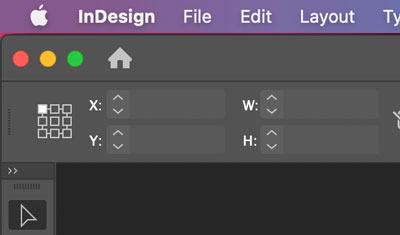
The Home Screen is great until you decide that you want to change a default setting with no documents open and realize that the part of the interface you need to use is not available, because the Home Screen has taken over the entire application window. The good news is that there’s an easy fix. In the upper-left corner of the Home Screen, you’ll see the InDesign icon (Figure 9).

Click that icon and you’ll be switched over to the regular InDesign interface so you can make any desired tweaks to default settings. To switch back to the Home screen when you’re finished, simply click the house icon in the upper-left corner of the window (Figure 10).
Note that the Preferences dialog box is always accessible (even when the Home Screen is visible) by pressing Command+K (macOS)/Ctrl+K (Windows), or using InDesign’s menus.
Make InDesign Your Own
In the end, changing preferences is all about reducing friction in our daily work. Over the years, I’ve learned to leverage InDesign’s preferences to get the program to bend to the way that I work instead of spending my energy fighting the program’s default behavior. Spending a small amount of time thinking about the way you work and adjusting InDesign’s preferences to accommodate your process can pay big dividends when working on future projects.
Commenting is easier and faster when you're logged in!

Recommended for you
InDesign Magazine Issue 141: Transparency
Issue 141 has articles on working with transparency, transparency FX, handwritin...

Scripts from the Crypts
Mike Rankin digs deep into the InDesignSecrets archives to find 20 scripts that...

InReview: DocsFlow 3
This cloud-based editorial plug-in offers improved interoperability between Goog...