
PowerPoint for Print Documents
Using PowerPoint to make documents for print output is not as crazy as you might think.


This article appears in Issue 3 of CreativePro Magazine.
Yes, you read that title right, and I know what you’re thinking. Why on earth would you ever use PowerPoint as a desktop publishing tool to create a print document? It’s a fair question, but there are some good reasons, particularly if you’re the kind of designer who’s focused on solving client problems and listening to their needs. Let me explain.
InDesign is an amazingly powerful program for print document production, but it comes with a lot of baggage. For starters, it’s expensive, it has a big learning curve, and it’s nowhere to be seen in the vast majority of offices. Then there’s Microsoft Word. Sure, it’s powerful, but have you ever tried to use it to execute any kind of highly designed layout? If so, you have my sympathies. So when we’re looking for a program that nearly everyone has and is able to use, one name stands out: PowerPoint. Admittedly, it’s not designed for print production, but it does allow you to build good-looking content that’s easily editable by many people (simply because they have the program and know how to use it). So, when a client needs something to look good and be widely editable in-house, that’s when I opt for PowerPoint over InDesign.
I should note that for the purposes of this article, print will mean a physically printed document or a digital-only PDF—essentially anything that is not a speaker-guided onscreen presentation.
Characteristics of Print Design
If you are going to create a “presentation” with PowerPoint that will not be projected but read by one person at a time, then it is simply a document and should be designed as such. To get out of “PowerPoint-think,” focus instead on the characteristics of print production that you can make use of when designing your PowerPoint document.
For example, these are some things that you might see in a print document, either on the surface or under the hood:
- Vertical pages
- Use of a grid
- Columned text
- Prose organized in paragraphs
- Professional quality typography
- Smaller type
- Inline imagery
- Text styles*
- Threaded text frames*
- Text wrapping*
- Footnotes and endnotes*
Naturally, InDesign can handle all of the above with ease, but so can PowerPoint—with the exception of the last few items with asterisks. Actually, PowerPoint can also do styles, but I’ll leave that trick for the end.
Yes, there are some big stumbling blocks when using PowerPoint for document creation. The inability to thread text and have true footnotes means that you don’t want to use PowerPoint for your 100-page academic paper. But I promise it will be just fine for your 15-page internal report that will be circulated as a PDF. And PowerPoint brings with it some important benefits. We’ve already discussed its ubiquity and ease of use. Add to those the modular nature of a PowerPoint document. Every page/slide is self-contained, so anyone can quickly reorder and cut and paste pages without affecting the rest of the document. This is a major advantage when you have a workflow in which multiple authors, working and thinking independently, need to take turns working in the document. Each person can take care of what’s theirs without blowing up someone else’s work. Believe me, it’s great for team harmony.
Page Size
While there is nothing wrong with horizontal page layouts (hey look, you’re reading one right now), I often recommend going vertical to get both writer and reader completely out of PowerPoint-think mode like I did with the 100+ page quarterly report for a foundation’s board of directors shown in Figure 1.

Figure 1. There’s no reason why a “PowerPoint presentation” can’t be designed to look like a Word or InDesign project.
To change your page size and orientation, go to Slide Size under the Design tab and select Page Setup. Don’t choose the default Letter Paper (8.5″ × 11″) option, because this bizarrely will give you a 7.5″ × 10″ page size. You’ll need to choose Custom and enter 8.5″ × 11″ or A4 dimensions (Figure 2).
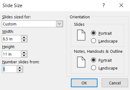
Figure 2. To create an 8.5″ × 11″ portrait document, just change the slide size under the Design Tab: Slide Size: Page Setup.
Grids and Columned Text
Whether you’re working in portrait or landscape, you’ll want to set up a grid the way a print designer would with almost any document. PowerPoint does have an option for setting an underlying grid (Windows only), but it’s not the kind of grid you want. To set a grid with margins and gutters (the space between columns), you’ll need to use PowerPoint Guides.
Setting precise guides manually can be a major headache unless you make use of the incredible BrightSlide add-in, which lets Windows users enter mathematically precise margins, columns, rows, and gutters. The macOS version of BrightSlide does not include the Grids feature. So this is one of those times that I jump over to my PC or fire up Parallels. I generally add guides only to the Master and include gutters to aid in making columned text. Having a grid doesn’t mean that you can’t color outside the lines, so to speak, but it will give you a strong underlying structure to align items to and to set up columned text (Figure 3).

Figure 3. Setting Guides with the free BrightSlide add-in is far easier than doing it with PowerPoint’s native tools.
Columned Text
There will be times when you’ll want to make use of multiple text boxes in a layout. But in general, I advise you to stick to a single text box such as a Master Text Placeholder. To set columned text, select the text box and, under the Home tab, click the Add or Remove Columns button. Ignore the presets, and choose More Columns so you can enter the number of columns you want along with the gutter, or what PowerPoint calls Space Between Columns. You’ll want to set the spacing to the exact value you entered when setting up your guides with BrightSlide (Figure 4).

Figure 4. Set your desired number of columns and space in between with the Columns tool on the Home tab.
Typography
PowerPoint doesn’t have nearly the typographic control of InDesign or its Creative Cloud companions, but you can still set paragraph line spacing, as well as space before and after paragraphs. In general, the default single line spacing rarely feels right, so I’ll usually opt for .9 or 1.1 depending on the layout and content I’m working with (Figure 5).
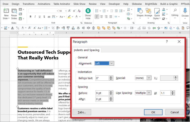
Figure 5. Take more control of your text with the Line Spacing dialog box on the Home tab.
You can also set tracking values (which PowerPoint calls Character Spacing.) To kern a pair of characters, such as in a large headline, the trick is to select the first letter only and then apply your Character Spacing setting (Figure 6).

Figure 6. Control your tracking and kerning with the Character Spacing dialog box.
If you want a live preview of your type adjustments, use the special typography controls in BrightSlide.
Design-Worthy Typefaces with Cloud Fonts
When you’re using PowerPoint for print purposes, there’s no excuse for choosing Calibri or Arial. If you have professional fonts like Gotham or DIN on your computer, you can, of course, use those in PowerPoint. But now that Microsoft has introduced Cloud Fonts for Microsoft 365 subscribers, you can take advantage of hundreds of professional fonts at no additional cost (Figure 7).

Figure 7. Take advantage of hundreds of professional-level fonts with Microsoft’s Cloud Font library.
Any font you see listed in the Fonts menu with a cloud icon is a Cloud Font. (Note that after you download and activate one of these fonts, its cloud icon disappears.) You’ll find some amazing typefaces here, such as Georgia Pro, Gill Sans Nova, and Neue Haas Grotesk Pro, to name just a few. I’m partial to the Cloud Font version of a typeface that print designers have used for years called Avenir Next LT Pro.
Also, be sure to reduce your type size down from what you might be used to using in PowerPoint; a printed page doesn’t need to be read from across the room. Consider using 10–11 pt (or whatever looks right for a particular font).
Easy on the Bullets
With smaller type, vertical pages, and columned text, hopefully you’re writing more full sentences and paragraphs. Resist the urge to use too many bulleted lists the way you might if you were creating a PowerPoint presentation. Instead focus on judicious use of headings, subheads, and even pull quotes.
Inline Imagery
PowerPoint cannot wrap text around imagery, but simply placing imagery within blocks of copy is an easy thing to do, requiring only a few extra returns to give the picture the space it needs. Yes, I know this is definitely not a best practice in InDesign, but that’s because InDesign has text wrap features. So, when in Rome…
Bleeds, Crop Marks, and Color Management
Although I have successfully used PowerPoint-created PDFs in professional print projects, you do need to keep some things in mind. The first is bleed. If you want to include bleed on pages, you’ll need to set up your file larger than 8.5″ × 11″ (or whatever the final trim size will be). You can also add crop marks into your file manually, add them in with Acrobat DC, or just do without if you have an understanding printer. (A really good printer once printed a PowerPoint PDF created without included bleed by first expanding the page 1–2%, and then carefully cutting the pages down.)
When it comes to managing color, PowerPoint recognizes only RGB and Hex values. You can’t specify CMYK values or spot colors, so if you need precise color management, you’ll probably want to head back to InDesign. But if you don’t need those things, you should probably be leaving your colors in RGB anyway, and leave the conversion to your print service provider for best results.
Spreads
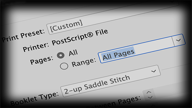
If you really want to flex your Microsoft muscles, you can set up a PowerPoint file to be printed in spreads. You’ll need to do some copying and pasting between slides and constantly check things in Slide Sorter view, but there’s really no reason you can’t have content span pages like in this double-sided, spiral-bound report (Figure 8) in which the cover image also wrapped around to the back.

Figure 8. With a little work, you can design PowerPoint to print spreads.
Hacking Styles
Okay, I know you’ve been waiting patiently for this one. How does PowerPoint do styles? Well, it doesn’t technically have paragraph styles in the way Word does, but you can create and apply them by harnessing the formatting properties of bullet levels in Master Text Placeholders.
Each text placeholder on a Master Layout can contain up to nine levels of bullets (though only the first five are initially visible with text prompts). And each of these bullet levels can be formatted uniquely with font, color, character spacing, paragraph spacing, and space before and after settings. Each bullet level doesn’t even have to have a bullet or be indented. You can apply all your formatting in the topmost Master Text Placeholder, in which case it will flow down to all child layouts, or you can apply formatting individually on layouts and within any individual text placeholder.
To make use of your newly created styles on slides, place your text in one of these placeholders and then use the Indent More buttons to cycle through all your styles until you arrive on the one you like (Figure 9).

Figure 9. After you have designed bullet levels in the Master, use Increase List Level to cycle between them and apply them to your text.
These styles can be updated in the Master and will auto-update on slides.
I usually set my body copy to the first bullet level, with headings and subhead styles set to subsequent levels (Figure 10).

Figure 10. Create paragraph styles for headings, subheads and other text in your document by formatting up to nine levels of bullets available to you in a Master text box.
PowerPoint to PowerPrint
We all know that PowerPoint was not designed for print production. But in the right circumstance, it can be your best option for producing a print (or onscreen) document that will never be used in a presentation. My best advice is if you’re going to go down this road, you need to think not like a slide designer, but like a print designer:
- Use small type, professional fonts, and columns.
- Go easy on the bullets, and opt for more paragraphs of text.
- Use guides to set up a grid.
- Consider changing your layout to portrait.
- Account for bleeds if appropriate, and know that you can even simulate readers’ spreads.
- Make full use of every tool at your disposal, such as using bullet levels for styles.
Once you start designing in this new way in PowerPoint and offering clients a more editable product, you may even find yourself having fun solving new problems and addressing different challenges.
Commenting is easier and faster when you're logged in!

Recommended for you

Interview with Lisa Marie Grillos, Presentation Rockstar
Q&A with Lisa Marie Grillos, who is presenting Learning to Live with Goggle Slid...
Creating a PDF from InDesign’s Print Booklet Feature
A step-by-step guide to creating a PDF of printers spreads with Print Booklet.

InDesign Magazine Issue 93: Editorial Tools
We’re happy to announce that InDesign Magazine Issue 93 (January, 2017) is...