
Making Charts and Graphs in InDesign
There are many ways to create information graphics in InDesign. Which is best for you?

This article appears in Issue 26 of CreativePro Magazine.
It’s hard to believe that Adobe hasn’t built a modern, full-featured, designer-friendly graphing solution that integrates seamlessly into an InDesign page layout workflow. Adobe’s solution is the nine anemic graph tools built into Illustrator—tools that contain only very basic features, haven’t been significantly improved since they made their debut in Illustrator during the early 1990s. Different workflows require different tools. Do you just need to create an occasional highly designed chart, or do you need to include hundreds of repetitive data-driven graphics in a lengthy report? Will the charts be used for both print and digital output? Can you get by with standard pie, bar, and line charts, or do you need more esoteric chart styles? In this article, I’ll show you how to create charts that integrate into InDesign layouts and the strengths and weaknesses of each method. I’ll cover plug-ins and scripts, some special data visualization fonts, some miscellaneous solutions that you might already own, and how to find out more about these tools.
Plug-ins and Scripts
Enterprising software developers have developed various plug-ins and scripts to help with charting. Here are the three that I’ve found to be the most useful.
Cacidi Charts CC
Cacidi Charts CC adds a new panel where you create pie, expanding pie, circle, gauge, column, bar, pyramid, area, high/low, and combined line scatter charts right in InDesign (Figure 1). To open it, choose Window > Cacidi Charts. You can enter your data directly into this panel or import data saved as CSV (comma-separated values). Next, choose your chart options, click Create, and you’ll see a new frame containing the chart on the page. To edit the chart, just select the frame, once again choose Window > Cacidi Charts,
then change the data or chart options.
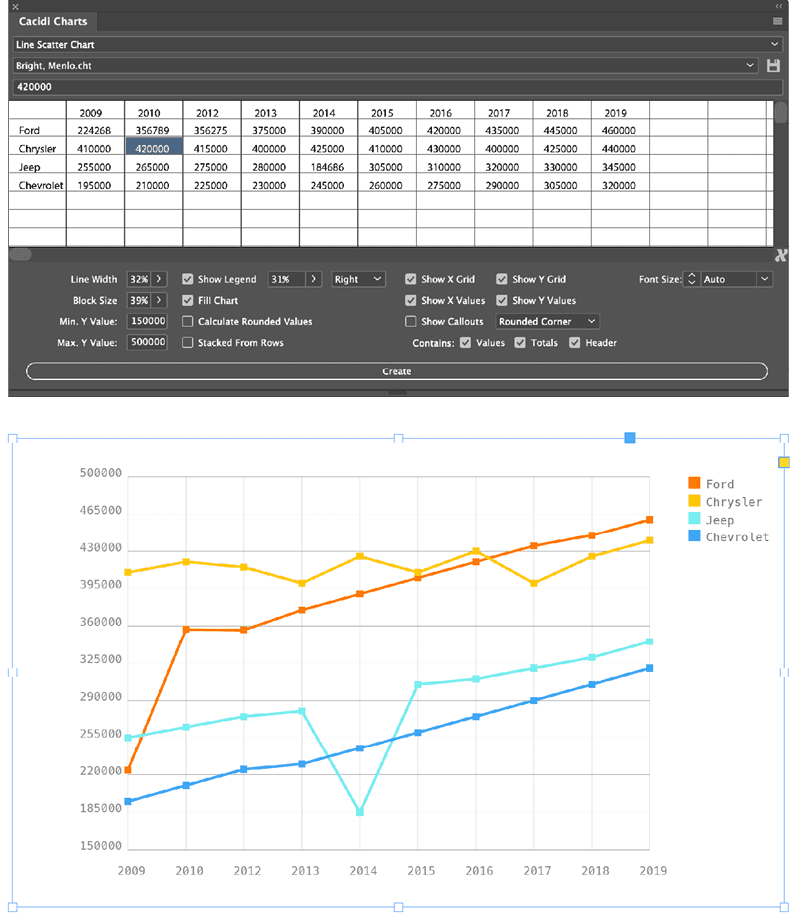
Figure 1. The Cacidi Charts panel contains numerous features to customize your chart. Most changes you make in the panel (top) are reflected immediately on-screen (bottom), though certain changes require you to click the Create button before they take effect.
Cacidi Charts works well, but some idiosyncrasies take some getting used to. Entering and editing data in the dialog box doesn’t follow standard conventions. For example, you must press Enter after changing a value; if you don’t, the change doesn’t stick. Numbers in the data cannot contain dollar signs or commas. Be sure to read the documentation to avoid frustration. (Jamie McKee’s full review of Cacidi Charts appeared in InDesign Magazine, issue 104.)
One of the best features of Cacidi Charts is its ability to quickly convert a chart from its own format to native InDesign objects. Simply choose Convert Charts to Objects from the panel menu. The selected chart is converted to objects, and the original chart is copied to a new layer it creates, in case the chart needs to be edited later. By letting you edit the artwork, you can customize the chart appearance far beyond the features the plug-in provides.
Cacidi Charts is one of the few solutions that lets you import and use your own set of InDesign swatch colors for a chart, though the method it uses to do so is unconventional. Again, be sure to read the documentation.
To create a series of charts that all have similar formatting, just create the first one, fiddle with the settings until you nail down its appearance, and then duplicate its frame. Select the duplicate frame and edit the data in the Cacidi Charts panel to create the second chart, and repeat this process for each chart in the series.
Claquos 3
Claquos 3 is a script that lets you create pie, exploded pie, and donut charts in InDesign, and it’s also more elegant—and easier to use—than Cacidi Charts for these types of charts, which it builds with native InDesign objects.
To build a chart with Claquos, you can either select data in table rows and columns in your layout and then run the script from the InDesign Scripts panel. Or, with nothing selected, you can run the Claquos script and type the data into the Claquos dialog box (Figure 2).
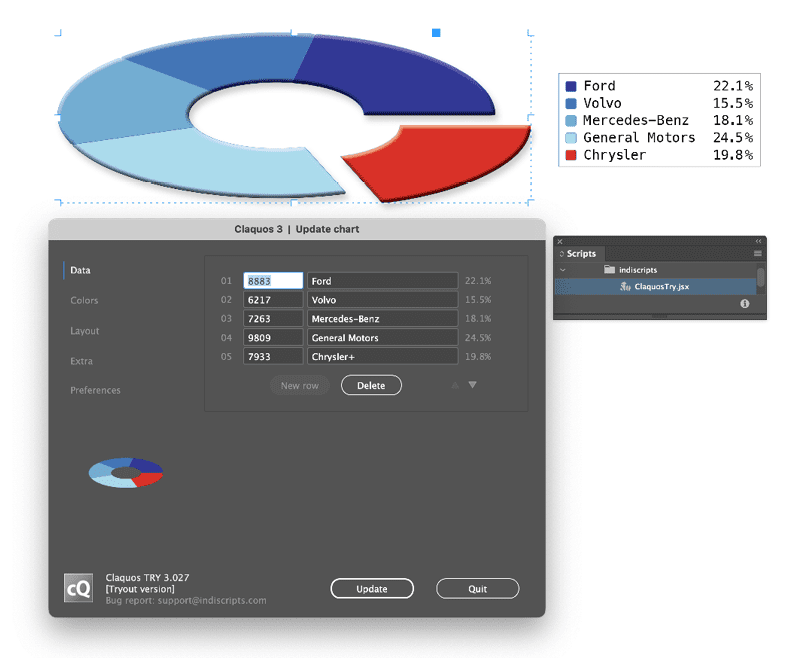
Figure 2. The Claquos dialog box contains lots of options to customize the chart data, colors, layout, and much more.
Claquos provides many options for customizing chart colors; assigning colors to specific chart components; specifying a stroke, hole size, or legend appearance; and much more.
Using the script is generally self-explanatory through its well-organized dialog box and well-written, comprehensive PDF documentation. If pie charts are your jam, I recommend it.
Resize Chart Bars
Resize Chart Bars is a low-cost script with one purpose: to resize the width or height of individual InDesign frames according to a list of values. It’s very helpful for creating bar charts with properly sized bars.
Using the script is simple. First, type or place the data values into a text frame, with a return after each value. Next, create a step-and-repeat grid of an equal number of objects on the page. Select both the grid and the text frame containing the values, then run the script. Specify horizontal or vertical resizing in the box that appears and click OK. Each bar is resized according to the value you entered (Figure 3).

Figure 3. Before (left) and after (right) running the Resize Chart Bars script.
Be aware that the numbers cannot contain decimals, commas, or dollar signs. Rectangles can contain corner effects, strokes, and InDesign effects. The objects to be resized don’t need to be rectangles at all—they can be ellipses, polygons, or compound paths—but the shape of such objects will be distorted as they are resized.
Fonts for Creating Charts
Each of the following fonts leverages advanced features in the OpenType font specification to display numerals as charts. With each of these fonts, you first type the numbers that you want to chart, as well as other glyphs that affect your formatting options. Next, you select the numbers and change them to the charting font, activating the OpenType Discretionary Ligatures option to convert the numerals to a chart.
Chartwell
Chartwell is an amazing 28-font family that can be used to create various types of charts. Once you understand how these fonts work, you’ll find them an excellent way to create high-volume, repetitive, data-driven charts.
In its newly released version 4, you can use these fonts to create a huge array of chart types, as well as progress boxes, dots, squares, and stars (Figure 4).
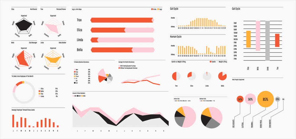
Figure 4. A sample of the wide variety of chart styles that can be generated with Chartwell. Any chart title, data, or axis labeling is added manually.
Here’s how you would create a simple pie chart with Chartwell:
- In a text frame, type the values for each piece of the pie, separating them with a plus sign:
10+34+25+10+21. - Select each value and change the color, tint, and stroke that you wish that slice of the pie to displayed with.
- Select the entire string of numbers and change the font to Chartwell Pies.
- Toggle InDesign’s OpenType Discretionary Ligatures option on.
Various chart types feature modifiers that can be added to the data string. For example, adding +x20 to the end of the string adds a 20% “hole” to the inside of a pie chart.
As you type and format the text, you can toggle discretionary ligatures on and off to see what you are doing, or—better yet—just work with the text in the Story Editor while viewing the resulting chart in the layout (Figure 5).

Figure 5. Viewing the text in InDesign’s Story Editor lets you see the text that generates the chart. The color assigned to each numeral in the text determines the color of the related chart element.
Chartwell is well-suited for lengthy reports that contain a lot of data. If you can work with someone to format reports from your company’s data system and submit them with the numbers in the syntax required by Chartwell, you can make short work of producing lots of charts.
Here are a few other details you should know:
- You can enter values with a single digit after the decimal point, but all decimal values are rounded to the nearest integer for chart display.
- Most of the chart types work only with numerals in the 0–100 range. If your data falls outside that range, you’ll need to do some math to convert it into percentages, a process called normalization. Luckily, you can use a simple tool to do this conversion for you.
- Chartwell doesn’t add any value or axis labeling to the charts it produces. Labeling is left up to you.
One of the most useful Chartwell fonts is Progress Stars (or bars, boxes, dots, and squares). By simply typing 3/5, choosing Chartwell Progress Stars, and turning on Discretionary Ligatures, you get a star rating as shown in Figure 6. This is really useful for directory projects that contain star ratings.

Figure 6. The Chartwell font’s Progress Stars style makes star ratings quick and easy.
The rights to Chartwell have returned to Travis Kochel, the original designer, who is relaunching an updated version of the fonts on the website of his company, Vectro Type, along with new documentation on how to use them.
NumToBars
This font creates only bar charts and does so in much the same way as Chartwell Bars, but with three key differences.
First, Chartwell rounds the results to the nearest whole number, but NumToBars is accurate to one decimal.
The second difference is that you separate the numbers with a plus sign in Chartwell Bars, but with NumToBars you enter the numbers with a return after them, or you can create stacked bars by separating the numbers with a delimiter such as an en space and then using nested styles to create a stacked bar effect (Figure 7). This difference between the two provides more layout flexibility with NumToBars.
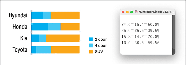
Figure 7. The ability to separate values with any delimiter, combined with InDesign’s nested paragraph styles feature, allows you to create interesting stacked-bar-chart effects with the NumToBars font.
The third difference between the two fonts is that Chartwell Bars provides some modifiers for displaying ranges, grids, and reference lines in a chart. With NumToBars you’ll need to create these elements manually.
So which font should you use, Chartwell Bars or NumToBars? It really comes down to three questions: Do you need accuracy to one decimal place? What form is your data in? Is it more convenient to have returns after each numeral or a plus sign?
Sparks
A sparkline is a small chart presented inline with surrounding text, typically without axes or coordinates. These are often used to convey a sense of change over time. The concept is often attributed to information design expert Edward Tufte.
The free Sparks font lets you create these little charts easily, by just entering numbers surrounded by braces, with each number separated by a comma, and then applying one of the 15 Sparks font variations to create a line, bar, or dot chart (Figure 8).
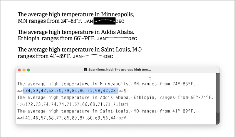
Figure 8. The free Sparks fonts make short work of including sparklines (or bars or dots) in your text.
Numerals used to generate sparklines cannot contain decimals and must be normalized to the range 0–100.
Amazing Infographic
Amazing Infographic is a commercial font from Zetafonts, part of their Amazing Grotesk type family. This font leverages OpenType features to automatically create circle charts, bar charts, pie charts, and more by inserting @c, @b, or @p followed by a two-digit numeral (Figure 9).

Figure 9. Amazing Infographic, part of the Amazing Grotesk type family from Zetafonts, leverages OpenType features to display circle charts, bar charts, pie charts, and more by typing a simple formula syntax.
Circle and pie charts can display only two slices, but the percentage of one of the slices can be automatically overlaid on the chart.
- Bar charts can feature an unlimited number of bars, or you can create a single stacked-and-labeled thermometer chart.
- Only whole numbers can be used. No decimal points are allowed.
- A free version of the font for noncommercial use can be downloaded from dafont.com.
External Tools
Of course, all kinds of third-party desktop and web-based tools are available for creating charts. Here are three widely used options that offer robust ways of generating charts.
Datylon Online
Datylon is a fantastic web-based tool for creating more than 20 styles of charts, ranging from pie, bar, and line charts to lollipop charts, stream graphs, bubble charts, and heatmaps. The free online version is entirely usable, allowing you to create an unlimited number of charts, store them online, and download them as vector PDFs to place in InDesign (Figure 10).
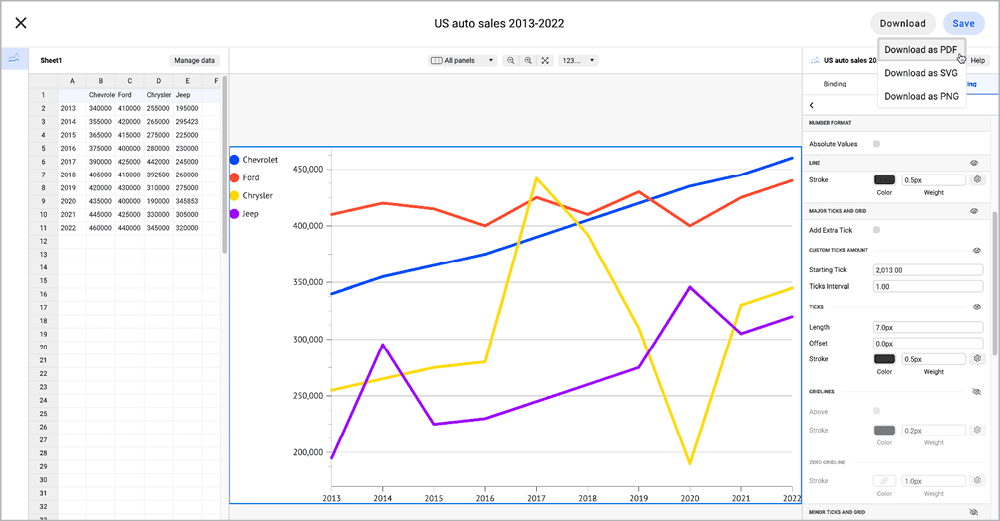
Figure 10. Datylon Online, a full-featured chart editor, enables you upload your data, choose from a vast array of chart styles, tweak the appearance of almost any chart element, and then download the result as a PDF.
Charts can be created to a precise size, you can specify a wide variety of Google fonts, and you can specify RGB or hex values for precise color assignment. Each chart you create is assigned a unique URL.
Best practice: Add the URL to the downloaded PDF’s metadata. That way, you can quickly and easily return to the URL later if you need to modify the chart online and re-export a PDF.
If you purchase Datylon for Illustrator, you can use your own fonts and embed those fonts in templates that can be used in Datylon online. You can upload data from Excel or connect to Google Sheets or Excel spreadsheets in OneDrive.
Excel
Excel is a full-featured charting tool, although it is much maligned for its ability to play nicely with InDesign. But with some best practices, you can create charts that work well in your layouts.
Best practice 1: Right-click a chart, select Format Chart Area, click the Size Option under Chart Options, and enter specific dimensions for your chart (Figure 11). Locking in the size in Excel will let you create a series of charts in your layout with consistently sized elements.

Figure 11. The Size fields in the Format Chart Area panel let you create a chart with specific dimensions in Excel.
Best practice 2: Use quality OpenType fonts for chart labels. Avoid system fonts and other default fonts like Ariel or Times New Roman in your chart elements, or you might experience font problems when you place your charts in InDesign.
Best practice 3: To export a chart in high-quality vector format for your layout, right-click a chart, choose Save as Picture, and choose PDF for Save As Type.
Google Sheets
Google Sheets is also a full-featured charting tool that can create charts that work well in InDesign. I don’t know of a way to specify an absolute chart size in either inches or pixels in Google Sheets, so generating a series of charts of a consistent size requires some ingenuity.
Google Sheets lets you choose from only 12 fonts for chart elements, but those fonts are embedded in the PDF export and thus will display properly in InDesign.
To export your chart in high-quality vector format for your InDesign layout, click the more icon (three vertical dots) in its upper-right corner. Choose Download to download the chart as PDF or SVG. (You can also choose PNG.)
Which Method Is Right for You?
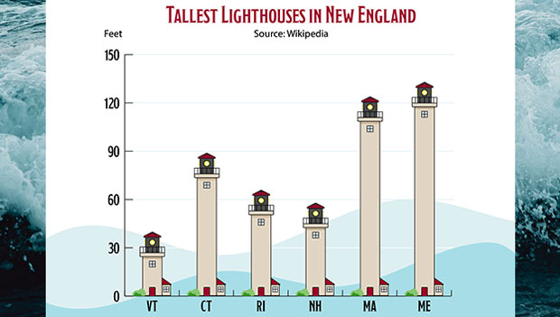
You have a wide variety of ways to create charts for use in an InDesign layout (Figure 12). The method that will work best for you depends largely on what tools you have access to, your budget, your tolerance for learning new things, the types of charts you need to produce, and where your chart data comes from.

Figure 12. You’ll find a wide variety of ways to create charts for use in InDesign.
Commenting is easier and faster when you're logged in!

Recommended for you

CreativePro Video: Numbering Across Stories in InDesign
In this week’s CreativePro video, Sandee Cohen demos how to continue a numbered...
How to Create a 3D Pie Chart in Illustrator
Learn two methods for making 3D charts in Illustrator.
How to Enhance Illustrator Graphs with Graphics
Turn plain graphs into infographics with this exclusive Illustrator feature.