


Louise Fili
All designers have their own list of the creative professionals they admire and respect the most. Louise Fili is at the top of my list, as well as the list of so many other professionals. She heads Louise Fili Ltd, a graphic design studio that offers unique and elegant solutions to all things related to food, books, and culture, including brand development for restaurants and specialty food packaging.

Fili’s studio
Formerly senior designer for Herb Lubalin, Louise Fili was art director of Pantheon Books from 1978 to 1989, where she designed close to 2,000 book jackets. She has received Gold and Silver Medals from the Society of Illustrators and the New York Art Director’s Club, the Premio Grafico from the Bologna Book Fair, and three James Beard award nominations.
Fili has taught and lectured extensively, and her work is in the permanent collections of the Library of Congress, the Cooper Hewitt Museum, and the Bibliothèque Nationale. A member of the Art Directors Hall of Fame, she has received the medal for Lifetime Achievement from the AIGA and the Type Directors Club. In 2004, she was inducted into the Art Directors Club Hall of Fame. Today she teaches in graduate and undergraduate programs at SVA and at the school’s Masters Workshop in Rome.
This very busy designer was generous enough to take the time to speak to us about some of her influences and inspirations, as well as some advice for young designers.
Looking back, we often see early clues to our future careers. What are your earliest memories of loving type and/or lettering?
My earliest typographic memory was when I was four years old—somehow I got hold of a carving tool, and I took to surreptitiously carving letterforms into the wall above my bed at night. I couldn’t yet put the letters together into words, but I simply loved looking at the alphabet.
When I was 16, I sent away for a pen that I had seen advertised in the back of the New Yorker magazine every week, and I taught myself calligraphy. Soon I would be creating illuminated manuscripts of Bob Dylan lyrics to sell to classmates. My prized possession was a Dover book of illuminated initials that I used on a daily basis.

Graphique de la Rue celebrates the beautiful signage of Paris, featuring the best examples of gold leaf, neon, and mosaics from the City of Light.
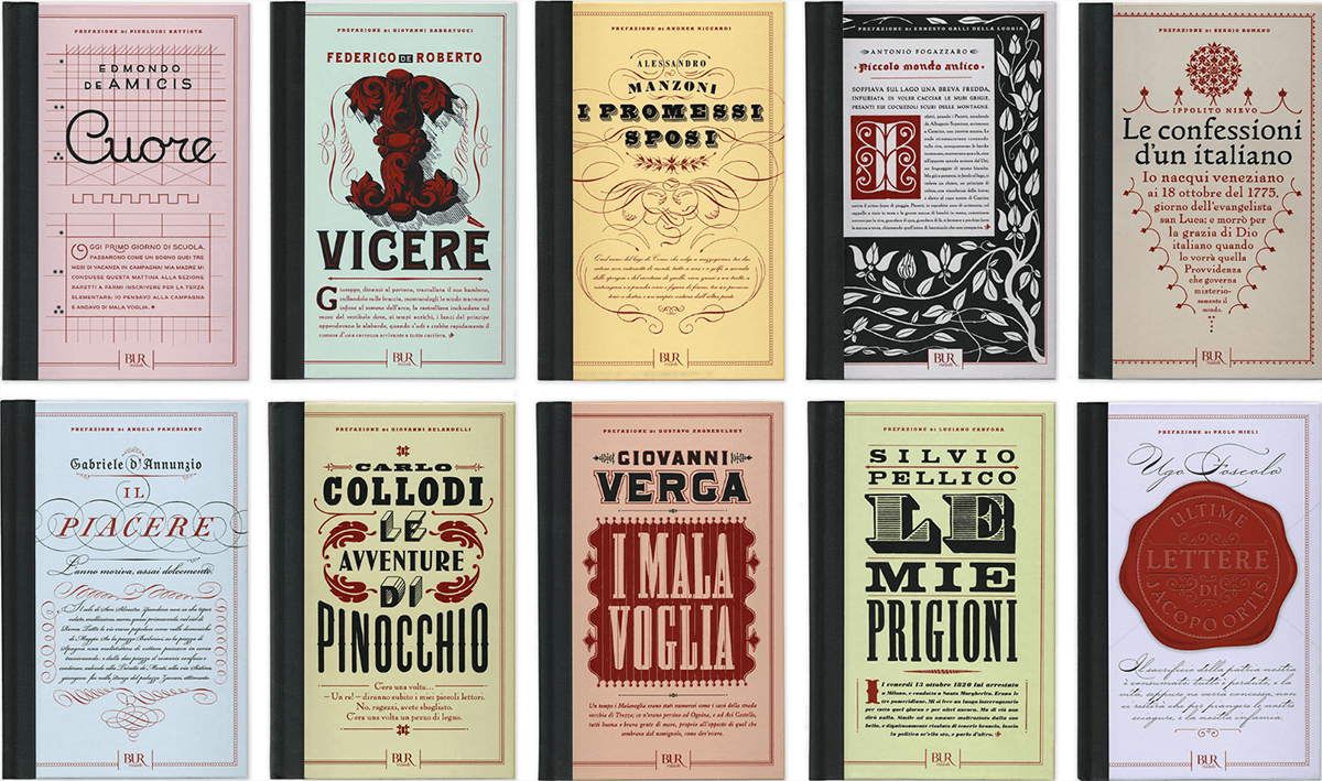
For the 150th anniversary of the unification of Italy, Fili designed covers for a series of the ten great novels that shaped the nation for Rizzoli International. The books have an authentic yet timeless look.
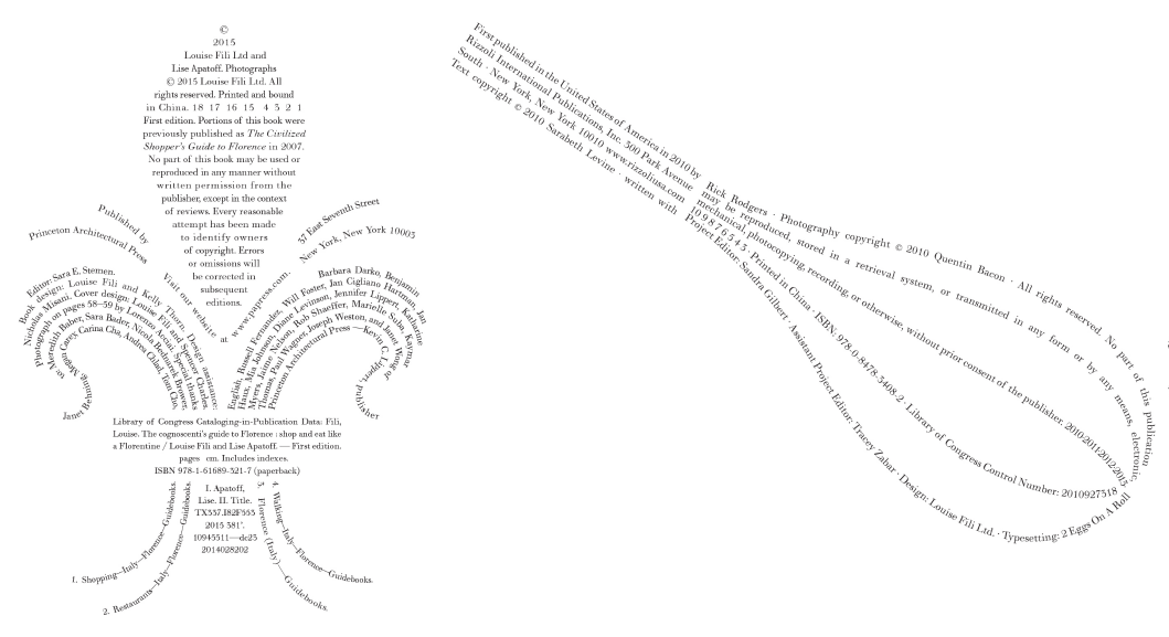
Louise Fili has created copyright pages in a shape for every occasion; these are two of her typographic creations.
Who were your most important influences?
Herb Lubalin taught me the importance of type as an expressive tool. He didn’t have to rely on illustration or photography to convey an idea—the type design was the illustration, and it did all the talking. Herb was also an auteur—he wrote his own copy most of the time, which of course is the best way to get a design to fit! While I was working for Herb, one of my clients was Harris Lewine, the brilliant and brash art director of Harcourt Brace Jovanovich. Harris’s encyclopedic grasp of design history opened doors for me, and his take-no-prisoners approach to art direction is something that I took with me when I started my job as art director of Pantheon Books.


Sometimes a logo can be viable for the entire life of a company and never appear dated or stale. However, often even the most established logos can benefit from an update. Above are two of Fili’s before and after rebranded logos.

An assortment of matchbooks designed by Fili over the years.
How did the movement from mechanical production methods to digital affect you and your work?
Changing technology has had an enormous impact on my work, particularly in regards to my passion for photographing European shop signage. For decades I had been documenting signs in Italy and Paris, while I watched, heartbroken, as they continued to disappear. These photos, which started as 35 mm slides, then point and shoot prints, and finally digital, were always meant for nothing more than my own reference and enjoyment. But as digital technology got better and better, I was finally able to consider making a book.
Ironically, it was this same technology that was in part responsible for the disappearing signs, to be replaced by clumsily crafted plastic letterforms made from free fonts. I felt a sense of urgency to go back to re-photograph these signs before they were all gone. To date, I’ve done three books: Italy, Paris, and Barcelona, which was just published. Grafica della Strada got great press in Italy, to my surprise, and all the reviewers had basically the same observation: We walk by these signs every day without noticing, and it took an American to come here to make us appreciate them!

An assortment of packaging and labels designed by Fili.

A shimmering twist on classic Italian packaging, Brillante is a companion to bestselling pencil sets Perfetto and Tutti Frutti. It contains twelve double-sided pencils in six metallic shades.

Ambessa (Ethiopian for lion) is a line of imported teas from chef Marcus Samuelsson. The flavors trace his history from his African birthplace (Safari Breakfast) to American home (Earl of Harlem).
Any good stories from the trenches?
Some people may not be aware that Herb Lubalin was colorblind. When we used to choose colors together, he would say, “Let’s find a nice red” while he was flipping through the green pages of the Pantone book. No wonder his color of choice was Pantone 452—a totally neutral, indescribable shade that worked perfectly for surprinting and dropouts.

Three of the volumes in a series. Each includes an artfully curated selection of hundreds of international and classic examples.

Six of the many restaurant logos designed by Fili.
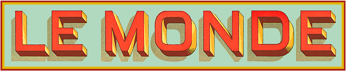
Designed as a classic French enamel sign from the thirties, the logo for Le Monde, an uptown brasserie, weds vintage dimensional letterforms to a contemporary visual aesthetic.

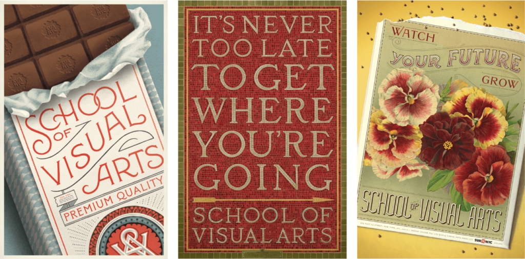
This poster/mailer for a seminar at School of Visual Arts was inspired by French typographic design of the 1920s.
I encounter many students and working designers who are interested in hand lettering. Any suggestions for them?
Look at as much reference as you can gather. Fortunately, there is a lot of it out there.
Three posters for School of Visual Arts created for the New York subway system. Designer Louise Fili discusses these subway posters in this video. Film produced by Heller Films.


Every June, School of Visual Arts conducts a Masters Workshop in Italy, where Louise can share her enthusiasm for Italian food and typography with a group of fifteen participants. Above are two of the posters designed by Fili for this event.

School of Visual Arts honored Louise Fili with the 28th annual Masters Series Award and Exhibition in October 2016. The Masters Series: Louise Fili was the first comprehensive retrospective of her forty-year career, and includes book jackets, branding, food packaging, and restaurant identity work.
* * * * *
Louise Fili designs typefaces too!

Marseille is an Art Deco-inspired typeface with a distinctive flair that exudes La Belle France.

Montecatini takes its cues from the elegant Stile Liberty travel posters of Italy in the early 1900s.

Mardell is an Italian Futurist-inspired typeface designed for the Hamilton Wood Type Museum.

This article was last modified on April 19, 2024
This article was first published on October 25, 2017
Commenting is easier and faster when you're logged in!

Recommended for you

TypeTalk: Investigating Insouciant
TypeTalk is a regular blog on typography. Post your questions and comments by cl...
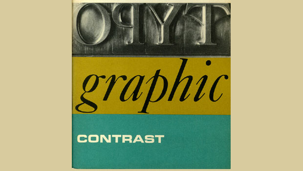
dot-font: Seven Principles of Typographic Contrast
Carl Dair, an expert typographer, reveals the secrets of typographic contrast in...