


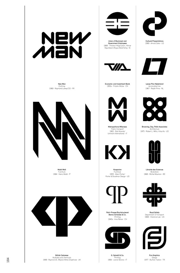
A new book—Logo Modernism—by Jens Müller set to be released in November showcases the best of modern corporate logo design. The German graphic designer compiled over 6,000 logos covering the period from 1940 to 1980 into this 400+ page hardcover retrospect. The featured logos are divided up into three major categories: geometric, typographic, and effect, based on the defining elements of each company’s mark. The logos are also helpfully grouped with others that share a common letter of the alphabet, a prominent shape, or optical effect (such as depicting movement) as their focus. Each logo is accompanied by the company name, year the logo was introduced, and the designer and agency responsible for the piece.

See also: Top Logos and Design Projects of the Last 50 Years
Logo Modernism not only displays fine examples of the use of simple shapes and symbols to define a brand, but also features case studies, designer profiles, and an essay on modernism and graphic design by its contributor, R. Roger Remington. Whether you are simply interested in the history of modernism in design, or are looking for inspiration to guide your designs back to the basics, this book should probably make its way to your holiday wishlist. At $70, it’s not exactly inexpensive, but valuable reference sources tend to be worth every penny.

See also: Extract Vector Logos from PDFs
This article was last modified on October 22, 2015
This article was first published on October 22, 2015
Commenting is easier and faster when you're logged in!

Recommended for you

Rebranding CreativePro
Take a look behind the scenes as we build a new look to better reflect who we ar...

Vectorizing Logos in Illustrator
Explore the image preparation tips, advanced settings, and bonus clean-up tips t...