
London-based Steve Caplin creates 12 editorial photomontages during an average week. He also reviews software for MacUser magazine, and he’s written or co-written five books (some with multiple editions). Throw in the odd lecture and you have one busy man. Lucky for us, he recently took the time to explain step by step how he created one montage. Following his tutorial is an interview, in which Caplin speaks with creativepro.com contributing editor Molly Joss about his methods, tools, background, and advice on working with clients.
From Suburban to Smash-Up
By Steve Caplin
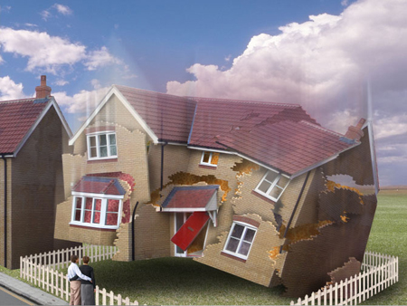
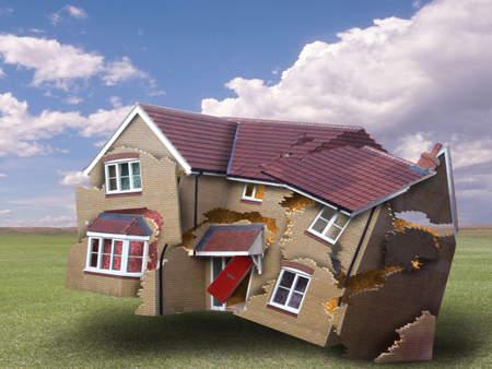
The Sunday Telegraph, a newspaper in the United Kingdom, asked me to illustrate a story about falling house prices with a montage of a house crashing to the ground and breaking up on impact. In the wake of the London bombings, however, I thought too much realism would be an unfortunate reminder of that event: so I opted for a more cartoony approach, making fun of the subject rather than showing destruction in graphic detail.
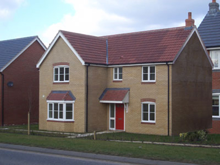
Here’s the original photograph, taken on a housing estate earlier this year. There was a house on the right in front of the one I wanted to use, but I was able to use the new Vanishing Point filter in Photoshop CS2 to rebuild the right hand wall; I simply copied the right roof board from the one on the left, and flipped it horizontally.

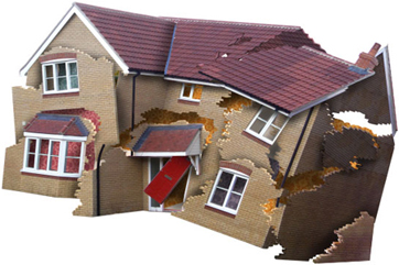
With the house cut out from its background, the next step was to break it into chunks. I made a selection from the wall with nothing more sophisticated than the Lasso tool, roughly following the lines of the brickwork to make it more convincing. I then cut this selection to a new layer.

Giving the wall some thickness is a surprisingly easy task. First, Select All on the new layer and hide the edges; then, holding down the Alt key, use the cursor keys to nudge the selection right by one pixel, which makes a copy of the original. Then release the Alt key and nudge down one pixel. Repeat this process half a dozen times, and the wall extrudes itself. At the end of the process, the front section of wall is selected, having left the extrusion behind it. Inverse the selection so that the extrusion is selected and use Dodge and Burn to add highlight and shading to the revealed brickwork.

Here’s the house with all the sections broken into separate layers and extruded. Rotating each layer by a small amount increases the sense of destruction. I’ve also copied, flipped, and darkened a section of roof to show behind the original.

Adding shading to each layer using the Burn tool brings a three-dimensionality to the image that was previously lacking: each layer casts its shadow on the layer beneath.
I duplicated a section of wallpaper several times, placing it behind the house to give the impression that you’re seeing the interior of the building. By coloring each section slightly differently, I give the impression of a variety of different rooms.
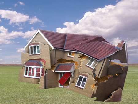
The sky and grass are two separate images I’d photographed and kept on file. It’s important to place the horizon line appropriately: here, you’re looking at the house from a high vantage point, more or less level with the top floor windows.
As before, it’s the shading that really makes the difference. Allowing the viewer to see a little unshaded grass beneath the left edge of the house shows that it’s mainly still up in the air at that point, while the right edge has already hit the ground.
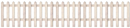
I built this fence from a scan of a piece of wood, broken into chunks, desaturated and shaded appropriately. Now that I’ve drawn it, I’ll keep this fence for future use!
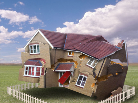
I placed four copies of the fence around the house. By marking out the ground area, I’ve provided further visual clues to strengthen the sense of the house’s airborne state.
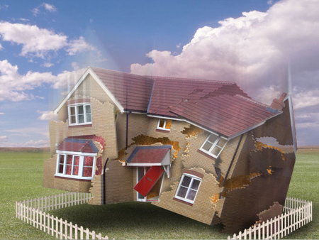
I blurred a merged copy of all the house layers using the Motion Blur filter; then I masked it out to give a sense of movement at the top of the building.

A copy of the original house, placed to the far left, together with a small section of road, gives a sense of the house being part of a larger development — essential to the effectiveness of the image. But a picture that’s completely devoid of people is always a little lifeless; the couple standing in front add that much-needed sense of human involvement.
To see an animated progression of the images and to read the interview, go to page 2.
This article was last modified on January 18, 2023
This article was first published on August 29, 2005
Commenting is easier and faster when you're logged in!

Recommended for you

Scanning Around With Gene: One Ringy-Dingy, Two Ringy-Dingies
In the annals of great American institutions, American Telephone and Telegraph,...
ClipDrop Review
ClipDrop offers a range of high-powered and occasionally unique solutions to eve...

Working with Live Shapes in Adobe Illustrator
Adobe Illustrator has always been the go-to application for drawing vector-based...