
InType: Using White Space Characters
Ilene Strizver demystifies the many choices for white space character you can use in InDesign.

This article appears in Issue 84 of InDesign Magazine.
The long and sometimes mysterious list of options located under Type > Insert White Space (Figure 1) is frequently overlooked and quite often misunderstood by designers.
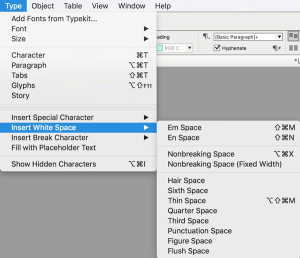
Figure 1: Who ever thought there could be so many ways to make space?
Not only are the characters’ meanings and usages unfamiliar to many, but the path to their navigation can be trying, due to the zigzaggy nature of the path you have to take to get to them. Also, as you can see from the menu, some of them have keyboard shortcuts, others don’t. But they are important and useful elements that should be known to every designer wanting to finesse their typography for the most professional results. I personally admit negligence in the use of white space characters, usually opting for the kerning or tracking feature. But in researching this article, I’ve come to find out this is not the best, nor I daresay the most professional, way to add space. The use of white space characters is considered to be the more elegant, professional solution, and will avoid the creation of overrides when using styles, which can be problematic later in the production process.
Scott Citron, designer and Adobe Certified Expert, says, “Why are these spaces better than using kerning or tracking for the same result? The value of each is easily repeatable. If I’m constantly kerning a pair of quotes followed by a single quote, I have to either remember the kerning value or I have to copy/paste the characters each time. But the best reason is that I can copy a thin space into the Find/Change or GREP search field and tell
InDesign to look for all em dashes and replace them with an em dash that’s bracketed by thin spaces. You can’t do that with mere kerning!”
The Cast of Characters
The listing of white spaces shown in Figure 2 shows their relative widths in a visual way. Read on for more gnarly details.
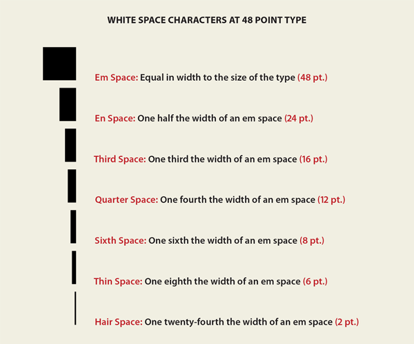
Figure 2: The comparative widths of white space characters. These are always fixed widths relative to the point size being used.
The letter series
An em space is a blank space equal in width to that of an uppercase “M” of that font family. That width essentially defines, or you could say personifies, the accepted size of the entire face. So it follows that in 48-point type, an em space is 48 points wide, in 24-point type the em space is 24 point, and so on. This variable space (as opposed to a fixed space, which is the same for any sized type) can be accessed via Command+Shift+M or Ctrl+Shift+M. The en space white space character is half the width of an em space (defined above). For a 48-point font size, an en space will take up a width of 24 points, and so on. You can use an en space to create a bigger gap between certain words or special characters. Its keyboard shortcut is Command+Shift+N or Ctrl+Shift+N.
The nonbreaking series
Although the following nonbreaking spaces appear in the middle of InDesign’s drop-down menu, it would make more sense (to me) if they were at the beginning or the end of the list, as they are not really white spaces, but commands to achieve an action. In any case, here are their definitions: Nonbreaking Space: This space is actually a command or instruction that keeps two words together, and prevents them from being broken or separated at the space character at the end of a line. It can be used in proper names such as company and product names, cities, states, or countries, or in numerical expressions that you want to keep together, such as New Zealand, 460 B.C., Bill Brown, Jr., p. 48, or 2500 USD. In the last two examples, you might not want “USD” following “2500” to drop to the next line, or you would want to keep together “p. 48,” so you would replace the word space between the entities with a nonbreaking space to keep them together. The shortcut for this is Command+Option+X or Ctrl+Alt+X. Nonbreaking Space (Fixed Width): A fixed width, nonbreaking space, as shown in Figure 3, prevents the line from being broken at the space character, as does the one explained above, but does not expand or compress in justified text. Use for non-justified text.
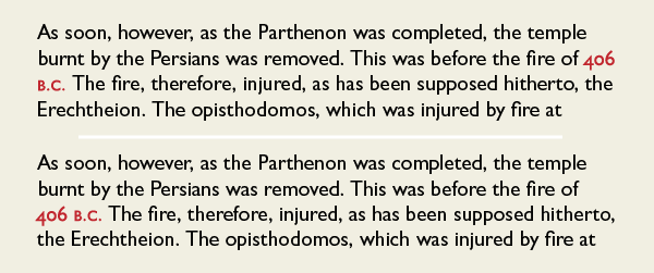
Figure 3: The year and its suffix in the date 406 B.C. are separated by the demands of the automated rag (top). In order to keep them together, insert a nonbreaking space between them (bottom). Excerpt from The American Journal of Archaeology, 1893-1 by The American Journal of Archaeology.
The (mostly) numerate-sounding series
The hair, sixth, thin, quarter, and third spaces that follow can be used anywhere you need a small amount of space to separate characters, including: Adding space around “too tight” en and em dashes (Figure 4)
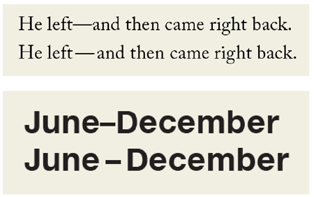
Figure 4: En and em dashes in some fonts are very tight next to the surrounding letters. If you prefer yours with a bit more air (as many designers do), try adding a white space character on both sides. The em dash (top) is opened up with a thin space, while the en dash (bottom) uses a sixth space.
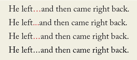
Figure 5: Ellipses vary greatly from font to font. The ellipsis glyph in Adobe Caslon Pro is quite open. If you want a tighter one, set it manually with three periods, and open up as desired using a white space character. Here, I’ve used a hair space.
Specialized spaces
These remaining spaces have specific widths and/or functions: Punctuation space: The same width as an exclamation point, period, comma, or colon in the typeface. Figure space: This white space character is, or should be, the same width as the tabular figures in any given font. (I say “should be” because in my exploration, I’ve found that it is not always the exact same width.) A figure space can be used to help align tabular numerals in tables and other vertical columns of numbers (Figure 6).
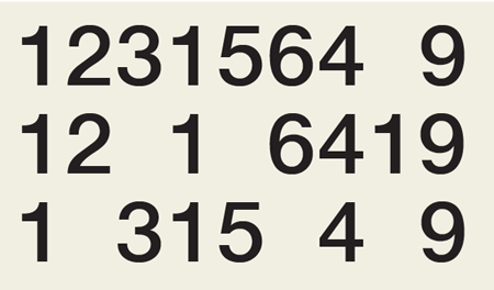
Figure 6: When setting columns of tabular figures, you can use a figure space when you want to add some space without disturbing the vertical alignment.
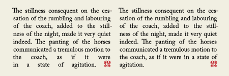
Figure 7: In this totally justified setting, an end mark signifies the end of the passage. The forced justification example on the left results in very open spacing in the last two lines. Inserting a flush space between the last period and the end mark greatly improves spacing in those lines.

Figure 8: A flush space can also be used to evenly space (or flush) out justified lists, such as these three states. Without it (top), two-word names are separated, but the addition of a flush space between the two state names (bottom) fixes the problem.
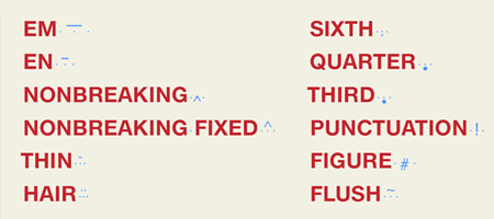
Figure 9: The symbols for each white space character are shown in blue. (The three dots are spaces.)
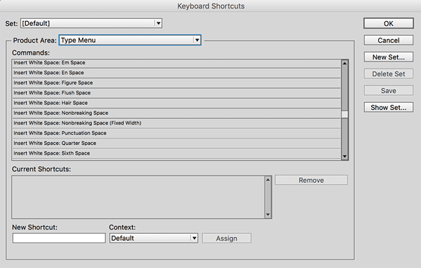
Figure 10: You can use InDesign’s keyboard shortcuts for a multitude of interface items, including white space characters.
Space Exploration
So what is the takeaway? Take the time to research and experiment with InDesign’s white space characters. You might find these hidden gems to become some of your favorite, most productive, and practical typesetting shortcuts yet!
Commenting is easier and faster when you're logged in!

Recommended for you

Saving GREP Queries for Reuse and Sharing
How to save and locate your favorite GREP Find/Change queries so you don't have...
InFocus: Autumn 2022
A roundup of tools, fonts, add-ons, assets, and other InDesign-centric goodies.

How to Create and Swap Colors the Smart Way in InDesign
Learn how to easily create colors from scratch in InDesign and to swap out exist...