
InType: Legibility vs. Readability
Follow these tips for selecting and designing with type to create text that attracts and keeps a reader’s attention.
This article appears in Issue 56 of InDesign Magazine.
“I can’t read it!” Every designer has heard it, from clients, audience, or even their own mom. And you should pay attention to this concern! After all, it’s crucial that people be able to read the text in your documents, no matter what you’re designing. In the world of typography and design, people often throw about the terms legibility and readability—in fact they’re often even used interchangeably. But they’re not interchangeable; these words actually refer to two different concepts. And though it might seem like splitting typographic hairs, it’s worth understanding the difference in order to make good decisions when selecting and designing with type. In a nutshell: Legibility is an attribute of a typeface, and readability is an attribute of an arrangement of type.
Legibility
In its broadest terms, legibility refers to how easy it is for someone to read a typeface. More specifically, it refers to how easily you can recognize letters and distinguish them from each other. Legibility is the responsibility of the typeface designer, who chooses shapes and design details for each letterform so that they can combine into words and sentences. Legibility is not always a priority when designers craft a typeface. In a “body text” font, it’s essential, of course, as the degree of legibility contributes directly to holding the reader’s attention for the duration of the copy. However, in a display font, which is generally used for fewer words in larger settings, and where the objective is to be instantly noticeable and to convey a mood or a feeling, legibility might not be as important (Figure 1).

Figure 1: Not all typefaces are designed with legibility as a
priority. These display designs forgo some degree of legibility for a more expressive, demonstrative personality.
- x-Height: A typeface with a tall x-height is generally more legible than one with a shorter waistline, due to its larger, more open shapes and interior spaces in a given cap height (Figure 2).
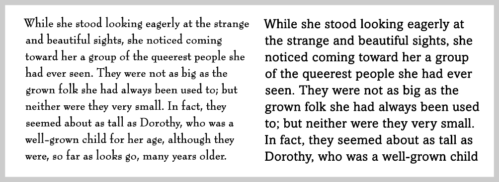
Figure 2: Type designs with short x-heights, such as Bernhard Modern (left), are not as legible as those with taller x-heights, such as Amasis (right). Excerpt from The Wonderful Wizard of Oz, by L. Frank Baum.
- Weight: The most legible typefaces are those with a moderate overall thickness, and are usually identified as book (aptly named!), regular, or occasionally medium weight. When setting a long chunk of text, stick to these weights, saving the light and bold weights for shorter blocks of text (Figure 3).

Figure 3: The overall weight of a typeface impacts its legibility, as is evident in these three weights of Metro Nova. The regular weight (middle) provides the greatest legibility, especially for lengthy text; save the thin and extra black versions for brief settings.
- Decorative shapes: The more decorative and embellished the characters in a typeface, the more legibility will suffer. The same thing goes for extremely condensed or expanded letterforms. So, when you’re looking for a legible font, look for simple, uncomplicated, and unadorned letterforms (Figure 4).
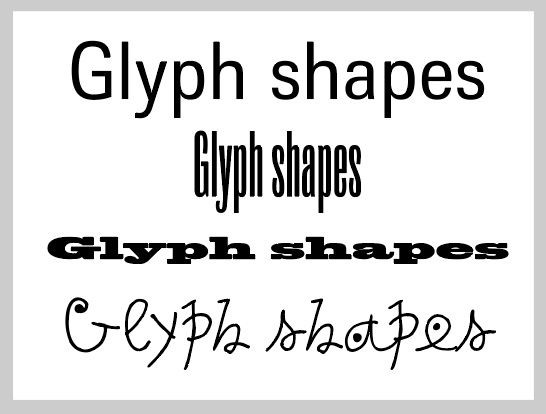
Figure 4: Open, uncomplicated glyph shapes, such as those exemplified by Trilon (top), are considerably more legible than type designs that are extremely condensed, expanded, or have more unconventional shapes.
- Stroke contrast: While low to moderate contrast between the thick and thin strokes of a typeface can contribute to character recognition, extreme contrast such as typestyles with hairline thins combined with bold strokes can result in a loss of legibility (Figure 5).
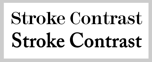
Figure 5: A typeface with extreme stroke contrast and ultra thins, such as Modern 216 (top), forgoes a degree of legibility for greater elegance. Adobe Caslon (bottom), with its more moderate stroke contrast, is more of a workhorse, and can be easily read even in a long page of text.
- Counters: The interior “empty” space of a character—like the hole in the middle of an O or in the loop of a P—is called a counter, and a font’s counters are just as important to legibility as the surrounding shape. When these interior spaces are very small—such as in some black or ultra weights—legibility suffers (Figure 6).
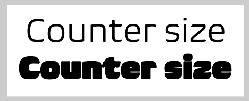
Figure 6: Generous, open counters make for a more comfortable read than ones with small, cramped interior spaces, which are often found in heavy weights, as seen in this setting of Biome light and ultra.
- Serifs vs. sans: Most designers believe that serif typefaces have a higher degree of legibility than sans serif typefaces (thus their predominance in English-language books, magazines, and newspapers), but studies on this topic are inconclusive. While it is true that serifs help guide the eye through a word and across a line of type, exaggerated serifs actually reduce legibility. This is even more true in low-resolution environments (such as desktop printer output) which might not display small or thin serifs clearly.
Readability
So if legibility is the purview of the type designer, then whose responsibility is readability? Yours! Readability is all about how easily an arrangement of type can be read, which you determine by how you typeset, or arrange, the text. Of course, readability and legibility can influence each other: a very legible typeface can be made unreadable by how it is set; and the experience of a hard-to-read font can be improved with a clever type treatment. So, since you’re the one setting text on a page, what can you do to maximize readability? Here are ten things you need to consider for every individual block of text:
- Type size: When it comes to text, you might assume that the larger the type size, the easier it is to read. While this is often the case, too-large text can be just as difficult to read as too small, depending on the page design. Most importantly, remember that type size goes hand in hand with line spacing to create readable type. That’s why type is almost always talked about as “font size on leading,” such as “10 on 12 type” (Figure 7).

Figure 7: Setting type at a large size but with tight line spacing doesn’t always translate into a greater degree of readability, as demonstrated in the setting on the left of ITC Flora—an otherwise highly legible design. When the same typeface is set much smaller but with more generous line spacing, it becomes much more readable.
- Line spacing: Adjusting the line spacing—or leading, the distance from one line of text to the next or previous line—in a block of text has a major effect on readability. In general, generous line spacing contributes to better readability. If the line spacing is very tight (as was popular in the ’70s), type can become hard to read, even at generous type sizes. Though, of course too much line spacing can be just as bad! A smaller type size with larger line spacing tends to be more readable than larger type with tight leading (Figure 8).
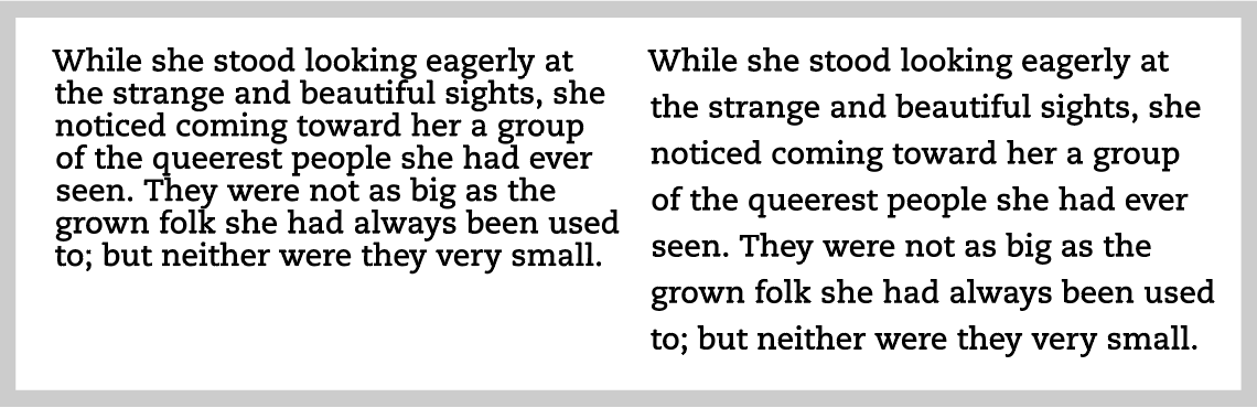
Figure 8: While tight line spacing allows more characters to fit in a given space (left), it considerably reduces readability. Generous line spacing makes text easier to read, providing a greater chance of keeping your reader engaged.
- Line length/column width: When you set type, it’s crucial that you pay attention to the width of your column—or, more specifically, how many characters can fit in a line. A general guideline is to stay within 60 to 70 characters per line. Very wide column widths with a large character count reduce readability—especially for lengthy text—due to the large gap the reader’s eye has to cover from the end of one line to the beginning of the next. Too long lines can cause your readers the frustration of either rereading the same line or skipping a line. Conversely, very narrow columns with numerous hyphenated words are just as bad!
- Alignment: The most readable text alignment in the Western world is flush left, which is also called rag right. Many designers assume they should use justified text, but beware: while it can be as easy to read as flush left copy, this is true only if the column width is large enough to maintain the overall word and letter spacing of the font without lots of stretching and squeezing, which disturb the color, texture, and flow. Flush right, centered, and contoured (non-rectangular, such as in text wrap) type certainly have their place when used purposefully and sparingly, but can also make it harder to read for any length of text due to their varied and sometimes unpredictable left edge.
- Letter spacing: Overall letter spacing that is either too tight or too open can impede the ease and rhythm of reading and decrease readability. Many designers assume that a font’s letter spacing is a legibility issue—that is, it’s baked into the font design. To some degree that’s true, but if you use a font that was designed for display (such as Helvetica) for text, it will appear too tight, and need to be opened (given more space between its characters). You can do that with the Tracking feature, or by adjusting the optimum letter space settings in InDesign’s Justification dialog box. Additionally, when you set text in a very bold weight or in a font intended for display, the letter spacing might need to be opened for a more pleasing, inviting texture. On the other hand, with a typeface intended for text at larger sizes, you should tighten the spacing a bit. Remember, just because the font designer found a particular letter spacing pleasing doesn’t mean you shouldn’t override it if you think you can make it more readable.
- Word spacing: When you’re looking at words all day, it’s easy to overlook something that’s just as important: the space between those words. This seemingly small detail can impede readability when the spaces are either too large (creating a visual interruption) or too tight (making the words appear to run into each other). You’ll often notice this when you set justified type, because word spaces are stretched or squeezed—sometimes even noticeably differently within the same paragraph. Similarly, you have to watch out for word spacing issues whenever you use a display typeface for large block of text; these faces are designed with less word spacing than those intended for body copy. InDesign lets you adjust the optimum word spacing in the Justification pane of the paragraph styles dialog box (Figure 9).
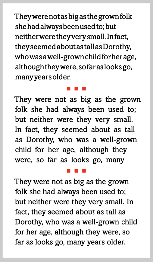
Figure 9: Word spacing should not be so tight that the words run into each other (top) nor so open that it becomes challenging to read groups of words (middle). Balanced word spacing that maintains the overall texture of the type, allowing your eyes to glide through the text, is the most readable (bottom).
- Hyphenation: When you set type in a justified column (or you set any text in a narrow column width), InDesign uses hyphenation to create more pleasing line breaks. Some designers insist that you should never hyphenate left-aligned (ragged right) text, but take that with a grain of salt. More importantly, be aware that too much hyphenation seriously reduces readability as your reader struggles to put the words back together. Two good guidelines are: Avoid more than two hyphens in a row, and avoid breaking words after or before only two letters.
- Color and contrast: The most legible typeface, set with readability in mind, can be hard to read without contrast between the color of the type and the background. For example, it’s just asking for trouble to set red type against an orange background or blue type on black. Similarly, placing type on a busy pattern or photograph reduces readability (Figure 10).

Figure 10. Avoid clashing colors of similar values and busy backgrounds, both of which can be hard to read. Maintain a strong, even contrast between type and background for greatest readability.
- Orientation: Not all type flows from left to right! When type is vertically aligned, set at an angle, or on a curve, it becomes more difficult to read. There’s no need to avoid these treatments—just be mindful of them, making sure they are appropriate for your audience and objectives, and alter them accordingly to maximize effectiveness and readability (Figure 11).

Figure 11: Keep in mind that changing the orientation of type to anything other than left to right will reduce readability.
- Additional considerations: Other factors affecting readability of type in print are surface and porosity (paper, glass, plastic, etc.), ink and finish (matte, gloss, or metallic), and viewing distance (signage requires a different type treatment than a book held at close range). For type on the web or in motion, resolution and speed of motion will greatly affect readability.
Clearly, there is a lot to think about when selecting and setting type in order to achieve maximum legibility and readability. The key is to know as much as possible about the project beforehand, and take all the above factors into consideration when selecting and designing with type.
Commenting is easier and faster when you're logged in!

Recommended for you

Get a List of Images In Your Document
AMB wrote: Is there a way to capture the names of all the linked files in the 'l...
Five Favorite Design and Marketing Resources
A taste of the resources you’ll discover in Theresa Jackson’s upcoming session a...

Bitstream to Debut "Pageflex: One Application for All Things Variable" at GraphExpo 2006
Bitstream Inc. (NASDAQ: BITS, www.bitstream.com) and www.pageflex.com) today ann...