Members Only

InType: Know Your Small Caps

Add sophistication and polish to your type by understanding the different kinds of small caps, as well as how and when to use them.

In today’s “do-it-yourself” digital world where most designers are called upon to spec, style, and set their own type, learning how to finesse your typography is crucial to achieving professional results. One typographic element that is often misunderstood, overlooked, and occasionally misused is small caps. What are they? When and how should you use them? Where do you find them? Whether you find yourself one of the perplexed or just wish to refresh your knowledge of the topic, read on to become a bit more typographically enlightened!

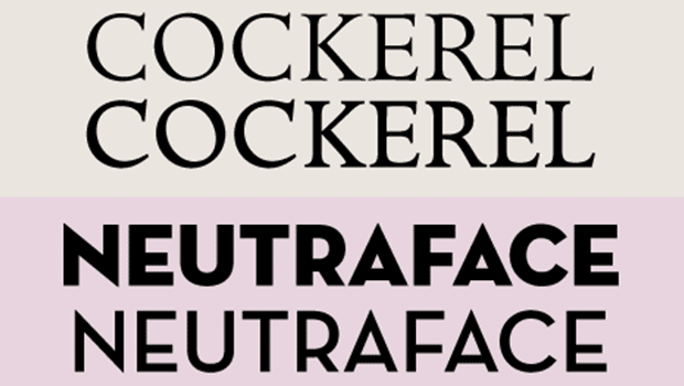
Small caps are uppercase letterforms that are shorter than cap height. In a typeface intended for text, small caps most often approximate the measure of the x-height, so they blend in with the lowercase characters. Small caps for display or more decorative designs have more flexibility, and can be taller than the x-height (Figures 1 and 2).

Alfon and Braganza lower case small caps and upper case

Figure 1: The height of true-drawn small caps can vary from typeface to typeface. Some designs, such as Alfon, have small caps that are created to blend with the lowercase; others, such as ITC Braganza, have small caps that are meant to be companions to the full caps.

Alfon and Braganza small caps and lowercase height comparison

Figure 2: Alfon (on the left) has small caps that are the same height as its lowercase, while Braganza’s small caps (on the right) are taller than the x-height.

True-drawn or “proper” small caps that are supplied with or for a typeface are superior to computer-generated or “fake” small caps (whose usage is considered to be a type crime), as the true-drawn ones are designed to

match the weight, proportion, and overall color of the caps. Computer-generated small caps, on the other hand, are just reduced capitals, and therefore look too light, too tightly spaced, and in some cases, too narrow (Figure 3).
True drawn small caps vs. computer generated small caps in different fonts

Figure 3: True-drawn small caps (left column) and computer-generated small caps (right column). Computer-generated, “fake” small caps are just reduced caps and therefore look too light (and often too narrow and too tightly spaced).

Small caps can be a useful and typographically sophisticated feature to take advantage of in your designs. They are commonly applied to lead-ins in running text, such as first paragraphs in book chapters, magazines, and brochures, as they can create emphasis and draw attention to an opening phrase or sentence. In these instances, the text usually begins with a full cap (or a oversized initial letter) followed by the small caps. Small caps can also be useful for title pages, page headings, and footers, either as cap/small cap settings, or all small caps. Small caps are often used to set acronyms (pronounceable abbreviations such as RAM [Random Access Memory] and GIF [Graphics Interchange Format]) and initialisms (non-pronounceable, and thus spoken, characters such as FBI, USA, and LOL) instead of using full caps, particularly when repeated numerous times in text. Small caps create a more subtle emphasis than full caps, and stand out nicely without disturbing the color of lowercase text. They also take up less space. Even if the appearance of one or a couple of all-cap abbreviations scattered about looks acceptable, numerous instances located in proximity to each other can create a visual disturbance in the overall color and texture of the type, in addition to reducing readability—both of which can be improved with the use of small caps. Keep in mind that the substitution of small caps in these instances should be done on a case-by-case basis, with the client’s needs and objectives your primary consideration; while you might think too many all-cap abbreviations are a visual disruption, your client might welcome or even require them as a typographic reinforcement of their brand or of other important information. (Note that while the occasional copyeditor might protest the use of small caps in abbreviations, considering them to be visually confusing for the reader, I believe this decision should be left up to the type-savvy designer and/or a typographer.) Another common usage of small caps is for the time-formatting abbreviations AM and PM, as seen in Figure 4. With or without periods, these abbreviations set in small caps can look more refined than lowercase, and blend in better with surrounding (upper- and lowercase) text than full-sized caps. But this decision—as with all others related to small caps—is more about personal taste than correct typographic convention.
Public Library description with small caps

Figure 4: Small caps work well in a number of scenarios, including headings, abbreviations (such as AM and PM), and lead-ins.

Another practical yet often overlooked use of small caps is when the look of all caps is desired in small text. Consider using all small caps instead, set to the desired cap height, rather than all full caps. Why? Because they often have a higher degree of legibility at smaller sizes than full caps, due to their wider letterforms, more open spacing, and heavier appearance at the same cap height (Figure 5).
Small caps vs all caps

Figure 5: The differences between all caps and small caps set at the same height (here set in Classic Grotesque™) can make for a more legible treatment for cap text at small sizes.

True-drawn small caps are available in an increasing number of OpenType fonts—today’s preferred font format—due to their ability to include thousands of characters, as compared to the more limited character sets of Type1 and TrueType fonts. Prior to OpenType, true-drawn small caps were only available for a limited number of fonts. When they were, it was usually as an expert set, or a secondary stand-alone font provided as a companion to the primary font. An exception to this is a number of display fonts that are designed with small caps instead of lowercase characters.

Accessing True-Drawn Small Caps in InDesign

An increasing number of OpenType fonts come with true-drawn small caps, but knowing which have them and how to access them can be a bit confusing. InDesign has two options for converting text to small caps, but each behaves differently (Figure 6):

  • The Small Caps setting in the Character panel’s flyout menu (or the Small Caps button in the Control panel) will convert only the lowercase letters in selected text to small caps—the true-drawn variety if available in the chosen font, or the fake, computer-generated ones for fonts that don’t have the real thing. It will leave the full caps unconverted, resulting in a combination of full caps and small caps.
  • The All Small Caps setting in the OpenType submenu accessed from the Character panel will convert all characters in selected text to small caps, including the full caps, resulting in a total small cap setting. Note that this feature is only accessible—and therefore unbracketed—for OpenType fonts that contain true-drawn small caps. It will never generate the fake variety.

Character menu all small caps

Figure 6: The differences between all caps and small caps set at the same height (here set in Classic Grotesque™) can make for a more legible treatment for cap text at small sizes.

If you want to stick to the true-drawn variety (as you should) but want a cap/small cap setting, first make sure the font contains true-drawn small caps by checking that All Small Caps in the OpenType panel is unbracketed, or by visually checking for them in the Glyphs panel. If they are present in the font in question, you can then convert the text using the Small Caps setting located in the Control or Character panel.

Small Cap Control

Advanced Type Small Caps 100%

Bookmark
Please login to bookmark Close

Not a member yet?

Get unlimited access to articles and member-only resources with a CreativePro membership.

Become a Member

Comments (0)

Leave a Reply

Your email address will not be published. Required fields are marked *